Tag Archives: advice

Expanding the World Inside Your Book

expandingbookworld
As I’ve progressed further and further in writing my first novel, I’ve found myself thinking about the world my characters live in rather than just about the characters themselves. After all, a book with great characters is one thing, but if they live on blank pages rather than a colorful fictional world with its own backgrounds and settings, the characters feel a little flat. We as authors have to provide information about our book’s “world” so that its characters’ actions make sense.

The following parts of a fictional world, in my experience, need to be fleshed out:

Geography/Topography

What does your book’s world look like? Where are the mountains, beaches, deserts/plains, forests, oceans, volcanoes, and so on? This information impacts the characters’ ability to travel and adds to the mythos of the world you’re creating.

Political Divisions of Land

How is the land divided up, politically? Are there separate countries, states, provinces, regions, etc.? Determine where these boundaries fall in your fictional landscape, and what that means for your characters.

Weather Patterns and Seasons

If your book’s world has different seasons than our Earth’s, you have to note that in your book, otherwise readers will be very confused! Also, any weather patterns that impact your characters’ travel plans and daily lives should be described.

Governments, Social Classes, and Social Structures

Is your book’s world largely governed by representatives, a monarchy, or some other structure? What about the social classes–is there just “rich” and “poor”, or are there subtler divisions, like “upper middle class,” “lower middle class,” etc.

Also, think about how people’s jobs might divide the population into classes, such as those dedicated to a particular deity, those who work in service industries, etc.

Races, Ethnicities, and Genders

How diverse is the population of your book’s world? Is it largely the same as our world, or are there more or fewer races/ethnicities? Are there just two genders, or are there more? (Hey, in fantasy worlds, you never know!). These decisions will impact your characters either indirectly or directly, depending on your book’s events.

Society Type

Is your fictional world based in an agricultural or technological society? In other words, are they mostly farmers or mostly not-farmers? This will determine what all types of conveniences your characters have available to them, such as running water, toilet facilities, and electricity, among other things.

Technology

What kind of technology is available to your characters? You’ll have to determine that too, and note that for your readers so that they know what parameters your characters are working within. It’d be weird, for instance, to be reading a book that’s supposedly about an alternate reality of ancient Greece, and then come across a Facebook reference in there somewhere.

Religion(s)

What religion(s) are present? Are there even multiple religions? What is the deity or pantheon of deities like? What are the rituals associated with each religion? Outlining your world’s basic belief systems will be very helpful in determining how your characters will interact with each other on a spiritual basis; it may not be necessary for all plotlines, but a subplot or two may require it, so it’s good to have it fleshed out beforehand.

Where to Contain All This Information?

Keep a written record somewhere of this world-building information–for instance, I have several digital files on my computer with these details, kept separate from my novel but backed up in the same places. But you might find it easier to build your fictional world using a journal, notepad, or even a visual inspiration board to help you remember what places look like, etc. Whatever helps you access this information and reference it most easily!

Summary

Certainly, building a fictional world is difficult and requires a lot of questions to be answered. But if you want to make your book a fully-enriched experience, this background work will help readers appreciate your plot and characters.

(And even if your book is largely set in our world, it still helps to directly express the truth of the world as you experience it–other readers will be approaching your book with a different take on the world and will need to know how you see it to understand your book!)

Feed Some RSS to Me

feedsomersstome
Aside from content widgets automatically generated by social media websites, RSS feeds are the easiest way to get content from other websites onto your pages. However, the process can be REALLY esoteric, especially if you’re new to the process of incorporating RSS feeds into your personal designs.

When I first started fiddling around with RSS, I had no idea what I was supposed to do with the RSS link…and then, I found a Web service that handled most of the backend code for me.

The Solution: Feed2JS.org

I literally stumbled across this site while aimlessly browsing StumbleUpon–best random search result ever! Feed2JS.org, or “feed to JavaScript,” turns any RSS feed into a block of JavaScript-ed content that can display on your web page.

To test this, I went to their Build Your Feed page, plugged in the URL of the RSS feed I wanted (the first one I did was Last.fm), and then I was given the chance to consider the following options.

  1. Show or hide info about the feed publisher (the website you’re getting the feed from)
  2. Number of items to show in the feed
  3. Show or hide item descriptions
  4. Show item author (if applicable) or not
  5. Use HTML in the item display, or format it with CSS
  6. Show posted date or not
  7. Show the time of post according to your specific time zone or not
  8. Open links in new window or not
  9. Choose UTF-8 character encoding or not
  10. Podcast enclosures or not (link directly to media file)
  11. Create a custom CSS class for your feed or not

An Example of a Built Feed

In the case of my Last.fm RSS feed, I didn’t want a title (because I was going to title it myself with the words “Last Played”). I also didn’t want any descriptions of each song, just the title of the song. I wanted the 10 last played songs to display, and I wanted their info to pop up in a new window so that people didn’t just lose my page.

I also didn’t bother with including the date, time, or author of the post because I felt that would unnecessarily clutter the look of the feed. I wanted it to look as much like a WordPress widget as possible. Lastly, I added the custom CSS class of “lastfm” so that I could style my Last.fm feed just like I wanted it.

So, my Last.fm feed’s Javascript turned out looking something like this in Javascript:

<script language=”JavaScript” src=”http://feed2js.org//feed2js.php?src=http%3A%2F%2Fws.audioscrobbler.com%2F1.0%2Fuser%2F__MYUSERNAME__
%2Frecenttracks.rss&num=10&targ=y&utf=y&css=lastfm”  charset=”UTF-8″ type=”text/javascript”></script>

And this is what it ended up looking like on the actual test page:


I added the Last.fm icon and “Last Played” text myself, but the rest of the info is all Javascript-ed in! Neat, huh?

WARNING! Don’t Forget to Style The Feed!

The last thing about Feed2JS feeds? Remember to style them, otherwise they look pretty yucky on the page–just basic Times New Roman size 12 font, and default link colors (oh, the horror!).

Even though I had specified a custom CSS class using the “Build Your Feed” page, I had no luck styling my Last.fm feed with the class. I even went to the Style Your Feed page and read up on how to construct the CSS classes that my feed ostensibly needed, but it didn’t work for me at all. (Not sure if it was a browser issue or user error–somehow, I suspect the latter. LOL)

So, instead, I styled the display and the links by specifying the link styles of the div with the id “lfm” that contained my Last.fm feed, using code like the following:

#lfm {
background-color: #abb461;
color: #FFFFFF;
border-radius: 10px;
padding: 3px;
list-style-type: none;
font-size: 11px;
font-family: “Arial”, sans-serif;
}

#lfm a {
color: #fbfcf3;
}

This worked beautifully (aside from the silly list bullets that won’t go away despite putting “list-style-type: none;” in my code), so I’m not worrying about the custom CSS class unless I have to. The less headaches I encounter while coding, the better. 🙂

Summary

RSS feeds are great ways to put interactive, live-updating content on your page, even in this age of WordPress widgets and little automatically-generated boxes that do it all for you. Feed2JS provides a quick way to put the RSS feed on your page using Javascript, and through their generated code, you can learn how to code the Javascript yourself one day!

Get a Fix on Position: Fixed

getafixonpositionfixed
With the modern Web and its hyper-fluid, mobile-friendly designs, you might think there isn’t much use for a piece of CSS code that makes a page element stay in the same place, like “position: fixed”.

But never fear, there are still uses for fixed element styles in your CSS! Read on to discover 2 ways that fixed elements actually help the style AND function of your page!

Use #1: Fixed Sidebar

Some websites have a little sidebar on some of their pages that scrolls with you in the same place on the screen, no matter how far down the page you go. That behavior is all because of “position: fixed;”.

For instance: a typical sidebar’s CSS, below.


#sidebar {
float: left;
color: #FFFFFF;
background-color: #000000;
border: 1px solid #FF0000;
font-size: 11px;
font-family: “Verdana”, “Arial”, sans-serif;
width: 180px;
height: 200px;
}

This would be a cute, basic little sidebar, but when the user scrolls up or down, the sidebar would vanish with the rest of the scrolled content.

However, if you wanted that little sidebar to stay with the user, you could simply add a couple of lines to the the CSS:


#sidebar {
float: left;
color: #FFFFFF;
background-color: #000000;
border: 1px solid #FF0000;
font-size: 11px;
font-family: “Verdana”, “Arial”, sans-serif;
width: 180px;
height: 200px;
position: fixed;
margin-top: 30%;
margin-left: 10%;

}

This fixes the sidebar in place, 300px from the top of the page, and 100px from the left side of the page. Now, if the window size changes, this measurement system would be a bit off, but for most desktop users, that should hold it in place sufficiently close to the main content without overlapping.

This technique would be useful for navigation sidebars as well as social media sidebars–it keeps a list of handy links nearby for users to easily navigate the page.

Use #2: Background Images

Large background images are great–that is, until you scroll down and you realize it’s not repeating down the page, or it’s repeating but the tiling effect is not smooth at all. If you’ve ever been in this position (as I have, many times), it’s very frustrating! But a fixed styling on your background image can save you a lot of hassle.

Say you have the body styles section of your CSS done like so:


body {
color: #000000;
background-color: #FFFFFF;
background-image: url(‘YOUR_COOL_IMAGE.GIF’);
background-repeat: no-repeat;
background-position: top center;
}

This would just place your background image at the top of the page, centered, and it would not tile, but it also wouldn’t affect anything but the top part of the page. Once your user scrolls down, that background image disappears.

However, if you added just one line to your body styles CSS, you could change that, like so:


body {
color: #000000;
background-color: #FFFFFF;
background-image: url(‘YOUR_COOL_IMAGE.GIF’);
background-repeat: no-repeat;
background-position: top center;
background-attachment: fixed;
}

“background-attachment: fixed;”, in this case, works like “position: fixed;” with any other element. It forces the background to stay in the same place on the screen, meaning that your content and everything else scrolls on top of it.

This can be a beautiful look if you design for it properly; you just want to make sure that the text is still readable as your users scroll down the page. Fixed backgrounds are great for sites that don’t need a really detailed background, or that don’t use their background image as a header image.

Summary

Fixed elements still have a place in modern web designs–and these are just a couple of ideas. There are plenty more ways to use this design strategy!

Becoming Creative

becomingcreative
Because I’m naturally so creative, I often forget that for some, creativity is not the instinctual, natural process that it is for me. When I talk to others who don’t do a lot of creative stuff, they’re sometimes puzzled or amazed by how much time I devote to these activities, or how I come up with the ideas for poems, music, jewelry, web layouts, etc.

This disconnect got me thinking. Might there be a way to become creative? Is there a way to tap into creativity you never knew was there? I find it hard to believe that there are people who do not have any creativity whatsoever–when I taught in a city middle school, I was actually able to help some students find creative expression that they never knew they had, and they were energized by that.

Working off my teaching experience as well as my social experience, I think there are ways to tug out your creativity. The following two exercises might just tease out a few creative fibers in your spirit!

Exercise #1: The “Meh” Object

Have you got an object in your house that you’re kind of “meh” about? It’s okay, but it’s not exactly your style, not exactly your favorite color, etc. You may not even be sure why you don’t like it a whole lot, but it’s just kind of…there, and it doesn’t do much for you.

If you could change this object, how would you change it to make it fit your personality/style better?

For Instance…

In my freshman dorm room, I had the standard orangey-brown desk, dresser, wardrobe, and bed, and while the furniture was really basic, I had done pretty well with most of it. I had decorated my desk with some personal pictures, had dressed the bed with my favorite blue bedclothes, and had even hung cute little decorations on the front of the wardrobe, but the dresser was just…BLAH. It had to hold my TV and DVD player on the top, leaving no room for anything else that was purely decorative.

Finally, I found myself thinking one day, “If I could just put something on it that was navy blue, it would match everything else, at least.” Then my eyes drifted over to my desk chair, where I had a navy chenille throw with delicate fringe draped across the back of the chair. The throw always bunched into uncomfortable shapes against my back, and usually ended up in the floor anyway.

Inspiration struck, and struck hard. In a few minutes, I cleaned off and dusted the top of the dresser, and settled the narrow throw longways across the top of the dresser, letting the fringed edges dangle gracefully to either side. The previously-plain dresser was transformed, and I still had room for the TV and DVD player!

What Does This Have to Do With Creativity?

Creative people see the world around them and see how they could make it better. For example, they might dress up a plain, clear bud vase with a decorative bow affixed to the front of it; they might throw a bright, solid-colored tablecloth across a beat-up card table to make it fit for company. They might even take a bunch of wooden candlesticks of different heights and group them together, tying them together to create a fun, multileveled centerpiece for a table.

And it doesn’t have to be just decorating things, either. You can make your personal world better through arranging your desktop icons in fun shapes, fixing up your profile picture with some color or text, or rewriting your profile information to portray your sense of humor. Anything you see in your world that you wish was better, try something new to fix it up and make it better!

Exercise #2: The Room

Look around your personal space, and answer the following questions (mentally, ’cause this ain’t a test):

  1. How would you describe it?
  2. What is most special to you in this room?
  3. Where do you spend the most time in your room?
  4. What colors/lighting/fabrics are used?
  5. How do you feel when you’re in your personal space?
  6. What does this space mean to you?

Make a quick list of your answers to these questions. Now, how would you describe all of what your personal space is and what it means to someone who’s never been in your room? Would you use words, pictures, sound, gestures, etc.?

For Instance…

shaded dappled light filters
through old lacy curtains;
too lazy to try climbing down the wall,
it instead splays itself across the ceiling,
echoing my sprawl across the bed,
luxuriating in the fan breeze,
the cool crisp sheets under my body,
and the rare quiet of this afternoon room

This short poem I wrote describes my room as I experience it–quite simply, a haven. Each description in the poem (such as the lazy light, low breeze, crisp sheets, and rare quiet) creates an image of rest and ease, and oozes the enjoyment I have in just kicking back and relaxing in my room.

What Does This Have to Do With Creativity?

Creative people describe their world through their creations. Writing, art, music, drama–all those arts describe, celebrate, or seek to change the world they experience. My poem both describes and celebrates my room; if I was instead unhappy with my room, I would write about how all the junk on the floor and in the closet really depresses me every time I look at it. (Well, it kinda does, but that’s beside the point at the moment. LOL) I would then write about how I want to change it.

Many artists of all types make art about the things they see in the world that they want to change, or they make art celebrating the world they came from, viewing it with pride and encouraging others to take pride in it as well. Beginning with your room or your world, you can choose your favorite medium for art, and then use that art to talk about your experience. That’s definitely part of creative expression!

Summary

Being creative, and becoming creative, doesn’t just mean making a bunch of decorative “junk” or spending your days with your head in the clouds. Seeing your world for what it is–or what it could be–and describing it to others through all sorts of mediums is creative, too!

Coffee Shop Internet Etiquette

coffeeshopinternet
Coffee shops are a hub for public activity, even and including Internet access. For most folks, it’s a nice getaway from home and a place to be with friends. But for some people, “coffee shop Internet” is their only choice for fast Internet. It was for me until winter 2013.

Wait, Why Doesn’t Everyone Have Internet at Home?

In this day and age, home Internet access is nearly considered a utility like electricity and water. But some folks just don’t have it, for these and many other reasons:

  • Can’t afford it
  • ISPs don’t provide service to their community (this was our problem till Dec 2013 when AT&T finally installed U-Verse ^o^)
  • They don’t need Internet enough to warrant paying for it every month

For these people, public Internet access, provided at libraries and coffee shops, is their only link to the Internet. Libraries, however, are usually taken up with students and don’t allow food and drink, so coffee shops are the natural recourse.

Coffee shops, however, are not the easiest places to use Internet. If you enjoy lots of noise, space constriction, and inconvenience, coffee shops are great! If you’re actually trying to get work done, well…

if you're trying to get internet work done at a coffee shop you're gonna have a bad time

My Pet Peeves as a Public Internet User

  • PEOPLE! TALKING! IN! THEIR! LOUDEST! VOICES! (GRR! Even headphones don’t block it out!)
  • People taking up 2 or 3 tables for no reason, blocking out space I could use
  • People looking at my screen and making obnoxious comments/being nosey
  • People hogging the tables/chairs next to power outlets when they’re not even using them, so I have to work off my battery capacity
  • People asking me if they can use my computer
  • People asking me for computer advice because I happen to be using a computer

Basically, if you’re a loud, obnoxious, space-hogging coffee shop visitor, chances are the working people around you are actively restraining the urge to strangle you. (There are so many people in my hometown who are alive today because I restrained myself… LOL)

How to Be Courteous to Public Internet Users

  • Leave the tables and chairs located near power outlets for computer users.
  • Speak quietly if seated near someone using a computer, even if they’re wearing headphones (easily-distracted people will thank you for it)
  • Don’t spread your stuff over multiple tables if you only need 1 table.
  • Don’t ask to use someone else’s computer; ask if they could look up something for you instead.
  • Allow them to have a bit of privacy–don’t ask or comment about what they’re doing on the Internet.

What Tips Would You Add?

Have any additional advice for public Internet users or the people around them? Add your voice in the comments section!

5 Tips for Increasing Site Loading Speed

loadingspeed
In this day of widespread fast Internet coverage, I’ve noticed that many webdesigners have built much more complicated pages, with larger images, more feeds, and multi-step scripts. For most users, who have access to higher-speed connections, this is not a problem.

However, just because most desktop users have faster access doesn’t mean that all our visitors have fast access. As more and more people use the Internet via smartphones and tablets (which often have slower data connections), we now have a new challenge: to design good-looking sites for desktop users which still load quickly and look good on mobile, too. (Not to mention that there are still places where fast internet is not offered; my household could not get anything but dialup until the winter of 2013!)

So, how do we go about designing these beautiful but quick-loading sites? Here are some tips from my experience on slow connections:

#1: Slice Up and Compress Images

I can’t count the number of times a page wouldn’t load on dialup simply because the designer used a background image the size of a small soccer field. (And on mobile, it’s a lost cause. TRUST ME.) If you want a big background image (or any big image on your page), please, PLEASE, for the love of Internet, use a graphics program to slice it up into smaller pieces and compress each piece (see Tip #5) so that all connections can load the page much faster.

You might complain, “But then I’ll have to align all the image pieces in a table or bunch of divided layers!” True, it might be a little more backend work for you, but it will likely result in a faster-loading page for your users, and that’s what you ultimately want: a page that loads quickly so that your users can get the information they came for. (Free graphics tools and programs that slice: GIMP and PicSlice.com.)

#2: Don’t Use Images Where Well-Formatted Text Would Suffice

Pages full of images are very frustrating for both mobile and slow-connection users, especially when the images are just text. Each big image can take up to 15 minutes to load, just by itself, on a dial-up connection, whereas a page full of just text would have loaded in under a minute.

If you really, really want a different and trendy font for your web site, try using the @font-face CSS property and be sure to include the font file on your site. (Also, make sure that there’s a more generic “fallback” font specified for mobile and dialup connections, otherwise your text will be invisible until the font file loads!) Style your font carefully with CSS, and you might just like your text better than the image version anyway!

#3: Divide Up Long Pages of Images

Instead of having an “endless” page of images (which never load on mobile/dialup anyway), break up image pages into sections/pages. This does mean more clicks for your user, but it also means each page loads more quickly so that they can enjoy your content quicker. Using a fast-loading thumbnail image script, like the one at DynamicDrive, phpThumb(), or HighSlide, can work well, too.

#4: Minimize the Number of Site Branding Images

The more images you have per page, the longer it takes to load every time your user clicks an internal link on your site. Thus, you want your image usage to be striking but not overwhelming. Any place you’re using an image for site branding, brainstorm ways you could reduce or replace that image with a CSS trick, icon font, or HTML special character.

For instance, you can use CSS’ margin, padding, and line-height properties to space text out without having to resort to using a text image. Icon fonts, like Socialico and Modern Pictograms can be brought in with the @font-face property to use for social media links or iconic navigation. (Alternatively, you could use HTML special characters, such as the ones listed on UTexas, Webmonkey, and DeGraeve.)

#5: Pay Attention to File Size and Content

No matter what files you’re using, pay attention to how big they are. If you’re consistently creating and calling files over 500KB, slow connections won’t have a prayer of seeing those in a timely fashion. (And 1MB files just make mobile and dialup users cry at the unmoving progress bar.)

Do all you can to keep file size down. Firstly, use image compression techniques that work for your needs (see my JPG, GIF, or PNG article about which image compression technique would be best). Also, for large text files, PDFs, or coded webpages, cut out extra stuff and load it separately–for instance, I use PHP includes to load my header and footer on most of my sites so the browser doesn’t have to keep reloading the same layout info every time.

Lastly, using deprecated tags or having a page loading in quirks mode (without a doctype) is also a loading speed killer–make sure your code is valid, otherwise, your mobile and dialup users will be waiting a long time and most likely see an error page instead of your site.

Summary

Loading speed may not be the issue it once was, but it’s still important. Streamline your site, and you’ll be surprised how much faster your sites will load–even your fast internet users will notice!

My 5 Tenets of Beaded Jewelry Design

beadedjewelrydesign
I consider myself still an amateur beader in many ways, but I like the process of coming up with new designs for the simple, delicate necklaces I favor. I might not be able to weave thousands of tiny beads together into a wearable maze of color, but I can at least string some pearly and sparkly beads on a wire! 😀

I’ve noticed, though, that I tend to use a certain set of rules when it comes to creating beaded patterns, though–and those rules sparked the idea for this post! Read on to discover how I design my pieces!

Tenet #1: Use smaller beads at the ends of the piece and larger beads in the middle of the piece.

This technique, called “size graduation,” is one of my favorites, especially for necklace design. You start out with small beads at either end of the necklace, and then use larger and larger beads till you get to the center of the piece. This draws the eye to the center of the piece, and also helps the wearer know where the necklace is supposed to be centered!

Tenet #2: Make patterns of interlocking symmetry.

I usually do lots of small patterns to make up my necklaces and bracelets. For instance, on either end of the necklace, there’s usually a couple of little symmetrical patterns; then, closer to the center of the necklace, there is a larger symmetrical pattern that surrounds the centerpiece (usually one to three large beads). All together, this necklace pattern looks like a wearable palindrome, both sides mirroring each other.


Pattern: tiny pink pearl–clear seed bead–tiny white pearl–clear seed bead–tiny pink pearl. This would be great at the ends of a necklace.


Pattern: clear seed bead–tiny pink pearl–small white pearl–tiny pink pearl–small tan/gold pearl–tiny pink pearl–small white pearl–tiny pink pearl–clear seed bead. This longer pattern would be great for building up toward the center of a necklace.

Working with small units of patterns like these seems to create a much better-looking product than some of the non-symmetrical designs I’ve attempted over the years. Somehow, I never finish the non-symmetrical designs–I don’t even get around to stringing them. The symmetrical ones, however, always end up finished. 🙂

Tenet #3: Use colors that play well with each other.

In most of my pieces, I sprinkle in a good bit of neutral and metallic colors, like white, clear, gold, tan, black, silver, or gray–and then I use one or two stronger colors that stand out. Old favorite combos like pink and gold or blue and silver also work well for me. Sometimes I’ll use all beads of the same color but in various finishes to achieve a neat effect (sparkly purple, for instance, looks very different from pearlescent purple).

I do occasionally like to weave in a few distinctive beads, but that’s usually saved for the centerpiece of a necklace, using patterns of more “ordinary” neutral beads around it to visually support it.

Tenet #4: Different light textures are welcome.

What I mean by “light textures” is how the light bounces off each bead (as mentioned briefly above). Sparkly beads sharply reflect light, while pearlescent beads softly glow, and metallic beads shimmer. By putting the three different textures together, you get a neat effect on the eye–the eye constantly moves around the necklace, taking in the different sparkles, shimmers, and glows.

My favorite necklace, by far, is one that I made using light teal sparkly beads (Pacific opals) and white pearls, with clear and silver seed beads as accents. It always gets delighted comments when I wear it, and I think it’s because of the different light textures (plus the pretty color combination).

Tenet #5: Don’t go too big.

I like to use smaller beads because it lends a delicate, fairy-like look to my jewelry designs. In small sizes, any sparkly beads are pretty rather than flashy, keeping the overall effect clean and modest. It also doesn’t draw attention away from the outfit as a whole, but enhances and plays up the good parts of the ensemble. (Given that I’m pretty clumsy, I don’t like to wear any jewelry that I could potentially get tangled up in or injure myself on, so that’s probably another reason I go for short, simple jewelry. :D)

Summary

Small, balanced designs with colors and textures that play harmoniously with each other represent the five rules I go by when making beaded jewelry. But what do you think? What are your favorite ways to design? Tell me in the comments!

Mana Base: The Literal Foundation of a Magic Deck

manabase
Okay, I’ll admit it: I’m generally terrible at building a mana base for my decks, even though I’ve been playing Magic since 2005. When I start building a new deck, I’m usually focusing on the awesome cards I’m going to put in, rather than the mana I’m going to use to play said cards. Usually, I end up with way too many cards I want to put in and no room for mana!

I’m sure I’m not alone in this, either. I theorize that the reason Standard Magic (or Type II) has so many netdecks (copied strategies from pro and semi-pro players) is because most of us have a hard time building the right mana base. (Check DeckCheck, EssentialMagic, and the Standard General section of the Wizards of the Coast forums if you don’t believe me about copied strategies.) And, since mana bases are the foundation of any deck, when your mana base isn’t right, the deck doesn’t work.

So, how does a Magic player go about making a mana base that works? Here are some tips I’ve recently started to follow, with success:

#1: Determine what types of mana you need.

Sounds too simplistic, but this is the very first step to building a working mana base for your deck.

If you’ve got a mono-colored deck, for instance, you don’t need dual-color lands. And if you have dual-colored cards in your deck, you’re going to need both colors of mana to support them unless they are hybrid-mana cards (which means they could be played with either color).

How you choose to provide mana for your deck from color determination on is really based on what kinds of cards you have in your deck. For example, if you have a creature like Leonin Elder that gains life whenever an artifact comes into play, you will want artifact lands (like Ancient Den, at right) in your deck so that you have more artifacts to trigger that life-gain.
You also might have a creature that costs less to play for each certain type of land in play (this is called the “affinity” mechanic, seen on Tangle Golem at right). Playing this kind of ability means you’d want more of that land type in your deck than anything else.
Branching off the affinity concept, you could also use artifact lands to pump up a creature like Broodstar, who gets bigger for every artifact in play:
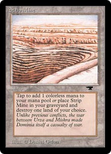
Other lands could support your deck in other ways, like lands that turn into creatures when a certain condition is fulfilled, or lands that can do other things besides give mana. Urza’s Factory, for instance, can put a 2/2 creature into play.
Strip Mine can get rid of an opponent’s land…
And Mutavault can become a 2/2 creature until end of turn.

You have to determine what you want your mana base to do for you before you proceed!

#2: Determine how much of each type you need.

Mono-colored decks get off easy in this regard. You simply put in enough mana sources of the color of your choice to constitute at least a third of your deck (so you’re drawing land about 33% of the time with a good shuffle), and you’re pretty much done.

However, if you’ve got a deck with more than one color, you need to balance things more carefully. Some things to consider include:

Casting costs of each spell.

Example: If you have a Green/White deck together, but all your Green spells have two Forests in the required casting costs, you’re probably not going to get away with an even split of Plains and Forests in your mana base. Instead, you’ll have to put in twice the number of Forests as Plains, so that you’ll more likely have the mana to play those double-green spells.

How many cards of each color you have.

Example: If you have a Green/White/Blue deck together, but you only have a few Blue cards, you won’t need many true Islands in the deck–you could possibly get away with just having a couple of dual- or tri-color lands. (I have such a deck together, and I’m only running 3 Islands, but I actually have enough access to Blue mana with the tri-color lands and land fetch I included in the deck.)

The land fetch you have included in your deck build.

Especially if you’re playing mono-Green or you’ve splashed Green into your deck, land fetch will help offset a troubled mana base. Land fetch, or the ability to retrieve another source of mana from your deck, is often necessary to offset turns where you have no land to play.

If you’re playing a lot of land fetch, you may not need as much of each color as you might have otherwise. If you’re not playing any at all, you will probably need to boost the amount of each type of mana you need for your deck.

#3: Determine how much of the deck you want to devote to your mana base.

I said earlier that about a third of most decks is dedicated to land. However, there are times when you don’t need 20 lands in a 60-card deck. You might need 24, or you might need 16. 20 is a good place to start, but depending on the type of deck you’re running, you may need to adjust that land count as you play the deck.

The only way to tell how much you’ll truly need for the deck’s best play is to test-play it quite a bit, either in a virtual environment or a real-life environment. I’ve had times where I built a 20-land mana base and got so consistently flooded with land it was unimaginable; I’ve also had times where a similar 20-land mana base got me stuck mid-game because I could not consistently draw enough land to support the cards I wanted to play.

Decks that discard a lot of their hands might have to ratchet up their land count to offset the cards they might lose in the process, for instance. Decks that need lots of mana to play super-high-costing stuff (such as Angels, Elementals, etc.), also generally need higher land counts. By contrast, decks that have lower-costed spells or creatures that tap for mana might not need as many lands. This is the most difficult part of refining a mana base, but it is necessary!

Summary

By taking into account your particular deck’s casting costs, spell types, colors, and abilities, you can be more informed about creating a good mana base the first (or thirty-first) time around. Research and consideration, plus a good dose of trial and error, is the best way!

Clothing for Your Website: Color Schemes

clothingforwebsite
Choosing the colors for your site’s layout might seem like an arbitrary decision, but in fact, a layout’s colors can have a remarkable impact on your visitors. Using color strategically and beautifully is one more way we as designers can delight our visitors (and keep them on our site long enough to enjoy our content!).

But how do we choose just the right colors, and how do we implement them? Here are a few tips:

Image-Heavy Sites: Simple Blocks of Low-Key Color

imageheavysites

Sites with a lot of images, such as photoblogs, Tumblrs, or craft sites, just need color to visually delineate the site, since the images themselves will be attractive enough to viewers’ eyes. In the illustration above, the “navigation/sidebar” is a different color blue from the “content,” and the lower panels are done in light green, enough to draw attention when the user gets to the bottom of the page. This separates out the site’s content.

Image-heavy sites don’t need a lot of dramatic color; choosing softer shades of any color will work best, especially colors with lots of white, gray, or black mixed in (such as pastels, slate blue, and jewel tones). Try working within the “warm” colors (red, orange, yellow) or “cool” colors (green, blue, violet).

For Text-Heavy Sites: High-Contrast Text and Background Colors

textheavysites

The number-one concern for sites with a lot of text content is readability, and for that, you’ll want a color scheme with a high contrast between its text and background colors. The example above uses a light blue for the background color and a dark blue for the text, which helps the text stand out. (An even better contrast would be white background and dark blue text, but you can still use lighter colors for your background.) You can arguably use a dark background and light text, but your older visitors will have a harder time seeing the text.

As for which colors to choose, it’s best to stay within the same color family on a text-heavy site. Shades of the same color make the site both easy to read and attractive. (Just don’t use a red background color!)

For Feed-Heavy Sites: Small Shots of Color

feedheavysite

When you have a feed-heavy site (or a site with a lot of little sections you want to draw attention to), you can get away with little pops of different colors. Above, I have used colors from Facebook, Youtube, RSS feeds, and Twitter, with a couple of random colors mixed in, to show how this can work. Tiny bits of different colors helps your visitors see right away that your site has lots of different content–just don’t go overboard! Use unifying neutral colors (I used gray) on the rest of the site.

As for choosing which colors to use, you can just about use any shade of any color you want, since you’ll be using each color in such a small dose. Just try not to use the entire rainbow in your site–limit your color usage, perhaps, to 5 or 6 different brighter colors for the “color shots,” and use neutrals everywhere else.

Get More Color Scheme Inspiration

Be sure to look around you wherever you go for color scheme inspiration. In my hometown, for instance, there’s a beautiful old hotel that was once painted in cream and light pink, with a lot of black wrought-iron details. The colors have all faded somewhat over the years, so that the wrought-iron is now dark gray, the pink is just barely there, and the cream is almost white, but you can still see parts of the building that haven’t faded so much. I took that unexpected color scheme, modified it a bit, and used it for my novel update page. Literally anything can be color inspiration!

Color Scheme Websites

ColourLovers
Adobe Kuler
Paletton
ColorCombos.com

Sight-Reading: An Acquired Taste

sightreadingacquiredtaste
I may be able to pick up melodies quickly and compose my own piano/vocal music, but I sure don’t sight-read well. Even after many years of musical study, I still sometimes have to squint at the page and use the old sight-reading tricks, like “Every Good Boy Does Fine”, “F-A-C-E”, “All Cows Eat Grass”, etc., to remember which notes are which. And sight-reading a piano piece, trying to play both staffs together? Forget it. It’ll be a hot mess, especially if I’ve never heard the song before. Having to produce music based on something visual is definitely not natural for me.

But sight-reading doesn’t have to be a stumbling block forever, as I’ve found out! Scroll down to discover a few tricks I’ve picked up to help me play along a little faster (pun intended).

#1: Look at Sheet Music for Songs You Know Really Well

Don’t dismiss this as pointless before you try it! Since you already instinctively know how the melody “goes” and what the rhythm does, it’s much easier to read a known song’s sheet music. Sites like OnlinePianist and MusicNotes have sheet music for even very current popular music–find a song you know, and start putting the notes and rhythms in your head with the marks on the page.

#2: Memorize At Least One Note’s Position

quarternote If you can learn to at least recognize one note (like E, noted above), then you can build off that. Knowing that the first note on the bottom of the staff is E means that the next note, the one in the first space, is F; then the note on the second line is G, and so on. Use that one note as the key to the rest of the scale!

#3: Practice Notating The Chorus of Your Favorite Song

This works as both ear training and sight-reading training. First, sketch out a quick grand staff (you can use the one in the image above as a guideline), then listen to your favorite song, and mess around on an instrument of your choice until you find the starting note of the chorus. Mark the line or space where it belongs, and then move on to the next note and the next until you’ve noted the whole melody.

Once you have the pitches marked out, then you can go back and add in the correct rhythm value for the notes, such as quarter note, eighth note, etc. Here’s my example for a favorite song of mine:

notation_example
I did this in Photoshop, which has no rests or ties available, but at least the basic melody is there for the chorus of “Somebody’s Watching Me.” See video below for comparison:

Summary

Sight-reading can be a huge pain, but these 3 tips have helped me inject a little fun into practicing this skill. Try any or all of them out for yourself, and let me know what has helped you the most!