With just a little editing and polishing, my trusty post on image file formats is updated and awesome again! Check it out to learn more about the differences between JPG, GIF, and PNG!
Tag Archives: graphics
What IS “Flat Design” and Why Should We Use It?

After seeing several webdesign blogs mention “flat design” as a still-up-and-coming design trend for 2014, I was intrigued. “What do you mean, ‘flat’ design? Ain’t the screen flat already?” I thought, jokingly.
At first, I wondered if perhaps the CSS box shadows, pretty text bevels, and all of that had started going out of style–you know, the stuff I worked really hard to master and have just now begun implementing into my new designs. But the answer is a lot more subtle than that.
Flat Design: A Feeling Rather than a Set of Rules
The Ultimate Guide to Flat Web Design is where I began my research, and after perusing the screenshots of several different “flat design” layouts, I began to understand. Not only was flat design already a “thing” on the Web, but it wasn’t necessarily just “flat” as in boring. It was, instead, a certain minimalist approach, a “less-is-more” feeling…and it was EVERYWHERE.
A few examples:

Tumblr’s login form, for instance, has elements of flat design; the fonts are simple, the text boxes are only very slightly rounded (VERY slightly!), and the colors are basic (white, blue, and a touch of gray here and there). And yet, there’s an elegance in this simplicity–there is no high-gloss “Web 2.0” feeling, but it still looks “finished.”

My WordPress login screen is treated very similarly–subtle variations between colors, pictorial icon rather than text logo, and clear, readable fonts. Notice on the right and bottom sides of the form, there is the very faintest shadow, just barely there.

Here’s the most surprising example of flat design, at least to me–this comes from Version 13 of my own domain’s layout! In my search to give my layout a new, icon-heavy/pictorial feel, I quite by accident wove in some flat design aesthetics. You can’t call my color choices “subtle” (LOL), but the simplicity of the icons and fonts still fit.
Basically: Flat Design = Natural Makeup
Flat design is to webpages as “natural” makeup is to faces. I know that’s a weird analogy, but it’s accurate. When you choose natural makeup, the point is to not LOOK made-up–it’s all about enhancing the bone structure and features that are already there, with skin-like shades and very careful, subtle color placement. Flat design does the same thing, with 1px strokes of faint shadows, minimal color choices and simple icons, and only the very subtlest shaping and rounding of page elements.
Where Can You Use Flat Design?
Thankfully, like all web trends, you can choose to hop aboard the “Flat Design Train” or not. The look can be too boring for some and too cold for others, especially if used all over the page. Some projects just don’t need that much minimalism (as weird as that sounds!).
That’s why I personally advocate using flat design for your basic page functions, such as navigation and web forms, and perhaps use a more striking graphic or design aesthetic for news, updates, or anything else which needs immediate user attention. Just as a makeup artist balances a strong red lip with just the barest touches of eyeliner, flat design’s concepts can provide just enough styling to your page to make it look polished, without detracting from your most important content.
Summary
Give flat design a try with your next design–toy around with shading things just right, picking simple yet effective icons and fonts, etc. Who knows, you might find your next idea hiding amid your musings!
Custom Website Background Tiles with PatternCooler
After making the changes to my domain’s new layout, as profiled in last week’s webdesign post, I found myself still dissatisfied with how plain the layout appeared. It just was…BLAH.
As per my usual habit, I found myself surfing aimlessly around the Internet, trying to pinpoint what it was about my favorite site designs that gave them the “oomph” I was looking for. I just couldn’t quite put my finger on it…and then, I sighted a subtle tiled background effect on one site, and realized that perhaps all I needed was something to give the background a little interest.
Enter PatternCooler.com, a website that should definitely be on your favorites/bookmarks as a design resource!

In the Pattern Editor, you can start off by browsing tons of different background patterns, from bold to subtle and everything in-between.
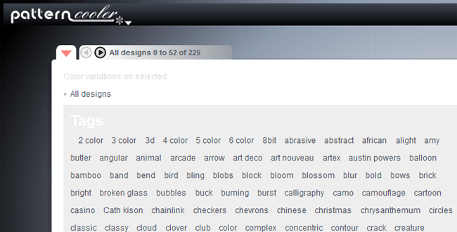
Sort through the background images using the tag menu, available from the top left drop-down arrow…

…and once you find a tag you like, you can browse through the shortened list much more quickly. But this isn’t where the magic stops!

Once you select a pattern you like, you can actually change the colors in the image with either the onboard color picker OR a custom HTML hexcode (like what Photoshop outputs).

For this example, I picked the colors from my domain’s upcoming Version 14 layout, and started playing around. It looks so cool already!

You can play with the Transparency slider at the bottom left of the editor to make one or both colors more or less prominent. There are also Texture filters to customize the image even further (bottom right toolbar), as well as options to resize the image. When you’re done, simply click Download!

And here’s a sample of what that very background image looks like in use on my upcoming layout! I like how the subtle color variation gives a LITTLE interest to the background without overwhelming the eye.
Be sure to check out PatternCooler.com‘s new Background Tile Editor for your layout needs; this has been by far the easiest and best experience I’ve had with creating a background tile. (And they ain’t paying me to say this, either–I just had the good fortune to stumble on this site and realize what a gem I’d found!)
Visual Tricks You Can Accomplish with CSS
Time was, if you wanted something visually impressive to appear on your page, you had to use an image. Creative logos, text shadows, graphic designs in the background–you had to be a Photoshop or Paint Shop Pro whiz to make it all happen.
Thankfully, with the wizardry of CSS, you no longer need images for many of these tasks. You can add shadows and outlines to text, give a 3D shadow effect to divs, crop images (or at least make it look cropped), and even create gradients and other lovely design elements with just CSS. See below!
Text-Shadow
This example shows off the “text-shadow” property in CSS3, which can give your text a “popping-off-the-page” effect. The shadow can be as long and as wide as you wish, and it can be any color you wish! (Note: this effect works in all major browsers of the latest edition, but IE 9 and earlier don’t support it.)
When you write your CSS rule for this, be sure to follow this order: “text-shadow: h-shadow v-shadow blur color;”. For instance, this is the CSS which makes the above effect:
.shadowedtext {text-shadow: 2px 2px #777777; color: #6b00a2;}
In this case, the text shadow is positioned 2px horizontally away from the text, and 2px vertically away from the text. The shadow is also given a color–#777777, a dark gray. (You don’t necessarily have to specify a “blur” value, but the option is there if you want to use it. It just makes your text shadow a little softer.)
W3Schools Text-Shadow Reference Page
Box-Shadow

See how this box of text “pops” off the screen at you? This is achieved with the “box-shadow” CSS property, which is very similar to the “text-shadow” property in both appearance and execution. It’s just that “box-shadow” works on paragraphs, divided layers, and other larger sections of pages. This works in all major modern browsers.
When you write your “box-shadow” rule’s CSS, follow this order: “box-shadow: h-shadow v-shadow blur spread color inset;”. This is how I’ve constructed the CSS for my example:
.shadowedbox {box-shadow: 10px 10px 5px #888888; background-color: #CCCCCC; padding: 10px; width: 500px;}
Here, I have a shadow which appears 10px away from the box in both directions, and it’s blurred out 5 more pixels to give it a softer edge. I didn’t use the “spread” part of the property, nor the “inset,” but I did give it a dark gray color. (“Spread” affects the size of the shadow; “inset” can turn the drop shadow effect into an inner shadow.)
W3Schools Box-Shadow Reference Page
Gradients (CSS3 Only)

Can you believe this pretty gradient was created just with CSS3? It’s true! And not only can you make a linear gradient, like this one–you can make all sorts of gradients, no image program required!
Though IE doesn’t support this functionality quite yet (as far as I know), most other modern browsers do, and it is fantastic for helping your pages load a little faster and having less images to deal with.
As for explaining how you can create gradients with just CSS, I will defer to Chris Coyier of CSS-Tricks.com, who has created not only a lovely, thorough explanatory article, but also a really neat demo page where you can see all the different types of CSS3 gradients and the corresponding code.
CSS3 Gradients @ CSS-Tricks.com
Text Outline/Stroke
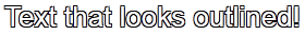
Oh, how I used to long to know how to get outlined text, even in Photoshop! Long after most of the world had updated to a version of Photoshop/Paint Shop Pro that had the ability to add outlines, or “strokes,” to their text, I was still puttering around in older versions, wondering where the outline setting was.
Thankfully, there are a few pure-CSS ways to make your text pop with outlines (and they can be any color!). Again, I will defer to CSS-Tricks.com for the explanation and further examples–there is an actual property that creates an outline, and then there’s a fun little workaround that actually produced the example above. (Hint: we’ve already seen it at work in this article!)
Adding Strokes to Web Text @ CSS-Tricks.com
Cropping Images (Or At Least Making It Look That Way)
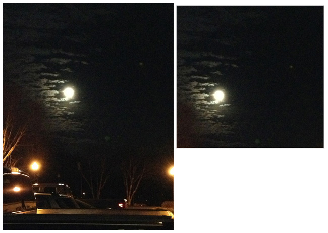
Look at these two images side by side. Would you believe me if I said these are both the exact same image file, and that simply specifying negative margins made the right image smaller?
Believe it or not, that’s how it was done–and it’s only one of the ways in which CSS can “edit” your images for you. This can be a real time-saver if you’ve got tons of images which all need to be formatted in a specific way when they display on the page (such as thumbnails). Check out CSSGlobe.com’s “faux-cropping” article to find out more about these techniques!
3 Easy and Fast CSS Techniques for Faux Image Cropping @ CSSGlobe.com
Visual Effects: Text Rainbows/Inner Shadows/Other Amazing Things

This lovely text effect was created by only using CSS and Javascript–amazing! (And there are plenty more colorful examples on the demo page!) DragonInteractive has come up with this tidy little way to help us all beautify our text in various ways, available through the following link:
DragonInteractive Labs: Rainbows
Visual Effects: Bokehs

Okay, this one requires a little help from jQuery to make this CSS run right, but it’s still a lovely way to incorporate graphic effects without ever having to open an image-creation program. Using the following linked tutorial, you can add as many of these softly blurred, half-opaque “bubbles” to your page as you wish!
Pure CSS3 Bokeh Effect (with some jQuery help) @ MarcoFolio.net
PNG-8 Vs. PNG-24: There’s a Difference!
In terms of image file formats, which I’ve written about before, there are marked differences between JPG, GIF, and PNG. But there is also a subtler but still noticeable difference in quality between the two levels of PNG files.
Yes, you read that right–PNG has two different levels of quality (PNG-8 and PNG-24), even though they both are identified as “.png” files. The main difference between these two shows up when you try to save a partially-transparent image…and the proof is below!
PNG-8: Something Looks a Bit Fuzzy Here…
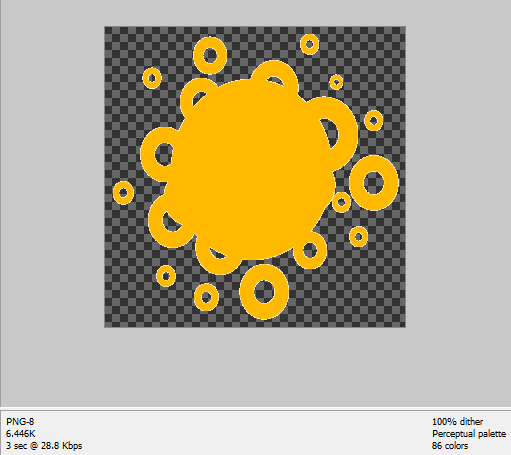
(Note: In these examples, the orange shape is the part that will be non-transparent–the dark checkerboard pattern in the background is how Photoshop Elements shows you what parts of the image will be transparent when the image is saved.)
Notice that while the orange shape is mostly “cut out” against the background, the outlines of the shape look “fuzzy;” there are little white bits hugging every edge (graphic artists call these white bits “artifacts”). Now, while you could probably get away with using this image on a white background, a dark background will be very unforgiving indeed. It makes the image look a lot sloppier than it actually is.
PNG-24: Fuzzies Begone!

Look what a change this made, just switching from PNG-8 to PNG-24! Now all the outlines of the orange shape are clean-cut–no fuzzy image artifacts anywhere. The file size is about double the PNG-8’s size (11.71 KB instead of 6.446 KB), but it’s a small price to pay for a much better image result.
But Wait, PNG-8 Isn’t All Bad!
I will say that PNG-8 is a great file format for saving Internet screenshots, and for making web graphics that don’t require transparency. In fact, the two illustrative screenshots shown above are saved as PNG-8. But PNG-24 just does transparency so much better and cleaner. If you’re making a partially-transparent image and you have the option to save it as a PNG-24 file format, why not?
“Sleek” Design Doesn’t Mean “Bland”
As a design challenge to myself, this past week I’ve been working on a new layout for my main domain, withinmyworld.org. My keyword for this design was “sleek”–I wanted to make something rather minimalist but still pretty, easily readable but still styled.
My first attempt came out like this:

(click the picture for a larger screenshot in new window)
I’ve never tried designing with this vibrant purple before, so this was a fun new challenge. Plus, I really liked the “sticky nav bar” I came up with for a recent blog post, so I incorporated that as well.
The only problem? As lovely and minimalist as this design is, it’s also fairly text-heavy…and kind of blah, somehow. I hated even to admit it to myself, but I had done it again–I had gone overboard with all the text and other elements, and forgotten about how the layout would look all together. Even with the RSS feeds and affiliate buttons I planned to add later, it would still be lacking a certain something.
So I brainstormed. I didn’t want anything too splashy or crazy for this layout, so what could I do to maintain a simple, minimal but “wow” layout?
The Idea: Just a LITTLE Something to Add
What I discovered, after thinking about it and studying it for a couple of days, was that the layout was just a little bit too “same-y” across the page. There was nothing really to draw the eye in, no real graphic elements besides the social network buttons. It needed a little visual interest, as graphic designers say…but it didn’t need a huge image to take away from the “sleekness” of the page design, either.
To that end, I came up with a couple of simple little graphic tricks that could add a little “wow” to my page…and the same principles can work for your page, too! The best part: you only need symbol fonts to do this. (Symbol fonts are just like regular fonts for text, except that every time you hit a key on your keyboard, you make a symbol instead of a letter from the alphabet.)
Trick #1: A Subtle, Simple Background Tile
You don’t have to be skilled at pixel graphics to create a background tile for subtle pattern on your page. Take the following screenshot, in which I added a tiny 15×24 background tile for a little interest:

With just a tiny bit of color variation, plus the use of the Wingdings 2 font and the letter “g”, I crafted this very subtle tile pattern which repeats on either side of the content. (It also repeats behind all the text, too, but I made my container div have a background color so the pattern wouldn’t distract from the text.)
This background tile adds just a little touch of variegated color without looking “busy.” And it’s a curving, soft shape on this page full of hinted squares, rectangles, and other sharp angles–a pleasing juxtaposition!
To Make Your Own:
- Explore symbol fonts to find a cool symbol you’d like to use on your site. Something fairly simple in shape works really well. (See the “Free Font Sites” list at the bottom of this article to start your search.)
- Make a small graphic (no bigger than 50×50) and dye it your background color.
- Choose a second color that is only a few shades different from your background color.
- Type your selected font symbol in the second color, and resize as necessary so that it fits within the graphic without having any overlap. (Any overlap means your tiling will look obvious and even misaligned…sad!)
- Save your image, and try putting it as your background tile image (“background-repeat: tile;” in CSS code).
- Tweak this process as necessary till you get just the right look. (This tiled example was my fourth attempt–I had to tone down the color contrast quite a bit to get this look!)
Trick #2: Add a Little Graphic Twist Anywhere on Your Page
Little graphics don’t have to be just on your background or header–they can appear anywhere you need a divider for your text, or anywhere you want just a little pizzazz. See the following screenshot:

(click the picture for a larger screenshot in new window)
Here, I’ve added a little semi-border to the top of the page, right underneath the navigation bar and centered above the content div. It’s the same symbol as before (Wingdings 2, lowercase “g”), just in a lighter-colored font and in multiples, strung repeatedly across the top.
This could be placed between the content and the footer, or between sections on my sidebar, just as easily as it is placed above the content. Anywhere I place it, though, it gives the page a little feminine flair while still being minimalist.
To Make Your Own:
- Select a font symbol you like, as before.
- Make an image that is wide but not tall (mine here is 300×20, but size yours according to your specific layout needs).
- Dye your image with your background color.
- Choose another color that is either much lighter or much darker than your background color.
- Type your chosen symbol in that second color in a straight line across the image, making sure the symbols fit neatly within the image’s borders so there’s no overlap.
- Save it, and place it anywhere on your page, in multiples or just one at a time, wherever you need a little visual pep.
(Alternatively, you could achieve this same look by uploading the symbol font file to your site’s folder, typing in a long string of the corresponding letter, and then styling it with CSS, but the above process gives a smoother, anti-aliased look to the result.)
Summary
Adding a little visual interest does not always involve lots of big splashy images, especially if you’re trying to be “sleek” or “minimal” in your design. You may only need a couple of touches to transform your site from “blah” to “wow”!
Free Font Sites
Dafont.com
FontsBytes.com
1001FreeFonts.com
FontSquirrel.com
Stop Coding This Right Now, part 5: Informal Fonts for Business Sites
Choosing which font to use for your website’s graphics seems like such a small concern, especially in the light of all the other parts of building a website. For business websites, the font concern can seem even less important–there are so many other choices to make, like hosting, bandwidth, site colors, etc., that seem much more pressing. But even if your content is wonderful, your images superb, and your networking beyond compare, your site will still suffer if its font choices look less than professional.
What do I mean by “less than professional” font choices? Anything that looks informal, more like printing or cursive handwriting than typed text–like the following:
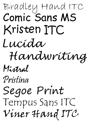
|
Comic Sans has gotten most of the bad press for being a rather overused and ill-advised font, but there are other fonts out there that are not good choices for business sites.
I’m not saying that these fonts are all-around bad–not at all! Tempus Sans ITC is one of my favorite fonts to use, for instance. But I use it for personal design and web projects only. It and other “handwriting” fonts give the right touch of personality and humanity to small personal sites; for a business website, however, it makes the business’ Web presence seem less polished and “finished”. It’s like getting dressed for a job interview. If I went to an interview wearing my best blouse, but paired it with torn jeans, I wouldn’t be likely to get the job–torn jeans are more appropriate for casual events. The same goes for fonts; handwriting fonts are more appropriate for casual or personal webpages. |
Look at the following example, using Kristen ITC for the top font and Palatino Linotype for the bottom font. With both fonts in similar sizes, styled with the same color and drop shadow, which font looks more professional and polished? Which site would you instinctively trust more to give you accurate information in a timely manner?

Fonts silently tell your visitors more about your content and your businesslike personality–for better or for worse. When you’re designing a page for a business, you want to make sure your website is putting its best foot forward, and fonts are a surprisingly important part of that. (This is one reason I’m looking at redesigning Crooked Glasses’ own look soon–I want to make sure I’m following my own advice!)
Design Around Your Content
We’ve likely all seen examples of websites that could hang in a museum, as visually appealing as they are. Such feats of graphic strength amaze both users and other webdesigners, who may wish to imitate or pay homage to what they see.
But, at least in my experience as a designer, it IS possible to go overboard with the “visual art” part of the design, and forget all about what those graphics are supposed to do–frame the website’s content. In a way, we webdesigners are creating usable art, with heavy emphasis on the “usable.”
Today’s post focuses primarily on designing around text, images, and social connectivity, as these are the three major types of content on the Web these days. Each type of content must be handled differently, as you’ll see below!
Designing for a Text-Heavy Site
For a site with lots of text (ahem, this blog and others like it), you want to make sure your header, footer, and sidebar are as unobtrusive as possible, while still making your site easy to navigate. Having a fairly thin header, possibly with across-the-top navigation included, and well-organized but uncrowded sidebar and footer is a good idea–it keeps the rest of the site simple while letting the text content shine.

This design on GeekyPosh does a great job of combining the header and navigation into one seamless whole, making the latest post visible without the user having to scroll down at all. The blue ribbon running across the page neatly divides “content” from navigation, without making it look blocky. Additionally, the background texture is also subtle enough to lie behind the text without any visual confusion.

While the header image on Jenn.nu is larger, the thin strip of navigation below the header makes up for it–combining not only navigation but social media links into one easy-to-read, accessible “bar” below the image. In this case, the large header image does not detract from the site’s purpose, as it’s still easy to scroll down a little and begin reading.
When designing for text-heavy sites, you also want to make sure your text and background colors contrast strongly (like white and black) so that your text is easy to read. (Nothing’s worse, for instance, than having to squint at the text or highlight it just because the designer thought taupe text on a tan background looked good.) Both GeekyPosh and Jenn.nu do a great job of making their text colors highly readable against their background colors.
Designing for an Image-Heavy Site
A site with mainly images as its content needs plenty of visual space around each image–maybe not a full page of space, but a good amount of space so that separate images don’t run together.

Hark! A Vagrant, with its emphasis on visual webcomics, uses both plenty of white space in its layout, and a few samples of the artist’s embellishment on its navigation links. The white space makes it easy to take in each individual comic; the navigation images give the site its own personal, memorable stamp.

Alternatively, image-heavy sites can make the sidebar and footer utterly unnecessary, and combine header and navigation into one bar, a la Pinterest. This kind of site also benefits most from neutral site colors that don’t take attention away from the images themselves–hence, Pinterest’s beige/gray/occasional pinkish-red color scheme.
Designing for Social Connections/Conversations
Since social connections and conversations are part of many sites these days, we all want to make it easy for our users to connect with us and our sites.
The best thing we can do? Make our comment forms, tagboards, social media links, guestbooks, etc. very easy to find. We need to feature any important conversation links or social media buttons at the top of the page or as close to the top as possible. (Alternatively, we can put such links on a scrolling sidebar/header bar that makes it clear how to connect and converse with the site owner and other users.)

Whimsical.nu’s comment form gets it very right–a big, easy-to-read form that doesn’t force all the text to be 8pt tall and squished together. (A personal pet peeve of mine is too-tiny text in a form space–you end up unable to read what you’ve typed in!) Plus, the visual space is used well, and the form is actually designed to blend in with the site instead of looking like a cookie-cutter afterthought.

Upon hovering over links on PopURLs, not only does a content preview show up, but you also get a little box out to the left or right of each link that reads “Share | Clip.” You can then choose either of those options easily with just a move of your mouse (or a tap of your finger). This makes it so much easier to spread the site’s content across the Web, and interact with other users who have shared or clipped the particular item of content as well.
Summary
Beautiful, visually attractive designs are wonderful–but what’s even more beautiful to the user is a well-designed and usable site. Taking into account readability, page organization, and convenience for the user is perhaps the most important part of designing a page; our designs should frame the content rather than overpower it.
Break Out of Web Design Cliches
We’ve all fallen victim to them, as web designers. After a while, a certain style or structure of site layout becomes second nature, and you just begin to design every site the same way regardless of content. Either because it’s easier or because it’s familiar, we can all fall into the “web design cliche” trap…but we don’t have to be trapped by it forever!
Common Webdesign Cliches, Illustrated

While the above image I’ve made is rather tongue-in-cheek, this fairly well describes several of the design cliches I’ve seen in the last few years. (Sadly, some of these are the same ones I find myself relying on, so I’m kind of preaching to myself today, too. :P)
For instance:
900-Pixel Two-Column Layout with Floated Divided Layers
As you see in the above screenshot, the old faithful 900px two-column layout looks sharp and clean, but somehow…a little bland and overly confined, too. In this age of mobile screens and bigger screen resolutions, should we be confined by this limited-width design anymore?
I will admit it’s an easy design to make and it’s very familiar…I almost want to say “if it ain’t broke, don’t fix it.” But then again, it might BE a little broken for our tablet and smartphone age, when it can’t shrink and grow with our various screen sizes.
Blue, Gray, or Black Layout Colors…but Mostly Blue
Don’t get me wrong, I absolutely love blue, and I love using it in layout designs. It’s just that about 70 million other designers apparently love blue, too, and think that it’s a great color for their websites as well.
Along with gray and black, blue is generally overused on the Internet because it’s a “safe” color, a “sleek”-looking color. There are definitely instances where blue, gray, or black may be called for in design, but these days a “safe” color choice can make an otherwise awesomely-structured layout look less than original.
Huge Header Image

I’m as guilty of this as anybody–making a wide, occasionally awesome header image for the top of many of my layouts. I got used to doing this in webdesign about six years ago, and it’s been just plain hard for me to imagine a site which doesn’t use a header image of some sort.
But when you have this much visual space at the top of a layout, even if you’ve got a fairly eye-catching image, you’re not really drawing any attention to your content. Nor is it giving your site a good first impression, graphically speaking. (This has been a very hard lesson to learn for me, but it’s a necessary one from a user’s standpoint.)
Huge, Empty Footer

Footers are great little page-enders. They give your users ways to navigate your page without scrolling all the way back up to the top, as well as including extra links and info that don’t need to be front and center on your page.
Yet many of us web designers have gone a wee bit overboard when it comes to footers, trying to make everything BIG and important-looking, and usually ending up with the above result: a very spacey, empty-looking end to a page. If you’ve got a small site and don’t really have a lot of info that needs to be in a footer, it can even look like an unintended space at the bottom.
Gradient Background Image

|
Ah, gradients! I love them, so much…and yet they, too, can look generic. We designers have often used gradients to give a slightly dimensional effect to our websites, but they can very easily become a design crutch, too. We can begin to depend on them for backgrounds, when perhaps another kind of background effect might look better.
Simpler is better, most of the time, but in this case, it’s almost too simple–it doesn’t brand your site or add much visual interest. And, in the case of mobile browsers, it might never even be seen, not in the way you intended; spacing issues can throw off a gradient background image and make it render strangely behind the text. |
Left-Aligned, Spaced Out Navigation

|
This style of navigation began life, most likely, as an “ease of use” design choice. It still is very easy to use and easy to look at, especially when you have a lot of links in your main navigation, but you still need your navigation area to look organized.
But what about sites that might not have that much navigation, like this example? For smaller sites, the left-aligned navigation adds almost too much white space, and takes away from the space that the content could expand into as well. You end up with a large dead space in the middle of the layout, if you’re not careful. |
Moving Away from These Cliches
Making different design choices doesn’t mean you have to completely rethink everything about the cliches I’ve mentioned. Instead, you can make small or medium-sized changes to the cliches themselves, like the ones I describe below:
Instead of A Two-Column Layout…
…Think about a three-column layout (two sidebars, either flanking the content or both out to one side of your content), or even a one-column layout with all your regular sidebar stuff in the footer or across the top. A three-column layout could work well for a big, media/content-driven site; a one-column layout would likely work best for a small personal site.
Instead of Left-Aligned, Spaced-Out Navigation…
…You could try a series of icons for navigation on the right side of the page, or text navigation strung across the top of the page. Maybe even try a navigation bar that scrolls along with the user as they move down the page, especially if you have long pages. You still want to make sure your navigation is very easy to find and use, but making it neater and more tightly-organized can only help the process.
Instead of Blue, Gray, or Black Layout Colors…
…Try other colors, possibly used alongside blue, gray, or black to make it a little less jarring. A dark burgundy could give subtle punch to an otherwise gray layout; a bright splash of pale yellow or green could liven up a black layout.
And if you really want to break out of the color cliche, try “strange” color combinations; recently on my main domain and its subsites, I’ve tried combinations like navy and peach, deep red and bright periwinkle blue, pale green and deep purple, etc., with success. (It all hinges on how much or how little you use each color; using a bright or vibrant color is great for drawing attention to new or featured content, for instance, but it’s not great for dousing the whole layout.)
Instead of a Huge Empty Header or Footer…
…Make your header or footer retractable (with jQuery or a similar language), where the user can “fold” it up out of the way with a click when they don’t need to view it. Or you can use your header as an advertising space for your most accessed/favorited content, and your footer as ad space for other webmasters’ sites. Anything that uses that space as a content holder rather than dead space!
Instead of a Gradient Background Image…
…Check out what kinds of subtle, site-branding patterns you can use instead. You don’t have to have an animated GIF background image (God forbid!); you can try a small tiling symbol that represents your site, done in subtle shades that blend nicely with your overall layout’s colors. (For instance, for my main domain, I could use the stylized sun icon as a small tiling image in a slightly deeper or lighter shade of burgundy than the background color, adding a little design texture but not too much.)
Summary
Safe and familiar designs don’t have to trap us, as designers; sometimes, we just have to be willing to step outside our design “box,” just a little, changing the cliche just enough. Even the tiniest of changes can get our design Muses going again!
Making a “Good” Layout Better
Web design is not always a simple matter of knocking something together in Notepad, putting pretty pics with it, and uploading it. Sometimes, as we well know, layouts just end up looking…blah on the page.
Take the following layout, which I was trying to craft for my upcoming webdesign tutorials page.

(click for larger size image)
This, in terms of a layout’s pure functionality, works. It displays what it’s supposed to; nothing’s out of place, misspelled, or obviously buggy. And yet it just looks…blah. The icons look too small, being dwarfed by the text and the header image. Not to mention there’s a lot of open, unfilled green space. It’s just…empty.

(click for larger size image)
This was my first attempt at fixing the emptiness and too-small icons of the first layout. I resized the icons and tried to reposition them where they wouldn’t just be hanging out in the middle of nowhere…and yet, again, I ended up with a problem. This time, the issue is that the layout looks cluttered–there is nowhere for the visitor’s eye to rest, because the icons stick out like sore thumbs and the header image looks off-center. And again, the layout has a bunch of empty space, especially on the left side. Sigh…

(click for larger size image)
Third time is the charm, I believe! This time, I centered the header image over the two-column layout below, leading to a more symmetrical look. I also included the navigation icons WITHIN the image div itself, and, After much tussling with HTML and CSS, got them to be positioned where I wanted them. (Who would have thought margins and padding would kick up such a fuss?) But the result is a much cleaner and more understandable look. It might not be “the BEST LAYOUT EVAR OMG,” but it’s much better than the one I had when I started out!
Sprucing Up a “Blah” Layout
If you’re having similar difficulties with a layout of yours, you might not need to go back to the drawing board completely. Instead, you might benefit from just reworking a section or two, as I did with my troublesome layout. Here are some general tips:
Change the Positioning of Graphic Elements
If the visual balance of your layout looks off, or it feels cluttered with graphics, try moving some of your images/icons around a bit. Try them positioned in a completely different place on the page, or even going a different direction (like vertically instead of horizontally, or vice-versa). You’d be surprised how much a little strip of icons can affect a page, as I found out!
Take Away Text, Add Icons
If, however, your layout feels heavy with text, you may be able to transform some of those words (especially textual navigation) into iconic navigation. (In my example layout, I challenged myself not to use text links in my navigation unless it was absolutely necessary, so that it wouldn’t detract from my content.) It may not seem like text is overwhelming your page, but it can easily swamp your visitor with information overload. An icon, by contrast, looks simple and neat.
Experiment with Content Positioning
Does that old left-aligned sidebar look dated and tired? Then maybe all it needs to do is flip over to the right side! Placing content in slightly-unexpected areas can change the look of the whole layout; moving smaller blocks of content around within your layout can also affect your users’ experience. Keep this thought in mind every time you design: “What do I want my users to see/click first?” This should be closest to the top of the page, and your header should “point” toward it, drawing their eyes to it.
Work With Your Fonts
Sometimes, a layout can seem too crowded simply with a too-small font, or a font that isn’t very clear. If you’re having difficulty displaying content attractively, as I was, a font change may be in order. Trying a bigger point size, a clearer font, or even a different class of font altogether may help clear away the “text-cluttered” look.
Summary
You may feel like scrapping a layout that you feel is too ugly to save, but don’t be so hasty! Experimenting and reworking just bits and pieces may just save you a lot of time and hassle designing a totally new look. I was about to give up on that example layout of mine, till I experimented around and found a clean, simple new way to put the same elements together.