Choosing the colors for your site’s layout might seem like an arbitrary decision, but in fact, a layout’s colors can have a remarkable impact on your visitors. Using color strategically and beautifully is one more way we as designers can delight our visitors (and keep them on our site long enough to enjoy our content!).
But how do we choose just the right colors, and how do we implement them? Here are a few tips:
Image-Heavy Sites: Simple Blocks of Low-Key Color
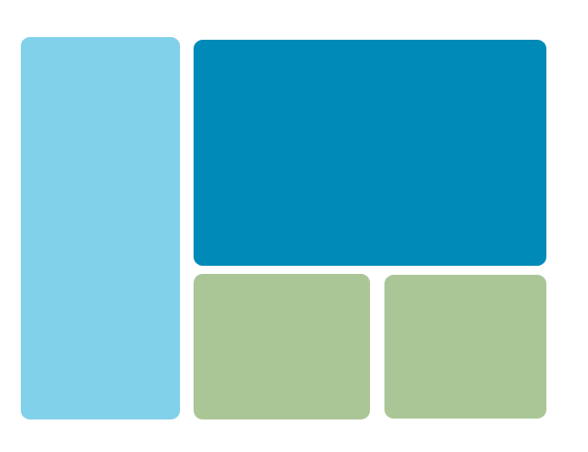
Sites with a lot of images, such as photoblogs, Tumblrs, or craft sites, just need color to visually delineate the site, since the images themselves will be attractive enough to viewers’ eyes. In the illustration above, the “navigation/sidebar” is a different color blue from the “content,” and the lower panels are done in light green, enough to draw attention when the user gets to the bottom of the page. This separates out the site’s content.
Image-heavy sites don’t need a lot of dramatic color; choosing softer shades of any color will work best, especially colors with lots of white, gray, or black mixed in (such as pastels, slate blue, and jewel tones). Try working within the “warm” colors (red, orange, yellow) or “cool” colors (green, blue, violet).
For Text-Heavy Sites: High-Contrast Text and Background Colors
The number-one concern for sites with a lot of text content is readability, and for that, you’ll want a color scheme with a high contrast between its text and background colors. The example above uses a light blue for the background color and a dark blue for the text, which helps the text stand out. (An even better contrast would be white background and dark blue text, but you can still use lighter colors for your background.) You can arguably use a dark background and light text, but your older visitors will have a harder time seeing the text.
As for which colors to choose, it’s best to stay within the same color family on a text-heavy site. Shades of the same color make the site both easy to read and attractive. (Just don’t use a red background color!)
For Feed-Heavy Sites: Small Shots of Color
When you have a feed-heavy site (or a site with a lot of little sections you want to draw attention to), you can get away with little pops of different colors. Above, I have used colors from Facebook, Youtube, RSS feeds, and Twitter, with a couple of random colors mixed in, to show how this can work. Tiny bits of different colors helps your visitors see right away that your site has lots of different content–just don’t go overboard! Use unifying neutral colors (I used gray) on the rest of the site.
As for choosing which colors to use, you can just about use any shade of any color you want, since you’ll be using each color in such a small dose. Just try not to use the entire rainbow in your site–limit your color usage, perhaps, to 5 or 6 different brighter colors for the “color shots,” and use neutrals everywhere else.
Get More Color Scheme Inspiration
Be sure to look around you wherever you go for color scheme inspiration. In my hometown, for instance, there’s a beautiful old hotel that was once painted in cream and light pink, with a lot of black wrought-iron details. The colors have all faded somewhat over the years, so that the wrought-iron is now dark gray, the pink is just barely there, and the cream is almost white, but you can still see parts of the building that haven’t faded so much. I took that unexpected color scheme, modified it a bit, and used it for my novel update page. Literally anything can be color inspiration!
Color Scheme Websites


2 thoughts on “Clothing for Your Website: Color Schemes”