With just a little editing and polishing, my trusty post on image file formats is updated and awesome again! Check it out to learn more about the differences between JPG, GIF, and PNG!
Tag Archives: images
“Jumpy” Hover Borders on Image Links: Solved At Last
Over at CSS-Tricks.com, I spied an article that spoke directly to one of my infamous webdesign flaws over the years–making all my image links have a:hover borders.
Why would I call this a “flaw?” Well, unfortunately, when you give anything on a webpage a border under some circumstances and not others, it can create a “jumpy” layout look–for instance, when you hover over image links on my blog, they get a border underneath them, which makes other page content shift a little downwards on the page until you mouse off the image.
This is the “image rollover border” effect, and it can make your page look REALLY amateurish…as I well know. 🙁 It’s been bugging me for years on this blog and all my other sites–I love how the hover border looks on text links, but I hate the way it makes other things on the page “jump” a little!
Making Non-Jumpy Rollover Borders for Images
The CSS-Tricks article does a wonderful job of explaining exactly why all this happens, as well as offering some solutions for how to incorporate a “bordered” hover look for your images without getting layout shifts. Several methods, including negative-margin borders, are suggested and diagrammed for you.
Getting Rid of Image Hover Borders Altogether: Mission Impossible?
But what if you don’t want borders around your images at all? Preferably, I would like my text links to have the border-bottom property on hover, while my image links would be without that dumb-looking border.
So I started looking into how to get rid of the hover border on just my images, thinking it would be pretty easy. All I’d have to do is use a little bit of CSS like so…
img {border: none;}
…and I’d be good, right?
WRONG. Wrong wrong wrong. That didn’t work, and nor did the other iterations I tried, such as:
a:hover img {border: none;}
img a:hover {border: 0px;}
I tried everything I had in my mental CSS toolkit to solve this. No luck. Then I decided to Google it, wondering if I was the only webdesigner who was having this issue. “After all, it’s probably a really simple fix,” I thought.
Turns out, I’m not the only webdesigner who has had difficulty with it, and it is most definitely NOT an easy fix. The only real “fix” for this problem comes in two similar flavors:
|
Fix #1 |
Fix #2 |
| Give all your image links a specific CSS class, and reference it every time you have an image link in your document. | Get rid of the CSS that creates a hover border entirely. |
Fix #1’s CSS
Make a specific CSS class for all the links that will be wrapped around images…
.imglinks a {border: none;}
…and implement it every time you have an image link (place the code in the link tag rather than the image tag):
<a href=”your link here” class=”imglinks”><img src=”your image filename here”></a>
The Problem with Fix #1
If you have a large site, or you run any sort of blog software to make your site, Fix #1 is just not going to be worth your time. You would have to physically go back and edit EACH image link throughout your ENTIRE site to completely implement this fix. I have almost 800 blog articles on this site already, and I can’t imagine going back and editing each of those image links in all those articles to make them not have a hover border anymore.
But if you have a small site or don’t run any blogging software, Fix #1 will work beautifully for you, provided you have the patience to change all your image links.
Fix #2’s CSS
Anywhere you see CSS code like this that would hit any images on your page…
a:hover {border: 1px solid #000000;}
…change it to:
a:hover {border: 0px;}
This will fix all your image links, but it will also take away any borders from your text links as well. It’s a quite ham-handed fix, but it gets rid of “jumpiness” on your page. (Note: Make sure you make your hovered links look different enough from regular text without the borders–different color, etc.)
This is a better option, albeit a less graceful one, for larger sites or sites that run blogging software. For certain, it saves you some gray hairs and gnashing of teeth. XD
For Further Reading
The following forum threads discuss this problem in greater detail, and helped point me toward the fixes I have detailed above:
Remove a:hover for images? @ StackOverflow.com
Getting Rid of a:hover on Images @ Sitepoint.com
CSSBeauty Discussion on A:Hover Borders
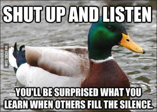
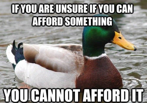
A Most Useful Meme: Actual Advice Mallard
With the emergence of so many new memes across the Internet, it can be hard to pick out the best and brightest. One that I think deserves a lot more recognition is the “Actual Advice Mallard” meme–each one contains clever and useful life advice, a life hack, or a handy tip to make things easier, printed on a picture of a green-headed (male) mallard duck.
Here are just a few samples of Actual Advice Mallards from across the Internet:
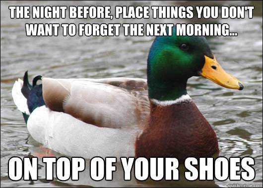

This REALLY works, and not just for pizza–it works for any food that you want to rehydrate after a night in the fridge!


Very, VERY wise words…
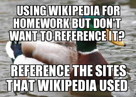
(Important note: Check the Wikipedia page’s sources and make sure they are reliable and trustworthy before putting them on your source list–the content of your paper is far more important than not sourcing Wikipedia in your bibliography. This advice brought to you by a former English teacher.)

(Also known as: Don’t argue back while your parent is talking.)


Such appropriate advice for our time.


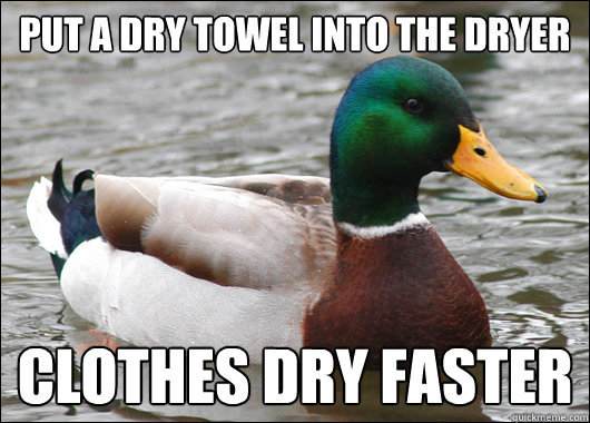
I’ve tried this fix, and it absolutely works–I’ve got two pairs of pants I’ve fixed with this advice.


Very important, especially while outside in direct sunlight!

Steam, also known as “the lazy person’s iron.” LOL

This needs to be plastered on every road billboard in my town.

From experience, I can say AMEN to this!

For all us job seekers out there!

SUCH TRUTH

I’m going to print this and put it in my wallet…XD

I can’t believe I never thought of this!

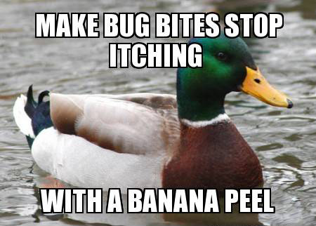
Something to keep in mind, especially for the summer months here in the Southeast!

Never knew about this little keyboard shortcut!
For More Actual Advice Mallard:
(Warning, some Actual Advice Mallards may have curse words)
Actual Advice Mallard @ Tumblr
Quickmeme
Memestache
Memebase
Visual Tricks You Can Accomplish with CSS
Time was, if you wanted something visually impressive to appear on your page, you had to use an image. Creative logos, text shadows, graphic designs in the background–you had to be a Photoshop or Paint Shop Pro whiz to make it all happen.
Thankfully, with the wizardry of CSS, you no longer need images for many of these tasks. You can add shadows and outlines to text, give a 3D shadow effect to divs, crop images (or at least make it look cropped), and even create gradients and other lovely design elements with just CSS. See below!
Text-Shadow
This example shows off the “text-shadow” property in CSS3, which can give your text a “popping-off-the-page” effect. The shadow can be as long and as wide as you wish, and it can be any color you wish! (Note: this effect works in all major browsers of the latest edition, but IE 9 and earlier don’t support it.)
When you write your CSS rule for this, be sure to follow this order: “text-shadow: h-shadow v-shadow blur color;”. For instance, this is the CSS which makes the above effect:
.shadowedtext {text-shadow: 2px 2px #777777; color: #6b00a2;}
In this case, the text shadow is positioned 2px horizontally away from the text, and 2px vertically away from the text. The shadow is also given a color–#777777, a dark gray. (You don’t necessarily have to specify a “blur” value, but the option is there if you want to use it. It just makes your text shadow a little softer.)
W3Schools Text-Shadow Reference Page
Box-Shadow

See how this box of text “pops” off the screen at you? This is achieved with the “box-shadow” CSS property, which is very similar to the “text-shadow” property in both appearance and execution. It’s just that “box-shadow” works on paragraphs, divided layers, and other larger sections of pages. This works in all major modern browsers.
When you write your “box-shadow” rule’s CSS, follow this order: “box-shadow: h-shadow v-shadow blur spread color inset;”. This is how I’ve constructed the CSS for my example:
.shadowedbox {box-shadow: 10px 10px 5px #888888; background-color: #CCCCCC; padding: 10px; width: 500px;}
Here, I have a shadow which appears 10px away from the box in both directions, and it’s blurred out 5 more pixels to give it a softer edge. I didn’t use the “spread” part of the property, nor the “inset,” but I did give it a dark gray color. (“Spread” affects the size of the shadow; “inset” can turn the drop shadow effect into an inner shadow.)
W3Schools Box-Shadow Reference Page
Gradients (CSS3 Only)

Can you believe this pretty gradient was created just with CSS3? It’s true! And not only can you make a linear gradient, like this one–you can make all sorts of gradients, no image program required!
Though IE doesn’t support this functionality quite yet (as far as I know), most other modern browsers do, and it is fantastic for helping your pages load a little faster and having less images to deal with.
As for explaining how you can create gradients with just CSS, I will defer to Chris Coyier of CSS-Tricks.com, who has created not only a lovely, thorough explanatory article, but also a really neat demo page where you can see all the different types of CSS3 gradients and the corresponding code.
CSS3 Gradients @ CSS-Tricks.com
Text Outline/Stroke
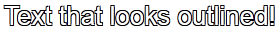
Oh, how I used to long to know how to get outlined text, even in Photoshop! Long after most of the world had updated to a version of Photoshop/Paint Shop Pro that had the ability to add outlines, or “strokes,” to their text, I was still puttering around in older versions, wondering where the outline setting was.
Thankfully, there are a few pure-CSS ways to make your text pop with outlines (and they can be any color!). Again, I will defer to CSS-Tricks.com for the explanation and further examples–there is an actual property that creates an outline, and then there’s a fun little workaround that actually produced the example above. (Hint: we’ve already seen it at work in this article!)
Adding Strokes to Web Text @ CSS-Tricks.com
Cropping Images (Or At Least Making It Look That Way)
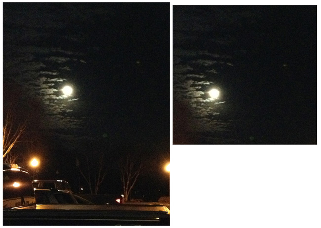
Look at these two images side by side. Would you believe me if I said these are both the exact same image file, and that simply specifying negative margins made the right image smaller?
Believe it or not, that’s how it was done–and it’s only one of the ways in which CSS can “edit” your images for you. This can be a real time-saver if you’ve got tons of images which all need to be formatted in a specific way when they display on the page (such as thumbnails). Check out CSSGlobe.com’s “faux-cropping” article to find out more about these techniques!
3 Easy and Fast CSS Techniques for Faux Image Cropping @ CSSGlobe.com
Visual Effects: Text Rainbows/Inner Shadows/Other Amazing Things

This lovely text effect was created by only using CSS and Javascript–amazing! (And there are plenty more colorful examples on the demo page!) DragonInteractive has come up with this tidy little way to help us all beautify our text in various ways, available through the following link:
DragonInteractive Labs: Rainbows
Visual Effects: Bokehs

Okay, this one requires a little help from jQuery to make this CSS run right, but it’s still a lovely way to incorporate graphic effects without ever having to open an image-creation program. Using the following linked tutorial, you can add as many of these softly blurred, half-opaque “bubbles” to your page as you wish!
Pure CSS3 Bokeh Effect (with some jQuery help) @ MarcoFolio.net
PNG-8 Vs. PNG-24: There’s a Difference!
In terms of image file formats, which I’ve written about before, there are marked differences between JPG, GIF, and PNG. But there is also a subtler but still noticeable difference in quality between the two levels of PNG files.
Yes, you read that right–PNG has two different levels of quality (PNG-8 and PNG-24), even though they both are identified as “.png” files. The main difference between these two shows up when you try to save a partially-transparent image…and the proof is below!
PNG-8: Something Looks a Bit Fuzzy Here…
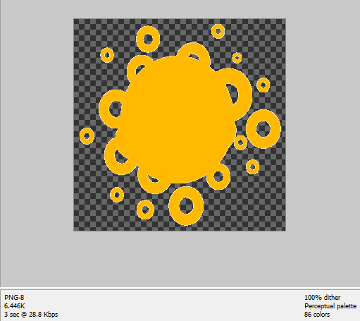
(Note: In these examples, the orange shape is the part that will be non-transparent–the dark checkerboard pattern in the background is how Photoshop Elements shows you what parts of the image will be transparent when the image is saved.)
Notice that while the orange shape is mostly “cut out” against the background, the outlines of the shape look “fuzzy;” there are little white bits hugging every edge (graphic artists call these white bits “artifacts”). Now, while you could probably get away with using this image on a white background, a dark background will be very unforgiving indeed. It makes the image look a lot sloppier than it actually is.
PNG-24: Fuzzies Begone!

Look what a change this made, just switching from PNG-8 to PNG-24! Now all the outlines of the orange shape are clean-cut–no fuzzy image artifacts anywhere. The file size is about double the PNG-8’s size (11.71 KB instead of 6.446 KB), but it’s a small price to pay for a much better image result.
But Wait, PNG-8 Isn’t All Bad!
I will say that PNG-8 is a great file format for saving Internet screenshots, and for making web graphics that don’t require transparency. In fact, the two illustrative screenshots shown above are saved as PNG-8. But PNG-24 just does transparency so much better and cleaner. If you’re making a partially-transparent image and you have the option to save it as a PNG-24 file format, why not?
Making Your Own iPhone Backgrounds
No longer do you have to download pictures from other websites for your iPhone backgrounds, nor do you have to rely on pictures you’ve taken with your iPhone. If you’ve made an image you want to move to your iPhone, you can!
Please pardon my enthusiasm–after a few months of owning my iPhone, I finally figured out how to load self-made pictures onto my iPhone, and I’m very happy about it, as you can tell. 😀 If you’re like me and enjoy playing around in image creation programs, your iPhone provides you yet another outlet for your creative expression; it just takes a little time!
Some Visual Examples!
Here are a few (shrunken) examples of iPhone background images I either made myself or edited:


|

|
The first three images are edited from images I downloaded from the Internet; credits are at the bottom of this article. The last two are simpler abstract images I made myself.
Here are some tips and tricks I came up with while I was making, editing, and transferring these images:
| Image Styles | Technical Stuff |
|---|---|
|
|
Putting These Works of Art on Your iPhone
WonderShare.com has an excellent, simple tutorial to help you through transferring your images to your iPhone. If you don’t want to sync all your photos/images to your iPhone, simply make a separate folder for your created/edited iPhone backgrounds, and just sync that folder to your iPhone.
Credits/Resources
There are lots of image resources on the Internet which can provide you with beautiful pictures to use as iPhone backgrounds (and lots more). Here are some of my favorites:
Picture Tweaks for the Web
These are the days of instant picture-taking and sharing, and as such, most people don’t worry too much about how the pictures look; it’s more about the subject matter than anything. But, if you’re a webmaster/webdesigner, pictures take on a slightly different meaning. They are not only photos, but visual representations of your website.
It’s easy to get daunted by all the image-creation and image-editing software out there. But I’m here to tell you there are quick little tricks to make your photos (and your website) a little more awesome for your users. Read on and discover!
Photos in a Range of Sizes: Convenience for the User
When dialup and slower DSL connections ruled the Web, thumbnail photo galleries were all the rage. They were the fastest way to preview tons of photos, because users could see at a glance which photo they wanted to click on and view in full. Downside? They took forever to make, because you had to select the most salient point of the photo to make it attractive to click.
These days, web designers trying to present tons of visual content do not have to resort to thumbnails anymore due to slow connections (for the most part). Instead, what is most helpful for the modern Internet user is a selection of various sizes for your photos and graphics, a la Flickr. Like so:

This is the small size…

…and this is the larger size!
This way, your users do not have to try enlarging or shrinking the photo on their own; instead, you as the webdesigner/webmaster provide them with a choice of sizes for their convenience. (And the more convenient you can make photo-saving, the better!)
The “Levels” Tool: Beautifying Even the Most Drab of Photos
Looking for a way to subtly enhance your Web-ready photos and graphics without making your pictures look fake? Then you might want to try changing the images’ “Levels” settings, in your favorite trusty image editor/creator. (I’m using Photoshop Elements 8.0; your program may differ slightly in how this feature is set up, or it may not have a Levels tool at all. More about how to work around that in the next section. 🙂 )
Let me show you the difference a few Levels tweaks make:

Before changing Levels: A pretty outdoors picture.

Showing the Levels dialog box alongside the picture, with no changes yet.

With slight rightward shifts to the leftmost arrow (the Shadow settings), then slight leftward shifts to the middle arrow (the Midtone settings), the colors appear stronger and make the picture more interesting.

End result: a MUCH better “pretty nature pic.” And yet, it doesn’t look fake–it just looks better, at least to my eye.
Small, subtle changes like this can make your photos more vibrant and captivating–and who doesn’t want and need that kind of draw for their website?
Brightness/Contrast: The Poor Man’s Levels Tool
Now, if your image editor/creator does not have a “Levels” tool, all is not lost! Before I got Photoshop Elements, I used a long-forgotten program that had only the barest of image “editing” wizards and tools. The most sophisticated editing tool it had was a tool called “Brightness/Contrast,” and in a pinch, this can spiff up the colors of your photos like the Levels tool can. The following example uses a recent picture of me to demonstrate. (Avert your eyes if necessary–I am no model. xD)

|
My picture, before changing any Brightness/Contrast settings. |

|
The Brightness/Contrast dialog box, ready to make my picture AWESOME! |

|
With slight changes to the Brightness and Contrast settings (Brightness +10, Contrast +20), the pink of my shirt looks more colorful, my hair looks a little darker, and my skin looks a little bit smoother (and if that ain’t a miracle, I don’t know what is!). |

|
Finished product: a slightly more presentable me–always a good thing on the Internet. (And if you recognize this picture from my Twitter avatar, points for you! xD) |
With Brightness/Contrast, you can make your pictures just a little bit livelier. Just don’t go overboard changing these settings, otherwise you will end up with fake-looking pictures. Like, more fake than me with blonde hair. 😛
PNG-8 Format: Smoothest Gradients and Truest Colors
If you want a lovely gradient effect for your website, these days it’s best to turn toward the PNG format, and to the PNG-8 format in particular for smooth gradients in a small file size.
Observe the difference when you save the same exact gradient in the three major Web image file formats:

|
This is a low-quality JPEG rendering, with obvious diagonal striations going across the image. (You CAN get a smooth gradient with true colors in a JPEG format, but the file size will be much bigger.) |

|
The GIF file format, especially with “Restricted” colors like this one, makes a pointillist mess of the gradient. (The “Perceptual” GIF setting does render the gradient better, but still has annoying striations running through it.) |

|
Ah, perfection! The PNG file format renders the gradient just as well as when I created the image, but contains it within a 33 KB size! |
PNG-24 Format: Best Transparent Graphics Creation
On the other hand, there is a use for the PNG-24 graphics format: making truly transparent graphics. I’ll show you what I mean:
From left to right: GIF, PNG-8, PNG-24, all with transparency settings on. Which icon would you rather use in your webdesign?
To my eye, the PNG-24 format results in the best-looking transparent graphics, whether the graphics are small like icons or big like website headers. By contrast, the “fuzziness” around the GIF and PNG-8’s icons make them both undesirable for making true transparent graphics. While the file size may be a tiny bit bigger (the PNG-24 in my example is 618 bytes, as compared to 387 bytes for the GIF and 430 bytes for the PNG-8), the payoff is definitely worth it from a design perspective.
Dark Page Backgrounds: Show Off Those Beautified Pics!
Now, for the final question: How do you properly display your newly-spiffed pictures? Answer: with a darkly-colored page background!
Think this is too simple? It does work–way back in high school, I served on the Yearbook Staff for a year, and learned a similar trick of telling a “good” picture from a “bad” one. It seems that pictures just show up better if they’re against a black or dark-colored background, and it’s easier to tell if you need to reshoot the picture or if it’s worth using. The same goes for displaying pictures on the Web; a darker background can make the colors in an image pop a little more, or help the details show up better.
The following side-by-side example shows what I mean:


This is based on exactly the same picture, with no Brightness/Contrast or Level changes between the two. And yet, the one with the black background/border around it seems to have more detail and better colors than the one with the white background/border. Weird, but it works! Using a darker-colored background for your picture pages will make them show up just that much better.
Summary
You don’t have to be a photo whiz (or a Photoshop ninja) to make your pictures look awesome for the Web. All you need are a few quick and subtle tricks to spiff up those photos for their Internet closeups, and you’ll have a much better collection to show off!
Using Music to Inspire Your Web Designs

As an avid musician and composer, I find that music, like writing, permeates the other areas of my life, and that definitely includes web designing. I often use music as a background when I am in full “Photoshop mode,” sometimes assembling a full playlist of particular moods and flavors of songs, and sometimes just letting iTunes Shuffle dictate what mood I’ll hear next.
Some of the more memorable designs I’ve churned out over the years have begun with music. For example:

The clock-like notes and soaring guitars of “Alone” by Heart inspired this deep, space-like violet image, studded with faint stars. This became the background for one of my early personal sites’ splash pages.

Wispy vocals and an ethereal music box sound in Britney Spears’ song “Everytime” helped me create this handmade gradient of soft blues and sunny white. I eventually used the image as the fixed background for a contact page.

“Saltwater” by Chicane had such fathomless depth and rain-like rhythms that I was inspired to create this energetic swirl of blue-green and black. Later, this became part of a header image for an early fansite.
Where These Images/Color Selections Come From
Since I listen to the songs while I’m creating the images, I believe a lot of it has to do with my sound-color synesthesia, which I’ve referenced in other blog posts. The choices of colors and shapes often have absolutely nothing to do with the music videos, album artworks, or the artists themselves–it seems instinctual for me.
From doing this process over a number of years, I’ve discovered that hard rock, metal, or generally angry songs usually lead to harder lines, violent streaks of bright or vivid color, and harsh delineations of visual space in the resulting layout. By contrast, Celtic, New Age, or generally peaceful songs leads to soft gradients, less delineation of space on the layout, and more pastel/muted colors. Love songs of any type have almost invariably led to monochromatic designs with soft lines and yet defined content/sidebar/menu spaces on the layouts.
This is likely a result of the emotional content of each song as I experience it. But what about your own experience?
Try It For Yourself!
- Pick a song, any song, from your music library, and start playing it. You’ll likely want to set it on repeat for this exercise.
- Open your favorite graphics creation program (mine is Photoshop).
- Immerse yourself in the music. What colors and shapes would you associate with what you’re hearing? Does that funky guitar riff sound like a series of stretched-out triangles looks? What about that lovely glissando on the harp? Does it remind you of ripples in a pond? Let your imagination stretch out on this, and go with whatever comes to mind–don’t try to control the result too much at this stage.
- Whenever you’re ready, choose some colors and start creating. Anything goes at this point–remember, if you don’t like it or it doesn’t fit your vision, there’s always an Undo button!
- Once you’re satisfied with it or finished with it, whichever comes first, save your work.
Can’t Use It Yet? Don’t Worry!
You may never use this created image for anything–but on the other hand, it might become the basis for your next web design, or it might inspire you to create a totally new image a few months from now. If you can’t use your created image for your current project, save it for inspiration later!
The Lowly Transparent Shim

You probably read this post title and thought, “Shim? What’s that? And why is it transparent?” Well, in the days before CSS padding and margins, transparent shims were a godsend to webdesigners…but they can still help out our modern pages! Read on to find out how!
A Little Shim History
Transparent shims borrow their name from their wooden companions in the carpentry and construction businesses. These thin wooden pieces, often made from scrap wood or plywood, can be used to fill awkward gaps or spaces, help separate a couple of pieces of material, or make something fit more snugly and more level.
In webdesign circa the mid-2000s, a “transparent shim” image was about the only way to precisely position elements on your page. For instance, need an extra 30 pixels of horizontal space between your HTML form’s label and its text entry box? Then you’d just put in a little image tag linking to your shim image between the form label and text entry box, like so:
<img src=”shim.gif” width=”30″ height=”1″>
Or, if you needed more vertical space between your header image and your content, you’d put a little image tag like this between header and content:
<img src=”shim.gif” width=”1″ height=”50″>
Because this image was transparent, it could be stretched to any dimensions using the width and height measurements without the layout looking strangely colored. And, because it started out as a 1px-by-1px GIF file, it loaded quickly and didn’t clutter up slower connections.
These Days: Less Shim, More Padding
With the advent of easier-to-code CSS padding and margins, however, transparent shims have been less and less needed. No more need to call for that shim 50 or 60 times in a page when a couple of well-coded properties in a stylesheet can handle it all, right?
…Well, MOSTLY. There are a couple of instances where transparent shims can still help out:
Shim Situation #1: CSS Padding Rendering Differently Between Browsers
Sometimes Internet Explorer, Firefox, and Chrome will disagree on how to interpret CSS style rules such as “margin: 3px;” or “padding: 1px 10px 1px 10px;”. (CSS box model problems with IE, specifically, have been widely documented for several years.)
Shim Situation #2: Disobedient Layout Elements
Sometimes, an element on the page just will NOT position itself where you want it, and no amount of finagling, debugging, pleading, or shaking your fist at the screen will fix it. Whether text isn’t wrapping like it should, or whether some floated element is somehow “un-floating” itself, display bugs can ruin your webdesign day.
Enter the transparent shim; they act as little peacemakers, going across platforms, being equally accessible and understandable. All you have to do is put in that little image tag wherever you need it, and work with the pixel measurements to your heart’s content.
How to Make a Transparent Shim
- First, open an image program that can make images as well as edit them, and that can make images transparent. Adobe Photoshop Elements is the program I use; Microsoft Paint won’t do it, and neither will most really basic photo editors. Free applications that can make transparent images include GIMP and Pixlr.
- Choose to create a new image rather than edit an existing one, and make sure its width and height are both 1 pixel. Also, choose the “Transparent Background” option (could be in a dropdown list or a checkbox).
- Once you’ve created the image, save it as a transparent GIF or PNG-24 file. (JPEG format doesn’t recognize transparency.) Make sure you click the option to save it as a transparent file, otherwise it will just render as white. (For instance, Photoshop Elements has the “Save for Web…” option, in which you click a little checkbox reading “Transparency” underneath the file format option box. Your image program may be different–check every option before you click “Save!”)
- You should be done! To test transparency, load your new image, sized at 50 pixels by 50 pixels, on a basic black-background web page. If no 50×50 white block shows up at the top left corner, your image is indeed transparent!
Summary
Transparent shims are relatively easy to make and work with. If you have an awkward form width, an odd spacing, or even a fairly okay layout that needs just a little adjustment, try placing a shim, and see how heroic 1px by 1px images can be!
The Renaissance of Web Animations

Moving images on the Web have now come full-circle–first fashionable in the early 2000s, becoming passé in the mid- to late 2000s, and now back in style thanks to sites like Tumblr and BuzzFeed. Not only that, but a new format has arisen to possibly challenge the GIF format for its animation crown. The WebM Project describes a new compressed video format, much smaller than typical videos and yet still delivering higher-quality picture than GIFs, with audio to boot.
Because of this, the temptation to overuse animated image formats is again going to soar. But let’s not throw ourselves back into the “bad ole days” of pages so crowded with Flash movies and GIFs that they load slower than molasses. Here are some ideas for (carefully) using animations in your web design:
Feature Just a Few Large Animations Per Page
Since GIFs especially can be large files, don’t clump them all on one page; even super-fast connections will balk trying to load these heavy pages. Instead, have only a few animations load at a time, using separate pages.
If Animations Are Your Main Content, Let Them Shine Alone
When you’re working with animations as your main attraction, make sure the rest of your site doesn’t distract from them. Too many animations (even lots of small ones) equals a busy page!
Subtler Ways to Use Animations
Link Rollovers
Links with subtle movement when the user hovers over them, like a gradient of color washing from left to right behind the text, can give your site a little boost. It’s also fairly easy to incorporate using GIFs and CSS–here’s the W3Schools post on :hover, and a tutorial on hover animations for image links.
New Content Alert
When you have new content, a little animated graphic pointing your users to the updated content can be a cute way to draw their attention without having to write out “Hey, I updated this and this, go check it out.” A simple arrow moving back and forth beside your updated content can be all it takes, for example.
A Site Brand
Since you want to make sure your site sticks out in users’ minds (so they return), you could have a little bit of animation in your site’s symbol, like an animated avatar that you use for all your social media sites connected to your website. That way, when users see that animation, they know they’re on a page that’s associated with your site, and they’ll remember it. Just don’t make it too gaudy or overpowering!
Summary
Web animations are back, but we still have to look out for common pitfalls. Try a few of these tips and see what works for your site!