Tag Archives: web development

Why Do You Want Your Own Site, Anyway?

These days, it’s very fashionable to have your own website–seems like everyone and their brother has one, like a status symbol. Whether you code it all yourself or use a site-building service, whether you buy your own domain name or have it hosted on someone else’s domain, it’s a goal for many if not all of us to have a place where we can share our thoughts, advertise ourselves, and make a name for ourselves on the Internet.

But in this flurry of “buy it, code it, design it, advertise it,” sometimes we forget the purpose behind our sites. Why DO we want a website for ourselves, anyway? A pointless website is one visitors won’t return to and we’ll have trouble maintaining, after all. So, it’s important to determine the site’s purpose before you even start thinking what domain name you want.

Site Purpose is More Important than Anything

sitepurposeinfofreshness
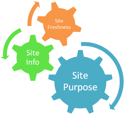
In this small graphic, I show how site purpose is the largest gear that drives webdesign. Your site’s topic and its relative updated-ness will all hinge on its purpose.

For instance, my blog’s purpose is to showcase articles I write about all manner of things that interest me; to that end, I chose six topics I could consistently write about without getting bored or exhausting myself, and I chose to update each topic weekly. Without first knowing that purpose, I would never have known how or what to write about. Indeed, I never did know what to write about on my old blogs, but that was before I determined a strong purpose for one. 🙂

So, how do you determine what your site’s purpose is? Simply answer two questions:

  • Is this site about me/one or more of my projects? Yes/No
  • Is this site about one or more of my interests? Yes/No

A Site about You/Your Projects: A Self-Promoting Website

Whether you’re a writer, software developer, athlete, musician, business owner, etc., a site about you or any of your projects/products/services is a self-promoting website. That is its core purpose. Navigation should be simple and direct, since all the content comes from you, and your outbound links can include friends and colleagues as well as your social networking links.

A self-promoting site is not a bad thing–in fact, it can be a major driver of business and interest. Just make sure that you’re not including content areas that do not come from you (i.e., copy-pasted from other sites), or content that you don’t really want or care about. For one, people will be turned off by copy-pasted material, and for two, your lack of care for certain content areas will show through in your writing. Think quality of pages over quantity of pages.

A Site about Your Interests: A Fansite

When a site is not really about you, but about an interest of yours, you’re running a fansite, and the purpose is to help other Internet users know about something that you enjoy. In this case, navigation will probably be a little more complicated, since you will be covering several aspects of your topic, and outbound links should include sites that cover the same topic, as well as “official” information sources.

A fansite can be done more as a hobby than as a money-maker, but if people enjoy your opinions enough and you get enough web traffic, they may want to buy ad space on your site. As with self-promoting sites, just make sure that your site doesn’t have any stolen or copy-pasted content. Also, include something unique and original based on your topic, something that makes your site stand out from other fansites, such as humorous content, opinion essays, photo edits, and the like.

Summary: Knowing Your Purpose Makes a Better Site

It really shows when someone has made a site that is focused and purposeful. It reads better, it feels easy to browse, and it’s fun to look through and gain information. Without direction and purpose, a site is likely to sit there un-updated for a long time; with purpose, both you and your audience will enjoy browsing and using your site. Start off on the right foot with your website, and determine your own purpose for your site today!

Easy-to-Code Navigation that Scrolls With You: It’s Possible!

These days, navigation that follows a user down the page is a very attractive and user-friendly design. When a user doesn’t have to scroll all the way back to the top of the page to get to the navigation, and doesn’t even have to fool with clicking a “back to top” link, it’s a wonderful thing.

But it’s a little challenging for us web designers to get it done, as I discovered while researching for this blog post; there are plenty of designers looking for ways to make this happen in their own layouts, and there are just as many solutions in various programming languages.

Eventually, I just opened my trusty Notepad++ and started knocking together some code myself–and I accidentally found a very, very simple CSS solution.

Robin’s Sticky Nav Bar: The (Code) Recipe

stickynavbar

Click to see my simple “sticky nav bar” demo! (opens in new window)

To make the above page navigation work, it took about an hour of experimenting with HTML and CSS, creating a dummy layout and the like. But finally, on a whim, I stuck the following bits of code into my navbar div:

#navbar {width: 900px; height: 40px; padding: 0px; position: fixed; top: 0px; background-color: #0f00a1; box-shadow: 2px 5px #000555;}

The code in bold above is the important bit to see here; this was the magic wand that transformed my plain ol’ horizontal navbar. Once you style your own navbar the way you want it, all it takes is two code bits–“position: fixed;” and “top: 0px;”–to make it stick to the top of the page.

And, to make it centered like the rest of my layout, I made sure to put my navbar div within a container div called “wrap,” styled like so:

#wrap {width: 900px; margin: 0px auto; padding: 0px;}

The following HTML code is what I mean by “putting the ‘navbar’ div within the ‘wrap’ div:”

<div id=”wrap”>
<div id=”navbar”>
<span id=”sitename”>my dummy site name</span> <a href=”#”>about</a><a href=”#”>faq</a><a href=”#”>products</a><a href=”#”>services</a><a href=”#”>support</a><a href=”#”>home</a>
</div>
<div id=”sidebar”>
more code here, etc…
</div> (this ends the “wrap” div)

That’s really all the magic there is to it! (This design works in Firefox, IE, and Chrome; I have not tested it in any other browsers, but it seems that these three handle it identically, so I have hope that it works with all browsers similarly. If you find that this code doesn’t work in a browser I haven’t tested, let me know!)

One Small Caveat:

Fixing your navbar to the top of the page with “position: fixed” works great–but only if you don’t mind your navbar being the very topmost thing to display on your layout. If your ideal navbar is located beneath your header image to begin with, but then sticks to the top of the page when your user scrolls down, then just using “position: fixed” with a different pixel value in “top:” won’t make that happen. (Believe me, I tried–it was fail. I ended up with a navbar just stuck randomly in the middle of the page blocking the content. :/)

So, what to do if you want a navbar that will stick to the top of the page, even if it’s not at the tip-top of the layout to begin with? Well, from what I found in my research, you’re likely going to have to use Javascript/jQuery to make this more complex navbar. Here are two forum/discussion sites which explain these methods much better than I ever could.

jQuery and Javascript Methods for Sticky Nav Bars

Summary

“Sticky” nav bars are sleek, clean, user-friendly–and fairly easy to achieve with these three methods presented here. I hope at least one of these helps you with your next layout!

Awesome Blog Alert: GeekyPosh.com

geekyposh_side Interested in beauty products? How about home decor? Geeky products and articles more your speed, or do you like to read about pets? How about the occasional post on the Christian life?

If any or all of these subjects strike your fancy, then I recommend GeekyPosh.com as a blog you’ll want to add to your reading list. Run and written by the awesome Jenny, GeekyPosh is like a website version of a super-cool older sister, who is always on the cutting edge of both style and functionality.

Not only that, but Jenny also has written some pretty cool life posts as well; I enjoy her posts about her cats and about her faith, because they make her blog feel more personal and heartfelt. And with just about every article, she includes lots of pictures, making her writing at once more informative and more attractive to the casual viewer. (I could learn quite a lot from that strategy… :D)

I promise Jenny hasn’t paid me to say any of this–I just admire her work and thought more people should know about her blog, since she’s a fellow freelance webdesigner and developer. Go visit! 🙂

Design Manual Review: “The Web Designer’s 101 Most Important Decisions”

101decisionsbook
The Web Designer’s 101 Most Important Decisions, by Scott Parker.

While browsing at the bookstore the other day, I came across this little gem hidden behind other books in the Web Programming and Web Graphics section. I ended up buying it, and after reading it through I can safely recommend it as a great all-around introductory web design manual.

It’s not just a book about layouts and graphics, though it covers that. It’s also not just about programming and coding, though it discusses both those topics as well. This book literally covers every part of the webdesign process, from planning and programming your site to launching and promoting it. Here’s a very small sample of topics which Parker offers pointers on:

  • planning before developing a website
  • what kind of programming languages are available
  • keeping content both brief and informative
  • the great “vertical navigation vs. horizontal navigation” debate
  • modal windows, the new and slightly less annoying pop-up window (this was news to me)
  • giving clear site error messages
  • making stylesheets that are disabled-friendly and mobile-friendly
  • effectively connecting with users via blogs, forums, and social media pages
  • promoting your website with business cards and flyers (sound old-fashioned? It ain’t!)

…and there is a TON more stuff that I haven’t even mentioned. Seriously, this is only the tip of the iceberg.

The book is organized into 11 chapters, of which each topic covered takes up a page or two, and each page is graphically organized to be easy to browse through and scan. It’s also fairly easy to find pages again if you need to look something up, so it’s not just a book you read once and give away–it’s a book you keep around for quick reference.

Though this is definitely not a step-by-step manual on how to code an HTML page, how to set up a Facebook page for your site, or how to create a layout in Photoshop, it does introduce you to all these concepts and more, as well as giving you keywords to aid in your search for further information. Kinda wish I’d had a book like this when I started web design back in ’03! 😀

Stop Coding This Right Now, part 4: “Click Here!” Link Descriptions

The first 3 installments of this series have been about bad user interface design, namely nonsense navigation, horizontal scrollbars, and autoplaying music. But today, I’ll discuss another Internet annoyance: nondescriptive links, also known as “click here!” links.

Why “Click Here!” is Useless (and Downright Dangerous) Link Text

It’s deceptively easy to just write “Click here!” in our text links, or in the alt text of our image links. It requires no thought, and it seems like good attention-getting text. That should be a good thing, right?

Let me give you an example. If both of the following links went to a Paypal donation page, which of these would you be more likely to click on, as a user?

If you’re like most users, you might be attracted toward the flashing “click here!!!!” link, but you’d be more likely to click on the “donate” link.

“Click here!” harms our website’s concept, in two ways:

  • It does not describe what the user is about to click on, at all
  • It looks suspiciously like ad text, or even spyware-generated text

It’s important that our websites be easy to use and made of genuine content. But nondescriptive link text works against both those goals. Not only does the user have to guess what to click on to find desired information, but he or she doesn’t even know whether the link is real content or just a hook for an ad. Too many times, ad companies (and ads that download spyware) use “Click Here!!!” to get attention. Modern users are wise to that trick, and will avoid such links like the plague.

The Ideal: Short but Descriptive Link Text

As with most content, you do want to keep link text brief, so that users can simply skim your site to see whether you’ve got the information they want and need. But brief text can still be descriptive, like the examples below:

  • “About” instead of “About This Site” or “About Me”
  • “Follow” as the alt text for your Twitter image, instead of “Please follow me on Twitter”
  • “[Name of a site]” instead of “Visit http://wwww.[name of a site].com”
  • The Web-classic “FAQ” instead of “Frequently Asked Questions”

It’s all about shortening the description to a couple of words, but using words that still make it clear what the page is about. That’s all your user wants–and, if you think about it, that’s all we want out of websites when we use the Internet ourselves!

Stop Coding This Right Now, part 1: Autoplaying Music

When you’re first building a website, you usually want to make it an experience for your user. You want it to be awe-inspiring, enveloping, amazing. You want the user to browse your site for hours, enjoying every moment.

How do you achieve that encompassing web experience, you ask?

Definitely NOT by having music autoplay as soon as the user loads your page, the same song looping forever, un-mute-able, un-pause-able.

Why is This an Issue?

Autoplaying music might be a great addition to webpages, except for the following three truths about Internet users.

Users generally…

  • Have their own music going while they surf
  • Have more than one tab open at any given time
  • Want to be able to customize their web experience, i.e., with pause buttons, links to change font size, etc.

Autoplaying music, with no pause/stop buttons visible anywhere on the page, thus offends users on three levels. Not only is there mysterious music playing, usually at an ungodly volume, clashing with the music you’ve got going, but you’ve got to hunt through all your tabs to find and eradicate the source of the annoying sound. And when you finally find the maddening site, you can’t pause the music, stop it, or even lower the volume–it’s just THERE.

The only cure for autoplaying music is to leave the site entirely, and most users will be all too happy to click that Close button. Thus, autoplaying music loses your visitors almost as soon as they hit your page–not what you want, as a designer and developer!

Are There Any Ways to Gently Incorporate Music into Your Webpage?

There is a trusted way to make music on a webpage infinitely more bearable–make sure you have a visible audio player (complete with pause, volume, and stop buttons), and make sure the music doesn’t autostart when the user loads the page.

Draw attention to this little audio module with special formatting, and leave it at that. Your users will find it and use it if they so choose–all you have to do is leave the choice up to them. That, my friends, will make your visitors so much happier than an uncontrollable loop of tinny music drilling its way into their brains.

Open Forum: Your Biggest Design/Development Pet Peeves

Today, I’d like to open the “floor” for discussion, with a topic I think we can all talk about: what annoys us most about design and development, whether it’s something during the creation process, or something annoying you see being practiced around the Web.

To get the ball rolling, I’ll say that autoplaying music or video clips are a fairly annoying practice, as is un-descriptive navigation (not making it clear what the user is clicking on). During the design/development process, I get more frustrated by how a single misplaced comma or semicolon can break a whole CSS style sheet or PHP script, and how finicky MySQL is about how calls to the database are formatted. (Does an extra space matter THAT much? Apparently so! LOL)

So, what are your pet peeves? Share them with me in the comments!

Break Out of Web Design Cliches

We’ve all fallen victim to them, as web designers. After a while, a certain style or structure of site layout becomes second nature, and you just begin to design every site the same way regardless of content. Either because it’s easier or because it’s familiar, we can all fall into the “web design cliche” trap…but we don’t have to be trapped by it forever!

Common Webdesign Cliches, Illustrated


Full-size screenshot

While the above image I’ve made is rather tongue-in-cheek, this fairly well describes several of the design cliches I’ve seen in the last few years. (Sadly, some of these are the same ones I find myself relying on, so I’m kind of preaching to myself today, too. :P)

For instance:

900-Pixel Two-Column Layout with Floated Divided Layers

As you see in the above screenshot, the old faithful 900px two-column layout looks sharp and clean, but somehow…a little bland and overly confined, too. In this age of mobile screens and bigger screen resolutions, should we be confined by this limited-width design anymore?

I will admit it’s an easy design to make and it’s very familiar…I almost want to say “if it ain’t broke, don’t fix it.” But then again, it might BE a little broken for our tablet and smartphone age, when it can’t shrink and grow with our various screen sizes.

Blue, Gray, or Black Layout Colors…but Mostly Blue

Don’t get me wrong, I absolutely love blue, and I love using it in layout designs. It’s just that about 70 million other designers apparently love blue, too, and think that it’s a great color for their websites as well.

Along with gray and black, blue is generally overused on the Internet because it’s a “safe” color, a “sleek”-looking color. There are definitely instances where blue, gray, or black may be called for in design, but these days a “safe” color choice can make an otherwise awesomely-structured layout look less than original.

Huge Header Image


I’m as guilty of this as anybody–making a wide, occasionally awesome header image for the top of many of my layouts. I got used to doing this in webdesign about six years ago, and it’s been just plain hard for me to imagine a site which doesn’t use a header image of some sort.

But when you have this much visual space at the top of a layout, even if you’ve got a fairly eye-catching image, you’re not really drawing any attention to your content. Nor is it giving your site a good first impression, graphically speaking. (This has been a very hard lesson to learn for me, but it’s a necessary one from a user’s standpoint.)

Huge, Empty Footer


Footers are great little page-enders. They give your users ways to navigate your page without scrolling all the way back up to the top, as well as including extra links and info that don’t need to be front and center on your page.

Yet many of us web designers have gone a wee bit overboard when it comes to footers, trying to make everything BIG and important-looking, and usually ending up with the above result: a very spacey, empty-looking end to a page. If you’ve got a small site and don’t really have a lot of info that needs to be in a footer, it can even look like an unintended space at the bottom.

Gradient Background Image

Ah, gradients! I love them, so much…and yet they, too, can look generic. We designers have often used gradients to give a slightly dimensional effect to our websites, but they can very easily become a design crutch, too. We can begin to depend on them for backgrounds, when perhaps another kind of background effect might look better.

Simpler is better, most of the time, but in this case, it’s almost too simple–it doesn’t brand your site or add much visual interest. And, in the case of mobile browsers, it might never even be seen, not in the way you intended; spacing issues can throw off a gradient background image and make it render strangely behind the text.

Left-Aligned, Spaced Out Navigation

This style of navigation began life, most likely, as an “ease of use” design choice. It still is very easy to use and easy to look at, especially when you have a lot of links in your main navigation, but you still need your navigation area to look organized.

But what about sites that might not have that much navigation, like this example? For smaller sites, the left-aligned navigation adds almost too much white space, and takes away from the space that the content could expand into as well. You end up with a large dead space in the middle of the layout, if you’re not careful.

Moving Away from These Cliches

Making different design choices doesn’t mean you have to completely rethink everything about the cliches I’ve mentioned. Instead, you can make small or medium-sized changes to the cliches themselves, like the ones I describe below:

Instead of A Two-Column Layout…

…Think about a three-column layout (two sidebars, either flanking the content or both out to one side of your content), or even a one-column layout with all your regular sidebar stuff in the footer or across the top. A three-column layout could work well for a big, media/content-driven site; a one-column layout would likely work best for a small personal site.

Instead of Left-Aligned, Spaced-Out Navigation…

…You could try a series of icons for navigation on the right side of the page, or text navigation strung across the top of the page. Maybe even try a navigation bar that scrolls along with the user as they move down the page, especially if you have long pages. You still want to make sure your navigation is very easy to find and use, but making it neater and more tightly-organized can only help the process.

Instead of Blue, Gray, or Black Layout Colors…

…Try other colors, possibly used alongside blue, gray, or black to make it a little less jarring. A dark burgundy could give subtle punch to an otherwise gray layout; a bright splash of pale yellow or green could liven up a black layout.

And if you really want to break out of the color cliche, try “strange” color combinations; recently on my main domain and its subsites, I’ve tried combinations like navy and peach, deep red and bright periwinkle blue, pale green and deep purple, etc., with success. (It all hinges on how much or how little you use each color; using a bright or vibrant color is great for drawing attention to new or featured content, for instance, but it’s not great for dousing the whole layout.)

Instead of a Huge Empty Header or Footer…

…Make your header or footer retractable (with jQuery or a similar language), where the user can “fold” it up out of the way with a click when they don’t need to view it. Or you can use your header as an advertising space for your most accessed/favorited content, and your footer as ad space for other webmasters’ sites. Anything that uses that space as a content holder rather than dead space!

Instead of a Gradient Background Image…

…Check out what kinds of subtle, site-branding patterns you can use instead. You don’t have to have an animated GIF background image (God forbid!); you can try a small tiling symbol that represents your site, done in subtle shades that blend nicely with your overall layout’s colors. (For instance, for my main domain, I could use the stylized sun icon as a small tiling image in a slightly deeper or lighter shade of burgundy than the background color, adding a little design texture but not too much.)

Summary

Safe and familiar designs don’t have to trap us, as designers; sometimes, we just have to be willing to step outside our design “box,” just a little, changing the cliche just enough. Even the tiniest of changes can get our design Muses going again!

PHP Includes: Not Just for Headers and Footers Anymore!

Many of us likely use PHP includes to build and maintain our sites these days. But I would guess that most of us just use the following includes and nothing else:

<?php include(‘header.php’); ?>
<?php include(‘footer.php’); ?>

Headers and footers are very easily managed through the PHP include method. But thankfully, includes are not restricted to just headers and footers–in fact, you can manage a whole site with includes!

Example: My Joined Fanlisting Page

Back before I really mastered PHP includes, I had a joined fanlisting page–literally, it was a PAGE, because it was one single HTML file. Everything–style info, links, image sources–all were crammed into this one file. Uploading new layouts for it didn’t take a long time, but it sure was time-consuming to edit the file in any way. God forbid I would actually have to change a link or an image source!

For a long time, I didn’t know how else to do it; I just kept scrolling up and down in the same huge HTML file, spending countless minutes hunting for the small portion of code I wanted to edit.

And then, I discovered the beauty of including more than just header and footer.

The Solution: Make Each Section into a Different File!

When you visit my joined fanlistings site, it may not look any different to the user, but it’s vastly different on the back-end. Each section of fanlistings is separated out into its own files, as seen below:


As you can see, I have a file for every subject matter: fashion and beauty, food and drinks, movies, characters, etc. This makes it much easier to locate and edit links when needed. All I have to do is look for the general topic of my fanlisting, open the file that corresponds to it, and start editing, no frantic searching required!


This is what each separate file’s code looks like. Each section has its own special divided layer, and all of its code is self-contained so that it all fits within the larger “puzzle” of the index.php file.

Notice that I don’t have to put includes for the header and footer in each of these files–each file is simply a piece of index.php, not a page in its own right like most other PHP-driven sites.


Therefore, index.php is just a list of included files and nothing else, which makes it easy to add or delete a section from the viewable site as needed.

Why Bother Doing This?

I can think of three reasons you’d possibly want to break up your site into small files and including them with PHP:

  • You’ve gotten lost in the code while trying to edit your file
  • Editing your file has become so tedious that you put off doing it
  • The individual file loads more slowly than you’d like

In any of these three cases, breaking your data into chunks with separate files, and then reassembling those pieces with PHP includes, will help with editing time and loading time.

How to Make PHP-Included Files for Your Site

#1: Determine what defines a “section” for your site.

Look at your code, and look at the content you have. How does it divide up into sections? For me, I could divide my content, my joined fanlistings, by what general topic they could be filed under (Movies, Music, etc.).

#2: Copy-paste each section into its own file.

To divide up your file, you’ll need to carefully copy and paste each little section into a new file, and save it as a PHP file.

Warning: Make sure you carry over any formatting or structure that is specific to each section! I initially forgot to copy-paste the Fashion/Beauty section’s opening divided layer tag when I was creating my new joined fanlistings page, and major havoc resulted when I tested the page. xD

#3: Make your index.php file, with code that includes all your new files.

Once you have all your new little files, it’s time to include them! Wrap them all in a big group hug with code like the following:

<?php include(‘header.php’); ?>
<?php include(‘firstsection.php’); ?>
<?php include(‘secondsection.php’); ?>
<?php include(‘sidebar.php’); ?>
<?php include(‘footer.php’); ?>

Save this as “index.php”, then upload and test it. Result: you should have a perfect, much more manageable site! It shouldn’t look any different to your users, but it’ll be much less of a headache for you. 🙂

Web Design on a Budget: The Three Best Free Software Tools

If you’re just beginning web design/development, or if you simply don’t want to spend money on expensive software tools, it may seem impossible to achieve your dream of coding and designing your own site. You might even think you can’t create anything worth looking at or browsing if you don’t have high-end software.

I am happy to tell you that there are wonderful free software options for all of us who can’t yet afford some of the loftier programs. Not only are these programs free, but they are often the best utilities out there for the price. Here are the three webdesign software tools I use for my own designs:

Best Free Code Editor: Notepad++

Ever since I began web design, I longed for a “just-code” editor, one that would display the bare code like Notepad did…except that I wanted a little more Web-specific functionality, too. I wanted to surf through the code without getting so lost; I wanted to be able to speed up the long and tedious editing process. I needed a program that wasn’t so simplistic as a WYSIWYG editor, but one that was also helpful for those of us who were learning code.


Well, someone in the Notepad++ development team must have heard my prayers! Here, you can see how the different bits of code are color-coded (HTML tags are blue, selectors are in red, option choices are in purple, and so on).


See the gray minus sign and the line extending between the opening p tag and the closing p tag? This is another one of Notepad++’s great tricks: “folding up” a section of code if you need it up and out of the way.


When you click the minus sign, it closes the section of code encased by the opening and closing p tags, resulting in a display like this. Clicking the red plus sign will expand the hidden code out again.


Like the image above says, the “Replace” function is also known as “Hallelujah!!!” That’s what you’ll shout when you realize you can use the Find & Replace function to edit the same text in every file you have open within the program. SO awesome for expediting those previously long and tedious tasks, like editing a line of code on every page of your site.

Now, I haven’t even begun to expound upon all of Notepad++’s awesome features. The program supports a variety of different languages, from ASP all the way to XML, and even including some languages I’ve never even heard of (Haskell and KIXtart, among others). Plus, it has the ability to use macros, plugins, and converters for even faster programming. Check out the program with the link below:

Download Notepad++: Notepad-Plus-Plus.org

Best Free Graphics Program: GIMP

Ever wanted Photoshop but couldn’t hack the $600 price tag? Well, GIMP can do most things you’d use Photoshop for, even transparency and text addition, but for free.

Its interface is a little more free-form and spartan…


…but within it, you can still do all of the basic image-editing techniques, as well as some of the more sophisticated ones usually in higher-end products.


This is how an image looks when opened within GIMP–it appears in the central box of the program.


Most of the tools that usually appear under Enhance in Photoshop-esque programs are located under Colors in GIMP, such as Brightness/Contrast, Levels, Hue & Saturation. etc. These dialogs work just as well as the pricey ones, and these come with handy ToolTips to help you navigate the menus.


This is an example of the Levels dialog, in which you can change the shadows, midtones, and highlights to your heart’s content.


The Image menu remains largely unchanged from programs like Photoshop–it’s just that the “Resize Image” dialog is renamed “Scale Image.”


The dialog for resizing the image appears here. To resize your image proportionally, just type in your desired height or width, and then click the linked chains to the right of the boxes to get the corresponding number in the other measurement.

Besides changing sizes and tweaking shadows and highlights, GIMP can also do a lot of the artistic filters on pictures that Photoshop can, plus cropping, layering, and masking. It’s a great program, and even after six months of using it I’m still not done exploring all it can do. Check it out for yourself!

Download GIMP: GIMP.org

Best Free File Uploading Program: FileZilla

If you’ve got tons of files to upload, never fear that you’ll be stuck uploading through your browser again! FileZilla is a free FTP program that offers clean and simple uploading (and downloading!) functionality.


This is what the program looks like before you make a connection to an FTP server. On the left appears your computer’s folder hierarchy (top left pane), and the content you’re working with in the currently open folder (bottom left pane).


To connect to your FTP server, you’ll need to provide FileZilla with some information. This is the Site Manager dialog box, where you plug in the info for your site. The “Host” line is usually something like “ftp.yourdomain.com”; you’ll need to fill in your username and password for your hosting server. (My details are obscured for privacy reasons.) Once you’re done filling in your info, you can save and connect!


This button, at the top right underneath the word “File,” is the Quickconnect button. Use this to connect to any of the sites whose profiles you’ve saved already through the Site Manager dialog box.


Once you connect to a server, its folder hierarchy appears in the top right pane, and the contents of an individual folder appear in the bottom right pane. Uploading can be as simple as dragging and dropping the files from the bottom left to the bottom right pane!


Or, you can always right-click the file you want to upload and choose “Upload” from the right-click menu. (For Mac users, I am not sure of the keyboard shortcut to achieve this–please pardon my Windows-user ignorance.)


If you want to upload multiple files, the highlight-and-right-click-upload method works best, I’ve found.


FileZilla will even warn you if a file already exists, and through this dialog box you can choose whether you want to overwrite it or not–it even specifies very detailed actions depending on the age and size of the two files it’s comparing.


Not only can you upload files, but you can download them from your server as well! It’s great for making file backups…and, as I found out in 2011, great for emergency saves of all your hard work. When my hard drive crashed in 2011 and I lost ALL my data, FileZilla was able to download copies of all my files from my hosting provider very quickly and efficiently.

(And, just like uploading multiple files, you can highlight-and-right-click all the files you want to download from your server, and do it en masse. That’s what made getting all my Web work back a whole lot easier.)

FileZilla may not have a lot of frills, but it’s an excellent utility for bulk uploading and downloading, making file backups, and connecting to your site without having to have a browser window open. It’s well worth a download!

Download FileZilla: FileZilla-Project.org