Tag Archives: art

Hand-Drawn Graphics: Yes, They CAN Be Good Enough

Contrary to popular Web belief, Internet graphics don’t have to be sleek ‘n shiny like technology. In fact, in this age of lookalike layouts and cookie-cutter designs, landscapes of reflective images and shadowed text, hand-drawn graphics can give a touch of rustic personality to a page. A hand-drawn layout, icon set, avatar, etc., can make your page feel homey and intimate–truly “handcrafted.” What’s more, it can make your site seem more down-to-earth.

But not all Web designers are handy with a pen or a paintbrush. (I know I certainly ain’t the world’s best. LOL) It can be daunting to try to put your own artwork on your webpage for everyone to see; you can be paralyzed, thinking “What if it’s not good enough? What if I work really hard on it, and it ends up looking like I used it for toilet paper?”

These are some of the real thoughts and feelings I had about doing my own hand-drawn layouts…and I finally just decided to go ahead and try my hand at it, literally. The following are some of my results:

Examples of Hand-Drawn Graphics

(For each example, click on the image to get a full-size screenshot.)

The Network Look


This, my network page, was my first try at doing a hand-drawn layout. With this layout, based on a real tree I used to climb when I was a kid, I placed buttons and links as if they were flowers and buds on living branches, with my sketch as a simple background image.

I added no color to the actual sketch–I wanted the buttons to be the spots of color in the design, like trees’ natural flower buds and blossoms. (Plus, whenever I add color to my sketches, they automatically turn from “pretty good high-school art class” to “kindergarten art class mess”. Every. Time. xD)

The Domain Look


My domain layout featured a big, sheltering tree like the ones all around my house, its soft, cloudlike branches overhanging the content on either side of the “trunk.”


The “trunk” of the sketched tree stretched down all the way to the bottom of the page, where I had the “roots” of the tree in my footer, seen here. This is probably my favorite footer design to date–it really looks like the “end” of the page, the “ground” rather than just an arbitrary bit of code stuck at the bottom.

This sketch also received no color, because I knew I’d be using large areas of various shades of green in my CSS styles; I didn’t want the actual tree to clash. I also cite my previous difficulties with adding color to my sketches. It just never works out quite as I intend. LOL

The Fanlistings Look


This “flowers & ribbons” design literally framed my joined fanlistings page, and was difficult to code but looked beautiful on the page. For this one, I added a golden color to the flowers using Photoshop, and the overall layout looked much better as a result.

I used the boxed-in design as a way to stretch my design boundaries–the style succeeded with a little image slicing and creative use of HTML tables (yes, I used tables because aligned divs hate me). In this layout, the hand-drawn images define the space but do not detract from the content, like a good area rug in a living room.

The Update Blog Look


My update blog featured only small-scale sketches (a big leaf, a tiny multi-petaled blossom, and a growing flower on its stem). I used the leaf and blossom on the top part of the layout, and the flower-and-stem image in the footer, as seen below:

Using little sketched images in strategic places on the layout (and, again, not adding any color to the sketch itself, but using blocks of color in the layout code) gave it an airy, organic look. Plus, using fewer sketches meant more space for content, should the design need it; I wasn’t sure how much the various tag clouds and category spaces would need, so I went for as much visual space as possible.

Weaknesses of This Design Style

While this does look down-to-earth and homey, it can also look amateurish. (I fully admit mine are not the best in technical execution, but they were the best I personally could do.) In addition, hand-drawn designs can easily be misaligned, angled oddly, or leave crooked lines on a webpage; you can correct many graphical sins with Photoshop, but not everything!

However, if you’re skilled doing pencil-paper sketches (or sketches on a tablet computer with a stylus), you might be able to turn a hand-drawn design into a sleek-looking layout; it would be a worthy challenge! It’s just a little bit harder to get the perfect straight lines and shiny details we’re so used to with the Web these days.

Where Can You Use Hand-Drawn Designs?

In my opinion as a designer, hand-drawn designs are generally better for small personal/informational sites and the like, not big corporate or commerce sites. Any site where you need a personal touch, a more casual layout, etc., a little sketch (or a big one!) can work.

How to Make Your Best Hand-Drawn Graphics

You Will Need:

  • Pencil
  • Ink pen
  • Coloring medium (if desired; paint would need to be let alone to dry and might not scan well)
  • Ruler (if desired)
  • Printer paper (clean and uncreased)
  • Scrap paper
  • Scanner/copier/printer & computer, linked together

Directions:

  1. Sketch out your ideas on your scrap paper with a pencil–much easier to work with your design when your lines can be erased (take it from me).
  2. When you have something you’re satisfied with, take up your pen and printer paper, and begin transferring your sketch(es) into finalized form, using a ruler as necessary.
  3. Make a couple of copies of your uncolored sketch to see how well the machine picks up your lines, and make any lines darker that don’t show up. (Also, it’s good to have a few copies of your sketch on hand just in case something happens to the original.)
  4. If you want to color in your hand-drawn design by hand, do so now. Alternatively, you can add color digitally with an image-editing program once you scan it in.
  5. Scan in the image–you may have to adjust the contrast, brightness, and other image settings so that the pen lines or hand-added colors don’t look distorted. (I ended up with one sketch that looked like a photo negative because I messed up the image settings…LOL)
  6. Once it’s scanned into your computer, you now have an image that you can use as the baseline for any web project!

Simple yet Effective Art

Note: I am not and never will be a “great” artist, but I do like to mess around in MS Paint and see what kind of little visual creations I can come up with.

While playing around in Paint the other day, I started toying with shapes, colors, and random line shapes, just musing rather than trying to create a real picture. Along the way, I came up with 4 images that astounded me–they weren’t necessarily “great” art, but they were striking pictures nonetheless. It reminded me of logos for businesses, website headers, and other iconic pictures; the art was simple but effective.

The following simple tricks, like using various shades of one color and basic shapes, can sometimes make a bigger impact on your viewer than a complicated line drawing. Not to mention that it is MUCH easier to draw and color these shapes, especially with a laptop mouse. 😛 Read on to see examples of this kind of art!

Work with varying shades of the same color.

Sometimes, all you need is just one color, with various lighter and darker tones making up all the visual interest in the image. This sophisticated layered effect is created with just four squares of slightly different blues on a very deeply-hued background, which creates a soft picture perfect for some sort of logo or even just contemplative art.

Make your art look 3D with color shading.

With only four colors–bright yellow, black, and two shades of green–I created this simple image, which seems to be in 3D. The yellow “layer” of the picture pops up from the green “layer”, because of the line of darker green I put just below the zigzagging black edge. I seriously surprised myself with this picture…I had no idea the addition of the darker green could make the picture suddenly become dimensional!
This ribbon looks more realistic than not, with just a hint of darker lavender shading in strategic places. Curving shapes are a little harder to do than straight-sided shapes, but just add a little bit of shading at a time. (In this picture, I don’t think I got the shading QUITE right, but as with most of my art, I was afraid to try to do it over for fear I’d mess it all up…which is usually the result. LOL)

In both cases, all it comes down to is choosing a “believable” shadow shade and figuring out which “side” the light is coming from, and you’ve got it made!

Play with using the same shape in different sizes and colors.

By using various sizes and shapes of circles, as well as various colors, you can make a quirky and cool art piece. Layering shapes together in playful ways, experimenting with color combinations, and even putting in a bit of transparency here and there, can create an image you’d be glad to showcase as a logo, a print on a pillow, a piece of art in your bedroom–anything you can think of. This particular design would look nifty decorating a notebook or a pencil cup, I think. ^_^

The Big Secret? This Art Took Minutes

I kid you not; all this art took moments to make but doesn’t look it. Since I’m a very impatient artist, I needed art that didn’t take me hours and hours of sketching, erasing, drawing, coloring, erasing (and crumpling up of paper, eventually).

This kind of simple digital art can be easily used anywhere you want them to be, even in non-digital places–all you need is a printer and an appropriate medium for your project, and you’re set. Try it for yourself; open your simplest image-creation program, and start playing around… 🙂

Picturestruck

Have you ever been outside and been surprised by the beauty of light and shadow playing on an object? Or ever been amazed at the perfection of a flower blossom? Has anything, natural or man-made, ever looked so suddenly awesome that you just HAD to stop and take a picture of it with whatever camera was to hand?

If you have, you’ve been picturestruck. I get that way all the time, even though I’m not a particularly visual person usually. Sometimes I’ll see the sky in the daytime, for instance, and be awed by sunlight streaming down between cotton-candy threads of cloud; other times, the quiet loveliness of a full moon casting silver shimmers along the wide river close to my house will render me silent.

Taking care of the urge to capture the image before you is fairly easy if you have a cameraphone or small digital camera with you. It’s as simple as taking the device out of your pocket/purse, lining up the shot, and clicking the button. But if you’re picturestruck while driving, as I am so often, it can be difficult to balance your need to stay on the road with the desire to get an awesome picture right now!

I’ve been known to pull over to the side of the road long enough to fish for my phone and take the picture through my windshield, if I can’t stop long enough to get out of the car (or if it’s not safe to try to get out). But usually, I like to completely stop the car, get out, and take the picture without having to rush. Convenient parking lots are good places to stop for impromptu pictures, even if it does make me look like a tourist in my own town. LOL

Even if it might sound a little weird to practice this kind of art, I do enjoy it, and I end up with some beautiful images that I’ve even used in my web designs. Random spots of beauty in our world are always worth capturing for posterity if we can manage it, I believe.

Have you ever been picturestruck? Ever get any randomly awesome pictures? Tell me in the comments!

Desktop Art: Wallpapers

As long as I’ve had a computer of my own (which was when I started college), I’ve had the urge to design backgrounds for my desktop. In a way, it was part of creating art for me–I wasn’t particularly good at drawing, wasn’t particularly good at coloring, but I did seem to be good at making desktop wallpapers.

Unfortunately, most of the wallpapers I’ve created over the last few years are locked on a hard drive that may or may not be recoverable :(, but I can share with you the few that I uploaded to my deviantArt account many moons ago. I can also give you a few tips on creating a desktop wallpaper that will be a delight to your eyes.

Picking the Desktop Style that’s Right for You

What you like as a wallpaper varies greatly, depending on what you need your desktop to do. I know plenty of people who cover their whole desktop with icons for files; I myself prefer a desktop uncluttered with icons (regardless of how my physical room looks…*snicker*). Other people have hyper-organized desktops with tons of informational widgets and gadgets all over the place, from daily calendars to how hot the CPU is getting, and so forth.

I’d say that your desktop should represent you, and should also be functionally beautiful for what you need. In the next few examples, I’ll show you various ways of organizing as well as decorating your desktop wallpaper.

Make it Expansive and Gorgeous

A wide, panoramic shot is great for a large-picture desktop; I favor nature pictures for these, and I try to make them as uncluttered as possible, with very few desktop widgets or gadgets. Any picture with a broad view, lots of color, or an amazing light effect works great for desktops.


A Beautifully-Colored Sunset

This is a photo I took with my cell phone camera; I used it for several months as a desktop image, though I don’t have the actual desktop screenshot available. I loved the colors and plays of light and shadow in the picture, and so I fought to keep my desktop as clear as possible for this picture–I think I only had four icons on my desktop the whole time I used this picture. GASP!

A Desktop’s Not Just for Pictures

I like to include verses of poetry or quotes on my desktops, along with pictures or images. Usually I come up with my own poetry or quotes in direct response to what the image evokes in me; sometimes, though, I’ll mix my own words with someone else’s on the same desktop if I want a variegated desktop.

For these two screenshots, I show how I organize my desktop differently depending on my needs for that span of time.


Desktop January ’07 to March ’07

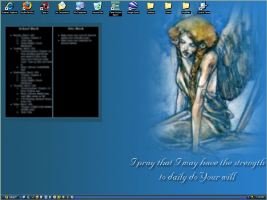
During the time this screenshot was up, I needed a constant HTML to-do list up on my desktop–thus, the large black area on the left, balancing the image (Sustaining Spirit, by Rebecca Guay) and my poetry on the right. (Had to motivate myself to do my homework somehow! I miss that functionality of Windows XP, to put an HTML page directly on the desktop…)


Desktop September ’06 to January ’07

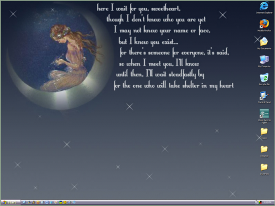
For this desktop, I didn’t need a to-do list, so I just kept all the icons to a minimum and let the background speak for itself, with self-created poetry and a lovely image for which I cannot remember the source.

Make It Look Like a Scrapbook of Your Life

To create a “scrapbook” look, I’ll often put several pictures on a plain or subtly-patterned backdrop, arranging them so they look either neat or haphazard, either all together or spread out across the page. I find this to be an inspiring and fun background style to use on a daily basis–gives a little “oomph” to a bad day!


Desktop June ’08

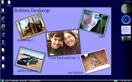
During this time, I was away from home and was very homesick, especially being away from awesome boyfriend of win, so I created this bulletin-board-like desktop with five real pictures, including a picture of us together. ^_^ I also had Vista’s Sidebar active (on the right, with some gadgetry in it), so I made sure the background did not compete with the Sidebar, nor did the icons on the left.

(Also, this was the infamous desktop that one of my classmates saw and asked, “Aww, is that your boyfriend? How many years younger is he?” I replied, “I’m twenty-FOUR and he’s twenty-NINE.” LOL)

Designing a Desktop of Your Own

To try out some of your own desktop art, pull out a few personally-meaningful photos, find some lovely patterns and images online (or make some yourself if you like), and start working. Play around in your favorite image-creation software or online image-manipulation site (like Pixlr or Aviary); arrange the photos and images any which way, add text if you want, and splash color all over it. It’s your desktop, after all–try everything and see what works best.

A few guidelines and tips for this process:

  • Check out your monitor’s screen resolution settings before you design, and make sure your image is as close in size to the resolution as possible. For many of my old desktops, I designed for a 1024 x 768 resolution; later, I had to design for a 1300 x 1050 resolution (I think), and so on.
  • Remember that the desktop background will likely be stretched a little bit to fit your screen if it’s not the same size as your monitor. Keep this in mind when selecting images, especially big images–you might end up with a funhouse-mirror photo!
  • Know where you’d like to put your icons and desktop widgets before you start designing your background. In my June ’08 desktop, I knew that I wanted Vista’s Sidebar to display on the right, so I offset the pictures left of true center so that the pictures wouldn’t be shadowed.
  • Try out “framing” your pictures in colorful patterns and shapes, and play with drop shadows and blur effects. These all seem to work well in a desktop setting.

Summary

Making wallpapers into “desktop art” can be an easier and more accessible way to involve creativity in your life. If you’ve never tried it, I encourage you to do so–who knows, you might make something truly inspirational!

Words as Pictures: The Wordle Way

A few years ago, while stumbling about on the Internet, I discovered a very creative site, and I think it’s one of the best modern ways to use words in visual art (besides web design, of course).

Wordle is a Java-enabled way to make blog entries, feeds, articles, pasted-in text, or even Delicious tags into a graphic. Now, I know that doing graphic arrangements of words is not new to the world of visual art, but Wordle does it in a particularly interesting fashion, with the largest words being the most used in whatever text sample it gets.

Some Personalized Examples

For some beginning examples, I used Wordle to do a couple of graphics based on two large samples of my writing, below:


Based on my webmistress page
It amuses me that “Grits” and “driveway” are two of the biggest words…LOL


Based on Crooked Glasses’s RSS Feed
You can tell the gaming post was prevalent on my feed this particular day. Haha

In both these cases, I chose the font color and style, as well as the background color. I also chose how the words spread themselves across the image. All of these tools and many more options are available to you through the Wordle interface–play around with it and see what you like best!

Some “Famous Poetry” Wordles

I also used Wordle to make word pictures with a couple of my favorite poems, seen below:


From the poem “The Raven” by Edgar Allan Poe


From the poem “Stopping By Woods on a Snowy Evening” by Robert Frost

Wordles as Wall Art/Gifts

Making a Wordle would be a fun thing to do with a particularly inspirational monologue, poem, or prose piece you like–print it large and frame it to put it on your wall, or just stick it on your bulletin board with tacks and call it a day. Anything that gets it into your line of sight on a daily basis would work well.

Also, if you wanted to give a Wordle as a gift, you could easily copy in the text of something a family member or friend has written, and transform their writing into evocative visual art that they can enjoy. Choose favorite colors for the words, arrange it all for best effect–it can make a beautiful personalized gift.

You could even write in just random positive words that describe the gift recipient into the text box provided. Just make sure the words that you want to be largest are there multiple times, and you’ve got it! Almost anything that uses words could become a word graphic using Wordle…you might come up with a totally new way to use it, too!

Try It On Your Own Writing!

Take the largest sample of writing you have, or the most vibrantly written work you have. Anything you want. It could even be a long Facebook status. Copy in your text, and see what Wordle can do for you. It’s not only a fun timewaster, but a great tool for design and art, too. 🙂

Art for Entertainment or Art for Meaning?

It feels like an either/or choice for many artists, including myself. Do we choose to create something that will be marketable, useful, widely accepted, and easily profitable, or do we choose to create something personally and passionately meaningful and hope someone else understands enough to buy it or appreciate it?

As an artist who is currently not making any money off her artistic pursuits, be it writing, music, or web design, I know I don’t have much perspective on the financial part of making art. But I do experience the tug and twist of the decision every time I pick up the pen or sit down to the keyboard (musical or computer): do I make something entertaining, or do I make something meaningful? Do I make something universally relatable and instantly likable (and possibly trite), or do I make something relevant to me, filled with loads of “new” meaning, and wait for others to pull the meaning out of it?

Art for Entertainment = Art for Everyone, But Art for Money

This might not seem like much of a decision. Of course you make marketable stuff. Of course you’d choose to create something that millions of people can get into and understand. That’s how people like us (artists, I mean) make any money, after all. If you want to succeed as an artist, you have to make things that lots of people enjoy and get meaning out of, not just an elite few who are critics in their own right. Plus, you can still couch grains of personal meaning in your work as an entertainment artist, and no one has to be the wiser–and you might get more genuine response. It just has to sell first.

Art for Meaning = Art for Artists…Sadly, Often Literally

And yet there’s the flip side, those of us artists who choose to create art that is personally meaningful first, without concern for how it will “sell.” I can count myself among these–I don’t want to be reduced to doing “things that will sell” just because of money. For me, doing art purely for entertainment seems to cheapen the act of artistic creation; it’s no longer about the work itself or the artist behind it, but about the dollar signs spewing forth from it. Yet, if artists do works that are less universally relatable and often regarded as strange or un-artistic, then what happens to the works? They are disregarded, and forgotten except by other artists.

Is There a Middle Ground? Or Do We Need Both?

To be honest, I don’t know if there’s a middle ground between art for entertainment and art for meaning. I do know, however, that both types must exist.

Yes, I just said that. Both pure entertainment and pure meaning must exist in the artistic world. The old classics in literature are wonderful creations, chock-full of meaning and beauty, for example, but sometimes you just want a Twilight book or a Danielle Steel novel, something you don’t have to pull teeth to understand, but that you can just EXPERIENCE.

Just like our bodies are designed to take in foods of wide varieties, our minds, too, are designed to take in arts of all kinds. Lady GaGa may not ever be considered a “serious” musician (what does that mean, anyway?), but her music has spoken to people all over the globe, because it’s got a good beat, an easy-to-catch meaning, and you can dance to it. Is her work any less meaningful to people’s lives for being dance-y? Does everyone always have to be in the “super-heavy-serious-music” category if they want to be considered “real” musicians?

Another example: Twilight has gotten a bad rap for its fluffy plot consistency, much like meringue on top of a pie–and I won’t deny that it is more for entertainment than for meaning. But it was also a book series that I experienced and didn’t feel the need to academically dissect like a typical piece of literature for my English major courses. THAT was welcome relief to my overtired mind. I was able to relax and let the story dissolve into my brain, like milk chocolate melting on my tongue.

I like to think about art the same way I think about food. A plate of super-healthy steamed vegetables would be good for us and would nourish us…they’re great. (Well, for people who like vegetables… LOL!) But I don’t want vegetables to eat all the time–sometimes, I wake up and just WANT a bag of Reese’s Peanut Butter Cups, or a big slather of Nutella spread and strawberry jelly on bread.

Same thing with art: while it might be healthier for our brains to take in all the old classics and spend our days in heavy-duty collegiate criticism of the works we’re studying, we don’t necessarily WANT to. Some days, we’re tired (“mental mush,” as my boyfriend puts it), and we want something that’s warm, comforting, and easy to mentally digest. When we’re feeling better, we’ll go back to the harder-to-digest but wonderfully-nourishing art, because you can get sick of sweet and non-nutritious after some time. (Trust me, after almost a month of having to eat soft foods like pudding and ice cream, I am getting starved for protein and salty snacks. I’ve never craved Fritos so much in my life. XD)

Basically: Lady GaGa produces the Reese’s Peanut Butter Cups of music, while J.S. Bach produces the hot plate of steamed vegetables with tons of fiber and vitamins. The wonderful thing about us artists is that we can produce both types of art–the art that invigorates (“serious” art), and the art that comforts (“entertaining” art). Lady GaGa could just as easily produce an unfathomably deep and “serious-music” kind of song (and probably still make it have a good beat); in several of the short stories I read in college, Jane Austen proved that she could parody the popular storylines of 18th-century novels in a delightfully tongue-in-cheek way, and make her writing more for entertainment as well as meaning.

Perhaps the Debate Need Not Even Exist

So, the time-tarnished debate of “art for entertainment” versus “art for meaning” may be a fruitless fight, after all. People may clamor on both sides, saying “I hate having to dissect and pull apart art to get at the meaning–give me something easy to take in!”, or “I hate art that doesn’t mean anything and is just for money–give me something deeper, something serious!” But both types, in my opinion, must exist, because we have a need for them. And any artist who creates is helping in their own small way. Even my rich and heavy songs, like a huge bowl of fettuccine alfredo pasta, have a place in the art buffet.

Summary

Balance is the key in creating and using art–we use art for relaxing and for awakening our minds. Neither side is somehow “better” than the other, because they are for different purposes. My art process relaxes me and invigorates others; I take in art that invigorates me sometimes, and other times I choose entertainment. For me, it seems all art is to the good, for whatever purposes the listener, reader, or viewer can use it.

Putting a Drawing in the Shade

Even though I have terrible luck with coloring my pictures (either the markers make it too dark, the pencils are too light, or the crayons are too textured), I seem to have a knack for shading. Somehow, the application of a pencil tip to the page in just the right places, moved quickly but carefully over the page to create gray gradients, clicks for me, where regular coloring doesn’t, at all.

And yet I’ve met many artists who have a lot of difficulty with shading. They can “never get it to look realistic,” or “it always ends up too dark for the rest of the picture.” These are the same people who draw absolutely real-looking still-lifes, who can sit down and in 15 minutes have a portrait of me or anybody else that looks like it took hours, and yet they have difficulty shading?

I think that the varying strengths and weaknesses of any artist in any art field depends greatly on each person’s individual skill set. I don’t have the patience for most coloring and most line art–I do very simple forms and hate to add color (usually because it ends up ruining my drawings!). Yet I love the soothing feeling of the pencil against the page as I shade; something about the quick movements makes me feel like it’s not taking terribly long, but the results look more masterful than the effort I put into it.

Shading may or may not be necessary for the kind of art you like to do, and it doesn’t have to be necessary at all, just like color is not necessary for my simple sketchlike forms. There are people in this world who can color in the lines, and then there’s me. XD But shading seems to come naturally to me, and so I try to make it a part of my drawings.

As a way to show others how to shade, I’ve written this blog post to explain how I shade (which is just one way of doing it).

Where’s the Light Coming From?

Before you find out where the shadow is on the page, you have to determine where your light source is. If this is a picture from reality, it’s as easy as looking at your subject and seeing where the light is coming from. If it’s a picture from your imagination, you have total freedom as to where the light comes from.

One of my art teachers taught me this trick in middle school: lightly draw a little sun image at the extreme edge of the page where your light source is, to show where the light is coming from. It’s a visual reminder, if you lose yourself in drawing and shading, that the light is coming from top left, or top center, etc., and you can easily erase it when you’re done shading.

Once you’ve decided where the light is, you know where the shadow is–it’s always directly opposite the light. Light coming from the left? Shadow’s going to be darkest on the right side of the object or person being shaded. Light coming from top right? Shadow’s going to be darkest on the bottom left side.

What’s the Shape of the Object to be Shaded?

Cylindrical shapes are the easiest things for me to shade–shade very darkly on the opposite side from the light, then gradually go lighter and lighter as you approach the other side of the shape. The gradient is done smoothly and evenly from one side to the other.

Unfortunately, you’re not likely to be shading just cylindrical shapes. Vases and faces, flowers and buildings, and all types of other shapes exist in art, so you have to figure out how the light falls on these objects and shade accordingly.

For a shape that is narrower in some places than others, I’ve found that the most realistic-looking shading brings shadow closer to the light side in the narrower spots. For a rounded shape, doing shading around the edge of the object farthest from the light seems better.

Do the Darkest Shading First

Once you’ve decided where the light is in the picture, the farthest and most opposite part of the object being shaded is where your darkest shadows will fall. I find it easier to do the darkest shading first, really scrubbing the pencil lead, charcoal, or ink into the paper, so that you know where your opposite point is. Line the shadowed side of the object, following its contours closely, with the darkest shadow color.

From here, you can shade lighter and lighter until you get to the other side (the light side) again. (It’s easier for me to do a gradient effect by hand if I know how dark the darkest shadows are supposed to be.) Build up your color in the darkest-shadow area gradually, making sure it’s right ahead of time (you’ll understand when and if you try to erase it, but more about that later). If you don’t get the deepest shadows right, it will be very hard to make your lighter shadows look real later on.

If In Doubt About Shading Placement, Go Lightly

If you’re not sure that your contouring or placement is right, shade very lightly first and check it. Does it look “real,” like it’s going to pop off the page, able to be touched? If it doesn’t look real, change it with either a few more lines of shading, or a handy (and good) eraser.

Once you’ve got the right placement for your shading, you can add more or take away as needed until the entire object is given its third dimension.

The Eraser is Your Friend–IF You Shade Lightly First

Erasers will not get rid of your darkest shading, so it is important to make sure your darkest shadows are correct. Erasers are, however, great for retouching parts of the medium- to lightest-shaded places in your picture. If you’ve gotten a little overzealous with your medium color shading, an eraser can lighten it up just a touch; it can also erase completely the lightest shading in your sketch.

Summary

Careful placement and a (generally) light touch with your shading implements, as well as constant observation of your object and whether it looks “real” on the page, is key to getting shading right. But as with all art, don’t get discouraged–keep trying to shade, even on little doodles, and you’ll get the hang of it. Every bit of practice helps!

Papercrafting Post #4: Quilling

For a change of pace, this papercrafting post focuses on a purely decorative craft instead of the practical papercraft I’ve been discussing in earlier posts. But quilling is quite lovely and fun to do; it’s something you can easily add to gift tags or greeting cards, and it can be done alongside ornare for an even more crafted look.

What is Quilling?

Quilling is the art of rolling paper into beautiful shapes for decorative purposes. First a distraction for the wealthy, it is now a very approachable art form for all people. Coiling, pinching, and twirling thinly-cut pieces of paper yield delicate and ethereal miniature sculptures!

Quilling basics @ Wikipedia.org

What is It Used For?

Mostly, quilling takes a low-priced medium (paper) and uses it to embellish other items for a very high-style look. You can add all sorts of rolled-paper decorations to handmade greeting cards, wall art, decorative trinkets, and even furniture! (I could definitely see a glass-topped table with colorful or metallic quilled paper underneath the glass in small niches, able to be seen but not squished.)

Types of Paper to Use

Printer/computer paper can work while you’re trying to learn the craft, but you can also use lighter-weight paper like origami paper (and possibly even tissue paper for a wispier look, though I haven’t tried this). Any paper seems to work well–just cut it into thin strips first so that the coiling process will be easier.

If you want to practice and you have no thin-cut paper to hand, even a straw wrapper will suffice. Get rid of boredom while waiting for your food at a restaurant AND practice quilling at the same time!

How to Start Quilling with Just Fingers

  1. Taking one end of your cut piece of paper, roll it as tightly and roundly as you can (i.e., no folding it over and over itself) until you get to the other end of the paper.
  2. Slowly release the paper so that the coil expands a bit.
  3. Holding the coil with two or three fingers, affix the last end of the paper to the closest side of the coil so that it won’t come apart. A small drop of glue (something a bit stronger than white glue, but no superglue, please) should work.

You now have a beautiful little coil of paper! Once you have mastered this design, you can start to make other shapes that work off of the basic circular coil.

More Advanced Quilling Techniques and Tools

For excellent tutorials and more advanced quilling work, these two websites show more than I could possibly do, being a novice quiller myself. Try this out–have fun coiling, gluing, and twirling!

More Quilling Basics and Intermediate Techniques @ HandcraftersVillage.com
Advanced Techniques and Quilling Tool Advice @ Craftzine.com

Papercrafting Post #3: Gift Tags

Yes, I know, Walmart and other big-box or discount places sell little gift tags you can tie onto your gifts. But who wants to spend $2 a pop for these little cardboard gift tags, when you can make loads of them yourself for a lot less money (and a much craftier, customized look)? This is part of papercrafting–making personalized items that cost less and also use up material that you might otherwise throw away.

The reason I chose to cover gift tags on this Papercrafting Post is because it’s a useful item that could easily save you money if you know how to make it yourself. You just have to be willing to break out a little creativity and spend a bit of time putting it together. Not as hard as it might seem!

What You’ll Need

  1. Card stock of any color OR unlined index cards of any color
  2. Any colorful or patterned paper you have lying around (crumpled-up tissue paper, old wrapping paper, etc.)
  3. Solid-color printer paper OR construction paper
  4. Double-stick tape OR a glue stick
  5. Single-hole puncher
  6. String, thread, ribbon, OR yarn

Eight Steps to Your Own Gift Tag

  1. Cut out a piece of card stock or an index card in the desired shape. Doesn’t have to be square–you could even cut it into a really fun shape if you want to!
  2. Using your cut-out shape as a guide, cut out a piece of your selected patterned/colorful paper. Make sure that your paper’s shape is about a centimeter/half an inch bigger around the edges than your card stock/index card shape.
  3. Wrap your paper shape around one side of the card stock/index card, taping or gluing down the edges as you go, kind of like wrapping a present. You will end up with one side of the tag completely covered with the paper and one side just covered around the edges. This is what you want.
  4. Get a piece of your solid-color piece of paper and cut out a smaller version of the shape of your gift tag.
  5. Affix this to the back of the tag (the side that is only partially covered) with tape or glue stick.
  6. Use a single-hole-punch tool to punch out a hole in your gift tag, for the string to be threaded through.
  7. Sign your tag on the solid-color side as appropriate (better to write on it now rather than wait until after you’ve tied it to your gift, trust me)
  8. Thread string, thread, ribbon, or yarn through the hole and tie to your gift, and you’re done!

Resources

Available at Office Supply Stores

  • Card stock
  • Index cards
  • Printer paper
  • Double-stick tape
  • Glue sticks
  • Single-hole punchers

Available at Big-Box Stores’ Craft Sections

  • Wrapping paper
  • Construction paper
  • String, thread, ribbon, and yarn

Likely Available In Your Home
Don’t forget to shop your home first–you might have more crafting materials hidden in your junk drawers and recycling bins than you’re aware of.

  • Old giftwrap/tissue paper
  • Scraps of printer paper and construction paper
  • Random bits of thread, yarn, string, or ribbon–even a twist tie can work!
  • Index cards that have been barely used and could be erased

Digital Cut-and-Paste Art

No Elmer’s School Glue or scissors required! Just a mouse and a simple art program on your computer can create some wild and fantastic artwork.

This instinct-based, haphazard-looking way of making art is not really new–think of Jackson Pollock’s artwork–but doing it digitally instead of with a paintbrush and palette is a little newer. No longer are we constrained by the tools we can buy or the paint colors we can find–you can create any color and use almost any type and texture of brush. You can even cut pieces out of your picture and put them somewhere else without hurting the canvas! Check out the process below:

The Process of Making a Cut-and-Paste Digital Artwork

(In the following demos, I’m using Microsoft Paint.)


Start with a blank white canvas, sized however you like.


For this art piece, I dye the background completely black. You can choose to dye the background any other solid color or make a pattern in the background if you wish, too.


I use “Calligraphy Brush 2”, at the widest width available, and choose the basic bright red available by default from the Paint palette. Then I paint rather randomly and haphazardly all over the canvas.


Then I choose the default yellow, again with the wide Calligraphy Brush 2, and paint randomly again, trying to cover different areas from the red, and a little less than the red.


Then I take Turquoise from the default palette and paint once again, still trying to cover different areas from the yellow and red streaks.


Now, I choose the “Select” tool, with a rectangular shape instead of the free-form shape, and cut out a small, nearly square shape from the piece. Then I move the cut-out piece just a little down and to the right, to reveal a white corner edge.

I follow the same procedure (except moving the cut piece down and to the left) with the second cut piece, below:


You can also resize one of your cutout pieces if you like–here, I’ve resized the bottom-left cutout piece to be much larger than its original size. It makes it almost pop out in 3-D, to my eye!

You could leave it like this if you like the white part of the picture; in my case, I want to recolor those white parts black again, to match the background.


This is a look I’m happy with, but you could also dye the background to match one of the other colors you’ve included in the picture. A shot of solid red, yellow or blue in this picture, for instance, would be striking!


This is my finished example. Yes, I know, it might look a little kiddy still, but I just wanted to show you the technique with as different a trio of colors as possible.

Other Examples of Color and Cut-and-Paste

If you like this haphazard abstract look but don’t want a ton of bright colors, you can also do something like these:


Here, I’ve used a gray background, with turquoise, pale blue, white, and purple sprays on top instead of the Calligraphy Brush. Then, I used the free-form selection tool to cut out and move some shapes to create sinuous and strange lines within the piece. At bottom right, I blew up one of the small shapes to a larger size.


In this piece, I used first a rose-pink Watercolor Brush across a sand-colored background, then added pale yellow Natural Pencil, then a creamy Calligraphy Brush on top. I didn’t cut anything out from this piece because it looked fine the way it was.

Doing Something More with Your Creations

If you have access to a more sophisticated graphics editing program, like Photoshop or Paint Shop Pro, you can do all kinds of fun stuff with these types of creations. (I used Photoshop Elements 8.0 for the following edits.)

Look at the two different looks I created out of my example piece, just by Motion Blurring it in two different directions:


Motion Blur going down from left to right brings out a lot of the blue lines and makes the red and yellow fade a little more. Reminds me of a ribbon dancer’s movements!


Motion Blur going up from left to right brings out a lot of little red and yellow streaks, almost like shooting stars.


I used the Liquefy filter to swirl these colors and sinuous shapes together. I know it doesn’t look like much right now, but this technique is all about seeing potential. This, for instance, could be useful as the beginnings of a website header (a little more blurring, cropping, and some text in a beautiful font and color, perhaps?).


I used the Paint Daubs filter, increased the width of the brush, and changed the brush to “Sparkle” to create this effect. The creamy swirls almost look like rippled water reflections on the bottom of a pool.

Summary

This kind of art requires us to be instinctual in our process. Choose the colors and shapes we like most in this moment, and just start going at the canvas until you have something beautiful. And if you don’t have something beautiful at the end, no worries about wasted paint or wasted canvas–you can just hit the “New” button and start again!