Editing, condensing, updating, and adding more pictures–always a good thing for an old blog post! My informational post on multiple sidebars is now light-years better.
Category Archives: Monday in the HTMLab
All about web design and development, and my triumphs and defeats therein.
The Beauty of a One-Page Site

Want to build a website, but don’t want to have to deal with tons of pages?
Well, these days you don’t have to! One-page sites are not only useful–they’re a Web “trend” that’s become a staple.
Why Choose a One-Page Site?
It used to be that lots of separated pages were just about required for having a “good” site. But these days, with wide screen monitors and larger screen resolution sizes, we designers and developers can put more information on one page without it looking crowded and hard to read. This can (potentially) be easier to code as well as to design, with less content files and more ability to concentrate on attractive design and function elements.

(click for larger image in new window) Take my about me page on my domain, for instance. I condensed all the information that used to make up my overly-complicated personal SITE and made it into a much simpler PAGE, using banner-like columns in different colors to organize the information in a pretty but functional way. No scrolling, no extra pages–just a well-designed presentation of who I am.
One-page sites are great for personal “about” sites like mine, but there are many other applications for this design/development style, including:
- Homepages for apps
- Portfolio pages for creators and performers of all sorts
- Online resumes
- Lifestream aggregators
- Small fansites
How to Design a Great One-Page Site
One-page sites can be floridly designed like an onscreen, interactive painting, or they can have a more minimalist vibe, or anywhere in between; your site designs don’t have to be hampered by the lack of “pages.” In fact, as the following sites will show, it can set you free from web design cliches!
OnePageLove, OnePageMania, and WebDesignerDepot’s pictorial article on single-page sites are all great places to start gaining inspiration for your own designs. When you’re ready to start coding, check out TeamTreeHouse’s list of open-source jQuery plugins for one-page sites and 1stWebDesigner’s parallax design tutorial, both key for building sleek, interactive one-page sites. (Or you could just do what I did and fit everything onto one page literally and figuratively without any special code…but then again, I’m not exactly on the cutting edge when it comes to web design, LOL!)
Redo: JPG, GIF, or PNG: This is the Question
With just a little editing and polishing, my trusty post on image file formats is updated and awesome again! Check it out to learn more about the differences between JPG, GIF, and PNG!
Most Websites vs. My Websites (Funny Infographics)
This is just from my personal observation while using the Internet…did I hit the nail on the head?


Note: I don’t run my sites for any profit, and I realize sites that are designed for profit have to make money…but sometimes all the “attention-grabbing” text gets a little much for the average Internet user, you know? 🙂
Redo: Fast Loading Times: A Personal Trademark
To kick off another Redo Week, I went back and reworked my old post about fast loading times, including more explanations in fewer words as well as quite a few explanatory links. All in all, a MUCH better article which is quicker and easier to read!
3 Little CSS Changes to Make Your Content Pop

It’s temptingly easy to get swept up in the visual/graphic part of a webdesign, and end up styling the content as what feels like an afterthought. But, as demonstrated in the following article, content styling is incredibly important–and the slightest changes can make a huge difference in whether your audience actually reads your content or not!
These 3 changes literally take less than a minute to implement, but they can radically improve your content design. Read on to find out!
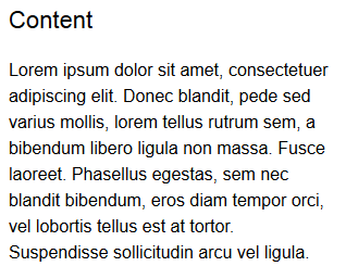
Make Your Font A Little Bigger

CSS Rule: “font-size: 14px; font-family: “Arial”, sans-serif;”

CSS Rule: “font-size: 16px; font-family: “Arial”, sans-serif;”
The first and easiest change to make is to just enlarge your font, just a bit. This isn’t just for nearsighted people like me, either–bigger font simply looks easier to read for everyone. Even the change from 14px to 16px, as depicted above, can be enough to make words more distinct at a glance. Visually, it looks more appealing already–and visually appealing content means readable content, which means your site has an audience. Awesome!
Space Your Lines Out a Bit
CSS Rule: “font-size: 16px; font-family: “Arial”, sans-serif;”
CSS Rule: “font-size: 16px; font-family: “Arial”, sans-serif; line-height: 24px;”
Bigger font, however, looks even better when spaced apart a little bit more. Ever wondered why your teachers always asked for double-spaced papers? As a former teacher, I found out that my eyes boggle less when the text isn’t all scrunched together like it just went through a trash compactor (especially when grading dozens of student papers late at night). Your site visitors likely think the same–respect their eyes and give each line of text a good amount of space with the line-height property.
Use Subtle Color in Your Headings and Subheadings
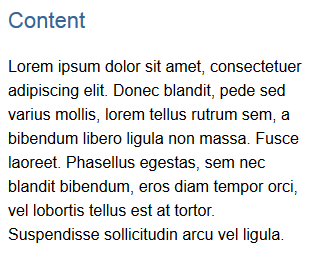
CSS Rule (heading only): “font-size: 22px; font-family: “Arial”, sans-serif; color: #336699;”
Using font colors in a webpage doesn’t have to involve crazy-bright hues. Even just a little color in your headings and subheadings, slightly different from your body font color (like the deep blue alongside the black in the above image), can help visually separate your content out. For all types of readers, whether they gobble down words or savor each mental morsel, the heading and subheading color is another cue that the topic has changed and they need to pay attention. This helps your readers take in your content more easily and understand it quicker.
Summary
Styling your content, even with just the few simple changes outlined in this article, can be the difference your site needs to become widely read. After all, content is why sites exist–let’s make it as appealing as possible!
Redo: What’s a footer for?
For today’s webdesign post, I went back and tidied up my post about designing footers. Now the pictures are fully clickable and expandable (in new windows), and the content is not outdated anymore! YAY!
I Hate Slideshow Articles!

As an Internet user, I inwardly groan upon discovering that an article I really wanted to read is actually a slideshow. In fact, it’s one of my top pet peeves of Web content formatting!
I’m not alone in this opinion: there are articles about why slideshows should be banned entirely, as well as workarounds for those of us who hate slideshows and other multi-page articles. (There are a few people who defend slideshows as a practice, but even they admit that the format can be overused.)
Since I’m both a Web content consumer AND a Web content writer, I studied this problem from both angles. Why do slideshows bother me so much, as a user, and why might Web content formatters choose this format when so many users hate it? The 4 following reasons explain why:
Why We Should Stop Using Slideshow Article Format
#1: It’s basically a strategy for getting page ads to load more often per user.
Above all, this is what irritates me about slideshow articles: they are invariably riddled with ads (including that dadgum “Ad Slide” that always pops up right in the middle of my reading and disrupts my whole thought flow). It actually feels like the content formatters are highlighting the ads INSTEAD of their content.
News flash: users hate ads! As a user, I don’t care if those ads are “paying for your site”–I don’t want to be bothered with them, ESPECIALLY not when I’m trying to read your admittedly interesting content. Making me click through a 10 or 12-page article just so you can get a few more cents feels like a huge tease. (And as a content writer, I know that the LAST thing we ever want to do is make our users feel like we think of them as money-generators and nothing else.)
#2: Because each slide is so short, the articles end up feeling skimpy on content.
You’d think that if an article is 10 pages, it would actually have some decent content, right? But unfortunately, in the slideshow format, article content is often compressed and badly written to fit alongside or under pictures. Each slide usually contains maybe 5 sentences, which may be enough to satisfy some users, but leaves this English major feeling pretty cold. Explanations are often glossed over in favor of using a picture that usually doesn’t really explain anything, and so the whole article feels rather useless.
Being a largely text-based content creator, I don’t want to waste my users’ time with insipid articles like the ones I end up clicking through all too often. If I’m taking the time to write an article, I want my users to feel like they’ve really learned something at the end of it. And I’d rather not have the format of the article steal emphasis away from my content.
#3: Slideshows don’t work well on mobile devices.
I’ve noticed this while trying to read slideshow articles on my tablet and smartphone–slideshows (especially the pictures!) are usually so huge that the mobile screen has to be scrolled around the page to read everything. And what if the screen can’t be zoomed out or in? Sorry, this content just isn’t visible, and you wasted your time clicking on this article. (Trust me, it’s happened more often than not!) There are some websites I actually just don’t visit on mobile (though I’d like to), because all their articles are slideshows and I can never read the content anyway. (Not to mention that tapping your touchscreen to advance to the next slide is very frustrating when you have big fingers and are trying to target small buttons/text!)
I realize that there are quite a few hurdles to jump when it comes to making slideshows mobile-friendly. In fact, the whole slideshow format seems ill-equipped to handle mobile users in general, from what I’ve been able to see. With that in mind, why aren’t we moving away from slideshow format to something that actually works on all devices?
#4: It makes reading the article take a lot longer.
Admittedly, this is probably my impatience/A.D.D. talking, but I am a fast reader and prefer to scan articles rather than sit and read each line word by word. Having to stop reading to click on to the next slide is an unnecessary block in my information digestion process. Not to mention that the pictures take longer to load than the text, and sometimes the slideshow article software decides to hang in the middle of the article. All of these factors make reading slideshow articles much more of a drag than they ought to be.
Those of us who write and format content for the Web have to be careful of frustrating our users like this. After all, a frustrated user is a non-returning user. Do we REALLY want people turned off from our awesome content because of the way we formatted it?
Redo: Navigation Placement, part II: New Ideas to Try
Today, we’re revisiting the long-ignored second part of my Navigation Placement series, New Ideas to Try. I have significantly revamped the post, making it about 300 times better (and with more mobile-friendly design advice this time!). Click and read through!
I’m Not a Typical Blogger (and That’s OK)

As a blogger, sometimes I feel pressure to be more like the other members of my website genre. I look around on other blogs and think, “Man, I ought to be doing that–I bet I’d be more popular.” Have you ever thought that?
For instance, I see other bloggers post zillions of pics of their offline lives, and I feel guilty that I don’t take enough pictures. Or I see them post blurbs about their real lives, almost like a diary entry of sorts, and I end up feeling dumb because my real life is literally not interesting enough to write about all the time. (Trust me, I’ve tried many times to keep a journal, both offline and online, and I even bored MYSELF to death.)
Not only that, but all I’m doing is writing advice articles (most of the time) or trying to get across a philosophical point based off my own experiences. I don’t do any real “crafty” stuff that most bloggers are doing these days; I don’t make goodies for my visitors, and I don’t do giveaways…
Why Trying to “Fit In” with Other Bloggers is Wrongheaded Thinking
It’s pretty clear I’m not like other bloggers. And that is actually OK, even though I still worry about it sometimes.
After all, crafting and photos aren’t my passion, so why should I force myself into doing posts about them, even if it would make my blog more “popular” (which, considering the glut of blogs on such topics, wouldn’t likely work)? It would be as pointless as me in middle school wearing heavy makeup because all the other girls were doing it–I did it because I wanted to fit in, but I hated it and it felt fake.
Instead, why shouldn’t I focus my energy on writing posts that I thoroughly enjoy? My passion for my subject matter will come through and make my writing more compelling, and since I’m writing on topics that are fairly different from the blogger status quo, my site could even be a refreshing change for users. Just because I’m not getting a lot of comments doesn’t mean my blog is unsuccessful; just because I’m not doing what everyone else is doing doesn’t mean I’m not worthy. And the same goes for you and your blog/website.
The Takeaway: Your Blog Should Reflect YOU, Not Blog Trends
If you like to craft and you run a blog, definitely feel free to post crafting articles. If you love to take pictures, showcase them on your blog with no regrets. If you like to write about music and post songs/videos, do that to your heart’s content. And if you write about anything and everything because it interests you, go right ahead–the Internet is big enough for us all. We bloggers don’t HAVE to do anything to be popular…except post!