Category Archives: Monday in the HTMLab

All about web design and development, and my triumphs and defeats therein.

Glasses Off: 4 Excellent Web Development Sites

Given that I generally blunder around a lot when it comes to backend coding, I often need to refer to others’ web development wisdom–not only to fix my own problems, but to write helpful articles of my own on these Monday posts. Here are four sites I find myself relying on for all this help and more:

Sitepoint
From HTML all the way to Ruby on Rails, and every major web programming language in between…this site is invaluable to me!

Tizag.com
This site’s MySQL and PHP tutorials are some of the most common-sense tuts I’ve ever read (and that’s a huge compliment!).

Nettuts
Whether you’re developing ASP.NET, HTML, Javascript, CSS, Python, or a host of other languages, Nettuts probably has a tutorial section for you!

WebProCafe
This forum provides a place for all us developers and designers to share ideas, ask questions, and offer help.

Glasses Off: 4 Awesome Webdesign Sites

Here in the HTMLab, I’m fairly skilled at what I do (namely, HTML and CSS), but many of my articles would not be complete without some heavy-duty online research and self-teaching. Listed below are four sites whose tutorials make it easy for even this self-taught, non-technical webdesigner to understand:

WebDesignerWall
Awesome articles abound here about the subtler points of design (which I definitely need help with!)

WebDesignLedger
This site covers everything from helpful webdesign tools to overarching Web trends…really informative!

Webdesign Tuts
Need a tutorial on how to make a webdesign visually work? Webdesign Tuts (part of the TutsPlus network) likely has the help you need, for both front-end and back-end design.

Webdesigner Depot
This site literally runs the gamut of everything a webdesigner is concerned about (even marketing and branding)! You could spend hours browsing and learning.

3 Tips for Naming Site Folders

What I’m discussing today is nearly as important as designing and developing your site, yet it is often ignored: naming your site folders. The way we name our folders affects the efficiency of our site’s internal structure, the URLs we have to type in our code, and even the URLs that our visitors see (if you’re not using nifty PHP coding tricks to make your URLs pretty).

So, how do we name our site folders appropriately for all these scenarios? Read ahead!

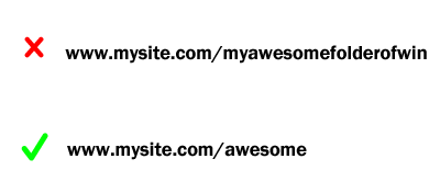
Keep Site Folder Names Short

shortfolders

The shorter your folder names, the less you have to type in for every URL you code in on your site…and trust me, you will be glad you made this decision, no matter how big or small your site is. Less typing, especially on EVERY URL, is GOOD!

Don’t Capitalize Folder Names

nocapsfolders

Not only do partially capitalized folder names look amateurish to the user, but they also can pose coding problems, especially with lowercase Ls and uppercase Is in certain fonts. Misspelled URLs are broken URLs!

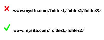
Don’t Nest a Ton of Folders Together

shortnestfolders

Nesting a lot of folders together looks clunky on the user’s end of things, plus it opens up a lot more opportunities to mistype a URL (and thus break it). Keeping your folder nests small (only two folders deep if at all possible) will save you a lot of time and trouble debugging later, and it will also look neater in the address bar. (Additional benefit: you don’t have to go digging around in hundreds of folders looking for ONE file!)

(Important caveat: Some web development software forces you to have tons of folders nested together for security purposes, like user passwords and information; if this is the case, leave those folder nests alone. But if you have total control over the site organization, make it as simple as possible for your own sanity.)

Summary

Making your folder names short and lowercase, plus simplifying them as much as possible, will save you time and effort coding. (Plus, anything that makes your site look more professional is definitely a good thing!)

Next-Gen Headers for Responsive Design

As users get more and more used to mobile browsing, we webdesigners are keeping up with that trend, making our sites ever more mobile-friendly. And nothing has shown that mobile sensitivity more than the responsive header, which not only resizes, but shifts its design slightly with the screen size.

Before we dig into how to make this happen, let’s look at a couple of examples from around the Web:

Visual Example #1: FunnyOrDie

fod_full
(Desktop view)

fod_mobile (Mobile view)

See this responsive header in action: FunnyOrDie.com

Visual Example #2: SmashingMagazine

smashmag_full
(Desktop view)

smashmag_mobile (Mobile view)

See this responsive header in action: SmashingMagazine.com

How Do We Make This Happen?

Combine Site Branding and Navigation in One Bar

An iconic site logo/site name and some simple navigation is the most mobile-friendly design choice. But that does not mean that your desktop users have to look at a boring header design! Both FunnyOrDie and SmashingMagazine’s navbars are both more complicated and elaborate on desktop view, with descriptive text added to icons, greater space between navigation links, and more subtle plays of color.

Make Your Header 100% as Wide as the Page, and Pretty Skinny

Make sure your header bar is always 100% of page width, so that it resizes with the screen size. Also, a navbar that is 100-150px tall translates well between screen sizes–it gives the mobile user enough screen space to tap on, while still being unobtrusive to the desktop user’s experience.

Fix Your Header Bar in Place

As described in my fixed navbar tutorial article, a combination header/navbar that scrolls with the user is infinitely more friendly, especially on mobile. It gives the appearance of an app without having to actually make an app for your site, and it makes quick browsing much easier.

Use Icon-Only Navigation on Mobile

Using tappable icons rather than text on mobile screens is much easier and quicker to view, and it keeps the navigation as small as possible (depending on how many links you have). (Notice that both FunnyOrDie and SmashingMagazine use a three-horizontal-line icon to give you access to full navigation.) This can be done using a CSS @media query to switch between displaying text and displaying icons.

Summary

Making a sleek, responsive header is key to making your site mobile-friendly, and it can be done with just a few code tricks! Try these suggestions and see what kind of mobile magic you can work!

Making a Sidebar Mobile-Friendly: 3 Solutions

I used to think the sidebar on a website was absolutely necessary–it was a place to hold navigation links, affiliates, site introduction, and all sorts of cool tidbits that I wanted to display on each page.

This was all well and good when we all browsed the Internet using large desktop and laptop screens. But now that many of our visitors could be using tablets and smartphones to view our pages, we need another strategy…because a sidebar on a smartphone screen means lots of zooming in, and the sidebar content just gets ignored anyway.

One reason I haven’t yet posted my blog’s new design is because I’ve been struggling with this issue: how do I make my page look interesting enough on a large screen, without making it almost impossible to view normally on a small screen? Thus, I set out to answer this question for the ages–and I discovered that some fairly simple solutions existed!

Solution #1: Cut Out an Unnecessary Sidebar

If your sidebar only includes a couple of introductory blurbs about your site and yourself, you could potentially get rid of the sidebar entirely on both desktop and mobile views.

These days, many designs feature a single-column layout with navigation across the top of the page in a horizontal bar, which scales down nicely to mobile screens. (Don’t despair, though–you can condense your introductory blurb down into a neat little slogan and still use that above your navigation!)

Solution #2: Move Sidebar Content Around for Mobile

If you’re like me and include blogrolls, affiliates, ads, and other such sitely things in your sidebar, you definitely want to make sure those stay on every page in desktop view. But for mobile, remember that most mobile users are mainly coming to view your content, so you want to make sure nothing else steals the content’s thunder.

Thus, you could dispense with the sidebar and move its content to somewhere else on the page, or on a separate page entirely for mobile users. A fixed bar across the bottom of the page could work for site ads, while a mobile-only page could work for blogrolls and affiliates, and so on.

Solution #3: Make the Sidebar Disappear on Mobile Browsers

Now we come to the solution which involves the most code–but it’s actually really simple once you think about it. If the sidebar is an issue for mobile browsers, why bother having the mobile browser load a sidebar at all?

This is achieved through the wonder of @media queries, which help you target CSS styles and rules for specific media types (like printing versus viewing on a screen) and specific screen sizes (like handheld devices). Here’s how it would work for hiding a sidebar from mobile viewers:

#sidebar {
width: 200px;
float: right;
padding: 5px;
background-color: #222222;
color: #FFFFFF;
}

@media handheld {
#sidebar {display: none;}
}

Here, the @media query encapsulates another #sidebar rule. Make sure you have your outside curly braces in place around the #sidebar display: none rule, otherwise this code will go completely bonkers! (Learn from my fail!)

IMPORTANT!

There’s a slight catch to this method, however–iPhones and iPads don’t recognize “@media handheld” in CSS. So, here’s the workaround:

@media screen and (max-width: 480px) {
#sidebar {display: none;}
}

(This particular @media query can also be structured as “@media(max-width: 480px)”, according to some sources)

Placing This in Your CSS

Make sure to put these mobile-only styles at the bottom of your stylesheet, so that they are the last things to load and won’t confuse the desktop browsers.

Summary

Sidebars need not be a responsive layout deal-breaker! You can make them behave or change them around as you need to–their content and placement are not set in stone. These 3 tips should help you (and me) get our websites mobile-ready with as little hassle as possible.

Further Reading/Credits

ArtOfBlog: Print and Mobile CSS (VERY helpful for newbs like me)
StackOverflow: Hiding WordPress Widgets on a Mobile Device
WeaverTheme: How to Have Alternative Page Display on Mobile
KyleSchaeffer.com: Responsive Layouts Using CSS Media Queries (read the comments on this article for even more insight!)
CSS-Tricks: Detect Mobile and Redirect (not EXACTLY about this issue, but tackles some of the same responsive design issues that crop up. VERY technical discussion, but informative!)

camelCase and 2 Other Tips about JavaScript Variable Names

When it comes to JavaScript variable names, you have to keep in mind that JavaScript is like many other web programming languages–it’s picky about capitalization, spelling, and spaces. (And when I say picky, I mean PICKY.)

This doesn’t mean that you have to be a perfect wordsmith to write JavaScript code; you do, however, have to debug your code carefully, because one simple typo can cause your whole script not to run. Here are 3 common pitfalls:

Capitalization (Like camelCase)

Often, you’ll see examples of JavaScripts floating around on the Web with object and function names like “myObject” and “getPage.” These are both examples of camelCase, or the act of combining two words together and then capitalizing one or both words’ beginning letters. (This is also called Embedded Caps, nerdCaps, and a whole host of other terms, LOL!)

Since JavaScript is case sensitive, you have to be careful when you’re writing object and function names with CamelCase in mind. “MyObject” and “myObject” are treated as two different objects; “GetPage” and “getPage” are also treated as two different functions. Read over your code carefully and make sure all your variable capitalizations match!

Spelling (Yep, It’s Still Important)

Along with the issue of capitalization, the spelling of your JavaScript objects and functions matters, too. If you spell your function as “myAwesomeFunction” in one part of your script, for instance, and then misspell it as “myAwseomeFunction” elsewhere, then JavaScript treats those as two separate functions, and you likely have a non-working script.

You wouldn’t believe how many times a careless spelling mistake has thrown my coding off. (One tip: if you’re having trouble spelling the name of the function or object, consider either changing the name to an easier-to-spell option, or setting aside the hard-to-spell name in a little text file and copy-pasting it every time it comes up in a script you’re writing.)

Spaces in the Variable Name: Just Don’t

One reason so many JavaScript developers use camelCase or other forms of combined-word variable names is because JavaScript does not like for variable names to have spaces in them. Thus, if you have a multi-word function or object name, you combine the words, but keep the capitalized letters to make it easier to read.

Sometimes spaces can crop up if there’s an accidental line return in the middle of your file; resizing your script file’s window to check for these line returns could possibly help you debug a script that just won’t run! (This trick saved me some hair-tearing when I was a webdesign newb trying to get a script to work…I had NO idea what was wrong until I maximized the window and saw the sneaky little space hiding in one of the function names!)

Further Reading

W3Schools: JavaScript Statements
W3Schools: JavaScript Object Intro

4 PHP Security Pitfalls to Avoid

For PHP developers of both newbie and veteran status, there are always new ways in which hackers exploit our carefully-crafted scripts. We have to keep tabs on newly discovered security holes in our scripts, as well as minding how we construct our pages so that people can’t just inject a bunch of code into our websites, all so that our sites will run the way we want them to, and so our users’ data will be protected.

Thus, I bring to your attention the following 4 PHP pitfalls, which are vitally important for us to be aware of as we build our sites. (Incidentally, this post started out as a “PHP tricks” post, but when I saw just how many blog posts are out there already with that premise (and how many of them advocate unsafe code), I thought it best to research PHP security problems instead. And boy, did I ever discover some doozies!)

#4: Exposing Your Filepaths to Users

Most users won’t care much if the paths to various files on your site are easy to guess (or easily viewable in their address bars). A few users, however, may choose to take advantage of that–not just for hotlinking your images, scripts, etc., but for stealing data that is supposed to be secure! Yikes! If you’re running any kind of site with
logins and passwords, especially an e-commerce site, easily-visible filepaths are BAD!

So, how to fix this? Thankfully, there are fairly easy PHP scripts that can disguise a file’s real path on your server with variables, making it much more difficult for hackers to guess where a file is. For instance, motov.net has an example script that is only 13 short lines of PHP code!

#3: Not Securing Your Databases

As mentioned in #4, MySQL databases with logins, passwords, credit card info, etc. are very juicy targets for hackers. If you don’t build in protections for all this sensitive data, your site could end up being victimized, leaving you with very angry users!

PHP.net has a series of articles on how to design your database for better security, how to securely connect to such a database, and more. Layering database security, just like layering clothes before you go out in the cold, can really help protect your users’ data! (Also, WebmasterWorld’s forums has a post about securing database connections which may be of further use.)

#2: Leaving Your PHP Sessions Open to Hijacking

Any time you have users logging in to a site, you are most likely incorporating a PHP session ID, a unique number that tracks them around the site so they don’t have to keep logging in every time they go to a new page. Unfortunately, hackers can get hold of those numbers if they’re easily guessed or stored in an insecure location (see #3). You might not think somebody could wreak much havoc with just a PHP session ID number, but a hacker could end up stealing somebody else’s whole account with just such a number!

To keep your users’ session ID numbers safe(r), consider some of the tactics suggested on this StackOverflow topic, including SSL connections, randomly-generated ID numbers (instead of incrementally increasing numbers), and sessions that expire within shorter time frames.

#1: Leaving Your Site Vulnerable to SQL Injections

When we PHP developers, especially newbie developers like myself, write MySQL queries pointing to our databases, sometimes we forget that malicious users exist for a minute. We forget to keep our very PHP script files safe from “SQL injections”–that is, targeted code attacks that fiddle with our SQL queries just enough to dig up data from the database, rewrite it, or even delete it all!

To keep your SQL/MySQL code from being fiddled with or just plain overridden, PHP.net has an excellent reference article which explains several code tactics you can use, such as connecting to your database with a user specifically limited to the task you’re trying to complete, checking that the inputted data is the right type, etc. This StackOverflow topic about preventing SQL injections may also be helpful as you tackle this tricky issue.

Summary

All of these precautions may seem unnecessary, especially to newbie PHP developers, but these are all giant security holes that can cause us a lot more headaches and frustration (not to mention user anger). Nip these problems in the bud, and you’ll be saving yourself a lot of time and trouble later!

Oh, the Things PHP Can Do!

Since I’m largely self-taught in all things webdesign, PHP can be both frustrating and magical, a box full of wondrous tools I know neither the origin nor the use of. If you’re a newbie developer like me (or even if you’re somewhat familiar with PHP), you’d be surprised how much PHP can accomplish for your website these days:

Collecting Feedback

This article at CodeTricks.com explains how to make a really simple feedback form, which emails you comments and questions that people have submitted. (This tutorial covers both the HTML form part and the PHP part, so I find it VERY informative!)

Displaying Thumbnail Photos in a Gallery

Nettuts’ article covers one way to easily display photo thumbnails with a few lines of PHP code–much better than having to host your photos on another site, or worse, making an HTML table for your images and resizing all your images yourself. (Been there, done that :P) Scroll down to #12 on Nettuts’ article to find out more!

Making Easy Site Templates

This PHP article at About.com shows you how to use a PHP header and footer to create a site template, which you can change easily by editing the content of just those two files. (I use this trick on almost all my sites–it makes my webdesigning life SO much easier!)

Automatically Sending Mail to a Mailing List

Nettuts also covers how to use PHP to send mail to a specific list of people–who knew there was such an easy way to automate it? (Just scroll down to #8 on their article to see more on how to code this.)

Redirecting Your Visitors to Your New Page

Need to redirect your users to your new page without requiring them to click another link? Over at About.com, they show you how to use just a line or two of PHP code on a mostly-empty page to get it done! (I had no idea it was this easy! WOW…)

Creating Your Own Content Management System

This post at CSS-Tricks.com shows you how to set up a MySQL database, make a specific table for posts within that database, make a simple submission form so you can add posts, and display posts using PHP on a webpage. Basically, it shows you how to beat blogging websites at their own game! (Can be a little technical in parts, but it has links to other articles for extra explanation)

Summary

Can you believe PHP can handle all this–and more? I sure didn’t, until I did research for this blog post and realized just how much PHP can help us webmasters with our tasks. Try implementing one or more of these techniques for your site, and see how much time it can save you!

Making and Maintaining a Facebook Page for Your Site

Whether you’ve got a blog, small hobby website, hosting site, or anything else Web-oriented, these days making a Facebook page is nearly required for increased audience and popularity. For instance, since I made a Facebook page for Crooked Glasses recently, I’ve noticed a definite surge of interest (if not comments), and it feels as though I’m finally engaging with readers that I had been unintentionally leaving out for a long time.

Making a quality Facebook page, however, takes a little bit more effort–but once you put in a little time, you can create a polished, attractive, easily-updated Facebook presence for your site! Here’s how:

#1: Make a fitting icon and cover photo.

fbpage_iconcover
Your icon and cover photo are very important to your site’s branding–they create an instant visual impression that can often make the difference between visitors clicking to visit or hitting the Back button. With the right images, you can really make their first few seconds on your page count!

Here are the dimensions and formatting requirements for each image:

  • Cover photo: At least 900px wide for current FB layout style; it doesn’t seem to matter what height it is, but mine is about 330px. Must be JPG format.
  • Icon: At least 180 x 180px; must be JPG format.

Your icon should be fairly simple and snappy, with high contrast and easily-visible shapes, so your page can be quickly recognized in the Facebook News Feed. Your cover photo, by contrast, should be a little more “in-depth,” giving your page a “mood” and a good sense of what your site is about. (This is why I chose the simple black-glasses graphic for my icon and used a real photo of my actual glasses as the cover photo for Crooked Glasses’ page.)

#2: Come up with several unique URLs you can use for your page.

Before you actually start the FB page creation process, brainstorm several short but descriptive page names for your URL, just in case your preferred one is already taken. (For instance, I had to go with “crookedglassesblog” instead of “crookedglasses” because the latter was already taken.) Make sure that you’re happy with your URL and that it’s spelled correctly, because you won’t be able to change it once it’s selected!

#3: Fill in all your page info (and I mean ALL).

fbpage_pageinfo
Take time to fill in just about everything about your site that is appropriate, from Founded date to About section and everything in between. (Warning: the “Company Info” section, not the “About” section, is the text that will be displayed on the front page underneath the “About” heading, so make it good! Also, be sure to include your website link in Company Info so people have a convenient link to click.)

#4: Invite every Facebook friend you have.

I know it might seem a little crass to send invitations to all your Facebook friends to like your website, but you never know who might like your page if you only give them the chance! Plus, it gives your page that much wider reach as your friends and family like and share your posts with their friends. Think of it this way: you’re giving them something new and entertaining to look at and enjoy.

#5: Post every day–about anything and everything related to your site!

fbpage_postdaily Make sure you post to your site’s Facebook page every day, so that people remember it exists. Don’t think you have to just post your blog articles or site updates, either–post about things you’re planning for the site, or even just a random funny update. Remember, keep your page looking lively, and people will come visit!

#6: Share articles and posts through your personal Facebook feed.

At least two or three times a week, share some of your site’s Facebook posts, perhaps ones you want to showcase or ones you want feedback on. This reminds people who disregarded the Page invite that your page still exists, and shows them a little of what they’re missing. Also, newer friends who didn’t receive an invite can be exposed to what you’re doing on your website. It’s a win-win!

Summary

These 6 steps will help you not only build a great-looking and well-functioning Facebook page, but will also help you keep it active and user-friendly. Visitors will enjoy coming to your page and staying updated, and that’s the whole point of a Facebook page, after all!

The Webdesigner’s Design Decision Cycle

As webdesigners, we have to make our sites both informative and beautiful to view. This takes a careful balance of design ideas, which need to be constantly upgraded and improved as users’ needs change.

Thus, the reason I came up with the following graphic depicting the considerations that go into making good webdesign decisions. I call this a “cycle” because we webdesigners never completely stop reevaluating our own decisions–we’re always coming up with ways to do it better, whatever “it” is!

webdesign_decisioncycle