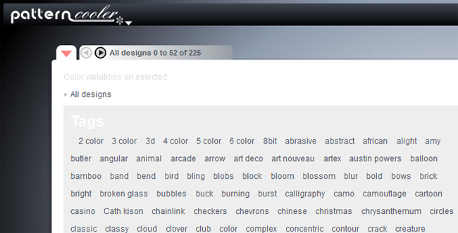
Category Archives: Monday in the HTMLab

All about web design and development, and my triumphs and defeats therein.

Using and Styling Infinite Scrolling

infinitescrolling
I came across the curious idea of “infinite scrolling” in the past week, as I searched for ways to make a Tumblr theme less annoying to browse. Especially on blog sites like Tumblr, the idea of having no page numbers to click has caught on as a way to make browsing easier–new posts and search results pop up without having to click or tap again.

Google’s Image Search and Pinterest both famously do this, as well as Facebook, Twitter, and 9gag–and those are just the websites I use most often that have infinite scrolling enabled. It’s becoming more and more popular with mobile-friendly sites especially, since scrolling on a mobile device is as simple as the flick of a finger. But I wondered whether it was really worthwhile. Should I dedicate time to learning this technique and using it on my pages, just because it’s Internet-popular?

I decided the best way to test it was to approach infinite scrolling as a user would, rather than as a designer. Read on to find out pros and cons, which sites can use infinite scrolling, and how best to style and set up your infinite scrolling layout!

Infinite Scrolling: Pros and Cons from My Experience

Pros

  • Passively taking information in has never been simpler
  • Works great when all you have to do is click briefly on something to save it for later
  • Especially easy to browse for images this way
  • Great for scanning items quickly for content

Cons

  • Can’t reliably return to your “position” in the item stream if you follow a link or click to “read further”
  • Always updates so you never get to the bottom of any results
  • Item feed usually displays one at a time, so it can get boring to search through endless data
  • Hard to find items again if you pass them by accidentally

Where Infinite Scrolling Works Best (and Worst)

If you have a website with quick blurbs of content and images, where links don’t take you out of the “stream” of information, infinite scrolling works well. This is great for news sites and some blogs–and I can see why it’s become popular with Tumblr themes, too. When you’ve got lots of posts with just a few images, a quote, or a short paragraph, infinite scrolling saves your user a lot of clicks.

But if you’ve got a website with a lot of links or in-depth content, such as this very blog you’re reading right now, infinite scrolling is definitely not your friend. Users will have a hard time searching your site for information, and every time they click to “read more,” they end up at the top of the page–very frustrating! Infinite scrolling on sites with fewer but longer posts (and/or more links to external content) doesn’t work nearly so well.

If You’re Going to Use Infinite Scrolling…

  • Make sure your posts are tagged thoroughly so that once people find one post they like, they can use its tags to find other similar posts on your site. (Example: an LOLcat picture could be tagged with “lolcat”, “cats”, “humor”, and “meme”.)
  • Use CSS to design your posts so that each one stands out on the page–make your posts’ headlines big and bold, surround each of them with a differently-colored “box” from the background. Anything you can do to separate out individual posts while people browse will help them navigate better!
  • Make your navigation either stick to the top of the page or scroll in a fixed position alongside the content. Infinite scrolling where navigation is only found at the top of the page = NOT a great idea, at all.
  • Give your users a separate “tag list” page where they can quickly scan through and see what kinds of posts you have on your site. That way, they don’t have to waste time scanning through your post stream to find things they like.

For Further Reading

jQuery4U: 5 jQuery Infinite Scrolling Demos
Awwwards: Best Infinite Scroll Websites
NNGroup: Infinite Scrolling is Not for Every Website
SmashingMagazine: Infinite Scrolling–Let’s Get to the Bottom of This
CodySherman.com: Infinite Scrolling Javascript

What IS “Flat Design” and Why Should We Use It?

flatdesign
After seeing several webdesign blogs mention “flat design” as a still-up-and-coming design trend for 2014, I was intrigued. “What do you mean, ‘flat’ design? Ain’t the screen flat already?” I thought, jokingly.

At first, I wondered if perhaps the CSS box shadows, pretty text bevels, and all of that had started going out of style–you know, the stuff I worked really hard to master and have just now begun implementing into my new designs. But the answer is a lot more subtle than that.

Flat Design: A Feeling Rather than a Set of Rules

The Ultimate Guide to Flat Web Design is where I began my research, and after perusing the screenshots of several different “flat design” layouts, I began to understand. Not only was flat design already a “thing” on the Web, but it wasn’t necessarily just “flat” as in boring. It was, instead, a certain minimalist approach, a “less-is-more” feeling…and it was EVERYWHERE.

A few examples:

flatdesign_tumblr
Tumblr’s login form, for instance, has elements of flat design; the fonts are simple, the text boxes are only very slightly rounded (VERY slightly!), and the colors are basic (white, blue, and a touch of gray here and there). And yet, there’s an elegance in this simplicity–there is no high-gloss “Web 2.0” feeling, but it still looks “finished.”

flatdesign_wordpress
My WordPress login screen is treated very similarly–subtle variations between colors, pictorial icon rather than text logo, and clear, readable fonts. Notice on the right and bottom sides of the form, there is the very faintest shadow, just barely there.

flatdesign_wmworg
Here’s the most surprising example of flat design, at least to me–this comes from Version 13 of my own domain’s layout! In my search to give my layout a new, icon-heavy/pictorial feel, I quite by accident wove in some flat design aesthetics. You can’t call my color choices “subtle” (LOL), but the simplicity of the icons and fonts still fit.

Basically: Flat Design = Natural Makeup

Flat design is to webpages as “natural” makeup is to faces. I know that’s a weird analogy, but it’s accurate. When you choose natural makeup, the point is to not LOOK made-up–it’s all about enhancing the bone structure and features that are already there, with skin-like shades and very careful, subtle color placement. Flat design does the same thing, with 1px strokes of faint shadows, minimal color choices and simple icons, and only the very subtlest shaping and rounding of page elements.

Where Can You Use Flat Design?

Thankfully, like all web trends, you can choose to hop aboard the “Flat Design Train” or not. The look can be too boring for some and too cold for others, especially if used all over the page. Some projects just don’t need that much minimalism (as weird as that sounds!).

That’s why I personally advocate using flat design for your basic page functions, such as navigation and web forms, and perhaps use a more striking graphic or design aesthetic for news, updates, or anything else which needs immediate user attention. Just as a makeup artist balances a strong red lip with just the barest touches of eyeliner, flat design’s concepts can provide just enough styling to your page to make it look polished, without detracting from your most important content.

Summary

Give flat design a try with your next design–toy around with shading things just right, picking simple yet effective icons and fonts, etc. Who knows, you might find your next idea hiding amid your musings!

Should You Make a Single-Page Site?

As a relatively “old-school” designer (having learned way back in 2003), the idea of a website having only a single page seems really weird. And yet, according to some folks in the webdesign world, it’s one of the hot new trends for 2014. It baffles me. I mean, a website’s supposed to be about content, right? And content needs to be divided up into pages, doesn’t it?

The answer: Not necessarily! There are actually several instances where a single-page site can serve you well. See the following examples:

Sites Which Work Well with a Single-Page Format

Portfolio Page

If, like most webdesigners, you choose to host your own portfolio page on your website, a single-page site should do well for you, since all you need for a portfolio page is your contact info, examples of your work, etc. And with a little careful page design, you can have a single-page portfolio where the user doesn’t even have to scroll much–thus, interested users don’t even have to click to see all they need.

App or Service Page

If you’ve made an app or are providing an Internet service, most times you won’t need a heavily-involved website. A small write-up (with screencaps) of what your app/service does, support/contact information, and links to download any necessary software, and you’re pretty much done. (Just make sure your single-page site is mobile-friendly if it’s for an app!)

Personal Site

Unless you just want a full-on site about yourself, your personal site can be more like a quick window into your life–your latest tweets, last listened tracks, and a small bio, for instance, or whatever you’d like for visitors to know about you. A single-page personal site can be tidy and still informative.

Small, Extremely Focused Fansite/Fanlisting

If you’ve made or want to make a small fansite or a fanlisting, the single-page format can work REALLY well. Think about it this way–it’s less pages to code and less for your users to click through. (This works best if your fansite/fanlisting has 10 or less pages of content.)

Sites Which Should NOT Be Made into Single-Page Format

Large, Intensive Fansites

If you have a HUGE fansite or topic site, a single-page format is definitely not the best idea. With a large site, you want to make sure your content is well-organized, which often means breaking it up into separate pages. That way, users can go right to what they want with a single click, rather than making them scroll for days.

Sites with a Lot of Topics

If your site has a slew of topics (like this blog, for instance), a multi-page website is better, both for content organization (as explained above) and linkage purposes. For instance, if someone is only interested in my Saturday with the Spark posts, he or she can simply bookmark my “Spark” tag page, rather than having to scroll through a ton of other posts to find the one or two desired-topic posts and read them.

Summary

Single-page sites can simplify your webdesign workload greatly. If you’ve already got a small site, give this kind of site organization/layout a try!

Web-Safe Fonts: There are More than You Think!

When it comes to using fonts for my websites, I admit I’ve gone the “super-safe” route more often than not. In search of making my text readable on all devices, I end up using Arial, Garamond, Georgia, and Verdana…and that’s pretty much it, since I avoid Times New Roman like the default plague it is.

Imagine my surprise, then, when I learned that there are plenty of other web-safe fonts available–and even some which are friendly to multiple operating systems! Here’s how to make this work for your site:

Explore Which Fonts ARE Web-Safe

CSSFontStack is an excellent resource to begin searching for the web-safe fonts you want. It displays OS statistics on the most commonly-used web fonts, so you’re more aware of which OS (Mac or Windows) likely carries your chosen font. VERY handy!

See Which Mac and Windows Fonts are the Same

This Windows and Mac fonts list shows you which fonts are designed alike (for instance, Verdana and Geneva, Lucida Console and Monaco, Book Antiqua and Palatino). This will not only help you pick a good cross-platform web-safe font, but it will also help you choose fonts for your font stack in your CSS document (see next point!).

Build Your Font Stack Varied and Strong

As this W3Schools page shows, you can’t safely specify just one font name and be done with it–you must give the users’ browsers a range of fonts to choose from if one or more of the specified fonts is not natively installed. This range of font options is called a font stack, and will save your users from having to read your content in a really odd font.

See Examples of Font Stacks

Sitepoint’s “8 Definitive Font Stacks” article is a great jumping-off point for your sites, either to use directly or as a template for designing your own font stack. This will help you make your font choices as web-safe as possible!

Summary

Choosing fonts for your website content doesn’t have to be “same-old, same-old”–using these web resources can help you pick stylish yet standard choices for your design! (And now if you’ll excuse me, I’m off to select some new favorite fonts! :D)

Don’t Forget to Credit Your Design Sources

Sometimes we get all swept up in the process of design and we forget exactly what font we used, where we found those Photoshop brushes, what site Google Images found that picture, etc. It may not seem like a big deal, but it’s actually important to credit other people’s work, especially when their work has made yours possible. Not only does it create good feeling among the creative crowds who make the stuff you use, but it also raises awareness about their work and may draw more interest their way! In webdesign, we’re all helping each other with links, after all!

So, here’s a handy little guide to crediting your design sources (and adding credits where none were before):

Properly Crediting Design Sources to Begin With

  • As you find brushes, fonts, graphics, photos, etc., copy-paste the URLs of each site where you found them. Also note the creator’s name, if provided, and their personal work’s website (if different from the source link).
  • Place your credits either at the bottom of each page of your site, or on a separate page (this option works great for longer lists of credits).
  • Your list doesn’t have to be super-organized or stiffly written. A simple, casual format like this could work: “I used brushes made by This Girl (WebsiteA.com), found the image by This Girl over at WebsiteB.com, and used This Cool Font, made by This Guy (WebsiteC.com).” (Just make sure you include the links somewhere in that text!)

Fixing or Adding Credits

  • Check through your files to see if you saved the Readme documents for your downloaded font or brush. Most creators will include at least a little something that can help you credit your source correctly.
  • If you don’t remember where you got your brush or image, try doing as specific a Google search as you can for it, and comb through all the sites you usually visit for visual design resources. It may be time-consuming, but it’ll be worth it!
  • If you just can’t remember or decipher what font you used on a design (been there done that), give the WhatTheFont tool a try. Though the process is a little more involved, it’s always been accurate whenever I’ve used it!
  • If all else fails and you are clueless as to where one of your design elements came from, put a line in your credits like this: “Apologies, but I have no idea where I downloaded this font/brush/image; if this is your work, please contact me and I will gladly put up your link.” Be honest, and you might just make a new design friend!

Custom Website Background Tiles with PatternCooler

After making the changes to my domain’s new layout, as profiled in last week’s webdesign post, I found myself still dissatisfied with how plain the layout appeared. It just was…BLAH.

As per my usual habit, I found myself surfing aimlessly around the Internet, trying to pinpoint what it was about my favorite site designs that gave them the “oomph” I was looking for. I just couldn’t quite put my finger on it…and then, I sighted a subtle tiled background effect on one site, and realized that perhaps all I needed was something to give the background a little interest.

Enter PatternCooler.com, a website that should definitely be on your favorites/bookmarks as a design resource!

patterncooler_1
In the Pattern Editor, you can start off by browsing tons of different background patterns, from bold to subtle and everything in-between.

patterncooler_2
Sort through the background images using the tag menu, available from the top left drop-down arrow…

patterncooler_3
…and once you find a tag you like, you can browse through the shortened list much more quickly. But this isn’t where the magic stops!

patterncooler_4
Once you select a pattern you like, you can actually change the colors in the image with either the onboard color picker OR a custom HTML hexcode (like what Photoshop outputs).

patterncooler_5
For this example, I picked the colors from my domain’s upcoming Version 14 layout, and started playing around. It looks so cool already!

patterncooler_6
You can play with the Transparency slider at the bottom left of the editor to make one or both colors more or less prominent. There are also Texture filters to customize the image even further (bottom right toolbar), as well as options to resize the image. When you’re done, simply click Download!

patterncooler_example
And here’s a sample of what that very background image looks like in use on my upcoming layout! I like how the subtle color variation gives a LITTLE interest to the background without overwhelming the eye.

Be sure to check out PatternCooler.com‘s new Background Tile Editor for your layout needs; this has been by far the easiest and best experience I’ve had with creating a background tile. (And they ain’t paying me to say this, either–I just had the good fortune to stumble on this site and realize what a gem I’d found!)

What Happens When You Rethink Your Design

Last week, I wrote about my upcoming domain layout and the design issues I was having with it. Check out what happened when I started rethinking all the bits I didn’t like!

layoutchanges_small
(click picture for larger image in new window)

This layout has a very, VERY different feel from my first design; the lighter, more neutral background color and the longer, thinner sidebar feel like the biggest changes, because those were my biggest problems with the first layout (too dark and crowded). But I also made some smaller changes, depicted below:

Text Shadows and Box Shadows, EVERYWHERE!

lc_dropshadows
The headings have a subtle shadow behind them to make them pop; so do the boxes holding the various website feeds. Even the sticky navbar at the top of the page has a little shadow! (I was following my own advice, LOL!) Though at first I was afraid I was going shadow-crazy with the layout, the design seemed to need a little extra detail, and I find that the text shadow on the headings especially looks good without being overdone. What’s your verdict?

Social Network Sidebar Slightly Revamped

lc_socialnetworks
Since I loved the social network sidebar as it was, I didn’t want to change it too much…yet the taller, thinner dimensions of the sidebar in this design called for me to make some sizing changes, at least. Instead of two wider rows of icons, I now have three narrower rows. However, I’m not sad about these changes–in fact, I like this more compact design even better!

*GASP* A Background Gradient!

lc_gradient
I’ve written about background gradients positively and not so positively, but after struggling with several background tiles and finding them all too “busy,” I finally chose this subtle gradient style, which highlights the top of the page AND scrolls with the sticky navbar as it glides down the page with the user. (I like this option better than the other ones I tried, but admittedly I’m still not QUITE sold on it…what do you think?)

New Quick Links Section

lc_quicklinks
After receiving a couple of complaints from visitors about not being able to find certain sites on my domain, I decided to include this little section–and quickly realized it would be just as helpful for me as for others! These are the sites that are the most active these days, so this Quick Links section could help draw attention to them as well as make it easier to navigate my network.

Less Blathery Welcome on the Sidebar

lc_welcome
Part of what made my first layout feel so crowded, I realized, was the super-long welcome paragraph I had shoved into the main content area. It felt clunky and distracting…so, with a ruthless Backspace key, I edited it and put it at the top of the sidebar instead, where it can properly greet people without overrunning the layout’s prime attention-grabbing space.

Bottom Line: Rethinking Isn’t Scary or Annoying–It Can Be Fun!

Revamping and rethinking my design seemed like a huge pain at the outset, but once I started digging into my layout and really trying to revision what I wanted for it, I found myself unexpectedly freed. For instance:

  • If I didn’t just love a layout feature, I wasn’t expected to keep it
  • It’s MY layout, so I can choose to have features wherever I wish/wherever they make sense
  • I can make several different versions of changes and compare them

In fact, doing this redesign gave me carte blanche to try styles and formatting I hadn’t messed with much before (such as the text shadows and the welcome message on the sidebar)–I found myself thinking, “why not try it?” After all, if I didn’t like it, the all-powerful Backspace key and Undo button could help me change it back. That was incredibly liberating! (Just make sure to save your work under different filenames if you want to compare two or more versions!)

So if you’re currently stuck on a webdesign you’re not sure about, I hope this post will inspire you to look back at your design and think, “Hmm, what could be different?” You may only make subtle changes, but it could end up creating a very different look–as I discovered!

Don’t Be Afraid to Rethink Your Design

The hardest thing for me, as a webdesigner, is to admit that a design of mine is just not up to par…especially when it feels like I’ve spent months crafting the stupid thing. Layouts and UIs take so long for me to think up and code, so it’s disappointing when I get to the end of the process and find that I’m dissatisfied with the product.

This is what’s happened to my latest domain layout, version 14, which has sat finished on my hard drive for about 5 months. Here’s what it looks like so far:

v14_ugh
I just can’t get up the gumption to let it go live, because I’m not QUITE satisfied with it. There’s something wrong with it, but I can’t exactly name what it is yet. So I’ve been sitting in “Layout Limbo,” pretty frustrated with myself.

I would guess I’m not the first or only webdesigner to feel like this, however. Come to think of it, we all end up with projects that just FEEL like they need redoing, for some reason. This impulse, contrary to my fears, is not a wasteful, horrible thing; it can serve as the impetus to keep doing BETTER, to keep making things more awesome. And it doesn’t just entail hitting Delete and starting all over again!

Step 1: Pinpoint What You Love about Your Design

Before you hit Backspace and delete all your code, and before you select and delete all your images, take a careful, thorough look at your design. What do you love about it, if anything? It can be even a really small thing, like the font you used, or a particular color.

v14_sidebarcool For instance, I love this cool little sidebar I developed for version 14. The simplicity of the icons, and how they pop against the background color, look tidy and sharp…plus, I like the font I used for the “social networks” and “affiliates” text.

I also like the navbar at the top of the page (which is a sticky navbar, yay)–I like that the main navigation scrolls with the page rather than getting lost.

When you find design elements that you like, make sure you note what they are, and copy/paste code and images so you don’t lose them. This is key to the “scrapping and remaking” process; if you don’t have anything to go on, you’ll be more stuck than you were with an unsatisfactory design!

Step 2: Figure Out What You Hate about Your Design

This is a tough one, but you have to confront it if you’re going to fix the problem. Really take time to look at your design–your choices of font, color, and basic content layout, your link styles, your images, EVERYTHING. What in your design sets your teeth on edge?

In studying my version 14 design, one of the things I keep saying to myself is “it’s so DARK.” The background is a lovely deep purple, but it almost feels so dark that it’s “flat”–it doesn’t seem to have much life in it. The lack of images also disturbs me subtly; it’s as if there’s nothing to brand my site, to make it look different. I was trying to go with the whole modern “mobile-friendly sleek and sexy” site look that’s so popular right now, but I think I may have gone overboard and turned it soulless instead. Even the addition of a few little curlicue images don’t seem to add enough spice.

As you observe your design with a similar critical eye, make notes about the things that bother you. But don’t delete your code or images just yet! There’s one more critical step!

Step 3: How Do You Fix These Problems AND Keep Your Favorite Stuff?

Now that you’ve gone through and figured out what you love and hate about your design, you need to know how to implement changes without losing the stuff you liked most. This is why I said don’t delete anything yet–you may only need to make small changes to your existing layout.

For instance, my main complaints on version 14 are that the background color seems too dark, and that the layout is overall lacking images, which would give it visual personality. Yet I like the sidebar and the top navigation bar. In my case, the colors and personality issues can be fixed easily without getting rid of the happy little sidebar and navbar–I can lighten the background color and darken text colors to maintain readability, and I can add in small images to demonstrate my personality without overwhelming the layout. (I don’t think I need a mid-2000s giant header image, but at least SOMETHING pretty and visual, right?)

Think about how you can blend problem fixes with the stuff you’re already happy with, and you’re halfway to a new design already! (And, if you end up having to scrap your design completely, don’t worry; it’s a learning experience if nothing else!)

Summary

Rethinking a design doesn’t mean you’re a horrible designer, nor does it mean you’ve failed–actually, it means you want to make a better product for your users to enjoy. Listen to those little tugs on your brain that say, “Hey, something doesn’t look right here!” Embrace that impulse to tweak, perfect, and shape your design to your heart’s content. You’ll be much happier with the end result!