With just a bit of tidying, my Cinderella-esque post about CSS and its design power in layouts is ready for the ball again! Click and enjoy!
Tag Archives: css
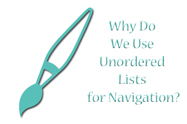
Why Do We Use Unordered Lists for Navigation?
The question in the title of today’s article has been bugging me for several years. Why, out of all the tags we could potentially use to style our site’s navigation, have modern designers chosen the unordered list?
At First Blush: Web-Elitism and Table Layouts All Over Again?
Coming from my background in hand-coding, when tables were still in vogue for layout building and lists were used for–well, listing things in one’s content–my confusion is warranted. I caught so much flack as a newbie designer for sticking with table format layouts, because, in the words of my critics, “tables are meant for tabular data only.”
So why use a list format for a navigation bar that is kinda sorta but not really a list? See the following:
<ul class=”nav”><li><a href=”page1.html”>Page 1</a></li>
<li><a href=”page2.html”>Page 2</a></li>
<li><a href=”page3.html”>Page 3</a></li></ul>
Sure, a site’s navigation IS a list of links, but the unordered list used in most navigation schemes these days doesn’t end up LOOKING like a regular bulleted list. Instead, it gets twisted and reshaped with CSS magic into whatever configuration is needed, whether that’s a vertical list of links without bullets or whether it’s a long horizontal bar across the top of the page. That magical CSS class creates all the beauty out of what otherwise looks like slightly bloated code, at least to my eye.
As I read article after article about using and styling unordered links, I kept thinking, “Isn’t that what we table-layout-makers were doing with tables back in the early 2000s? Isn’t this just another creative use of an HTML tag?” I found myself wondering if the unordered list would eventually go the way of the HTML table as a “deprecated” way of designing, and if those of us who had adopted it would be the butt of elitist jokes in 5 to 10 years. (Y’all who don’t think web-elitism exists–trust me, it does. People get snarky and condescending when they think they code better than you.)
The Answer to My Question: Yes AND No
But, as I’ve studied this problem a bit more, I’ve realized something. Yes, unordered lists seem like a little bit of excess code for what amounts to “a list that doesn’t look like a list onscreen.” But they actually solve a couple of problems, one of which reared its head in one of my recent designs.
My Old Navigation Style: “Display: Block” All the Way
I had organized my navigation into a div called “sidebar,” with the following code to handle all my navigation links:
#sidebar a {
display: block;
font-size: 20px;
font-weight: bold;
text-decoration: none;
border-bottom: 1px solid #AAAAAA;
padding: 10px 5px 10px 5px;}
#sidebar a:hover {
border-bottom: 1px solid #FFFFFF;
text-decoration: none;}
The corresponding HTML code for the navigation looked very simple, like this:
<div id=”sidebar”>
<a href=”about.php”>About</a>
<a href=”projects.php”>Projects</a>
<a href=”archives.php”>Archives</a>
</div>
The Problem: ALL the Links Were Affected
This was all well and good, until I decided to put more content in the sidebar–including some links that were part of paragraphs rather than navigation. You can probably guess what happened; I refreshed the page, and found that all my links in my sidebar were displaying proudly in block format, even if I had intended them to be contained in context with the paragraph around them.
So, what to do? I thought about creating another div to house my navigation links, styling it separately…but then, I realized I had the perfect tool for a vertical list of links already in my HTML toolbox. All I needed to do was to add unordered list code and give the unordered list a CSS ID. I dragged my feet about it a bit, but finally decided the list code was better than potentially causing layout havoc with another div thrown into the mix.
The Simple but Effective Fix
Thus, I ended up with this code instead:
#navlinks a {
font-size: 20px;
font-weight: bold;
text-decoration: none;
border-bottom: 1px solid #AAAAAA;
padding: 10px 5px 10px 5px;}
#navlinks a:hover {
border-bottom: #1px solid #FFFFFF;
text-decoration: none;}
The corresponding HTML code looked like this:
<div id=”sidebar”>
<p class=”sub”>A Headline</p>
<p>some text here with <a href=”index.html”>a link</a></p>
<ul id=”navlinks”>
<li><a href=”about.php”>About</a></li>
<li><a href=”projects.php”>Projects</a></li>
<li><a href=”archives.php”>Archives</a></li>
</ul>
</div>
Why This Change Helped
Adding the unordered list tags to my navigation helped me out in two ways:
- Eliminated the need for “display: block;” in my CSS, because the natural behavior of lists is to display each item on a separate line;
- Created a specific ID for just my navigation links, so that the other links in the sidebar would be unfettered by navigation styling
Having specifically targeted code like this, even if it results in typing <ul> and <li> about a thousand times more than you’d like, actually makes it easier for you to design. With your navigation self-contained in a little list “box” all its own, you can specify its styles to your heart’s content and not worry about those style choices overflowing and causing havoc in the larger divided layer.
This is a great habit to pick up–only applying CSS styling to the elements you absolutely need to style, rather than cramming all your style rules in one or two overarching divided layers. It organizes your code better, makes it easier to change small formatting issues later, AND can save you from accidentally messing up the whole page trying to affect one small section.
Summary
Putting navigation in unordered list format may seem esoteric at first, but it’s actually handy. You might not actually need a separate div to cordon off your navigation, necessarily; all you might need is <ul><li></li></ul>!
3 Little CSS Changes to Make Your Content Pop

It’s temptingly easy to get swept up in the visual/graphic part of a webdesign, and end up styling the content as what feels like an afterthought. But, as demonstrated in the following article, content styling is incredibly important–and the slightest changes can make a huge difference in whether your audience actually reads your content or not!
These 3 changes literally take less than a minute to implement, but they can radically improve your content design. Read on to find out!
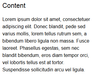
Make Your Font A Little Bigger

CSS Rule: “font-size: 14px; font-family: “Arial”, sans-serif;”

CSS Rule: “font-size: 16px; font-family: “Arial”, sans-serif;”
The first and easiest change to make is to just enlarge your font, just a bit. This isn’t just for nearsighted people like me, either–bigger font simply looks easier to read for everyone. Even the change from 14px to 16px, as depicted above, can be enough to make words more distinct at a glance. Visually, it looks more appealing already–and visually appealing content means readable content, which means your site has an audience. Awesome!
Space Your Lines Out a Bit
CSS Rule: “font-size: 16px; font-family: “Arial”, sans-serif;”
CSS Rule: “font-size: 16px; font-family: “Arial”, sans-serif; line-height: 24px;”
Bigger font, however, looks even better when spaced apart a little bit more. Ever wondered why your teachers always asked for double-spaced papers? As a former teacher, I found out that my eyes boggle less when the text isn’t all scrunched together like it just went through a trash compactor (especially when grading dozens of student papers late at night). Your site visitors likely think the same–respect their eyes and give each line of text a good amount of space with the line-height property.
Use Subtle Color in Your Headings and Subheadings
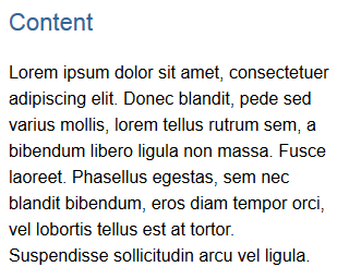
CSS Rule (heading only): “font-size: 22px; font-family: “Arial”, sans-serif; color: #336699;”
Using font colors in a webpage doesn’t have to involve crazy-bright hues. Even just a little color in your headings and subheadings, slightly different from your body font color (like the deep blue alongside the black in the above image), can help visually separate your content out. For all types of readers, whether they gobble down words or savor each mental morsel, the heading and subheading color is another cue that the topic has changed and they need to pay attention. This helps your readers take in your content more easily and understand it quicker.
Summary
Styling your content, even with just the few simple changes outlined in this article, can be the difference your site needs to become widely read. After all, content is why sites exist–let’s make it as appealing as possible!
Glasses Off: 4 Excellent Web Development Sites
Given that I generally blunder around a lot when it comes to backend coding, I often need to refer to others’ web development wisdom–not only to fix my own problems, but to write helpful articles of my own on these Monday posts. Here are four sites I find myself relying on for all this help and more:
Sitepoint
From HTML all the way to Ruby on Rails, and every major web programming language in between…this site is invaluable to me!
Tizag.com
This site’s MySQL and PHP tutorials are some of the most common-sense tuts I’ve ever read (and that’s a huge compliment!).
Nettuts
Whether you’re developing ASP.NET, HTML, Javascript, CSS, Python, or a host of other languages, Nettuts probably has a tutorial section for you!
WebProCafe
This forum provides a place for all us developers and designers to share ideas, ask questions, and offer help.
Glasses Off: 4 Awesome Webdesign Sites
Here in the HTMLab, I’m fairly skilled at what I do (namely, HTML and CSS), but many of my articles would not be complete without some heavy-duty online research and self-teaching. Listed below are four sites whose tutorials make it easy for even this self-taught, non-technical webdesigner to understand:
WebDesignerWall
Awesome articles abound here about the subtler points of design (which I definitely need help with!)
WebDesignLedger
This site covers everything from helpful webdesign tools to overarching Web trends…really informative!
Webdesign Tuts
Need a tutorial on how to make a webdesign visually work? Webdesign Tuts (part of the TutsPlus network) likely has the help you need, for both front-end and back-end design.
Webdesigner Depot
This site literally runs the gamut of everything a webdesigner is concerned about (even marketing and branding)! You could spend hours browsing and learning.
Visual Tricks You Can Accomplish with CSS
Time was, if you wanted something visually impressive to appear on your page, you had to use an image. Creative logos, text shadows, graphic designs in the background–you had to be a Photoshop or Paint Shop Pro whiz to make it all happen.
Thankfully, with the wizardry of CSS, you no longer need images for many of these tasks. You can add shadows and outlines to text, give a 3D shadow effect to divs, crop images (or at least make it look cropped), and even create gradients and other lovely design elements with just CSS. See below!
Text-Shadow
This example shows off the “text-shadow” property in CSS3, which can give your text a “popping-off-the-page” effect. The shadow can be as long and as wide as you wish, and it can be any color you wish! (Note: this effect works in all major browsers of the latest edition, but IE 9 and earlier don’t support it.)
When you write your CSS rule for this, be sure to follow this order: “text-shadow: h-shadow v-shadow blur color;”. For instance, this is the CSS which makes the above effect:
.shadowedtext {text-shadow: 2px 2px #777777; color: #6b00a2;}
In this case, the text shadow is positioned 2px horizontally away from the text, and 2px vertically away from the text. The shadow is also given a color–#777777, a dark gray. (You don’t necessarily have to specify a “blur” value, but the option is there if you want to use it. It just makes your text shadow a little softer.)
W3Schools Text-Shadow Reference Page
Box-Shadow

See how this box of text “pops” off the screen at you? This is achieved with the “box-shadow” CSS property, which is very similar to the “text-shadow” property in both appearance and execution. It’s just that “box-shadow” works on paragraphs, divided layers, and other larger sections of pages. This works in all major modern browsers.
When you write your “box-shadow” rule’s CSS, follow this order: “box-shadow: h-shadow v-shadow blur spread color inset;”. This is how I’ve constructed the CSS for my example:
.shadowedbox {box-shadow: 10px 10px 5px #888888; background-color: #CCCCCC; padding: 10px; width: 500px;}
Here, I have a shadow which appears 10px away from the box in both directions, and it’s blurred out 5 more pixels to give it a softer edge. I didn’t use the “spread” part of the property, nor the “inset,” but I did give it a dark gray color. (“Spread” affects the size of the shadow; “inset” can turn the drop shadow effect into an inner shadow.)
W3Schools Box-Shadow Reference Page
Gradients (CSS3 Only)

Can you believe this pretty gradient was created just with CSS3? It’s true! And not only can you make a linear gradient, like this one–you can make all sorts of gradients, no image program required!
Though IE doesn’t support this functionality quite yet (as far as I know), most other modern browsers do, and it is fantastic for helping your pages load a little faster and having less images to deal with.
As for explaining how you can create gradients with just CSS, I will defer to Chris Coyier of CSS-Tricks.com, who has created not only a lovely, thorough explanatory article, but also a really neat demo page where you can see all the different types of CSS3 gradients and the corresponding code.
CSS3 Gradients @ CSS-Tricks.com
Text Outline/Stroke
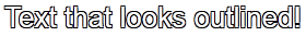
Oh, how I used to long to know how to get outlined text, even in Photoshop! Long after most of the world had updated to a version of Photoshop/Paint Shop Pro that had the ability to add outlines, or “strokes,” to their text, I was still puttering around in older versions, wondering where the outline setting was.
Thankfully, there are a few pure-CSS ways to make your text pop with outlines (and they can be any color!). Again, I will defer to CSS-Tricks.com for the explanation and further examples–there is an actual property that creates an outline, and then there’s a fun little workaround that actually produced the example above. (Hint: we’ve already seen it at work in this article!)
Adding Strokes to Web Text @ CSS-Tricks.com
Cropping Images (Or At Least Making It Look That Way)
Look at these two images side by side. Would you believe me if I said these are both the exact same image file, and that simply specifying negative margins made the right image smaller?
Believe it or not, that’s how it was done–and it’s only one of the ways in which CSS can “edit” your images for you. This can be a real time-saver if you’ve got tons of images which all need to be formatted in a specific way when they display on the page (such as thumbnails). Check out CSSGlobe.com’s “faux-cropping” article to find out more about these techniques!
3 Easy and Fast CSS Techniques for Faux Image Cropping @ CSSGlobe.com
Visual Effects: Text Rainbows/Inner Shadows/Other Amazing Things

This lovely text effect was created by only using CSS and Javascript–amazing! (And there are plenty more colorful examples on the demo page!) DragonInteractive has come up with this tidy little way to help us all beautify our text in various ways, available through the following link:
DragonInteractive Labs: Rainbows
Visual Effects: Bokehs

Okay, this one requires a little help from jQuery to make this CSS run right, but it’s still a lovely way to incorporate graphic effects without ever having to open an image-creation program. Using the following linked tutorial, you can add as many of these softly blurred, half-opaque “bubbles” to your page as you wish!
Pure CSS3 Bokeh Effect (with some jQuery help) @ MarcoFolio.net
My Fair HTML List
CSS rarely flexes its styling muscles stronger than in the display of ordered and unordered lists. HTML outputs basic-looking lists like these…
 |
 |
…but CSS can change them into great-looking lists like these:
 |
 |
 |
 |
 |
But exactly how CSS can style these lists can be pretty obscure to a beginning webmaster (or even old hats like me). Here’s how to turn your plain ol’ lists into something lovely, sleek, and even spectacular. (Read to the end if you want to know how to create these five styled lists!)
Step 1: Label Your Lists
Before you can begin styling any specific list, you have to give it a name. CSS provides two ways to name your lists: classes and IDs. (CSS classes can be used over and over, but IDs can only be used one time on each page.)
CSS classes look like this: .list1 {styling rules go here}
CSS IDs look like this: #list1 {styling rules go here}
You can label your list anything you want to, as long as you remember to link your CSS style rules with your list, like so:
<ul id=”list1″>
<ul class=”list1″>
Step 2: Select Your List Styles
Once you’ve labeled your list, you can begin putting in style rules to make it fit your design. CSS has three style rules that pertain specifically to list styling:
- list-style-type: Changes the bullet point out beside each list item to look a little different. (See the solid disc beside this list item?)
- list-style-position: Changes whether the bullet point is included with the list item or hangs out a little farther beside it. (The “hangs out” position is the default)
- list-style-image: Specifies a custom image as your bullet point image. (You have to make or find the bullet point image yourself)
|
List-Style-Type To change the bullet point image with list-style-type, you simply write a line of CSS that looks like this: #list1 {list-style-type: circle;} If you don’t want an open circle as your bullet point, you can replace the word “circle” in the above example with another word from the following list. (Note: numbers will not work with unordered [un-numbered] lists, and likewise, bullet point images will not work with ordered lists.) List-Style-Type Bullet Point Types
Also, if you don’t want a bullet point at all, you can put “list-style-type: none;” into your CSS instead. |
List-Style-Position To affect whether the bullet point displays closer to the list item than the default, write a line of CSS like this: #list1 {list-style-position: inside;} (If you want the bullet point to appear a little farther away from the list item, you can either type “list-style-position: outside;” or you can just leave out the “list-style-position” stuff altogether.) |
List-Style-Image To select a custom image for your bullet points, just add a line of CSS which looks like this: #list1 {list-style-image: url(‘IMAGE_FILENAME.jpg’);} Replace the “IMAGE_FILENAME.jpg” with the name of your custom image, and you’re in business! |
Step 3: Write Your List Style Rules
Once you’ve figured out how you want your list styled, you can combine all these various properties into one CSS rule, like so:
#list1 {list-style-type: square; list-style-position: inside; list-style-image: url(‘myimage.gif’);}
You can also combine all the “list-style” things into one shorthand property, like so:
#list1 {list-style: square inside url(‘myimage.gif’);}
When writing the shorthand, make sure that the “list-style-image” choice comes first, then “list-style-position,” and last, “list-style-image.”
Step 4: Make It Spiffy
Thankfully, you don’t have to just write “list style” rules. You can also change the list’s background color, font size, font family, borders, and all sorts of things, just as you can style other parts of your HTML code. Not only that, but you can style each list item, too! Check out the following examples to see how different padding, colors, borders, etc. affect your list’s look:
#list1 {list-style-type: circle; width: 150px;} #list1 li {padding: 0px; |
#list2 {list-style-type: square; width: 150px; font-family: “Verdana”, sans-serif; font-size: 15px;} #list2 li {padding: 5px; |
#list3 {list-style-type: upper-roman; width: 150px; font-family: “Garamond”, serif; font-size: 18px;} #list3 li {border: 1px solid #336699; |
#list4 {list-style-type: lower-alpha; width: 150px; font-family: “Bell MT”, serif;} #list4 li {border-bottom: 1px dotted #FF00FF;} |
#list5 {list-style-image: url(‘flashy.gif’); width: 150px; background-color: #000000; font-family: “Chixat 8”; font-size: 10px;} #list5 li {background-color: #000000; |
(Note: the screenshot of the last list doesn’t show the animated GIF bullet point in action, so here it is:  )
)
Summary
Lists, like any other element of an HTML page, can be styled to perfection with just a few bits of CSS. Experiment with your own list styles and see what you can create!
The 5 Web Languages You Need to Know
Much like learning a language is for communicating with other humans, creating websites from scratch is all about communicating your design and function intentions to a browser or Web server. And to be a good web developer in this day and age, you need to be multi-lingual–speaking several different programming languages to be able to design better, sleeker and more functional websites.
But just Googling “web programming languages” or something similar brings up a whole host of options to learn, and it can be overwhelming for the beginning user. Where do you begin? Do you start learning MySQL, or Ruby on Rails? Should you take a course in HTML, or is Python the next big thing?
Thankfully, it doesn’t have to be this confusing. In this post I have culled the 5 most important Web programming languages to know–the ones which make up about 90% of most modern websites. If you’re just beginning to learn how to build websites, this article will serve as a road map.
HTML: The Skeleton of the Web
HTML is the strong, silent (and mostly invisible) foundational structure which provides you a page to look at (such as the one you’re reading from right now). It provides line breaks, breaks text up into paragraph structures, formats tables, divides page content into layers…pretty much anything that makes up your page’s most basic structure is what HTML handles best.
This should be your first Web language to learn, since so many of the other programming languages depend on it to function. Here are some excellent resources to start learning:
HTML Tutorial @ W3Schools.com
HTMLGoodies.com
QuackIt.com’s HTML Resources
CSS: The Magic Styling Wand of the Web
Perfectly complementing HTML’s invisible strength, CSS takes HTML’s structure and gives it style. From giving your text just the right font choice and color to aligning each of your divided layers pixel-perfect on the screen, CSS can transform any boring old text and images into a lovely yet still functional page. There are plenty of simple CSS tricks that translate into downright amazing page effects–things you would never expect to accomplish with just a few lines of code!
CSS should be your second language to learn, as it builds on HTML knowledge while extending HTML’s capabilities of displaying Web content properly. Here are some resources to study CSS (both how it works and what it looks like when done right):
CSS Tutorial @ W3Schools.com
CSSZenGarden.com
Sitepoint.com’s CSS Reference
Javascript/jQuery: The Swiss Army Knife of the Web
Whatever special function you want your site to perform, whether it’s something to make your site display differently, something to change how your navigation menus open, etc., there’s likely a snippet of Javascript that can make it happen. Just putting a bit of carefully-chosen or carefully-crafted Javascript code into the head part of your HTML document can make a big difference! (By the way, the only real difference between Javascript and jQuery is that you don’t have to have a big library of Javascript code installed on your site for jQuery to work–all you need is a link to the library of code that’s already established on the Internet.)
Javascript should be your third language to learn, as it bridges the gap between Web languages that more about site display (“front-end development”) and Web languages that are more about site function (“back-end development”). Here are a few good websites to start studying Javascript:
Javascript Tutorial @ W3Schools.com
Codecademy’s Javascript Lessons
JavascriptKit.com
PHP: The Workhorse of the Web
Many of the websites you see today, like this one, are made possible with PHP–it’s literally everywhere, even though none of its code appears when you click “View Source.” The reason its code does not appear is because PHP is a server-side language, meaning that everything it does is tied to having a conversation with the server (that’s the thing that holds all your web pages, images, etc.).
PHP acts as a go-between for your browser (Internet Explorer, Mozilla Firefox, Google Chrome, or similar programs) and the server, asking questions of the server and delivering appropriate responses back to the browser in the form of a displayed page. (Ever searched for anything using a site’s search box? PHP was likely powering the search!)
PHP should be your fourth language to learn, since it is the most widely used of all the server-side languages, yet still deals with outputting data in HTML/CSS forms. Here are some excellent resources to help you learn PHP:
PHP Tutorial @ W3Schools.com
Tizag.com’s PHP Tutorial
PHP @ HomeAndLearn
MySQL: The Librarian of the Web
If you’ve got data to store, search through, and access, MySQL can handle it quite ably–it’s a programming language built to make, search, and access online databases on a server. The only trouble is, it doesn’t actually display the data on its own. So, quite often you’ll see PHP and MySQL being taught side-by-side; PHP code can “talk” to the MySQL database and retrieve results.
Still, you need to know how MySQL works in order to build a PHP script that can communicate with it. (Believe me, if you don’t know how MySQL works, you’re going to be VERY frustrated trying to build a successful PHP code to work with a MySQL database!) Here are a few sites to start your MySQL learning:
SQL Tutorial @ W3Schools.com
Tizag.com’s MySQL Tutorial
MySQLTutorial.org
(Fun fact: Most formally-trained programmers pronounce MySQL as “my sequel.” I, however, being relatively untrained, mentally pronounce it “my skwul” despite trying to train myself otherwise. LOL!)
Summary
These five Web programming languages may look scary, but if you take them one language at a time, mastering each before you move on, you will find that things become much easier to understand. And, once you understand these five, you will have a great basis of knowledge on which to build even further programming know-how. I hope this little “road map” serves you well!
Commenting Your Code: A Helpful Habit to Start
“Wait, what? You can put things in your code that are not read by the browser? Why would anybody want to do that?”
When I first started learning how to design web pages, I thought the same thing about using comments, until I started going back through my old layouts to rework and revamp old code for new designs. Boy, had I written myself some head-scratchers. “What in the world is THIS div even doing in the code? It doesn’t have anything in it!” “Huh? What’s this weird padding and margin thing?”
At the time I drafted the older bits of code, I knew exactly what I was doing with the code–I knew exactly what purpose each div, margin, spacer image, and line break was for. But going back to that old code after three or four years? Let’s just say I spent a lot longer than I should have trying to decipher my past self’s reasoning. LOL!
So, to avoid this kind of bafflement every time I go back to an old design, I have resolved to start using comments in my HTML, CSS, PHP, and Javascript codes.
Why Use Comments in Your Code?
As I’ve already said, comments are a great way to remind yourself of why you coded a particular section the way you did. (For instance, reminding yourself that a certain div or code hack is only in place to make IE behave itself. There are plenty of instances of that! LOL!)
But comments aren’t just useful for leaving yourself reminders about code–they’re also good ways to section your code, so that you don’t have to hunt through thousands of lines just to find the one thing you want to fix.
For example, an HTML page sectioned out might look like this:
<!–NAVIGATION–>
<div id=”nav”>
…
</div>
<!–CONTENT–>
<div id=”content”>
…
</div>
And a comment-sectioned CSS file might look like this:
/* BODY STYLES */
body {color: #FFFFFF;
background-color: #000000;
…}
/* LINK STYLES */
a:link {color: #FF0000; text-decoration: none;}
…
Both usages are sanity-preserving (and as web developers, we all know that sanity sometimes is in short supply, LOL). Comments make it possible for you to leave reminders, section headers, and even silly little in-progress notes to yourself to make your job a little more fun.
How to Code a Comment, in Four Different Web Languages
Each Web programming language has its own comment tag style, a way to include things that are only for the web developer to see.
HTML Comments
When you want to start an HTML comment, you place “” after. Like the following:
<!–Woo this is a comment–>
Comments in HTML can be placed anywhere within the <body> tag; the browser will just ignore them.
CSS Comments
When you want to comment in your CSS code, just put a “/*” before you start the comment, and put a “*/” at the end, like this:
/* Yay I have some CSS styles, woot */
You can place CSS comments anywhere in your CSS, whether your CSS is in a separate file or in the <head> section of your page.
PHP Comments
There are two kinds of PHP comment styles–one for comments that only take up a single line in your PHP document, and another for comments that take up multiple lines in the document. (In PHP, lines REALLY matter, so if you’re not sure if your comment will only take up one line of code, best to use the multi-line comment.
Single-Line Comment
To put in a single-line comment, just put “//” or “#” before you begin your comment. Everything to the right of those double slashes or hash symbol will be commented out as long as it’s on the same line as the slashes or hash symbol. Like so:
<?php echo “Whee!”; // a simple little echo statement
# why did I just write Whee? xD
?>
Multi-Line Comment
If your comment is going to go for multiple lines, you’ll instead put in “/*” before you begin your comment, and “*/” after you’ve finished your comment. (Looks identical to CSS!) Here’s an example:
<?php echo “Whee!”;
/* Seriously, why did I just write Whee? I have no idea.
Possibly because it’s 2 AM and I’ve been staring at this code for hours? LOL */
?>
Javascript Comments
Like PHP, Javascript has two different styles of commenting, depending on if the comment is on a single line or multiple lines.
Single-Line Comment
Doing a single-line comment in Javascript is identical to doing it in PHP–you use “//” before your comment, and everything out to the right of those two slashes will be commented out. Example:
<script type=”text/javascript”>
<!–
document.write(“Hello!”);
//I need to add some more stuff here!
//–>
</script>
Multi-Line Comment
Again, identical to PHP (and CSS), Javascript uses “/* at the beginning and “*/” at the end of its multi-line comments. Makes it pretty simple to remember if you code in multiple languages!
<script type=”text/javascript”>
<!–
document.write(“Hello!”);
/* Here I’ll put in a few more document.write things, as well as some preloaders, but I need to be careful! */
//–>
</script>
References and Further Reading
Here are the sites I used to research this article; they are both great sites to help you learn more about web development of all sorts.
HTML Comments @ W3Schools.com
CSS Comments @ W3Schools.com
PHP Comments @ Tizag.com
Javascript Comments @ Tizag.com
The Shadowy Side of CSS
For years, when webdesigners wanted to do shadowed effects with text or content boxes, they had to do so through the use of images. Either the text had to be saved in an image format, having been edited with an image program to make the text shadowed, or the content box had to be created with several slices of images to create the illusion of a whole box with a shadow slightly behind it. There were usually a good number of invisible tables behind the scenes setting up all these images so that the text and/or content boxes looked “natural” on the page, too. It was all a very convoluted process.
But thanks to the advent of CSS3 (and its wider browser support), we webdesigners can now add a little bit of shadow to our text and to our content boxes, with the box-shadow and text-shadow properties!
Shading Content Boxes with Box-Shadow
Any divided layer ID or class you create can have a box-shadow property added to it. Say, if I wanted to give a little pop of slightly-blurred gray shadow to my sidebar boxes, I could add something like this to the CSS class:
.sidebar {box-shadow: 5px 5px 5px #CCCCCC;}
What this means to the browser is: “I want a shadow that is positioned 5px to the right and 5px below this sidebar class, wherever it appears. I want that shadow to be blurred just around the edges (about 5 pixels around the edge). And I want the color to be #CCCCCC, or medium gray.”
Now, shadows don’t have to be gray or black, or even neutral colors. You can edit them to be any color, positioned as far away or as close to your content box as possible, and blurred/spread out as far as you like.
.sidebar {box-shadow: 30px 30px 5px 5px #0000FF;}
This shadow is positioned 30px to the right and 30px below the box it’s shading; it’s also bright, bright default-web-color blue. Another measurement is the “spread” of the shadow, how far it seems to be blended out into the background color of the website. The spread is the fourth pixel measurement (the second “5px” item). In this case, the shadow is blurred within itself 5px, and is blurred outward 5 more pixels.
You can choose any color shading and any size of shadow–experiment with this and see what you’d like to try with it. I’d also suggest visiting W3Schools’ Box-Shadow sandbox, where you can see different values and properties played out before your eyes. It’s a great way to see what you’d like for your design without having to hand-code it all first.
A Word about Browser Compatibility: Other Methods of Box-Shadow
For most new browsers, the above method (box-shadow) should work. However, if you want to completely cover your bases when it comes to browser compatibility, you’ll want to add the following lines of code to your shadowed box’s CSS id or class:
-webkit-box-shadow: (horizontal measurement) (vertical measurement) COLOR CODE;
-moz-box-shadow: (horizontal measurement) (vertical measurement) COLOR CODE;
filter: progid:DXImageTransform.Microsoft.dropShadow(color=Hexadecimal Code Of Your Choice, offX=Horizontal measurement, offY=Vertical Measurement, positive=true);
Many thanks to DynamicDrive.com for explaining this!
These three items are coded in very similar ways to the box-shadow property, but they are understandable to browsers requiring these specialized CSS codes. You’ll just need to make sure that you’re adding in the same pixel measurements and color codes as your box-shadow property, and you’ll be all set.
Making Text Pretty with Text-Shadow
At last, at last! I found a way to make my text shadowed without having to open Photoshop. My webdesigning soul is content. 🙂
Adding this property to any CSS (whether you’re stipulating body text, classes or ids of text) will make your text shadowed. For instance, I could make headings on my blog stand out a bit by doing the following code, making them shadowed with light gray just a bit below and to the right:
.heading {text-shadow: 1px 1px #EEEEEE;}
This would give me a very sharp light gray shadow, just to the right and just below my text. If, instead, I wanted a more diffuse text shadow, I could add the “blur” pixel measurement to my text-shadow property:
.heading {text-shadow: 1px 1px 10px #EEEEEE;}
The “10px” measurement in this example is how much the shadow is blurred beneath the text, and in this case 10px creates a very vague, misty appearance of any color underneath the text.
If you want to see more examples of text-shadow’s basic abilities, I like the W3Schools.com’s Text-Shadow Sandbox. Also, if you want to see some really crazy, funky effects that just a little finagling with text-shadow can create, I would suggest Zachstronaut’s article on text-shadow–you can do some awesome architectural, animation-like looks with just a few lines of code!
Alert: Internet Explorer Thinks Text-Shadow Has Cooties
As of this writing, Internet Explorer does not support text-shadow at all. Party poopers. (Just because Firefox got invited to the prom and IE didn’t… LOL). If you want text shadows to show up in IE, there are several fixes available across the web–these are some of the best and most understandable:
Full CSS3 Text Shadows–Even in IE (detailed, image- and example-filled, and BEAUTIFUL–requires a downloaded script, though)
Text-Shadow @ HowToCreate (simple tutorial taking you through several different steps of adding text-shadow)
CSS3 Text Shadow in IE @ ImpressiveWebs (how browsers compare in displaying shadows; using filter: glow for IE-only shadows)
IE Text Shadows @ WhatTheHeadSaid (CSS-heavy explanation of how to hack in text shadows for IE)
When Should I Even USE Shadows in CSS?
Shadows on a webpage are like makeup on a woman: just enough enhances natural beauty, but too much detracts from natural beauty.
To avoid your page looking like it’s been attacked and left bruised, only put shadows on special parts of your page. A lovely text-shadow on the main logo of your page, for instance, can look classy; adding a shadow underneath your “Latest Updates” box can help it “pop out” from the page enough to be noticed. You can also add shadows underneath every big heading on your page, or beneath featured images to help them look a little more 3-D.
Also, do not depend on text-shadows and box-shadows to make your page intelligible. White text on a light-gray background, no matter how shadowed you make the text, is still going to be illegible to most readers. By the same token, don’t make shadows and glow effects so bright behind the text that readers can’t focus on the text. Both of these mistakes will send your readers running for the hills. (And don’t let box shadows trail down on top of text below them…very annoying to try to read through!)
Use shadows as a lightly-placed accent, in other words, and your site will look great.
Summary
Shadows, when used as accents on your webpage, can provide some wonderful image-like effects without ever having to set foot in Photoshop or any other image-editing program. Try them out for your site, experiment with how they look, and see what elements on your page you’d like to shadow!