
|

|

|

|
Category Archives: Monday in the HTMLab
All about web design and development, and my triumphs and defeats therein.
Stable Sidebars: My New Favorite Layout of Choice
I know I’m probably about 3 years behind webdesign’s cutting edge (LOL), but I recently discovered how much I love the idea of a fixed, stable sidebar for my websites.
Wonder what I mean by “stable sidebar?” Here’s a couple of screenshots from my British TV shows fansite:

This is how it appears when you first load one of the show pages…

…and when you scroll down the page, the red sidebar on the left stays perfectly in place!
Why I Think This Design is AWESOME
I love the fact that the navigation and site branding stay in plain view, so nobody has to scroll all the way back to the top to browse between pages. Use convenience, YAY!
I also like that it’s a “headerless” design, which I wrote about back in June. Headerless designs force us as webdesigners to keep things more compact and less blathery (though I still found room for a little paragraph on the sidebar, as displayed in the screenshot, lol). Not to mention that the lack of a header means I don’t feel absolutely compelled to make a huge header image–and people don’t have to keep scrolling past that huge image to see content. Double WOOT!
Lastly, I like this kind of design because the sidebar functions as a visual ribbon decorating the page, adding a different color and look to this all-important bit of the page.
One Caveat: This Sidebar’s Not Exactly at the Leftmost Edge of the Page
One thing the above screenshots don’t show you is that the red sidebar isn’t actually at the left page edge; it actually hangs out kind of in the middle of the page in a fixed-width layout instead of being part of a fluid layout like most folks do.
The big reason for this? I can’t make fluid layouts work at the moment. I’ve studied, copied and pasted, and otherwise tinkered, but I’m still missing something important (my attempts at fluid layouts usually don’t scroll right, have horribly spaced out content in wide windows, or have a stinky vertical scrollbar on the side no matter what I do). I’m completely self-taught in webdesign and not really that great at understanding highly technical code, so I’ve had to mostly blunder through on my own when trying new layout styles.
So, in order to incorporate this look which I so loved, I had to find another solution, one that captured the essence of the stable sidebar without making the whole layout fluid (and thus breaking it). The following code was my fix:
How to Make a Robin-Style Stable Sidebar
#sidebar {float: left; width: 200px; padding: 5px; height: 100%; position: fixed; top: 0px; background-color: #8e0001; color: #FFFFFF; font-size: 14px;}
This is the code for the magic little sidebar. What makes the magic happen:
height: 100%;
position: fixed;
This makes the sidebar always as tall as the browser window it’s in, and it keeps the sidebar attached to the top of the page as well, so that it doesn’t scroll with the rest of the content. This sidebar stays right beside its content thanks to the old “wrapper-div” trick (seen below), which corrals both divs into a fixed-width layout.
#wrap {width: 1000px; margin: 0px auto;}
I’ve tested this in IE, Firefox, and Chrome with identical results; I don’t know how any other browser handles it, but it seems to be pretty obedient code. (IE usually has fits if I try anything creative, but this time it behaved itself!)
Comments or Questions?
Leave me a note in the comments about this design–like I said, I know it’s not the cutting edge of design anymore, but I really like it and it seems to function really well for my visitors. What do you think? (Oh, and if you have tips on how to make this kind of design work in a fluid setup, be my guest!! :D)
Robin Makes a Mobile Blog Layout, part 3: Testing Your Layout
Designing a mobile layout and knowing how to code it properly is great, but how does a webdesigner/developer test how a layout will perform on a mobile browser? After all, it’s not quite as easy as testing desktop layouts through your browser before uploading it.
I worried over this as I compiled this series, but thankfully, there are folks out there who have solved part of this problem, developing wonderful online tools that can test your site’s layout and help you identify problems in mobile browsing. The following sites are the best of the best, in my opinion, offering simple and sleek functionality as well as a wealth of information. Simply visit these sites and type your URL in to test how your current layout performs in mobile settings!
W3C MobileOK


This tool is a MUST for mobile web developers–it helps you validate, improve, and ultimately optimize your code for mobile usage. As you can see from the above pictures, Crooked Glasses currently fails miserably at being a mobile-friendly site…I got a lot of work to do. *sigh*
Responsive Design Tool

This simple online tool loads quickly and shows a range of different page widths at a glance, so that you can easily compare and contrast. (Caveat: you can’t click through pages unless you download the free tool from Github, but the download link is provided.)
Screenfly

Screenfly displays your website on many different platforms, mimicking everything from tablets to televisions. Click the various icons to see even more specific screen sizes (like Kindle vs. iPad, or iPhone vs. Android phones); you can even click through your miniaturized site to view different pages!
The Responsinator

The Responsinator gives you a scrollable list of all sorts of mobile devices, even comparing portrait vs. landscape orientation on the same device to show you how your site changes when the device is held a different way. The scrollbars on each individual display allow you to scroll around on your site to see what parts of your site may be obscured to the mobile user.
Further Reading
If the above tools have whetted your whistle in terms of mobile site testing, check out the following articles for even more apps and online tools!
SixRevisions: 10 Excellent Tools for Testing Your Site on Mobile Devices
WebDesignerDepot: 8 Popular Apps to Test the Mobile Version of Your Site
Robin Makes a Mobile Blog Layout, part 2: Mobile-Friendly Code
Making a responsive layout for mobile users is not just about the design of the site–the code also has to be constructed well. We webdesigners simply can’t afford to be lax about our code, because mobile browsers are less forgiving than desktop browsers. What looks great on your laptop may look terrible on a tablet or smartphone screen!
Here are some important things to remember about coding a responsive mobile layout:
Design and Code for the Smallest Device First
This seems kind of backwards, but don’t design and code your site’s desktop look first. Instead, make sure that the layout you’re making loads and operates well on a very small screen, like a smartphone. If it looks great and performs well on a mobile browser, it will function excellently as a desktop layout, too.
Include the Meta Viewport Tag
<meta name=”viewport” content=”width=device-width; initial-scale=1.0; maximum-scale=1.0; user-scalable=0;”/>
This little tag, included in the head of your page, keeps mobile browsers from super-shrinking your site to unreadable dimensions and making your users have to zoom in to read your text. (Note: this tag should only be used on responsive layouts or dedicated mobile sites, as HTMLBOY points out.) For more information on how to format this tag, check out the Webdesign Tutsplus page.
Keep the Code Simple, Sweetheart
When you’re designing a mobile layout, as I discussed last week, you want to make sure you’re not crowding your design with lots of images, which require a lot of data transfer over small devices’ connections. But you also don’t want to crowd it with clunky desktop-only formatting, or anything else that will slow the page load time down, especially on a mobile device. Keep the code as simple as possible–even if it looks TOO simple to your eye. A simple but effective site will perform much better than a complicated site that’s trying to do too much.
Also, don’t rely on a:hover at all in a responsive layout. Remember, the user’s “cursor” on a mobile browser is their finger, which doesn’t hover without clicking (unless some folks have magical fingertips quite unlike mine, LOL). Thus, drop-down menus and image changes that happen when the user’s cursor hovers over something is not a good mobile design choice.
Set a Maximum Width for Your Responsive Layout
“Now wait a minute,” you might ask. “Why are you worried about a MAXIMUM width when we’re talking about making a layout small and graceful?” Well, if you’re making a responsive layout, that means that the same layout will be served to all browsers, and will expand and contract with the browser’s window size. The layout that looks great at a width of 400 pixels will probably look REALLY odd at 1300 pixels wide–everything will be stretched out and hard to read.
#maindiv {max-width: 900px;}
The above tag, put into the CSS for your containing DIV, will keep your layout from stretching far into the distance on a widescreen desktop. Your users will cheer!
Don’t Hide Content from Mobile Users
Lastly, don’t assume that mobile users only want to see a few articles on your site. If I visit a site while on mobile, I expect to see ALL the content I would normally see while using my laptop. (This is a big pet peeve of mine to see mobile sites with maybe 20% of the desktop layout’s content.)
So, make sure all your content is accessible via mobile, either with a carefully-designed top-level navigation, or by grouping content into navigational pages so that users can scroll through links for just the content section they want to see. It may sound clunky, but it will work much better than simply hiding content!
Further Reading
NetTuts: Flexible Mobile-First Layouts with CSS
NetMagazine: Build a Basic Responsive Site with CSS
HTML5Rocks: Responsive Design
Designing CSS Layouts with Flexbox is as Easy as Pie
Robin Makes a Mobile Blog Layout, part 1: Designing the Look
I’ve been getting my proverbial hands dirty behind the scenes this week, grappling with code in order to put together a probable, working mobile layout for this blog. (The main thing I’ve realized so far? It’s a LOT of WORK. LOL)

|
This is the mobile design I finally came up with, working with the basic color scheme from the new desktop layout I’ve been designing. Its main features:
But it took quite a while to get this design “right”–and it wasn’t easy to figure out how to manage it. Indeed, I’ve struggled most of this last week to come up with a design that actually looked like a mobile site layout, instead of a hopelessly squeezed version of my desktop design! |
The Key: Focus on Readability and Content
I found out while designing this mobile layout that trying to fit all my navigation, my sidebar information, AND my content would just not work. Instead, I needed to make my mobile layout rather sparse-looking by desktop standards:
- Keep the color scheme basically the same as your desktop layout, but make sure that there is a lot of contrast between the text color and the background color. High contrast is especially important for readability on small screens!
- Only include the navigation that matters to your mobile users; if it doesn’t have to do with your content, it doesn’t need to be on your mobile site’s navigation. (For my blog, that meant that I had to exclude my “Links”, basically.)
- Same goes for content. If it’s not one of your articles, don’t include it on your mobile layout. (No sidebar info here!)
- Bigger font is actually better on a mobile device–you don’t want to make your users have to zoom in to read your text! That’s why you make a mobile layout in the first place. (For instance, I ended up with Garamond 16px for the body font in my mobile design, and I might even make it bigger than that in the final draft.)
- Make headings, links, and navigation very, very clear and very easy to tap on with big fingers. Take it from someone with large fingertips–a link in big font is much easier to tap on than a link in itty-bitty font.
- Include clear branding for your site (i.e., your logo/icon); if you can use the exact same logo/icon for your mobile site that you use for your desktop, all the better!
Summary
Mobile layouts have to be simplified, but that doesn’t mean that they are simple to design. (Indeed, you have to be deliberate and careful in your design choices, otherwise your mobile layout will be unusable!) But with a few considerations, you too can make yourself a layout that will transition well to all mobile devices, big screen or small.
(Tune in next week for part 2, in which I will attempt to make this mobile layout a coded reality!)
Promoting Your Blog: Don’t Forget the Little Guys
Writing posts, for bloggers, is often the easiest part of blogging (and that’s not saying much). Beyond writing, even beyond designing your own layout, there’s the question of promoting your little blog so that others can see the articles you labor over. Most promotion involves exchanging links with other blogs.
Most blogging experts will tell you one way to promote your blog this way. I, however, have a couple of divergent points to add, based on a few realizations I’ve had over the last few months.
What Others Say: Ally with the “Big Guys” Only
The blogging “experts” will tell you to promote your site by joining forces with the bigwig bloggers in your field–doing a Google search, for instance, for other blogs on your topic will likely bring up the most widely-known sites, as the following picture illustrates:

Checking out and sending blogroll requests to each of these sites is a valid strategy to follow, since even just the top three results pictured here provide you with a lot of link fodder.
There are additional strategies, such as the ones put forward by incomediary.com and postplanner.com, but most of them advocate purely making strategic alliances with larger, more popular blogs to get your “foot in the door,” so to speak.
What I Say: Ally with “Little” Bloggers like Yourself, Too
My two cents: Don’t get so worked up chasing after the “popular crowd” of bloggers that you end up forgetting about other beginning bloggers like yourself. Build up community with other small-time bloggers who are posting great articles, too.
Now, admittedly, you may not get the automatic prestige that you would from a link on a more popular writer’s blogroll. But you’ll get something a lot more worthwhile: credibility, humanity, and the reputation of just being a nice person to know, which counts for more than it seems. Our reputation as writers and as human beings is worth far more than a few links on somebody else’s site!
So how do you build community between fellow bloggers?
- Share links to fellow bloggers’ posts on your site; perhaps even set aside one blog post a week for just links to others’ posts, like my buddy Paula does over at Geeky Shopaholic Blog.
- Write up a post about another blogger’s site, whenever you can–give them a little extra publicity and a personal review of their site. Be honest and complimentary…and don’t forget that all-important link! (I did this for my friend Jenny’s blog, GeekyPosh.com, back in January of this year.
- Comment on other bloggers’ posts, as often as you can. This gives them encouragement–it shows them that people are reading, which is an awesome feeling! (And don’t be afraid to share a different opinion–state it politely, and you lay the groundwork for others to share theirs, too. An active comment thread is a happy comment thread!)
- Click through fellow bloggers’ blogrolls often to find new blogs you’re interested in.
- Invite bloggers to be on your blogroll, instead of waiting for them to send you invites.
IMPORTANT: I’m not saying give up on allying with the bigger blogs in your category–not at all! Just don’t forget the little guys (and gals) who are trying just as hard as you are. Support each other, and who knows–you all might end up being part of the “big blog” network yourselves!
Summary
Promoting your blog does not have to be a soulless, businesslike act–in fact, if you do it right, you can feel more like you’re part of a writing community instead of feeling like a lone voice in the wilderness.
This takes dedication and commitment; I’m certainly not doing it right yet (and I rarely have the Internet connection to do so with any regularity). But I can at least take the time every week to link to great posts by my fellow writers–and that’s a great place to start!
WordPress “Easy Mobile Layout” Plugins: YIKES
These days, more and more people are viewing blog content through mobile means–our phones and tablets have largely replaced our laptops when it comes to simply taking in content. We bloggers must keep pace with these demands when possible; after all, visiting a site and having to re-zoom in to see the text every time you open a new page can be an off-putting hassle. (Take it from me, I’ve run into this annoyance factor even on my own blog!)
But what if you don’t have the time to develop either an app or a mobile-friendly version of your site? The solution seems to be simple: use a mobile layout plugin! It’ll build your mobile design automatically!
Since I am running a self-hosted WordPress installation on my blog, I looked up WordPress plugins which create mobile-friendly layouts. The following is what I discovered while investigating 3 of the most Internet-viewed “popular” plugins…and it’s shocking, to say the least.
WPTouch
Free or Paid: Both options available, but the paid “Pro” option appears to have better tech support overall.
Brief Reviews: Most people get what they’re looking for–a quick, usable mobile layout with a little customization. However, the free version seems to have some issues, especially with themes giving a “too many redirects” error or not serving menus properly to mobile devices. Upgrading to the Pro version apparently fixes this for some users. Check out more reviews on the WPTouch reviews page.
More Information: WPTouch by BraveNewCode
WordPress Mobile Pack
Free or Paid: Free
Brief Reviews: Lots of bad reviews about this plugin not working properly, messing up blog databases, and and being almost impossible to install. Looks like you’d better steer clear of this one…check out more reviews here.
More Information: WordPress Mobile Pack
Mobile Website Builder for WordPress
Free or Paid: Paid
Brief Reviews: This one looked very, very promising–the best of the three I reviewed, in fact!–until I read about all the ads that the plugin puts all over your site, which are very difficult (if not impossible) to remove. Couple that with the fact that this plugin apparently hosts the mobile version of your site on a DudaMobile web address, and this doesn’t seem as strong a contender as I first thought. Check out more reviews here.
More Information: Mobile Website Builder for WordPress by Dudamobile
Conclusion: You’re Really Better Off Doing It Yourself
If you can believe it, this post started out as a way to let people know about great plugins to simplify the process of making our blogs mobile-friendly. Sadly, after considering all the reviews, I can’t in good faith suggest any of these–it’s not worth risking all your hard work just to save time on developing your own mobile-friendly layout. (Of course, this is just my opinion, but after reading about the database problems some of these plugins created, it’s kind of given me the willies about it all!)
I’ve written a few articles here before about developing mobile-friendly designs–these will be helpful no matter whether you want to develop a mobile app, make a separate mobile site, or build a responsive layout that adjusts to all sorts of browsers.
Crooked Glasses’ Upcoming Facelift: 3 Things to Learn
(LOL, y’all are probably thinking “IT’S ABOUT TIME!!!”)
For the last month or so, I’ve been spiffing up things behind the scenes, slowly getting things ready for a big new redesign of this little blog. As long and hard as I worked to get this original layout working, I realize it’s got a few usability problems, and I wanted to address those in the new version.
Such is the life of a webdesigner–we are always updating, always in the process of refitting so that our sites move with the Web and keep up with user demands. So, this week, I thought I’d use my current layout thought process to illustrate this point, and reveal how we webdesigners think out our design choices and put together good-looking yet usable layouts.
First: The Layout Mockup
First, I’ll give you a preview of how Crooked Glasses will look soon:

(Click on the picture to see the full size in a new window)
3 Things I Changed for the User’s Sake
I’ve kept the color scheme basically the same, since I was happy with it and no one has yet reported any visibility or usability issues with it. However, there were 3 big issues I wanted to resolve with this facelift:
A Sticky Navigation Bar

Ever since I did this blog post about an easy way to “stick” your navigation bar to the top of the page, I’ve been in love with the idea…so in this redesign, I incorporated a sticky navbar, for ease of navigation and a cleaner page look overall. Plus, it takes away the huge header image and collapses my site branding into a much more compact and tidy space.
Both these changes help readers get to my content faster without being bombarded with excess information or having to scroll up and down the page to find things. The more obstacles I can remove for the reader, the better for their stress levels–which means happier visitors!
Better Font and Lines Spaced Farther Apart
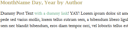
You know how your teachers always ask for your papers to be in Times New Roman and double-spaced? It’s not to make your paper twice as long–it’s for readability. I realized that in my original layout for this site, I had not taken line spacing into account, and as a result, awesome writing ended up looking like “Great Walls of Text” on people’s screens. Plus, the Arial font made body text run together more often than not, even when I was reading my own work! FAIL!
To combat that, I not only chose a larger font size and different font (Garamond 16px), but I spaced the lines 22px apart on the page. It’s not quite double-spacing, but it’s far enough apart to make each line distinct on the page. And with the new font choice, words don’t run together as easily, either. After all, if I’m writing a blog, I want users to be able to read what I’ve written as easily as possible!
Awesome New Sidebar

|
I got to thinking as I designed this layout: “I don’t want a sidebar that’s trying to do too much.” Admittedly, I filled my original layout’s sidebar with a TON of stuff, like a tag list, category lists, blogrolls, recent tweets–it was all happening up in the sidebar region, and it looked overstuffed after a while. But the stuff that should have been in the sidebar, like a welcome, proper attention paid to the blogroll, etc., was tucked away on WordPress pages. Not my smartest moment as a webdesigner, I’ll admit. But that’s the great thing about webdesign–there’s always “Undo” and “Backspace.” 😀
So, with this sidebar, I’ve included a welcome, put up a blogroll, added the “Brought to you by” links, and called it a day. (With the last choice, I eliminated the need for a footer altogether!) Plus, I spiffed up the FAQ page so that it would indeed answer any and all common questions about me and about this blog. This will keep the sidebar from looking so cluttered and stuffed with text, so that it doesn’t distract from the star of the show–my content! |
Summary
Good layout redesigns take time and thought, as well as a critical eye turned toward your own designs. As I’ve illustrated, you have to first point out what’s not working in the design you worked hard to craft, and then take steps to fix those problems so that the site works and reads better.
I’m very excited about this redesign, even though I dread the process of trying to placate WordPress to accept another layout; the last time was rife with much fist-shaking at the computer screen and words I’m trying to stop saying. xD But if these changes will help readers take in my content more easily, it’s ALL worth it!
An Unexpected Font Resource: Pinterest
Most of the time, Pinterest is a happy mish-mash of clothing, wedding planning, gadgetry, home decor, and humor. But, as I recently discovered, there are also pinners sharing their favorite fonts–it’s a fairly well-hidden resource for not only the crafters and bloggers among us, but for us webdesigners, too!
Below is a selection of free fonts I’ve discovered through Pinterest thus far:
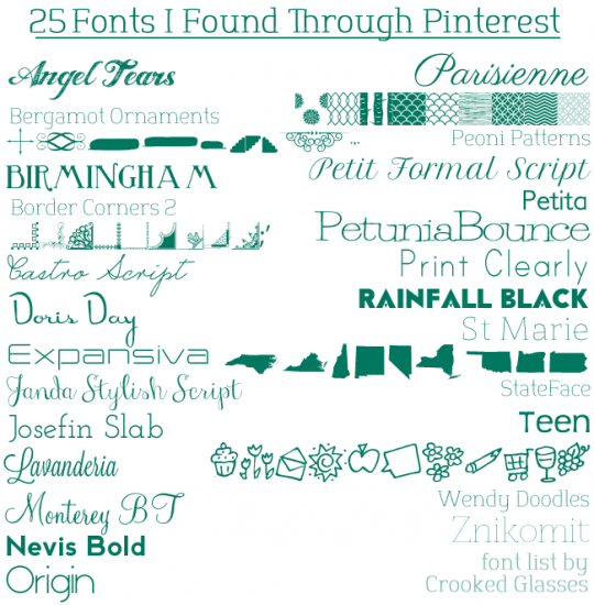
Font Download Links
Angel Tears
Bergamot Ornaments
Birmingham
Border Corners 2
Castro Script
Doris Day
Expansiva
Janda Stylish Script
Josefin Slab
Lavanderia
Monterey BT
Nevis Bold
Origin
Parisienne
Peoni Patterns
Petit Formal Script
Petita
PetuniaBounce
Print Clearly
Rainfall Black
St Marie
StateFace
Teen
Wendy Doodles
Znikomit
Want to find more fonts? Check out my Pinterest font board, “Fontalicious!”
Crashed Database Table? Never Fear, PHPMyAdmin is Here!
No matter whether you’re a veteran at using databases or a novice to the world of MySQL, there is one thing you NEVER want to encounter: a vanished database. (Especially when you’ve put a lot of work into loading that database full of content!) But if you’re facing this right now, never fear! The following article, compiled from my personal experience (and some frantic Googling) will help you attempt to restore that which seems lost.
The Situation: WP_Posts for Crooked Glasses Was GONE
Early on the morning of July 22nd, I was busily editing some WordPress pages after I had uploaded one of my weekly posts. The pages, however, would not save correctly–it seemed they “forgot” all the edits I made, no matter how many times I pressed the “Update” button.
About an hour later (I was working over dialup, so things were VERY slow), I tried again to update the page, only to be told “This page does not exist.” I tried navigating to the other pages I was working on–same message. Then I tried to view my blog…and was absolutely flabbergasted at what I saw.
NOTHING.
A big fat 650-pixel-wide space of NOTHING, where all my posts should be. I logged into my WordPress site, and both the Posts and Pages counts read 0.
You can probably imagine what happened next. Over 2 years of work (work I had only limited backups of), GONE? Just like THAT?! Furious weeping, gnashing of teeth (and, admittedly, some throwing of small items across the room) ensued. I scanned through all of WordPress’ help files hosted in my dashboard, but to no avail. I had no idea what had happened, and had no idea how to fix it.
…Well, I had no idea how to fix it, until I thought of something a little outside the box.
PHPMyAdmin: The Unexpected Savior
I remembered, in between gasping for panicked breaths, that my blog was hosted on my domain, and that the databases and tables for my blog should be housed within the PHPMyAdmin bit of my host’s control panel. After all, that’s how I’d worked with databases back in the days of fanlistings and such.
Working as quickly as dialup would allow, I opened PHPMyAdmin, clicked my WordPress blog’s database name, and pulled up the “wp_posts” table from within the huge list of tables it gave me.
Immediately, I was greeted with the message that answered my question and gave me another: “This table is marked as crashed and should be repaired.”
Okay, great, it’s crashed but it can be repaired, I thought. So how do you go about DOING that?
I Googled for help (thank God for Google!), and came across a number of articles, such as this one from SiteGround, telling me to “look for a drop-down menu below the list of tables, check the one that needs repairing, and choose ‘Repair Table.'”

Because of my dialup connection, when I tried to look at the wp_posts table, it did not load the table list, nor did it load any options at the bottom of the screen.

I thought perhaps that the option to “Repair Table” lay at the bottom of the sidebar, but all I saw at the very bottom of the sidebar menu was “Create Table.”

In desperation, I clicked the “Home” button on the sidebar…

…then clicked the “Databases” button (the very top left button in the big window).

From there, I selected my WordPress blog’s database name (all of these have been obscured for security reasons).

Selecting the database FINALLY brought up a list of the contained tables in the larger window. And there, at the bottom of the page, lay the long-sought drop-down box. HALLELUJAH! I quickly clicked the check-mark box next to “wp_posts,” then used the drop-down menu to select “Repair Table.”

And, a few minutes later–presto! The table was fixed!
One Small Caveat
The “Repair Table” solution usually works for most crashed database tables…but notice I said usually. Sometimes, a table crashes and you can’t get it repaired no matter what. :C I recommend doing backups of your work as often as possible, just in case.