Tag Archives: webdesign

Crooked Glasses’ Upcoming Facelift: 3 Things to Learn

(LOL, y’all are probably thinking “IT’S ABOUT TIME!!!”)

For the last month or so, I’ve been spiffing up things behind the scenes, slowly getting things ready for a big new redesign of this little blog. As long and hard as I worked to get this original layout working, I realize it’s got a few usability problems, and I wanted to address those in the new version.

Such is the life of a webdesigner–we are always updating, always in the process of refitting so that our sites move with the Web and keep up with user demands. So, this week, I thought I’d use my current layout thought process to illustrate this point, and reveal how we webdesigners think out our design choices and put together good-looking yet usable layouts.

First: The Layout Mockup

First, I’ll give you a preview of how Crooked Glasses will look soon:

blog_full
(Click on the picture to see the full size in a new window)

3 Things I Changed for the User’s Sake

I’ve kept the color scheme basically the same, since I was happy with it and no one has yet reported any visibility or usability issues with it. However, there were 3 big issues I wanted to resolve with this facelift:

A Sticky Navigation Bar

blog_navbar
Ever since I did this blog post about an easy way to “stick” your navigation bar to the top of the page, I’ve been in love with the idea…so in this redesign, I incorporated a sticky navbar, for ease of navigation and a cleaner page look overall. Plus, it takes away the huge header image and collapses my site branding into a much more compact and tidy space.

Both these changes help readers get to my content faster without being bombarded with excess information or having to scroll up and down the page to find things. The more obstacles I can remove for the reader, the better for their stress levels–which means happier visitors!

Better Font and Lines Spaced Farther Apart

blog_linespacingfont
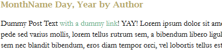
You know how your teachers always ask for your papers to be in Times New Roman and double-spaced? It’s not to make your paper twice as long–it’s for readability. I realized that in my original layout for this site, I had not taken line spacing into account, and as a result, awesome writing ended up looking like “Great Walls of Text” on people’s screens. Plus, the Arial font made body text run together more often than not, even when I was reading my own work! FAIL!

To combat that, I not only chose a larger font size and different font (Garamond 16px), but I spaced the lines 22px apart on the page. It’s not quite double-spacing, but it’s far enough apart to make each line distinct on the page. And with the new font choice, words don’t run together as easily, either. After all, if I’m writing a blog, I want users to be able to read what I’ve written as easily as possible!

Awesome New Sidebar

blog_sidebar I got to thinking as I designed this layout: “I don’t want a sidebar that’s trying to do too much.” Admittedly, I filled my original layout’s sidebar with a TON of stuff, like a tag list, category lists, blogrolls, recent tweets–it was all happening up in the sidebar region, and it looked overstuffed after a while. But the stuff that should have been in the sidebar, like a welcome, proper attention paid to the blogroll, etc., was tucked away on WordPress pages. Not my smartest moment as a webdesigner, I’ll admit. But that’s the great thing about webdesign–there’s always “Undo” and “Backspace.” 😀

So, with this sidebar, I’ve included a welcome, put up a blogroll, added the “Brought to you by” links, and called it a day. (With the last choice, I eliminated the need for a footer altogether!) Plus, I spiffed up the FAQ page so that it would indeed answer any and all common questions about me and about this blog. This will keep the sidebar from looking so cluttered and stuffed with text, so that it doesn’t distract from the star of the show–my content!

Summary

Good layout redesigns take time and thought, as well as a critical eye turned toward your own designs. As I’ve illustrated, you have to first point out what’s not working in the design you worked hard to craft, and then take steps to fix those problems so that the site works and reads better.

I’m very excited about this redesign, even though I dread the process of trying to placate WordPress to accept another layout; the last time was rife with much fist-shaking at the computer screen and words I’m trying to stop saying. xD But if these changes will help readers take in my content more easily, it’s ALL worth it!

An Unexpected Font Resource: Pinterest

Most of the time, Pinterest is a happy mish-mash of clothing, wedding planning, gadgetry, home decor, and humor. But, as I recently discovered, there are also pinners sharing their favorite fonts–it’s a fairly well-hidden resource for not only the crafters and bloggers among us, but for us webdesigners, too!

Below is a selection of free fonts I’ve discovered through Pinterest thus far:

25fonts_pinterest

Font Download Links

Angel Tears
Bergamot Ornaments
Birmingham
Border Corners 2
Castro Script
Doris Day
Expansiva
Janda Stylish Script
Josefin Slab
Lavanderia
Monterey BT
Nevis Bold
Origin
Parisienne
Peoni Patterns
Petit Formal Script
Petita
PetuniaBounce
Print Clearly
Rainfall Black
St Marie
StateFace
Teen
Wendy Doodles
Znikomit

Want to find more fonts? Check out my Pinterest font board, “Fontalicious!”
fontalicious

Design Fail: Red Backgrounds

In my quest to keep trying new designs and learning new code in webdesign, I’ve come up with some accidentally awesome designs over the years. Some of the code and colors that I thought would probably never work turned out beautifully in the long run. But, as with any trial-and-error process, I have ended up with a few misfires as well. The following design contains one such misfire.

redwebsite
When I designed Version 13 of my main domain last year, I was trying a new type of color scheme–purposefully using contrasting colors.

The problem does not lie in this concept, but rather the choice of red for my website’s background color. Since I don’t often use red in my designs, given that I personally dislike the color, I wanted to try something different in my design color schemes this time around. And for the most part, the resulting color palette of tomato red, creamy orange, and bright periwinkle worked pretty well…

It worked well enough, that is, until I realized how stressful on the eyes that red background was.

The Problem

Though I had taken time to view each page before I uploaded my site, just to make sure it all displayed properly, I didn’t take into account how the colors would affect extended reading. One of my friends brought this up as I was discussing my recent website work, saying, “You know, I love going to your site, but that color hurts my eyes after a while.”

I was stunned, and then, after a moment of thought, I understood. I had made a similar mistake using bright red as a background color several years before, as a newbie designer, and back then, I had received similar comments. But I had foolishly thought that a darker red would not trigger such problems. Obviously, I was wrong. And if even a good friend could not view my page without problems, how badly had the design choice affected visits by other Websurfers?

Great Website Colors: A Balance Between Striking and Relaxing

If I did this design over again, I believe I would choose the same color scheme–but with a definite change. I would reverse the usage of the periwinkle blue and tomato red, making the blue the background color and the red a lightly-sprinkled accent color. The main reason? Blue is a much easier color on the eyes than red; it makes reading website content easier, which would make my visitors much happier.

Yet, as designers, we don’t have to retreat completely into neutral, “easy viewing” colors. Instead, try using powerful, vibrant colors in smaller doses, balancing them with softer, more neutral colors for an overall attractive design. In fact, a little kick of color in the right places can really make your website design sing with purpose!

For instance, I could still use that rich red color, but only sparingly, much as one uses a strong spice in cooking–I could use it to attract attention to updates, draw the user’s eye to the navigation section, or just add bits of visual flair around the mostly-blue page. It would add a little punch of red, but not too much that it distracts or makes the page difficult to read.

Summary

If you’ve learned that your website’s color scheme is a little too strong for people’s eyes, learn from my fail: try making the softer/neutral color the background, and use the strong colors as accents and attention-grabbers. Who knows, all it might take is reversing two colors to positively change how visitors use your site!

Yes, I Still Use HTML Tables for Layouts!

I can just about hear the astonished gasps: someone still uses HTML tables to style their pages? In this day and age of aligning everything on a webpage with CSS-styled divs?!

Some webdesigners might react not with shock, but with scorn: “Pah, only newbs and amateurs style pages with TABLES. REAL designers use only CSS for layouts.” (Don’t think webdesigners say that stuff to each other? I have been part of several design discussions where such negative terms were bandied about–very discouraging!) But after 10 years of self-taught designing, I still rely on tables for a few styles of page layouts, including the one below.

table_example
The three-column design demonstrated above (which will be part of a future layout on my main domain, withinmyworld.org) is one of the many reasons I keep tables in my layout toolbox.

Why? Because try as I might, I have never been able to get a three-column pure-CSS layout to align like this–to have the correct, even spacing between content blocks, or to just LOOK like a cohesive whole. I’ve tried a few solutions–for instance, floating a few sets of nested divs (as in, two sets of “float: left” and “float: right,” one set for two of the columns, and the second set floating the first set and the third column).

But this solution always seems too clunky, and never looks just “right” on the page, either–usually, one column ends up too far away from the others, or the content boxes are unevenly spaced apart no matter how I try to shore up the padding and margins. Plus, if the page width shrinks too much, one or two of the columns always ends up dropping down below the others–definitely not what I want, either.

So, in lieu of CSS, this is how I achieved the above look:

  • Table tag: <table border=”0″ cellpadding=”14″ cellspacing=”14″ width=”790″>
  • Each table cell: <tr><td valign=”top”></td>
  • CSS styling:
    table {font-size: 11px;}
    .tablecell {background-color: #8fd6ff;}

This is much simpler coding (a plus for someone who is self-taught, like me), plus it’s less for the browser to load. Lastly, it gives me the look I want: clean, evenly-spaced blocks of content, with a slightly darker color in between the blocks to visually separate the content even further.

If It Ain’t Broke, Don’t Fix It!

I’m a big believer in the above sentiment when it comes to webdesign. If the coding still works in all modern browsers (and hasn’t been labeled as “deprecated” by the W3C), why not use it, if it is the only tool which works precisely as we need it to work?

I admit, I’d like to find a way to make this layout work the exact same way in CSS. But unless I’m just going about it all the wrong way, I haven’t found something to match the HTML table for sheer cleanliness, ease, and even spacing on a layout with more than two columns. And I don’t think that’s a bad thing. After all, visitors to our sites are not going to know (or care) whether we used tables or divs to make our layouts–they just want a site that works and is easy to browse!

I’m not suggesting that webdesigners quit trying new coding styles entirely; I am, however, suggesting that having multiple ways to code a page can be to our benefit. And, if the only tool that works is an “older” style (such as an HTML table), it shouldn’t be a point of scorn between designers. We’re all on the same side, anyway–we’re all in the business of putting together great pages for others to view!

(PS: If you know a way to make a pure-CSS three-column layout like the one I’ve pictured above, let me know in the comments! It’d be great to augment the good ol’ HTML table with a few more dabs of CSS.)

How Do You Pronounce “HTML?” (And Other Funny Pronunciations)

As webdesigners and developers, much of our work is nonverbal–we simply type it, upload it, and that’s that. But I find that when I’m drafting code, especially very difficult or time-consuming code, I end up saying what I’m typing as I go along (usually under my breath in a really irritated tone, LOL).

As I was debugging a particularly annoying piece of code for my upcoming video games fansite the other day, it occurred to me that I was doing this. Not only that, but I’d come up with some pretty strange pronunciations along the way…pronunciations which my brain considered “correct,” but which sounded pretty silly coming out of my mouth!

Check out the list below, and compare them to your own pronunciations–do any of yours appear here?

My (Strange) Mental Webdesign Pronunciations

  • HTML: Hut-mul
  • px: Picks
  • src: Surc (like “surf” with a “c” at the end)
  • CSS: Suss
  • $variable: CHA-CHING! variable (I kid you not, I caught myself doing this xD)
  • em: um
  • href: Huh-reff (all one syllable)
  • &nbsp: Nus-bup (yes, I know it doesn’t match the spelling, but it works)
  • valign: Vee-align
  • GIF: Jif (because gif with a “guh” sound at the beginning sounds wrong for some reason)
  • ?>: Huh? bracket
  • //: Suh-slash

And the piece de resistance…

  • if (!isset($var)): if MEEP! izzet CHA-CHING! var
    (with “var” pronounced like the first syllable of “varmint”–hey, I’m from the South, all right? xD)

Anybody Else Do This?

Have you ever noticed yourself doing this, or have you come up with your own pronunciations of various webdesign code? Let me know in the comments!

“Jumpy” Hover Borders on Image Links: Solved At Last

Over at CSS-Tricks.com, I spied an article that spoke directly to one of my infamous webdesign flaws over the years–making all my image links have a:hover borders.

Why would I call this a “flaw?” Well, unfortunately, when you give anything on a webpage a border under some circumstances and not others, it can create a “jumpy” layout look–for instance, when you hover over image links on my blog, they get a border underneath them, which makes other page content shift a little downwards on the page until you mouse off the image.

This is the “image rollover border” effect, and it can make your page look REALLY amateurish…as I well know. 🙁 It’s been bugging me for years on this blog and all my other sites–I love how the hover border looks on text links, but I hate the way it makes other things on the page “jump” a little!

Making Non-Jumpy Rollover Borders for Images

The CSS-Tricks article does a wonderful job of explaining exactly why all this happens, as well as offering some solutions for how to incorporate a “bordered” hover look for your images without getting layout shifts. Several methods, including negative-margin borders, are suggested and diagrammed for you.

Getting Rid of Image Hover Borders Altogether: Mission Impossible?

But what if you don’t want borders around your images at all? Preferably, I would like my text links to have the border-bottom property on hover, while my image links would be without that dumb-looking border.

So I started looking into how to get rid of the hover border on just my images, thinking it would be pretty easy. All I’d have to do is use a little bit of CSS like so…

img {border: none;}

…and I’d be good, right?

WRONG. Wrong wrong wrong. That didn’t work, and nor did the other iterations I tried, such as:

a:hover img {border: none;}
img a:hover {border: 0px;}

I tried everything I had in my mental CSS toolkit to solve this. No luck. Then I decided to Google it, wondering if I was the only webdesigner who was having this issue. “After all, it’s probably a really simple fix,” I thought.

Turns out, I’m not the only webdesigner who has had difficulty with it, and it is most definitely NOT an easy fix. The only real “fix” for this problem comes in two similar flavors:

Fix #1

Fix #2

Give all your image links a specific CSS class, and reference it every time you have an image link in your document. Get rid of the CSS that creates a hover border entirely.

Fix #1’s CSS

Make a specific CSS class for all the links that will be wrapped around images…

.imglinks a {border: none;}

…and implement it every time you have an image link (place the code in the link tag rather than the image tag):

<a href=”your link here” class=”imglinks”><img src=”your image filename here”></a>

The Problem with Fix #1

If you have a large site, or you run any sort of blog software to make your site, Fix #1 is just not going to be worth your time. You would have to physically go back and edit EACH image link throughout your ENTIRE site to completely implement this fix. I have almost 800 blog articles on this site already, and I can’t imagine going back and editing each of those image links in all those articles to make them not have a hover border anymore.

But if you have a small site or don’t run any blogging software, Fix #1 will work beautifully for you, provided you have the patience to change all your image links.

Fix #2’s CSS

Anywhere you see CSS code like this that would hit any images on your page…

a:hover {border: 1px solid #000000;}

…change it to:

a:hover {border: 0px;}

This will fix all your image links, but it will also take away any borders from your text links as well. It’s a quite ham-handed fix, but it gets rid of “jumpiness” on your page. (Note: Make sure you make your hovered links look different enough from regular text without the borders–different color, etc.)

This is a better option, albeit a less graceful one, for larger sites or sites that run blogging software. For certain, it saves you some gray hairs and gnashing of teeth. XD

For Further Reading

The following forum threads discuss this problem in greater detail, and helped point me toward the fixes I have detailed above:

Remove a:hover for images? @ StackOverflow.com
Getting Rid of a:hover on Images @ Sitepoint.com
CSSBeauty Discussion on A:Hover Borders

4 Essentials You Need on Your Main Page

When your visitors first come to your Web address, what do they see first? Too many of us webmasters crowd our main page with tons of information (guilty as charged), and it often results in information overload. Either that, or we give them a webpage with almost nothing on it–maybe a “splash page” with a clickable image and a tiny bit of information.

What I’m suggesting today is a middle path between these extremes: a main page that gives just enough information without being overwhelming. When you make your main page, here are the four essentials you must include:

#4: Clear and Concise Navigation

Navigation is very important for your visitor to see, but the format and number of links in your navigation is just about as important–it makes a big visual difference. A long horizontal bar of really tiny navigational links is daunting; navigation that is scattered all over the page in various sidebars is downright annoying.

Having all your navigation in one place, with a larger, easily-readable font (16-18 px), is the best way to go so that you don’t confuse your visitors. (If you have too many pages to link to on a horizontal navigation bar, you can always put your navigation in a sidebar menu and it will function just as well.) Also, make sure that the text for each navigation link is as concise as possible: using “contact” instead of “here’s my contact info,” for instance.

#3: Contact and Author Info

No matter what kind of contact information you plan to display on your site, it should be easily visible and accessible for your users. After all, if they have questions for the webmaster/webdesigner, they shouldn’t have to dig around for hours in your site to find out how to get in touch with you!

As far as “author information” goes, you can write a small blurb about yourself on the main page and/or link to a separate page of author info. But your contact information should be readily available. Your name/Internet nickname and an email address should be enough for most visitors. (You can even make or generate an HTML/Javascript contact form if you don’t want your email address actually visible to viewers.) These strategies help put you in contact with your visitors and give you a better idea of what they like and don’t like about your site.

#2: A Quick Site Purpose Statement

You don’t have to wax philosophical in your site description, but your main page should have at least a sentence or two describing what your site is about, whether it’s a personal blog, a fansite, a small hosting service, etc. This should be displayed prominently on your page so that the visitor’s eye is drawn to it.

This information helps people categorize your site for later viewing through a bookmark/favorite, and can help random visitors immediately know whether they want to stay on your site or keep on surfing. It’s all about convenience for your visitor, after all!

#1: Most Recent Updates

Going along with the “convenience” theme, the most important piece of information you need to display on your main page is your most recent updates to the site. If you are not already doing this, you should–it is the fastest way for your users to tell that your site is still alive!

You don’t necessarily have to place a big long update message on your site every time you update; just the date and a quick summary of what you updated will be enough for most users. This is especially important if you are going to be absent for a little while (for, say, a vacation, illness, etc.), so that your visitors know the site is still being maintained.

Summary

Providing clear navigation, contact/author info, a site purpose statement, and the most recent site updates not only makes your main page a hub of information, but it makes your site look and feel much more professional. When people don’t have to hunt around through your site for information, they are much more apt to come back and visit more often!

Headerless Layouts: The Why and the How

For me, this blog post deals with something I once considered web design anathema: design a page with absolutely no header. “Wait a minute!” my web design instinct cries. “Where will all my nifty page branding and my attractive page image go? What will I do instead?”

Simple: put it all into a sidebar.

Why Bother Going Headerless?

I suggest this layout style because more and more Web browsing is being done with mobile devices, and headerless designs simply load better on such devices. For instance, I’ve been using my iPhone at home for faster web browsing (we have dialup at home :C), and I’ve noticed how header images get distorted or just don’t show up in mobile browsers.

Keeping this in mind, trying a headerless design might just be the way to help our mobile users access the most important bits of our site without losing visual impact. Not to mention that the following design style effectively combines your sidebar into your header for a simpler and yet more elegant layout, leaving you with fewer sections to code and less for your browser to have to arrange. See below:

Sidebar: Your New Header

headerless_fullpage

This is just a quick sample I put together of what a headerless design could look like. See how the page content lies right up at the top of the page, so that the user does not have to scroll down to start reading? The same logic applies for the sidebar–all the pertinent information loads right at the top of the page, for ultimate convenience.

headerless_sidebar Here to the left, we see a close-up view of the sidebar–at the top, loading first, is a quick page summary, for people who don’t know anything about your site and are assessing your site to see if it’s something they want to browse. (Your “About the Author” section is for a similar purpose, especially on a blog.)

Next, we have social media and navigation; your social media links can be formatted to be much more compact with icons. You could also flip the positions of the Navigation and Social Media sections if you want the navigation closer to the top of the page.

You can definitely play with this sidebar style, but this is a pretty bare-bones representation of how to make your sidebar into your “header.” (Additionally, you could put in a few small images to make your sidebar even more visually attractive, such as a picture of yourself beside the “About the Author” blurb.)

How to Make a Headerless Layout

The way I put together my example uses a 2-column layout design, with the sidebar div set at a fixed width and the content div set to a percentage of the page width. (Unfortunately, mine doesn’t exactly do everything that I wanted, such as scaling correctly when the page resizes, so I’m not showing my [shameful] code here. LOL!) This style seems to be the best way to make a headerless design at the moment, however.

However, this concept has been tackled and solved by several webdesign whizzes–check out their tutorials to learn how to incorporate the headerless look for yourself!

Fluid Width with a Fixed Sidebar Demo @ StuGreenham.com
Fixed-Width Sidebar in Responsive Design: Discussion @ CSS-Tricks.com
Make a Layout with Fluid and Fixed-Size Columns @ RadiatingStar.com

Visual Tricks You Can Accomplish with CSS

Time was, if you wanted something visually impressive to appear on your page, you had to use an image. Creative logos, text shadows, graphic designs in the background–you had to be a Photoshop or Paint Shop Pro whiz to make it all happen.

Thankfully, with the wizardry of CSS, you no longer need images for many of these tasks. You can add shadows and outlines to text, give a 3D shadow effect to divs, crop images (or at least make it look cropped), and even create gradients and other lovely design elements with just CSS. See below!

Text-Shadow

textshadow
This example shows off the “text-shadow” property in CSS3, which can give your text a “popping-off-the-page” effect. The shadow can be as long and as wide as you wish, and it can be any color you wish! (Note: this effect works in all major browsers of the latest edition, but IE 9 and earlier don’t support it.)

When you write your CSS rule for this, be sure to follow this order: “text-shadow: h-shadow v-shadow blur color;”. For instance, this is the CSS which makes the above effect:

.shadowedtext {text-shadow: 2px 2px #777777; color: #6b00a2;}

In this case, the text shadow is positioned 2px horizontally away from the text, and 2px vertically away from the text. The shadow is also given a color–#777777, a dark gray. (You don’t necessarily have to specify a “blur” value, but the option is there if you want to use it. It just makes your text shadow a little softer.)

W3Schools Text-Shadow Reference Page

Box-Shadow

boxshadow
See how this box of text “pops” off the screen at you? This is achieved with the “box-shadow” CSS property, which is very similar to the “text-shadow” property in both appearance and execution. It’s just that “box-shadow” works on paragraphs, divided layers, and other larger sections of pages. This works in all major modern browsers.

When you write your “box-shadow” rule’s CSS, follow this order: “box-shadow: h-shadow v-shadow blur spread color inset;”. This is how I’ve constructed the CSS for my example:

.shadowedbox {box-shadow: 10px 10px 5px #888888; background-color: #CCCCCC; padding: 10px; width: 500px;}

Here, I have a shadow which appears 10px away from the box in both directions, and it’s blurred out 5 more pixels to give it a softer edge. I didn’t use the “spread” part of the property, nor the “inset,” but I did give it a dark gray color. (“Spread” affects the size of the shadow; “inset” can turn the drop shadow effect into an inner shadow.)

W3Schools Box-Shadow Reference Page

Gradients (CSS3 Only)

css3gradient
Can you believe this pretty gradient was created just with CSS3? It’s true! And not only can you make a linear gradient, like this one–you can make all sorts of gradients, no image program required!

Though IE doesn’t support this functionality quite yet (as far as I know), most other modern browsers do, and it is fantastic for helping your pages load a little faster and having less images to deal with.

As for explaining how you can create gradients with just CSS, I will defer to Chris Coyier of CSS-Tricks.com, who has created not only a lovely, thorough explanatory article, but also a really neat demo page where you can see all the different types of CSS3 gradients and the corresponding code.

CSS3 Gradients @ CSS-Tricks.com

Text Outline/Stroke

outlinedtext
Oh, how I used to long to know how to get outlined text, even in Photoshop! Long after most of the world had updated to a version of Photoshop/Paint Shop Pro that had the ability to add outlines, or “strokes,” to their text, I was still puttering around in older versions, wondering where the outline setting was.

Thankfully, there are a few pure-CSS ways to make your text pop with outlines (and they can be any color!). Again, I will defer to CSS-Tricks.com for the explanation and further examples–there is an actual property that creates an outline, and then there’s a fun little workaround that actually produced the example above. (Hint: we’ve already seen it at work in this article!)

Adding Strokes to Web Text @ CSS-Tricks.com

Cropping Images (Or At Least Making It Look That Way)

fauxcrop
Look at these two images side by side. Would you believe me if I said these are both the exact same image file, and that simply specifying negative margins made the right image smaller?

Believe it or not, that’s how it was done–and it’s only one of the ways in which CSS can “edit” your images for you. This can be a real time-saver if you’ve got tons of images which all need to be formatted in a specific way when they display on the page (such as thumbnails). Check out CSSGlobe.com’s “faux-cropping” article to find out more about these techniques!

3 Easy and Fast CSS Techniques for Faux Image Cropping @ CSSGlobe.com

Visual Effects: Text Rainbows/Inner Shadows/Other Amazing Things

dragonlabs_rainbows
This lovely text effect was created by only using CSS and Javascript–amazing! (And there are plenty more colorful examples on the demo page!) DragonInteractive has come up with this tidy little way to help us all beautify our text in various ways, available through the following link:

DragonInteractive Labs: Rainbows

Visual Effects: Bokehs

bokeh_css3
Okay, this one requires a little help from jQuery to make this CSS run right, but it’s still a lovely way to incorporate graphic effects without ever having to open an image-creation program. Using the following linked tutorial, you can add as many of these softly blurred, half-opaque “bubbles” to your page as you wish!

Pure CSS3 Bokeh Effect (with some jQuery help) @ MarcoFolio.net

My Fair HTML List

CSS rarely flexes its styling muscles stronger than in the display of ordered and unordered lists. HTML outputs basic-looking lists like these…

basic_ol basic_ul

…but CSS can change them into great-looking lists like these:

opencircle_list squarefont_list romanborders_list
alphabottomborder_list gifbackground_list

But exactly how CSS can style these lists can be pretty obscure to a beginning webmaster (or even old hats like me). Here’s how to turn your plain ol’ lists into something lovely, sleek, and even spectacular. (Read to the end if you want to know how to create these five styled lists!)

Step 1: Label Your Lists

Before you can begin styling any specific list, you have to give it a name. CSS provides two ways to name your lists: classes and IDs. (CSS classes can be used over and over, but IDs can only be used one time on each page.)

CSS classes look like this: .list1 {styling rules go here}
CSS IDs look like this: #list1 {styling rules go here}

You can label your list anything you want to, as long as you remember to link your CSS style rules with your list, like so:

<ul id=”list1″>

<ul class=”list1″>

Step 2: Select Your List Styles

Once you’ve labeled your list, you can begin putting in style rules to make it fit your design. CSS has three style rules that pertain specifically to list styling:

  • list-style-type: Changes the bullet point out beside each list item to look a little different. (See the solid disc beside this list item?)
  • list-style-position: Changes whether the bullet point is included with the list item or hangs out a little farther beside it. (The “hangs out” position is the default)
  • list-style-image: Specifies a custom image as your bullet point image. (You have to make or find the bullet point image yourself)

List-Style-Type

To change the bullet point image with list-style-type, you simply write a line of CSS that looks like this:

#list1 {list-style-type: circle;}

If you don’t want an open circle as your bullet point, you can replace the word “circle” in the above example with another word from the following list. (Note: numbers will not work with unordered [un-numbered] lists, and likewise, bullet point images will not work with ordered lists.)

List-Style-Type Bullet Point Types

For Unordered Lists For Ordered Lists
disc (filled-in circle)
circle (open circle)
square (filled-in square)
decimal (.1, .2, etc.)
decimal-leading-zero (0.1, 0.2, etc.)
lower-roman (i, ii, iii, etc.)
upper-roman (I, II, III, etc.)
lower-greek (classical Greek numerals)
lower-alpha/lower-latin (a, b, c, etc.)
upper-alpha/upper-latin (A, B, C, etc.)
georgian (Georgian numerals)
armenian (Armenian numerals)

Also, if you don’t want a bullet point at all, you can put “list-style-type: none;” into your CSS instead.

List-Style-Position

To affect whether the bullet point displays closer to the list item than the default, write a line of CSS like this:

#list1 {list-style-position: inside;}

(If you want the bullet point to appear a little farther away from the list item, you can either type “list-style-position: outside;” or you can just leave out the “list-style-position” stuff altogether.)

List-Style-Image

To select a custom image for your bullet points, just add a line of CSS which looks like this:

#list1 {list-style-image: url(‘IMAGE_FILENAME.jpg’);}

Replace the “IMAGE_FILENAME.jpg” with the name of your custom image, and you’re in business!

Step 3: Write Your List Style Rules

Once you’ve figured out how you want your list styled, you can combine all these various properties into one CSS rule, like so:

#list1 {list-style-type: square; list-style-position: inside; list-style-image: url(‘myimage.gif’);}

You can also combine all the “list-style” things into one shorthand property, like so:

#list1 {list-style: square inside url(‘myimage.gif’);}

When writing the shorthand, make sure that the “list-style-image” choice comes first, then “list-style-position,” and last, “list-style-image.”

Step 4: Make It Spiffy

Thankfully, you don’t have to just write “list style” rules. You can also change the list’s background color, font size, font family, borders, and all sorts of things, just as you can style other parts of your HTML code. Not only that, but you can style each list item, too! Check out the following examples to see how different padding, colors, borders, etc. affect your list’s look:

opencircle_list
#list1 {list-style-type: circle;
width: 150px;}

#list1 li {padding: 0px;
margin: 0px;}

squarefont_list
#list2 {list-style-type: square;
width: 150px;
font-family: “Verdana”, sans-serif;
font-size: 15px;}

#list2 li {padding: 5px;
margin: 0px;}

romanborders_list
#list3 {list-style-type: upper-roman;
width: 150px;
font-family: “Garamond”, serif;
font-size: 18px;}

#list3 li {border: 1px solid #336699;
margin: 5px;
padding-left: 4px;}

alphabottomborder_list
#list4 {list-style-type: lower-alpha;
width: 150px;
font-family: “Bell MT”, serif;}

#list4 li {border-bottom: 1px dotted #FF00FF;}

gifbackground_list
#list5 {list-style-image: url(‘flashy.gif’);
width: 150px;
background-color: #000000;
font-family: “Chixat 8”;
font-size: 10px;}

#list5 li {background-color: #000000;
color: #FFFFFF;
margin: 3px;
padding-top: 2px;}

(Note: the screenshot of the last list doesn’t show the animated GIF bullet point in action, so here it is: flashy)

Summary

Lists, like any other element of an HTML page, can be styled to perfection with just a few bits of CSS. Experiment with your own list styles and see what you can create!