It’s temptingly easy to get swept up in the visual/graphic part of a webdesign, and end up styling the content as what feels like an afterthought. But, as demonstrated in the following article, content styling is incredibly important–and the slightest changes can make a huge difference in whether your audience actually reads your content or not!
These 3 changes literally take less than a minute to implement, but they can radically improve your content design. Read on to find out!
Make Your Font A Little Bigger

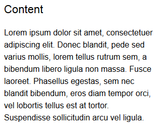
CSS Rule: “font-size: 14px; font-family: “Arial”, sans-serif;”

CSS Rule: “font-size: 16px; font-family: “Arial”, sans-serif;”
The first and easiest change to make is to just enlarge your font, just a bit. This isn’t just for nearsighted people like me, either–bigger font simply looks easier to read for everyone. Even the change from 14px to 16px, as depicted above, can be enough to make words more distinct at a glance. Visually, it looks more appealing already–and visually appealing content means readable content, which means your site has an audience. Awesome!
Space Your Lines Out a Bit
CSS Rule: “font-size: 16px; font-family: “Arial”, sans-serif;”
CSS Rule: “font-size: 16px; font-family: “Arial”, sans-serif; line-height: 24px;”
Bigger font, however, looks even better when spaced apart a little bit more. Ever wondered why your teachers always asked for double-spaced papers? As a former teacher, I found out that my eyes boggle less when the text isn’t all scrunched together like it just went through a trash compactor (especially when grading dozens of student papers late at night). Your site visitors likely think the same–respect their eyes and give each line of text a good amount of space with the line-height property.
Use Subtle Color in Your Headings and Subheadings
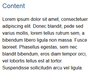
CSS Rule (heading only): “font-size: 22px; font-family: “Arial”, sans-serif; color: #336699;”
Using font colors in a webpage doesn’t have to involve crazy-bright hues. Even just a little color in your headings and subheadings, slightly different from your body font color (like the deep blue alongside the black in the above image), can help visually separate your content out. For all types of readers, whether they gobble down words or savor each mental morsel, the heading and subheading color is another cue that the topic has changed and they need to pay attention. This helps your readers take in your content more easily and understand it quicker.
Summary
Styling your content, even with just the few simple changes outlined in this article, can be the difference your site needs to become widely read. After all, content is why sites exist–let’s make it as appealing as possible!