Time was, if you wanted something visually impressive to appear on your page, you had to use an image. Creative logos, text shadows, graphic designs in the background–you had to be a Photoshop or Paint Shop Pro whiz to make it all happen.
Thankfully, with the wizardry of CSS, you no longer need images for many of these tasks. You can add shadows and outlines to text, give a 3D shadow effect to divs, crop images (or at least make it look cropped), and even create gradients and other lovely design elements with just CSS. See below!
Text-Shadow
This example shows off the “text-shadow” property in CSS3, which can give your text a “popping-off-the-page” effect. The shadow can be as long and as wide as you wish, and it can be any color you wish! (Note: this effect works in all major browsers of the latest edition, but IE 9 and earlier don’t support it.)
When you write your CSS rule for this, be sure to follow this order: “text-shadow: h-shadow v-shadow blur color;”. For instance, this is the CSS which makes the above effect:
.shadowedtext {text-shadow: 2px 2px #777777; color: #6b00a2;}
In this case, the text shadow is positioned 2px horizontally away from the text, and 2px vertically away from the text. The shadow is also given a color–#777777, a dark gray. (You don’t necessarily have to specify a “blur” value, but the option is there if you want to use it. It just makes your text shadow a little softer.)
W3Schools Text-Shadow Reference Page
Box-Shadow

See how this box of text “pops” off the screen at you? This is achieved with the “box-shadow” CSS property, which is very similar to the “text-shadow” property in both appearance and execution. It’s just that “box-shadow” works on paragraphs, divided layers, and other larger sections of pages. This works in all major modern browsers.
When you write your “box-shadow” rule’s CSS, follow this order: “box-shadow: h-shadow v-shadow blur spread color inset;”. This is how I’ve constructed the CSS for my example:
.shadowedbox {box-shadow: 10px 10px 5px #888888; background-color: #CCCCCC; padding: 10px; width: 500px;}
Here, I have a shadow which appears 10px away from the box in both directions, and it’s blurred out 5 more pixels to give it a softer edge. I didn’t use the “spread” part of the property, nor the “inset,” but I did give it a dark gray color. (“Spread” affects the size of the shadow; “inset” can turn the drop shadow effect into an inner shadow.)
W3Schools Box-Shadow Reference Page
Gradients (CSS3 Only)

Can you believe this pretty gradient was created just with CSS3? It’s true! And not only can you make a linear gradient, like this one–you can make all sorts of gradients, no image program required!
Though IE doesn’t support this functionality quite yet (as far as I know), most other modern browsers do, and it is fantastic for helping your pages load a little faster and having less images to deal with.
As for explaining how you can create gradients with just CSS, I will defer to Chris Coyier of CSS-Tricks.com, who has created not only a lovely, thorough explanatory article, but also a really neat demo page where you can see all the different types of CSS3 gradients and the corresponding code.
CSS3 Gradients @ CSS-Tricks.com
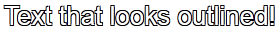
Text Outline/Stroke
Oh, how I used to long to know how to get outlined text, even in Photoshop! Long after most of the world had updated to a version of Photoshop/Paint Shop Pro that had the ability to add outlines, or “strokes,” to their text, I was still puttering around in older versions, wondering where the outline setting was.
Thankfully, there are a few pure-CSS ways to make your text pop with outlines (and they can be any color!). Again, I will defer to CSS-Tricks.com for the explanation and further examples–there is an actual property that creates an outline, and then there’s a fun little workaround that actually produced the example above. (Hint: we’ve already seen it at work in this article!)
Adding Strokes to Web Text @ CSS-Tricks.com
Cropping Images (Or At Least Making It Look That Way)
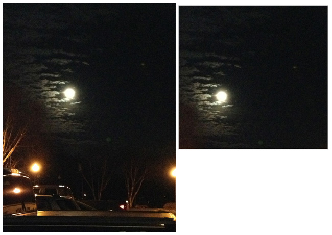
Look at these two images side by side. Would you believe me if I said these are both the exact same image file, and that simply specifying negative margins made the right image smaller?
Believe it or not, that’s how it was done–and it’s only one of the ways in which CSS can “edit” your images for you. This can be a real time-saver if you’ve got tons of images which all need to be formatted in a specific way when they display on the page (such as thumbnails). Check out CSSGlobe.com’s “faux-cropping” article to find out more about these techniques!
3 Easy and Fast CSS Techniques for Faux Image Cropping @ CSSGlobe.com
Visual Effects: Text Rainbows/Inner Shadows/Other Amazing Things

This lovely text effect was created by only using CSS and Javascript–amazing! (And there are plenty more colorful examples on the demo page!) DragonInteractive has come up with this tidy little way to help us all beautify our text in various ways, available through the following link:
DragonInteractive Labs: Rainbows
Visual Effects: Bokehs

Okay, this one requires a little help from jQuery to make this CSS run right, but it’s still a lovely way to incorporate graphic effects without ever having to open an image-creation program. Using the following linked tutorial, you can add as many of these softly blurred, half-opaque “bubbles” to your page as you wish!
Pure CSS3 Bokeh Effect (with some jQuery help) @ MarcoFolio.net