Category Archives: Monday in the HTMLab

All about web design and development, and my triumphs and defeats therein.

Songs to Write Code By

Often, I use music when I am webdesigning, either to encourage myself while writing code or inspire myself to create beautiful layouts. So, this week, I thought I’d kick off “Song Week” by creating a playlist of songs for all of us designers and developers to enjoy. Check ’em out, and get your webdesign groove on!

Songs about the Webdesigner’s Life (well, kinda)


White and Nerdy – Weird Al Yankovic

No webdesigning playlist would be complete without it, ’cause we’ve probably all made homepages for our dogs at this point. (Or at least Facebook Like pages. LOL)


World – Five for Fighting

Because when you’re coding and designing, you are literally making a “world” to display on your screen. 🙂


Under Pressure – Queen & David Bowie

For when you need to fix that bug in your design ASAP and you’re on a time crunch. XD


Fix You – Coldplay

The song you sing to your webpage when it’s not working and you’re trying to fix it…


One Step at a Time – Jordin Sparks

Because webpages are built one tag at a time; this is a nice reassuring song to play when you’re frustrated with a design. 😀


Nothin’ Better to Do – LeAnn Rimes

Because we actually have nothing better to do than to design and develop web pages–what could be better than affecting the internet with our talents?

Songs for the Design Process

For when you need a good groove to code to. 🙂


Invasion of the Gabber Robots – The Laziest Men on Mars


Rods and Cones – Blue Man Group


Straight Ahead – Tube and Berger


Popcorn (1969) – Hot Butter


Derezzed – Daft Punk


The Percolator – Cajmere

The Dumbest Thing I Have EVER Done in Webdesign

I’ve been prone to a few boneheaded design/development decisions since I began teaching myself HTML in the fall of 2003. We all have those moments, as webdesigners and as human beings–we all have huge foul-ups that we look back on later and laugh.

But this one, as you’ll see, takes the cake for “dumbest design ever;” it was July 2005, a scant year and a half after I had begun webdesign, and I attempted something I’d never done before (and haven’t done since).

The Infamous “Pink Layout”


This was my fourth layout for my domain, WithinMyWorld.org. Yes, yes, I know, you’re probably recoiling from your screen in horror right now. xD

Why might I consider this the “dumbest” design choice I’ve ever made? There are actually a few reasons:

  1. This layout used a color I absolutely abhor. I have hated pink, especially this Barbie shade, since I was a little girl, and I think my hatred for the color bled into the layout.
  2. I put in several images on this layout, but they were used in strange places (even underneath the content), which ultimately distracted user attention from the important bits of the site and made content difficult to read.
  3. I flung the navigation far to the left in this layout, as if it was in “Time-Out” or something. Users ended up having to hunt for the navigation instead of easily being able to click around my site.
  4. The largest text on the screen (specifically, “Within My World” and “Navigation”) used Scriptina, which is a gorgeous font. Unfortunately, I made it very difficult to read, especially the way I have it formatted with drop shadows and the like. Combined with the images and eye-searing color choices, the layout became just too “much.”

Basically, I went overboard with this layout in every way–I tried to stretch my designing wings and ended up about knocking the nest out of the tree, it seems. xD

How Can We Learn from This?

Acknowledging a foul-up is the first step to learning from it. Now that I’ve used this as a negative example, how can we learn better design from this?

Choose colors carefully.

When trying to choose a thematic color for your site, make sure the color fits your site and doesn’t detract from your content. In my case, the pink of this layout was not only an unfavorite color, but was also an overpowering color, taking away the attention that my content deserved.

It also didn’t fit the purpose of my site–this color belongs more on a fashion and beauty site/blog, or a breast-cancer awareness site. Color does more than just sit on a page; it symbolizes your content in ways you may not even be aware of. Making the most of those color associations can help your users categorize and enjoy your site more.

Use layout images to highlight content.

In this layout, I put images everywhere but where they needed to be. Nothing draws the user’s eye to the content–instead, your eye roams all over the place, not finding anywhere to really settle.

Instead, place detailed, eye-catching images within your content to further explain it, or place a few symbolic images in your header to make your site’s purpose clear without being distracting.

Put navigation in a highly-visible spot.

Don’t do what I did and push your site navigation out to the middle of nowhere. Navigation, like content, needs to be readily available so that users can actually USE your site. I kinda forgot about that when I was designing this page, and my site suffered as a result.

Ensure that your fonts are readable (even the decorative ones).

Beautiful fonts are awesome, but only when wisely used and formatted. Like I described earlier, Scriptina looks lovely, but I didn’t format it and use it to the best of its potential. What could have been graceful and light ended up chunky and almost illegible in parts.

When you’re choosing fonts for your site, whether it’s part of a decorative header or part of your page’s font selection, make sure your users can read them and that they won’t detract from the words those fonts are printing on screen. Those fonts are meant to communicate, not just look pretty!

How Webdesigning is Like Writing and Music

Since I both write music and literature outside of doing webdesign, I’ve found that the three activities are more similar than one might think otherwise. After all, they all activate my creativity, just in different ways; I play and design with pixels just like I do with notes and words.

So, here’s a little tongue-in-cheek webdesign philosophy for your Monday morning:

How is Webdesigning Like Writing?

  • Choosing just the right word for a description is like aligning each image pixel-perfectly on the screen.
  • In both writing and webdesign, the creator believes he or she has complete control over the final product, especially if working independently.
  • Both writers and webdesigners have the tendency to obsess over little details that nobody will actually notice.
  • Finding a missed typo in your writing is like finding a missed ending tag in your code–very annoying!

How is Webdesigning Like Music?

  • Little mistakes, whether in a browser or in performance, are rarely noticed by the audience.
  • Every musical performance is different, just like every Web browser renders a webpage a little differently.
  • What a listener gets out of a piece of music depends on his or her perspective and outlook on life; what a user gets out of a webpage depends on what browser and screen resolution he or she is using.
  • In both music and webdesign, no matter how many parts/harmony lines go into making it, it all renders as one beautiful whole to the audience.

Can you think of other ways that webdesign is like these art forms? What about other art forms (dance, visual art, etc.)? Leave me your thoughts in the comments! 😀

Tumblr: A Different Blogging Style

Have you always wanted to blog, but never known what to blog about? Have you put aside the whole idea because of not knowing how to design or code webpages? If these apply to you, let me tell you about Tumblr.

What Is Tumblr?


Tumblr is a relatively new kind of blogging platform, revolving around the concept of “reblogging.”

Reblog, verb: “to repost an item of interest from another blog to your own, with proper sources and credits already applied for you by the blogging platform.”

In short, reblogging on Tumblr is like retweeting on Twitter, or repinning on Pinterest–you only need to click a button, add comments if you wish, and voila, the reposted content is viewable to your followers (people who receive updates from your blog), with links to the source already included. This is not plagiarism; indeed, it is meant to help original content have a much wider reach and audience. If you like something enough, you can reblog it, and Tumblr will automatically give credit back to the person who originally posted it through Tumblr’s platform.

Of course, you can also create content of your own and post it through Tumblr as well; in fact, many small fansites are now run through Tumblr because of the ease of posting original content. It is an easily accessible platform to blog on–you just sign up, select a username for your Tumblr, and in mere moments, you’ll have a “yourusername.tumblr.com” address for your own blog!

More than a Blogging Platform–a Community

But reblogging is not the only thing that sets Tumblr apart from other platforms. More than on any other blogging platform I’ve tried, there is a strong sense of community between bloggers.

Much like Twitter and Pinterest, Tumblr uses the concept of “followers;” also like them, Tumblr has a sort of “news feed” of all the recent posts from blogs you follow, called a “dashboard” for short. What the Dashboard does differently is to allow commentary between bloggers that has no maximum character limit–very different from Twitter and Pinterest.

Not only that, but you can very easily find other bloggers who share your interests, and build a community with them through reblogging and messaging. I’ve only been on Tumblr since mid-July, and usually just get on at night due to dialup access, yet I’ve already experienced some of that supportive, open community. It just seems so much easier to reach out to other Tumblr users than it was to connect with other Livejournal users or other WordPress.com users.

Using Tumblr: A Crash Course


The Tumblr Dashboard, partly seen here, appears once you have logged in. It allows you to see recent posts from the blogs you follow, as well as post content yourself. The seven different-colored icons stretched across the page are your “content-posting” icons, and below them will appear a feed of the latest posts from the blogs you follow.


Each post you see on your Dashboard will have a top line that reads something like this. Usernames are quoted as “so-and-so reblogged so-and-so” or “so-and-so posted this,” as you see in the image. The number 9.054 on this image stands for the number of Tumblr users who have either liked or reblogged this particular post; the double-arrow symbol to the right is what you click to reblog, and the heart is what you click to like the post.


In this image, you can see that the heart is now red, signaling that I chose to “like” this post. The number 9,054 is now 9,055 in accordance with that.


Tumblr also provides you a quick way to see individual blogs from within the Dashboard. Hovering over the top right corner of any post on the Dash will “fold” the corner; you can then click that corner and Tumblr will open a new window with just that blog visible.


If you choose to reblog a post, this is an example of what you’ll see–content at top left, a place to comment on said content at bottom left, and places to schedule and add tags to your post. At the bottom, you can click to reblog, preview the post, or cancel if you so choose.


To look for posts about a favorite topic of yours, just type in the topic in the “Search Tags” box, and Tumblr will pull up a reverse-chronological list of posts with that tag. (This is also a great way to find new blogs to follow based on that topic choice!

Here, you can see my personal sidebar, off to the right of the posts on my Tumblr Dash. Yours will look a little different, but the basics are here–mostly links to help you run your blog more efficiently. Through the sidebar, you can view all the posts you’ve personally made, a list of all the blogs you follow (and all who follow you), what posts you’ve Liked, etc.

The section I’ve marked in red on this image shows my “tracked” tags. If you want to be notified every time someone on Tumblr posts something with a specific tag, all you have to do is search for that tag, then click the listing for that tag as it sits on your sidebar. Then, every time you log in, you can click that listing again to look at all recent posts with that tag. (Tracking tags is a good way to keep tabs on whatever topic you happen to be a fan of at the moment, as you can see from my personal list. LOL)

Finding Community on Tumblr

The most tried-and-true way to build community on Tumblr is to search for various content through the Tag system, as described above. If you browse through various tags and find that you like the posts by a particular Tumblr author, then all you need to do is click their username, go to their blog, and click “Follow” in the top right corner. This is pretty much how I started following most of the blogs I follow!

From there, building community with other users can be as simple as reblogging what they’ve made and messaging them if you wish. Tumblr, like Twitter and Pinterest, lets users know when others have reblogged their content, and from there they can choose to follow you back if they want to.

You do have to be fairly active and social to find that community for yourself, but I’ve found that Tumblr is a much easier community to involve yourself in–it doesn’t feel quite so insular as other blogging platforms have felt to me. Actually, I feel freer to speak my mind than I do anywhere else online, because Tumblr seems to attract free spirits like myself. 😀

Try Tumblr for Yourself!

It’s as easy as visiting Tumblr.com and clicking “Sign Up!” 🙂

Cleaning Up Layout Clutter

Just as I seem to be a severe pack rat in real life, I’m also a hoarder online…but I’m not the only one out there. There are many examples of cluttered layouts floating about on the internet these days (mine are likely prime examples).

What do I mean by “cluttered” layouts? Any site design that makes it hard for users to find what they need could be classified as cluttered. After all, in a cluttered room it’s difficult to find the items you need (as I know from laughable personal experience).

Today, I’ll share with you the four major ways we webdesigners and developers accidentally clutter up our layouts, and how to declutter them.

Extremely Busy Background Images

Background images are just that–they are meant to create a fitting backdrop for the main attraction, our websites’ content. But it’s very easy to overdo a background image and make it a dizzying sight. For example:


This doesn’t look too busy when it’s on a page by itself…


…but when it’s tiled and used as a page background, it looks more like one of those 3D images than a webpage background.

This kind of background image can make browsing your site difficult to do–your text-based content can be hard to read, or even impossible to read, and any images you’ve posted won’t attract the same kind of positive attention.

How to Fix This

You don’t have to sacrifice interesting design to make your backgrounds easier to take. These design strategies can help:

  • Use colors that are closer together in shade so patterns are subtler.
  • Try a soft gradient just along the top or sides of the page.
  • Use a larger, low-contrast pattern instead of a small, high-contrast pattern (sounds counter-intuitive, but works!).

Content, Content, Everywhere!

I’ll admit it–I cram my pages full of content. *cough* sidebar *cough* I’m a content hoarder, and I almost need an intervention. 😛

Content is wonderful; it’s the reason we all make webpages in the first place. But when we overload our users with tons of content crowded onto one page, whether it’s images, links, text, or anything else, we make our pages about ten times more cluttered.

Just like a cluttered room with too many items to look at, a page cluttered with content makes it hard for users to know where to focus first. If there are sidebar links, footer paragraphs, dozens of images, etc., all on one page, how can a user easily find what he or she is specifically searching for?

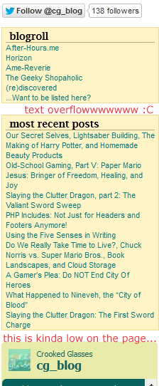
You could argue that this shot of my own sidebar on this blog is a bit cluttered–and I would agree with you.

For one thing, the text of each content box is really small; for another, the small headings don’t attract the eye as well as they might. Thirdly, the one social media link looks a bit lost, even at the top of the page.

Though at first I thought this design looked very tidy, now I see that the text looks a little haphazard and it’s hard to determine what to look at. And, as I’ve noted on the image itself, the Twitter feed is very low on the page, and the “most recent posts” box is overflowing with the titles of each blog entry. My inner pack rat strikes again! LOL

How to Fix This

Thankfully, you don’t need to take all the content off your page to declutter it. These tips can help:

  • If your sidebar is overflowing with content, try moving a section or two to its own page, and simply link to the new page on your sidebar.
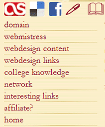
  • Use icons instead of text links (where possible) on your header, sidebar, and footer.
  • Shorten text link descriptions to as few words as possible.
  • Halve the number of content items displayed per page (i.e., if you have 20 content items per page now, try 10 and see how that changes the page look).
  • Enlarge the font size of your remaining content items/sections. (Again, sounds counter-intuitive, but larger text will command more attention and not look quite so messy.)

Unnecessary Information On Your Main Page

On your index page, do your users need to have the full-text version of your site’s history in the sidebar? Or do they need to see every single image you have in your site’s archives? It’s important to think about the purpose of your site, and what information the users are visiting your site for.

I’ve made the “unnecessary information” mistake dozens of times over, especially when I’m first crafting a site. I always start thinking, “But wait, I’ve got to put [this random piece of information] over here, and what about [this other bit of randomness]? I’ve got to find places for them all on the main page!”

To snap myself out of this mindset, I had to think about what was most important to my users–and this self-check could work for you, too. Think about what your user really needs to see when he or she first hits your page. What is most important to them? What do they need to click on or view first?

These items, whether they’re welcome/mission statements, Twitter updates, your most recent post, etc., need to be the only things to view on your landing page. Anything else needs to be put on a separate page, or hidden in some way unless the user clicks on it to open a section up.

How to Fix This

Your landing page doesn’t have to be bare, but a little information goes a long way–try these changes:

  • Determine the 3 most important things your user needs to see/interact with when they first come to your site. These 3 things need to be showcased; other information can be put on other pages or relegated to less prominent locations on your landing page.
  • Use clear text headings on your landing page so it’s easier for users to find information they need.
  • Divide up the information visually (images or CSS formatting) to make visual searching of your page easier.

Scattered Social Media Icons

It is important, if you’re making any kind of website, to make sure your users can interact with you and your site on social networks–you don’t want to skimp on that. But it’s equally as important to make sure those social network links don’t take over the rest of your page.

I found this out when I designed my 11th layout for WithinMyWorld.org–I carried over some social media icons from Version 10 and put them on the main page. Little did I know that unlike Version 10, Version 11 did not really have a good place to display icons. What looked crisp and clean on Version 10 looked like misplaced clutter on Version 11; it looked so bad, in fact, that I took the icons down within hours of changing over the layout.


This screenshot from Version 10 shows a nice, neat place for icons to live, right above the navigation.

Version 11, however, has no real place for icons to live on the page, because it creates a bad contrast with the background image.

How to Fix This

These all-important icons don’t have to be banished from your page altogether; some of these hints may help you figure out where they belong.

  • Think about where you’d like your social media icons to be BEFORE you design your layout. Design around them rather than sticking them on as an afterthought. (This really helps–trust me!)
  • Make the icons larger rather than smaller. This helps them stand out more on your page, so they’ll look less like clutter and more like a vital part of your site (which they are).
  • If the original icons’ colors clash with your layout, you can always make icons to match your layout, with a font like Socialico. Either include it as a custom font in your CSS, or make them into images–both ways work!

Summary

Making the extra effort to declutter our pages can make a huge difference to our users–it can positively affect the way your user views your content, and could even ensure return visits or new visitors via word-of-mouth. Thus, a tidier site can make for happier viewers and a happier webmaster, too! 🙂

PHP Includes: Not Just for Headers and Footers Anymore!

Many of us likely use PHP includes to build and maintain our sites these days. But I would guess that most of us just use the following includes and nothing else:

<?php include(‘header.php’); ?>
<?php include(‘footer.php’); ?>

Headers and footers are very easily managed through the PHP include method. But thankfully, includes are not restricted to just headers and footers–in fact, you can manage a whole site with includes!

Example: My Joined Fanlisting Page

Back before I really mastered PHP includes, I had a joined fanlisting page–literally, it was a PAGE, because it was one single HTML file. Everything–style info, links, image sources–all were crammed into this one file. Uploading new layouts for it didn’t take a long time, but it sure was time-consuming to edit the file in any way. God forbid I would actually have to change a link or an image source!

For a long time, I didn’t know how else to do it; I just kept scrolling up and down in the same huge HTML file, spending countless minutes hunting for the small portion of code I wanted to edit.

And then, I discovered the beauty of including more than just header and footer.

The Solution: Make Each Section into a Different File!

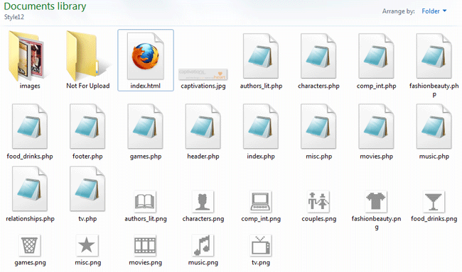
When you visit my joined fanlistings site, it may not look any different to the user, but it’s vastly different on the back-end. Each section of fanlistings is separated out into its own files, as seen below:


As you can see, I have a file for every subject matter: fashion and beauty, food and drinks, movies, characters, etc. This makes it much easier to locate and edit links when needed. All I have to do is look for the general topic of my fanlisting, open the file that corresponds to it, and start editing, no frantic searching required!


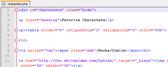
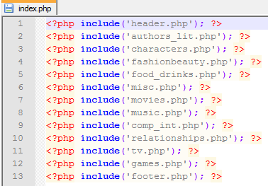
This is what each separate file’s code looks like. Each section has its own special divided layer, and all of its code is self-contained so that it all fits within the larger “puzzle” of the index.php file.

Notice that I don’t have to put includes for the header and footer in each of these files–each file is simply a piece of index.php, not a page in its own right like most other PHP-driven sites.


Therefore, index.php is just a list of included files and nothing else, which makes it easy to add or delete a section from the viewable site as needed.

Why Bother Doing This?

I can think of three reasons you’d possibly want to break up your site into small files and including them with PHP:

  • You’ve gotten lost in the code while trying to edit your file
  • Editing your file has become so tedious that you put off doing it
  • The individual file loads more slowly than you’d like

In any of these three cases, breaking your data into chunks with separate files, and then reassembling those pieces with PHP includes, will help with editing time and loading time.

How to Make PHP-Included Files for Your Site

#1: Determine what defines a “section” for your site.

Look at your code, and look at the content you have. How does it divide up into sections? For me, I could divide my content, my joined fanlistings, by what general topic they could be filed under (Movies, Music, etc.).

#2: Copy-paste each section into its own file.

To divide up your file, you’ll need to carefully copy and paste each little section into a new file, and save it as a PHP file.

Warning: Make sure you carry over any formatting or structure that is specific to each section! I initially forgot to copy-paste the Fashion/Beauty section’s opening divided layer tag when I was creating my new joined fanlistings page, and major havoc resulted when I tested the page. xD

#3: Make your index.php file, with code that includes all your new files.

Once you have all your new little files, it’s time to include them! Wrap them all in a big group hug with code like the following:

<?php include(‘header.php’); ?>
<?php include(‘firstsection.php’); ?>
<?php include(‘secondsection.php’); ?>
<?php include(‘sidebar.php’); ?>
<?php include(‘footer.php’); ?>

Save this as “index.php”, then upload and test it. Result: you should have a perfect, much more manageable site! It shouldn’t look any different to your users, but it’ll be much less of a headache for you. 🙂

Web Design on a Budget: The Three Best Free Software Tools

If you’re just beginning web design/development, or if you simply don’t want to spend money on expensive software tools, it may seem impossible to achieve your dream of coding and designing your own site. You might even think you can’t create anything worth looking at or browsing if you don’t have high-end software.

I am happy to tell you that there are wonderful free software options for all of us who can’t yet afford some of the loftier programs. Not only are these programs free, but they are often the best utilities out there for the price. Here are the three webdesign software tools I use for my own designs:

Best Free Code Editor: Notepad++

Ever since I began web design, I longed for a “just-code” editor, one that would display the bare code like Notepad did…except that I wanted a little more Web-specific functionality, too. I wanted to surf through the code without getting so lost; I wanted to be able to speed up the long and tedious editing process. I needed a program that wasn’t so simplistic as a WYSIWYG editor, but one that was also helpful for those of us who were learning code.


Well, someone in the Notepad++ development team must have heard my prayers! Here, you can see how the different bits of code are color-coded (HTML tags are blue, selectors are in red, option choices are in purple, and so on).


See the gray minus sign and the line extending between the opening p tag and the closing p tag? This is another one of Notepad++’s great tricks: “folding up” a section of code if you need it up and out of the way.


When you click the minus sign, it closes the section of code encased by the opening and closing p tags, resulting in a display like this. Clicking the red plus sign will expand the hidden code out again.


Like the image above says, the “Replace” function is also known as “Hallelujah!!!” That’s what you’ll shout when you realize you can use the Find & Replace function to edit the same text in every file you have open within the program. SO awesome for expediting those previously long and tedious tasks, like editing a line of code on every page of your site.

Now, I haven’t even begun to expound upon all of Notepad++’s awesome features. The program supports a variety of different languages, from ASP all the way to XML, and even including some languages I’ve never even heard of (Haskell and KIXtart, among others). Plus, it has the ability to use macros, plugins, and converters for even faster programming. Check out the program with the link below:

Download Notepad++: Notepad-Plus-Plus.org

Best Free Graphics Program: GIMP

Ever wanted Photoshop but couldn’t hack the $600 price tag? Well, GIMP can do most things you’d use Photoshop for, even transparency and text addition, but for free.

Its interface is a little more free-form and spartan…


…but within it, you can still do all of the basic image-editing techniques, as well as some of the more sophisticated ones usually in higher-end products.


This is how an image looks when opened within GIMP–it appears in the central box of the program.


Most of the tools that usually appear under Enhance in Photoshop-esque programs are located under Colors in GIMP, such as Brightness/Contrast, Levels, Hue & Saturation. etc. These dialogs work just as well as the pricey ones, and these come with handy ToolTips to help you navigate the menus.


This is an example of the Levels dialog, in which you can change the shadows, midtones, and highlights to your heart’s content.


The Image menu remains largely unchanged from programs like Photoshop–it’s just that the “Resize Image” dialog is renamed “Scale Image.”


The dialog for resizing the image appears here. To resize your image proportionally, just type in your desired height or width, and then click the linked chains to the right of the boxes to get the corresponding number in the other measurement.

Besides changing sizes and tweaking shadows and highlights, GIMP can also do a lot of the artistic filters on pictures that Photoshop can, plus cropping, layering, and masking. It’s a great program, and even after six months of using it I’m still not done exploring all it can do. Check it out for yourself!

Download GIMP: GIMP.org

Best Free File Uploading Program: FileZilla

If you’ve got tons of files to upload, never fear that you’ll be stuck uploading through your browser again! FileZilla is a free FTP program that offers clean and simple uploading (and downloading!) functionality.


This is what the program looks like before you make a connection to an FTP server. On the left appears your computer’s folder hierarchy (top left pane), and the content you’re working with in the currently open folder (bottom left pane).


To connect to your FTP server, you’ll need to provide FileZilla with some information. This is the Site Manager dialog box, where you plug in the info for your site. The “Host” line is usually something like “ftp.yourdomain.com”; you’ll need to fill in your username and password for your hosting server. (My details are obscured for privacy reasons.) Once you’re done filling in your info, you can save and connect!


This button, at the top right underneath the word “File,” is the Quickconnect button. Use this to connect to any of the sites whose profiles you’ve saved already through the Site Manager dialog box.


Once you connect to a server, its folder hierarchy appears in the top right pane, and the contents of an individual folder appear in the bottom right pane. Uploading can be as simple as dragging and dropping the files from the bottom left to the bottom right pane!


Or, you can always right-click the file you want to upload and choose “Upload” from the right-click menu. (For Mac users, I am not sure of the keyboard shortcut to achieve this–please pardon my Windows-user ignorance.)


If you want to upload multiple files, the highlight-and-right-click-upload method works best, I’ve found.


FileZilla will even warn you if a file already exists, and through this dialog box you can choose whether you want to overwrite it or not–it even specifies very detailed actions depending on the age and size of the two files it’s comparing.


Not only can you upload files, but you can download them from your server as well! It’s great for making file backups…and, as I found out in 2011, great for emergency saves of all your hard work. When my hard drive crashed in 2011 and I lost ALL my data, FileZilla was able to download copies of all my files from my hosting provider very quickly and efficiently.

(And, just like uploading multiple files, you can highlight-and-right-click all the files you want to download from your server, and do it en masse. That’s what made getting all my Web work back a whole lot easier.)

FileZilla may not have a lot of frills, but it’s an excellent utility for bulk uploading and downloading, making file backups, and connecting to your site without having to have a browser window open. It’s well worth a download!

Download FileZilla: FileZilla-Project.org

Make Yourself a (Font) Map

As webdesigners, we make use of hundreds (and possibly thousands) of different fonts every year, choosing just the right text ook for each of our layouts, small graphics, headers, and other projects. Symbol fonts, especially, have become very popular as a way to design matching social media icons, as well as general site commands (like Refresh).

However, if you’re working with many different symbol fonts, it can be difficult to remember which symbol occurs on which key when you’re using a particular font. Or, you may want a particular symbol and can’t remember which font has it. Fruitless searching follows, usually with a little (or a lot) of frustration included.

That is, unless you create something I like to call a “font map.”

What IS a Font Map?

This is an example of the font maps I’ve created for myself–this one corresponds to the Wingdings font, which is default on most Windows computers. The top group of four rows contains all the symbols that can be created with lowercase keys; the bottom group is all the symbols that are created by hitting Shift and a key.

How Do You Make a Font Map of Your Own?

You will need an image creation program–I use Photoshop, but even Microsoft Paint can do it (as I discovered while writing up this blog post!).

  1. Open a new blank image in your image creation program.
  2. Select the Text tool, and place a text box or text cursor onto your image.
  3. Type out all of the generally available keys on your keyboard, like I’ve demonstrated below:

    `1234567890-=
    qwertyuiop[]\
    asdfghjkl;’
    zxcvbnm,./

    ~!@#$%^&*()_+
    QWERTYUIOP{}|
    ASDFGHJKL:”
    ZXCVBNM<>?

  4. Select all the text you just typed/copy-pasted, and change the font to the symbol font you want to map out. Make sure the font size is big enough for you to read easily!
  5. Presto! A new font map! (If you want to, you can label the two different groups as I have done, and put the title of the font on the image, too. Just makes using your new font map a little easier.)

Does This Really Help? You Better Believe It!

I’ve been using font maps successfully in web design for several years now–it’s a real time-saver, meaning less minutes wasted typing and backspacing on my image till I find the right symbol. In seconds, I can flip through all my font maps, find the symbol I’m looking for, and be on my way to a finished design.

Try making one for yourself, and see how much easier it is to use the various symbol fonts in your designs. You’ll thank yourself later!

How Do You Make a Resizing Icon Bar for Your Website?

Today, instead of an informative article, I have a question for my readers. How do you make an animated, resizing icon bar?

Example Images of What I’d Like to Create


This is a smaller example of how I’d like the icon bar to look when a user loads the main page; larger icons, easy to click on.


This is a smaller example of how I’d like the icon bar to minimize when a user clicks an icon and goes into one of the content areas of the site; smaller icons, but still visible.

Usage and Placement of the Icon Bar

Ideally, I’d like the icon bar to run horizontally along the very top of the page, so that the navigation for the site is not too obtrusive for reading. It would also be awesome if the user could expand the icon bar out again by hovering over this bar.

Is This Even Possible?

I have found a few tutorials that kinda sorta do this, but don’t really get the exact same functionality.

The jQuery “Sliding Panel” Code

w3schools.com has these tutorials and examples for building a sliding panel or animated panel. This could possibly work for opening and closing a menu, and perhaps even a navigation bar like I wish for.

However, I’m not sure how to make the icons display bigger when users first visit the site. I think I’d probably have to stay with the same icon sizes so that the rest of the layout wouldn’t be thrown off with bigger images.

The JavaScript Hide/Show Menu Code

CSSCreator.com shows a way to hide and show specific divided layers with a Javascript in your header and some special classes created in your CSS.

This type of solution can produce a menu that is very easy to hide away when not needed, but it wouldn’t be automatically opened when the user first loads the page–it could end up being confusing rather than helpful to users.

What’s Your Answer?

Do you know of a way that I could create this resizing icon bar? Let me know in the comments! (If we can figure this out together, I may be able to debut this new trick on the upcoming Version 13 of WithinMyWorld.org!

The “Great Wall of Text” and Other Web Writing Mistakes

Making content for the Web is not as easy a proposition as it first sounds. At least, not if you’re going to attract readers to it. This, I have unfortunately discovered since I began running this blog; for instance, my writing style may be conversational and fairly engaging, but it’s also a little verbose. (I suffer from “Wall-of-Text Syndrome” on a daily basis. LOL)

This is a Web writing mistake that can drive away visitors–but it’s not the only one we Web content creators can make. Read on, for the 5 most common writing mistakes on the Web, and how to fix them!

Web Writing Mistakes

  1. Paragraphs that are too long (more than 5 lines)
  2. Font size smaller than 12px
  3. Font color too similar to background color
  4. No pictures to help illustrate points
  5. Using 100 words when 10 will do

How Can We Fix These Mistakes?

Thankfully, Web content is very forgiving–all you need to do is hit the backspace key and rework your sentences. And believe me, your readers will thank you for improved readability and comprehension!

#1: Break Up Long Paragraphs

Preview how your Web content looks in your layout. Are any paragraphs more than 5 lines long when contained within your divs or tables? If so, you’ll need to reword and reformat to break those longer paragraphs into smaller sections. Just like dividing larger pieces of food into smaller bits, keeping your paragraphs small makes it easier for users to digest what you’re saying.

Think about it this way: would you rather read Example #1 or Example #2, below?

Example #1
Crooked Glasses is a multi-topic blog–sounds pretty weird, but I enjoy writing it. During the week, I cover web design and development on Mondays, social commentary and philosophy on Tuesdays, Biblical analysis and application on Wednesdays, gaming and game strategies on Thursdays, Internet surfing on Fridays, and any and all forms of creativity on Saturdays. (Occasionally, I have a wildcard post on Sunday, too!) This blog has been going since January 2011 and can be followed on Twitter; I’d love to hear back from y’all about subtopics you’d like to see covered. Also, comments are enabled on every post, so if you have opinions or ideas regarding any post, feel free to click “comment!”

Example #2
Crooked Glasses is a multi-topic blog–sounds pretty weird, but I enjoy writing it.

During the week, I cover web design and development on Mondays, social commentary and philosophy on Tuesdays, Biblical analysis and application on Wednesdays, gaming and game strategies on Thursdays, Internet surfing on Fridays, and any and all forms of creativity on Saturdays. (Occasionally, I have a wildcard post on Sunday, too!)

This blog has been going since January 2011 and can be followed on Twitter; I’d love to hear back from y’all about subtopics you’d like to see covered. Also, comments are enabled on every post, so if you have opinions or ideas regarding any post, feel free to click “comment!”

Which felt easier to read? If you’re like most Web users, you probably answered Example #2–when information is spaced out in understandable chunks, it helps our brains understand it better. Spacing out content, even if you don’t rewrite it, can help our users understand what we’re writing.

#2: Enlarge Font Size

I don’t know about you, but loads of tiny font crammed onto a page doesn’t make for happy reading for me. Small font sizes are all the rage for designers who don’t want to take the focus off their layouts, but if we want our users to be able to use our sites, we need to make our content as easily-read as possible.

I’ve found that the 12pt font size works well for body content (that’s what I’m using on this blog)–it’s not so big that it overwhelms the screen, but it’s not ant-size either. We don’t want to give our users squinting wrinkles, after all!

Look at this example of the same text formatted in 8pt and 12pt:

Both use the same text (an excerpt of the famous “Lorem Ipsum” text), and the same font color. Which would you prefer to read on a computer screen?

#3: High-Contrast Text and Background

Many designers, especially beginning designers, choose to have their font colors similar to their background colors…sometimes a little too similar. (I admit, I made the same mistake in my newbie days!) As a designer, you do want your colors to match well together. It’s just that the font color and the immediate background color (behind the font) should not be almost the same color.

An example, here:

This dark brown text seems to almost vanish into the similarly-hued background. If this represents important text on your website, it’s likely your user will either ignore it completely, or try to read it but give up on it.


Putting the font in a much paler color pops against the same brown background I used in the previous example. See how much easier it is to read?

#4: Add a Couple of Explanatory Pictures

As I’ve seen for myself throughout this blog post, adding a couple of pictures really does help illustrate your points. Not only do you have to write less to explain yourself, but it further breaks up any “walls of text” that might be on your page already.

If I hadn’t done the font color and size examples in pictures, for instance, then I would have had to resort to explaining myself in words, which might otherwise have been ignored or skimmed over. Pictures draw the user’s attention and help visually summarize what you’re writing.

#5: Edit Down to One Sentence, Then Expand

This is tough. Oh, wow, is this ever tough for me. I love words, so it’s hard for me to cut the excess away. But if we want our users to read what we’ve worked so hard to write, then it needs to be concise. After all, if the user doesn’t get what he or she wants from our site as quickly as possible, they’ll go somewhere else.

One of the tricks that has really helped me with this is to edit down a paragraph into one sentence, often called a “topic sentence” in grade school. Then, I can expand my paragraph out just a little bit with enough detail to make it smooth and flowing again.

With that in mind, let’s take the text I wrote from the first example, and edit it down just a bit.

Before Editing
Crooked Glasses is a multi-topic blog–sounds pretty weird, but I enjoy writing it.

During the week, I cover web design and development on Mondays, social commentary and philosophy on Tuesdays, Biblical analysis and application on Wednesdays, gaming and game strategies on Thursdays, Internet surfing on Fridays, and any and all forms of creativity on Saturdays. (Occasionally, I have a wildcard post on Sunday, too!)

This blog has been going since January 2011 and can be followed on Twitter; I’d love to hear back from y’all about subtopics you’d like to see covered. Also, comments are enabled on every post, so if you have opinions or ideas regarding any post, feel free to click “comment!”

One-Sentence Summary
This is a multi-topic blog, covering web design, opinions, Scripture, gaming, fun links, and creativity; come read, follow, and comment!

Expanding On the Summary, Making It Sing
Web design and development! Social and philosophical opinions! Even Biblical interpretations, gaming strategies, new websites, and all the arts! If any (or all) of these topics interest you, then come visit Crooked Glasses, a rare form of blog. If you like what you see, follow us on Twitter, and leave your thoughts in the comments!

Without losing any of the main points, I was able to summarize and energize the text into a much more attractive bundle. I believe this is easier to read (and more fun to read)–what do you think?

Summary

By taking a little time to revise and reformat your words, your Web content can be infinitely more engaging and convenient for your users. And the best thing? Writing can be revised forever, so if you don’t get the fix right the first time, there’s always the Backspace key. Like I said, your users will thank you for this!