Category Archives: Monday in the HTMLab

All about web design and development, and my triumphs and defeats therein.

Making a “Good” Layout Better

Web design is not always a simple matter of knocking something together in Notepad, putting pretty pics with it, and uploading it. Sometimes, as we well know, layouts just end up looking…blah on the page.

Take the following layout, which I was trying to craft for my upcoming webdesign tutorials page.


(click for larger size image)

This, in terms of a layout’s pure functionality, works. It displays what it’s supposed to; nothing’s out of place, misspelled, or obviously buggy. And yet it just looks…blah. The icons look too small, being dwarfed by the text and the header image. Not to mention there’s a lot of open, unfilled green space. It’s just…empty.


(click for larger size image)

This was my first attempt at fixing the emptiness and too-small icons of the first layout. I resized the icons and tried to reposition them where they wouldn’t just be hanging out in the middle of nowhere…and yet, again, I ended up with a problem. This time, the issue is that the layout looks cluttered–there is nowhere for the visitor’s eye to rest, because the icons stick out like sore thumbs and the header image looks off-center. And again, the layout has a bunch of empty space, especially on the left side. Sigh…


(click for larger size image)

Third time is the charm, I believe! This time, I centered the header image over the two-column layout below, leading to a more symmetrical look. I also included the navigation icons WITHIN the image div itself, and, After much tussling with HTML and CSS, got them to be positioned where I wanted them. (Who would have thought margins and padding would kick up such a fuss?) But the result is a much cleaner and more understandable look. It might not be “the BEST LAYOUT EVAR OMG,” but it’s much better than the one I had when I started out!

Sprucing Up a “Blah” Layout

If you’re having similar difficulties with a layout of yours, you might not need to go back to the drawing board completely. Instead, you might benefit from just reworking a section or two, as I did with my troublesome layout. Here are some general tips:

Change the Positioning of Graphic Elements

If the visual balance of your layout looks off, or it feels cluttered with graphics, try moving some of your images/icons around a bit. Try them positioned in a completely different place on the page, or even going a different direction (like vertically instead of horizontally, or vice-versa). You’d be surprised how much a little strip of icons can affect a page, as I found out!

Take Away Text, Add Icons

If, however, your layout feels heavy with text, you may be able to transform some of those words (especially textual navigation) into iconic navigation. (In my example layout, I challenged myself not to use text links in my navigation unless it was absolutely necessary, so that it wouldn’t detract from my content.) It may not seem like text is overwhelming your page, but it can easily swamp your visitor with information overload. An icon, by contrast, looks simple and neat.

Experiment with Content Positioning

Does that old left-aligned sidebar look dated and tired? Then maybe all it needs to do is flip over to the right side! Placing content in slightly-unexpected areas can change the look of the whole layout; moving smaller blocks of content around within your layout can also affect your users’ experience. Keep this thought in mind every time you design: “What do I want my users to see/click first?” This should be closest to the top of the page, and your header should “point” toward it, drawing their eyes to it.

Work With Your Fonts

Sometimes, a layout can seem too crowded simply with a too-small font, or a font that isn’t very clear. If you’re having difficulty displaying content attractively, as I was, a font change may be in order. Trying a bigger point size, a clearer font, or even a different class of font altogether may help clear away the “text-cluttered” look.

Summary

You may feel like scrapping a layout that you feel is too ugly to save, but don’t be so hasty! Experimenting and reworking just bits and pieces may just save you a lot of time and hassle designing a totally new look. I was about to give up on that example layout of mine, till I experimented around and found a clean, simple new way to put the same elements together.

Phrases Webdesigners Say

Author’s Note: This is done in the style of the popular “S–t ______ Say” videos and articles; I thought it would be a fun twist to include webdesigners in the scope of this meme. Enjoy!

  • “REALLY, Photoshop? You decide to crash RIGHT in the MIDDLE of my huge photo edit. Great.”
  • “I just woke from the most horrible dream–I dreamed I uploaded index.html and it killed my whole site!”
  • “Can I absolutely position this code where the sun don’t shine?”
  • “Don’t talk to me right now; I have to finish this pixel alignment first.”
  • “Am I REALLY going to have to put this layout in a table format to make it look right?”
  • “…*really big sigh* Go away, Internet Explorer. Just go away.”
  • “What the–‘Database parsing error?’ Are you KIDDING me?!”
  • “Ugh, I can’t go to sleep yet–these two divs just aren’t lining up straight.” (OCD, much? xD)
  • “No, I’m not going to the movie tonight. I have to stay home and update my websites…”
  • “Parse THIS, MySQL!”
  • “Whoever designed this buggy, horrible script deserves a sentence of 15 years–15 years of browsing the Internet with IE 6.”
  • “I have never wanted to strangle digital code so badly in my life.”
  • “What language am I even coding in anymore? Klingon?!”
  • “Okay, there is no reason this code should even work…but it does. Okay, fine, HTML, whatever.”
  • “I think I’m tied to the rails that Ruby’s on.” (reference)
  • “I’ve tried padding, I’ve tried margins, and I’ve tried absolute positioning. The only thing I haven’t tried is smashing the keyboard with my face.”
  • “…Shoot, it works. There IS a God.”
  • “Oh, Save button, I love you. Let me count the ways…I love that you save all my grueling HTML edits; I love that you never forget a single keystroke.”

…And Yes, We Really Do Say This Stuff…

Most of these are (sadly) direct quotes from my webdesign experience. Do you have any funny phrases you’ve uttered during your coding experience? Share them in the comments!

Does Your Site Suffer from “Interaction Overload?”


See complete post @ TheOatmeal.com

As this hilarious comic from TheOatmeal makes clear, there’s a difference between making your site available for social media interaction, and spamming your visitor with a bunch of social media requests. These days, it seems, we as Internet users all want to be so interactive with the sites we visit, and we as webmasters want to make sure we’re connecting with our users as much as humanly possible.

However, we as designers can easily overdo it. If we try to push too much interaction on our sites, we may end up pushing away more visitors than we bring in. It’s great to be interconnected–don’t get me wrong–but we can’t afford to let “interaction” and the pursuit of it overshadow the content. We want our users to enjoy our content, not be driven away by dozens of popup forms and social media sharing opportunities.

A Quick Interaction Checklist

  1. Do you have social media buttons on your navigation, every post, sidebar, AND footer?
  2. Do pop-up boxes appear after users do or click anything on your site, asking if they want to be added to feeds/like you on Facebook/follow you on Twitter/etc.?
  3. Do you have tons of flyout content that randomly appears from the sides of the page, covering up actual page content while demanding that your user interact with the flyout?
  4. Can your user not even scroll down a little without being visually assaulted by images for all the social media networks you control are a part of?
  5. If your user clicks to exit your site, does a final warning message pop up saying something like “Wait! You haven’t liked us yet!!!”

If any of these sound familiar (maybe even the tongue-in-cheek ones)…your site might have “interaction overload.”

Fixing Interaction Overload

It is possible to tone down the amount of interaction opportunities on your site without losing visitors’ feedback. Here are a few ideas:

  • Instead of having large social media links scattered all over the place, include just one or two instances, in common-sense, highly-visible places (main navigation or header is always a good spot).
  • Alternatively, if you need to have social media buttons on every post (like most blogs these days), make the icons as unobtrusive as possible–big enough to click on, but small enough not to detract from content.
  • Make sure that pop-up information, like newsletter alerts, optional forms, etc., do not restrict access to the rest of the site’s content. (The notable exception here is if you want your users to sign up for an account with your site before they access any content.)
  • Above all, do not force interaction between users and the site, but make it readily available–make forms, social media sharing, and alerts highly visible on the page itself, so that users are free to click what they want.

Summary

Getting more users to follow, like, and use your site doesn’t mean begging in the form of several thousand social media requests. Provide ways to interact without looking desperate, and you’ll attract more users who will get more honest value out of your content. It’s kind of like dating, in a way–act too desperate, and you drive everyone away, but being comfortable in your own skin draws everyone near.

Picture Tweaks for the Web

These are the days of instant picture-taking and sharing, and as such, most people don’t worry too much about how the pictures look; it’s more about the subject matter than anything. But, if you’re a webmaster/webdesigner, pictures take on a slightly different meaning. They are not only photos, but visual representations of your website.

It’s easy to get daunted by all the image-creation and image-editing software out there. But I’m here to tell you there are quick little tricks to make your photos (and your website) a little more awesome for your users. Read on and discover!

Photos in a Range of Sizes: Convenience for the User

When dialup and slower DSL connections ruled the Web, thumbnail photo galleries were all the rage. They were the fastest way to preview tons of photos, because users could see at a glance which photo they wanted to click on and view in full. Downside? They took forever to make, because you had to select the most salient point of the photo to make it attractive to click.

These days, web designers trying to present tons of visual content do not have to resort to thumbnails anymore due to slow connections (for the most part). Instead, what is most helpful for the modern Internet user is a selection of various sizes for your photos and graphics, a la Flickr. Like so:


This is the small size…


…and this is the larger size!

This way, your users do not have to try enlarging or shrinking the photo on their own; instead, you as the webdesigner/webmaster provide them with a choice of sizes for their convenience. (And the more convenient you can make photo-saving, the better!)

The “Levels” Tool: Beautifying Even the Most Drab of Photos

Looking for a way to subtly enhance your Web-ready photos and graphics without making your pictures look fake? Then you might want to try changing the images’ “Levels” settings, in your favorite trusty image editor/creator. (I’m using Photoshop Elements 8.0; your program may differ slightly in how this feature is set up, or it may not have a Levels tool at all. More about how to work around that in the next section. 🙂 )

Let me show you the difference a few Levels tweaks make:

Before changing Levels: A pretty outdoors picture.


Showing the Levels dialog box alongside the picture, with no changes yet.


With slight rightward shifts to the leftmost arrow (the Shadow settings), then slight leftward shifts to the middle arrow (the Midtone settings), the colors appear stronger and make the picture more interesting.


End result: a MUCH better “pretty nature pic.” And yet, it doesn’t look fake–it just looks better, at least to my eye.

Small, subtle changes like this can make your photos more vibrant and captivating–and who doesn’t want and need that kind of draw for their website?

Brightness/Contrast: The Poor Man’s Levels Tool

Now, if your image editor/creator does not have a “Levels” tool, all is not lost! Before I got Photoshop Elements, I used a long-forgotten program that had only the barest of image “editing” wizards and tools. The most sophisticated editing tool it had was a tool called “Brightness/Contrast,” and in a pinch, this can spiff up the colors of your photos like the Levels tool can. The following example uses a recent picture of me to demonstrate. (Avert your eyes if necessary–I am no model. xD)

My picture, before changing any Brightness/Contrast settings.
The Brightness/Contrast dialog box, ready to make my picture AWESOME!
With slight changes to the Brightness and Contrast settings (Brightness +10, Contrast +20), the pink of my shirt looks more colorful, my hair looks a little darker, and my skin looks a little bit smoother (and if that ain’t a miracle, I don’t know what is!).
Finished product: a slightly more presentable me–always a good thing on the Internet. (And if you recognize this picture from my Twitter avatar, points for you! xD)

With Brightness/Contrast, you can make your pictures just a little bit livelier. Just don’t go overboard changing these settings, otherwise you will end up with fake-looking pictures. Like, more fake than me with blonde hair. 😛

PNG-8 Format: Smoothest Gradients and Truest Colors

If you want a lovely gradient effect for your website, these days it’s best to turn toward the PNG format, and to the PNG-8 format in particular for smooth gradients in a small file size.

Observe the difference when you save the same exact gradient in the three major Web image file formats:

This is a low-quality JPEG rendering, with obvious diagonal striations going across the image. (You CAN get a smooth gradient with true colors in a JPEG format, but the file size will be much bigger.)
The GIF file format, especially with “Restricted” colors like this one, makes a pointillist mess of the gradient. (The “Perceptual” GIF setting does render the gradient better, but still has annoying striations running through it.)
Ah, perfection! The PNG file format renders the gradient just as well as when I created the image, but contains it within a 33 KB size!

PNG-24 Format: Best Transparent Graphics Creation

On the other hand, there is a use for the PNG-24 graphics format: making truly transparent graphics. I’ll show you what I mean:

From left to right: GIF, PNG-8, PNG-24, all with transparency settings on. Which icon would you rather use in your webdesign?

To my eye, the PNG-24 format results in the best-looking transparent graphics, whether the graphics are small like icons or big like website headers. By contrast, the “fuzziness” around the GIF and PNG-8’s icons make them both undesirable for making true transparent graphics. While the file size may be a tiny bit bigger (the PNG-24 in my example is 618 bytes, as compared to 387 bytes for the GIF and 430 bytes for the PNG-8), the payoff is definitely worth it from a design perspective.

Dark Page Backgrounds: Show Off Those Beautified Pics!

Now, for the final question: How do you properly display your newly-spiffed pictures? Answer: with a darkly-colored page background!

Think this is too simple? It does work–way back in high school, I served on the Yearbook Staff for a year, and learned a similar trick of telling a “good” picture from a “bad” one. It seems that pictures just show up better if they’re against a black or dark-colored background, and it’s easier to tell if you need to reshoot the picture or if it’s worth using. The same goes for displaying pictures on the Web; a darker background can make the colors in an image pop a little more, or help the details show up better.

The following side-by-side example shows what I mean:

This is based on exactly the same picture, with no Brightness/Contrast or Level changes between the two. And yet, the one with the black background/border around it seems to have more detail and better colors than the one with the white background/border. Weird, but it works! Using a darker-colored background for your picture pages will make them show up just that much better.

Summary

You don’t have to be a photo whiz (or a Photoshop ninja) to make your pictures look awesome for the Web. All you need are a few quick and subtle tricks to spiff up those photos for their Internet closeups, and you’ll have a much better collection to show off!

You Might Be a Webmaster If…

For a little lightness and humor in today’s Webdesign post, I thought I’d include a Jeff Foxworthy-style list of ways you know you’re a webmaster. See if these aren’t as true for you as they are for me!

You Might Be a Webmaster If…

  • …you instantly know what font a business’s sign uses.
  • …you find yourself admiring the gradient effect of a sunset.
  • …you can type the following code in your sleep: <html><head><title></title><link rel=”stylesheet” type=”text/css” href=”style.css”></head><body></body></html>
  • …you routinely have nightmares about a PHP script that just won’t run right.
  • …you find yourself bracketing your sarcastic comments on the Internet with <sarcasm> and </sarcasm>.
  • …you make the analogy that kudzu is like a Javascript without a </script> ending tag.
  • …you have been known to shout at sluggish uploaders, FTP programs, code editors, and any other program which dares to get in the way of your creation.
  • …you see a bottle of AJAX brand dish soap at the grocery store, and wonder idly what part of the aisle it’s updating.
  • …you have been known to dance around your room upon getting a page to display properly.
  • …you use the Copy and Paste keyboard shortcuts on your computer more than the Spacebar itself.
  • …you often curse the existence of old Internet Explorers (especially version 6).
  • …you have officially broken up with GIFs (especially the animated kind).
  • …you cringe inwardly when someone asks you “Hey can you look at my website and fix it?! I think it’s pretty cool cause I have a lot of colors and tables and I’ve got links all over the place…?!”
  • …you saw this comic at The Oatmeal, and wept for joy that someone else finally understood your last freelance job.

Know any more funny “You Might Be a Webmaster If…” moments? Leave a comment and share your ideas!

Looking at Our Sites with Fresh Eyes

In this age of service websites and apps popping up all over the place, inevitably we as Internet users find that services duplicate each other. (Take the social-bookmarking sites Stumbleupon and Del.icio.us; they are pretty much identical in function.)

When this happens, we tend to weed out which service we’d prefer to use with something that seems more like an instinct than a conscious thought process. We evaluate identical sites, and indeed every site we choose to visit, based on their usability, available community, site structure, and design, and from there we choose whether we want to stay on that page or visit another site.

What we might not realize, as web designers/developers, is that our own sites are constantly being evaluated in the same manner, whether we offer an identical service as another site or not. Our users are often just as discerning as we are (and sometimes more so); if we’re having a harder time with receiving and keeping visitors to our sites, we may need to reevaluate how our sites look, function, and serve in users’ online lives.

In this article, I’ll compare and contrast StumbleUpon and Del.icio.us, studying their virtues as well as issues, and how we can learn from their individual troubles and successes as web designers and developers.

The Identical-Service Conundrum

I’ve had accounts at both Stumbleupon and Del.icio.us for ages, because both places used to be pretty good at saving my bookmarks socially, and I used to have different buddies on both sites’ networks. Now…well, I’m looking at getting rid of one of them. It’s not just because it’s annoying to sign into two sites and keep bookmark lists the same across two sites. It’s also because of the QUALITY of the service I’m getting from each site.

For me, it’s pretty easy to choose one to drop, because the usability of one of the sites (Del.icio.us) has gone downhill sharply, while the other one (Stumbleupon) has stayed pretty much the same. These are the issues I experience with Del.icio.us:

Del.icio.us Problems

  • Takes forever to load, even on fast connections–and you might as well not even try on dialup. (I waited FORTY-FIVE MINUTES for it to load on dialup, with nothing showing up at all and nothing else trying to load at the same time.)
  • Login process works about 40% of the time; otherwise, it either throws you to an error screen which doesn’t help you, or just hangs until you finally get tired of waiting and refresh the page.
  • No real way to connect with people on there–you can “follow” them, but it doesn’t really provide a good way to interact, not like it used to.
  • Useless feature: “stacks,” which basically do the same thing as tags. Why bother?

Stumbleupon, however, is not free of issues itself, as you’ll see below:

StumbleUpon Problems

  • Instead of saving the “real” address of a page, it saves a “StumbleUpon”-shortened link address that tells you nothing about what you’re visiting.
  • When you click on a “StumbleUpon”-ified link, an annoying black bar across top of the page tells you everything about StumbleUpon and its service, but takes away from the content you were looking at.
  • It’s very hard to add bookmarks if you don’t want to use the black bar–the “Add a New Page” feature is buried at the bottom of the left column on your profile page

When I compare and contrast the two services, this is the full list of pros and cons:

Del.icio.us

Pros

Can save “real” links
Not hard to add links, once you can finally login
Doesn’t have a browser-wide feature that detracts from your Internet usage

Cons

Can’t even login at all sometimes
Text-based link format, which should load easier but doesn’t
Networking/community is pretty much nonexistent
Useless feature: “stacks”
Does not offer a way to randomly browse Internet sites
Tag system can get unwieldy and hard to manage if you have a lot of links
Link-saving process sometimes hangs the whole browser

StumbleUpon

Pros

Can login easily, even on dialup
Pictorial link list, so you know more of what to expect from each link
Better ways to network with others
No useless features
“Stumble!” button easily browses your interests
Categorizing takes a little longer, but helps other users as well as yourself
Link-saving process takes seconds, even on dialup

Cons

Not easy to save “real” links
Hard to find how to save links, but once you do, it’s easy
Takes over your browser window with the black bar when you’re logged in

Given this compare-and-contrast table, there are a lot more pros for using Stumbleupon than Del.icio.us, and the pros are very important structural and design features rather than surface-level perks. The cons, while measurable, are bearable. Meanwhile, Del.icio.us seems to have serious issues with the login and link scripts hanging up, which kills the effectiveness and utility of the site itself. Why would anybody use a service that won’t even let you login most of the time?

What Can We Learn from These Pros and Cons?

As web designers and developers, there are several important lessons we can learn from this compare/contrast example:

  1. Make sure all the scripts that make your page function actually work, as close to 100% of the time as possible.
  2. Do not accidentally “hide” important/useful features or info from your users, either by putting links to them on obscure pages or making the links appear in small text.
  3. Do not take over a user’s whole internet experience with your service/app, without an easy option to opt-out.
  4. Make sure that all the features you’re developing for your site actually need to be developed for better functionality.
  5. Don’t make changes to your service/app and not let your users know.

The main takeaway is this: we always need to be mindful of the user’s experience when we design and maintain our sites. It’s hard for me, as the Internet mommy to withinmyworld.org, to step back and see my electronic baby objectively–but that is exactly what I must do, and what we must do as purveyors of Internet content. We must be prepared to judge our sites as our users will be judging them, looking critically at how we’ve designed our sites’ layout, graphics, code/scripts, and content to see if there are places we should make it more efficient, elegant, and easy to browse.

Think of it this way–if we don’t take the time to evaluate our sites objectively, then we will never know if our users are having difficulties with our sites, because we won’t have any users!

Are Gradients Passe?

While doing a search about various web design topics (for this very column), I came across an interesting phenomenon, regarding gradients and their use in web graphic design.

There were tons of articles about proper and beautiful gradient usage online, of which the following five are but a chip off the iceberg. From just reading these articles, one would gather that using simple gradients in one’s site design is still on-trend.

InspirationTi.me: Gradients
WebDesignLedger.com: 55 Inspiring Examples of Gradients in Web Design
SixRevisions: 25 Great Examples of Using Gradient Effects in Web Designs
1stWebDesigner: Beautiful Gradient Effects on Web Design
TheDesignMag: 28 Excellent Examples of Using Gradient Effects in Web Design

But there’s an important caveat here: these articles are from a few years ago, and some of their sources have changed their styles, as I noticed when I began to click through the various lists of examples. Actually, a lot of their sources have changed their styles, to be honest.

This raises a question: are gradients passe? Are they no longer “in vogue” on the Internet, but instead going the way of the animated GIF and overly-enlarged RSS icon? Have we and our users become too accustomed to them?

The Verdict: Not Quite

As I toured the various example sites and saw how they had changed their designs since these articles were written, I came to a conclusion. Gradients are perhaps not as hot as they used to be in web design; the simple “one color blending into another color in a simple linear fashion” seems to have gone more or less extinct.

But the technique of using gradients is still visible in today’s web designs, just slightly updated. The current style now seems to favor a much more subtle and complex gradient, involving more than two colors blended together, or such a slight change from one color to another that it’s merely a 3-D look rather than an official “gradient.” Some examples, below:


PlayInTraffik

Features:

  • More than two colors blended together (orange, gold, red, gray)
  • Not just a one-directional gradient–it’s an overall effect
  • Gradient includes soft shapes in the background
  • Gradient effect extends onto logo of site (top left)

Features:

  • Very, very soft and subtle gradient–hardly there at all
  • Acts as background shading for the content, rather than a huge, obvious color shift
  • Works with shades of the same color rather than two different colors

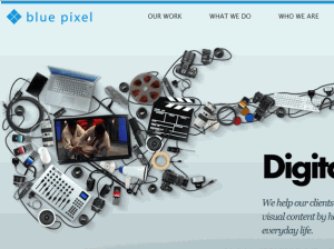
BluePixel

Newism

Features:

  • Not just a plain, smooth gradient–has streaks in it
  • More than two shades of color (range of purples)
  • Background streaks mirror logo’s angles
  • Radial gradient (bottom center) as well as linear (top left to bottom right)

Making Gradients New Again

Though the days of making simple and smooth gradients may be behind us, you can still use them for newer effects. Here are some tips for modernizing your own gradient look:

Use more than two colors, or strange two-color combinations. You might find a surprisingly lovely emerald-green shade hidden between a deep gold and muted teal shade, like this example at left.
Try subtle background patterns along with a soft gradient to give even the background of your page a little more visual interest, like this miniature sample at right.
Mess with the texture of your gradient; don’t be afraid to have sharper transitions of color, like the modern “streaked” design example at left.

What’s Your Angle on Gradients?

What do you think of using gradients in webdesign? Is it a past fad, a graphic design necessity, or a design style that hasn’t been thoroughly explored yet? Let me know in the comments!

Query: What is jQuery?

[/shameless parody of Lt. Commander Data in blog title]

Most web designers are familiar with HTML, CSS, and Javascript–they are the most basic web languages out there, forming the foundations of what the rest of the Internet is built on. Javascript in particular can make very pretty Web sites, in the sleek Web 2.0 style with subtle animations (like tidy menus you can pull out or put away with just a click).

Alas, Javascript is generally implemented through clunky individually-written or copy-pasted scripts, some outdated and some not. Poorly-written and bloated Javascript is one of the top Web features that can slow a page’s load time, as I well know from trying to load Javascript over dialup.

But what if I told you that Javascript isn’t just a random assortment of scripts and functions anymore? What if I told you that someone was bored awesome enough to gather all that Javascript can do into a single resource that developers can draw from?

It’s called jQuery…and it rocks.

What IS jQuery, Anyway?

Basically, whatever page element you’d like to animate, manipulate, or just plain select, jQuery can do that for you, just with the addition of one file to your site directory.

Think I’m kidding? Look at the detailed list of stuff jQuery can do, according to w3schools.com:

  • HTML element selections
  • HTML element manipulation
  • CSS manipulation
  • HTML event functions
  • JavaScript Effects and animations
  • HTML DOM traversal and modification
  • AJAX
  • Utilities

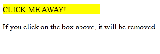
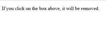
What this means is that you can now do page animations without images, slide various menu “panels” in and out of place temporarily, give blocks of text or images new formatting…practically all the other stuff you’re used to JavaScript being able to do. And, you can access all of those functions through code as short and simple as this:

<head>
<script type=”text/javascript” src=”jquery.js”></script>
</head>

You no longer have to copy-paste multiple iterations of <script type=”javascript”> into the <head> section of your webpages; all those functions are right there, waiting for you to ask for them (one reason it’s called “jQuery”).

jQuery’s Syntax

To include functions, you still have to put the script reference in thesection of your document, like you’re used to doing with individual JavaScripts. However, the syntax (how you write the script itself) is a little bit different.

Code Example

<html>
<head>
<script type=”text/javascript” src=”jquery.js”></script>
<script type=”text/javascript”>
$(document).ready(function(){
$(“button”).click(function(){
$(“p”).hide();
});
});
</script>
</head><body>
<h2>This is a heading</h2>
<p>This is a paragraph.</p>
<p>This is another paragraph.</p>
<button>Click me</button>
</body>
</html>

This example from w3schools.com, shown here for easy reference within this article.

Explaining This Code, Step by Step

First, you call for the jQuery library (the first <script> tag); that alerts the browser that “hey, we’re going to be doing something with this, so have your jQuery book open to the right page!”

Next, you start the individual script you’d like to run. In this case, the script’s function is to hide paragraphs when a button is clicked.

(Note: Before you have the script do anything else, it’s good practice to add in the “document ready” line before calling any other function in jQuery, because it gives the page time to load before the script starts running.)

After the “document ready” line, the actual script starts. This particular script selects all button elements on the page, and designates that when every button on this page is clicked, all elements will be hidden.

Changing This Script: Hiding One Paragraph

If, however, you wanted only one button on your page to do this effect, and only one paragraph to be hidden, you would change the script to the following:

$(“#click”).click(function(){
$(“#hideme”).hide();

And you would change the HTML code to the following:


<body>
<h2>This is a heading</h2>
<p id=”hideme”>This is a paragraph.</p>
<p>This is another paragraph.</p>
<button id=”click”>Click me</button>
</body>
</html>

In this modified example, you can see that adding an ID to both elements you want the script to use will make a difference in how the script runs. Instead of all buttons hiding all <p> elements, now only the button with the ID of “click” will affect the paragraph with the ID of “hideme”. Simple, but page-changing!

Changing This Script: Hiding One Class of Paragraphs

Say you wanted one button on your page to hide all <p> elements of a specific class? You can do that, too! Just make a tiny adjustment to the “hideme” ID, changing it to a class instead:

$(“#click”).click(function(){
$(“.hideme”).hide();

Make the corresponding change to your HTML code, like so (an additional <p> element has been added so you can test how it only hides the specific class):

<body>
<h2>This is a heading</h2>
<p>This is a paragraph.</p>
<p>This is another paragraph.</p>
<p>This is more stuff you’d like hidden.</p>
<button id=”click”>Click me</button>
</body>
</html>

More Examples of jQuery’s Abilities

You can see a couple of other examples through the w3schools website’s Try It! pages. For instance:

Fade out an element
Slide an element out of the way and back
Change the CSS of a particular element

Going Further with jQuery

If you want to learn more about the host of wonderful things jQuery can do for your webpage, the w3schools page on jQuery is a great place to start. (I’m personally going to be exploring jQuery for possible use in my domain’s next layout… :D)

The “Internet Snobs:” Elitist Webmasters

We’ve all had the unfortunate experience of meeting them. From somewhere within the murky depths of the Internet, they arise, to purportedly “help” beginning webdesigners and developers…but they manage to “help” while sounding incredibly snarky and condescending. They are the “elite designers,” the peddlers of snobbery on the Web.

For sure, their reputation as “elite” designers is well-deserved, generally. They make beautiful designs, seamless coding, and always seem to be fluent in the right Web languages. But their abilities to make such lovely streamlined sites lends itself all too easily to critical judgments of others, who may not be as fluent or as strong, but who are still learning their craft.

Don’t think they exist? Never run into them? Well, here’s a couple of personal experiences I’ve had with Internet snobs:

Web-Snobs in Authority: Anecdote #1

As a fledgling designer back in ’05, wanting to drive more traffic to my site, I ended up applying to various topsites and site directories to get my link “out there” in front of others’ eyes. All was going well, until I visited a particularly beautiful web directory, which had a little “Help Wanted” box on the front page–they not only wanted more links in their directory, but wanted people who would be willing to evaluate submissions.

I jumped at the chance to help evaluate–I figured that the more websites I saw, the more understanding I would get about my own coding, and perhaps it would help me grow at the same time I helped others get admitted to the directory. I submitted my link, as well as an application to become an evaluator, and happily waited for an email back.

But alas, a few Web snobs got hold of me. A few hours later, I received a curt reply that went something like this:

Dear Robin:

To be an evaluator for (site name deleted), we feel it’s important to have a strong grasp of good design techniques. We have reviewed your site, which you submitted to the directory, and were honestly unimpressed with your content presentation skills; we do not believe you’d know the right criteria for admissions.

We are hereby rejecting your application for evaluator. Also, we suggest that you perhaps take some graphic design courses and resubmit your link at a later date, so your site will be better up to par with the rest of our directory.

So, not only was I rejected as an evaluator, but my link was rejected from the web directory. Why? Because someone had a bug up where the sun don’t shine, basically. They believed my site was designed badly, and they wasted no time making me feel like a pile of poo over it.

I admit, the design in question was not my best work ever (in fact, you can see what it looked like here–it’s Version 4), but it was an example of me trying out new things, trying to be different, trying to get comfortable with doing various design styles. I had been teaching myself web design for only two years at that point, and I didn’t have access to any courses in graphic design; I was going off of what I believed to be best practices.

I know that as a busy web directory, these guys didn’t have a lot of time to waste with nicely-phrased replies. But rejecting a link to their directory, which could have driven traffic their way no matter how badly designed the referring site was? Even now, I regard that as a pretty stupid move, motivated more by snark than common sense. It was an unnecessary flourish; I could have taken the criticism of my design alone and learned from it, but their added sucker-punch of rejecting my site in totality made it seem like an attack.

Needless to say, I was secretly very glad to hear the directory had shut down a few years later. Reason? They didn’t have enough submissions coming in, and the directory was too small to drive links. (I enjoyed quite a nice belly laugh over that irony.) Good to know that snobs don’t always win in the long run!

Mod Gone Mad: Anecdote #2

Along with trying to submit my sites to topsites and directories, I also had joined a few web design forums to learn more and maybe help other beginners out. I joined one nameless webring clique, which was a site review clique as well as a link directory, but quickly found out that according to one of the mods, I didn’t belong there.

She was a popular webmaster and builder of several useful webmaster tools and software; she also knew a whole lot more than I did about the backend part of web design. I respected her and was quite willing to sit at her proverbial feet and learn from her. But I also wanted to bring my unique perspective on web design to the clique’s forums, helping other beginners like me, writing articles much like this very post. To my surprise, she wasn’t having it.

It started with a couple of posts I made about praising websites instead of being overly critical–due to my past experience with critical judgments, I was alarmed at the amount of snarky, cutting reviews on the webring. I knew what harsh judgments could do to a beginning webmaster’s confidence, and I sought to shore up confidence and offer constructive criticism, pointing them to resources and offering to help where I could. But when I posted about praise, her response was simply “I don’t have time for praise. Next.”

OK, I thought, well, I’ll just make a few comments to some beginning designers on here and stay off the forums for a while. So I visited a couple of sites, offered each webmaster detailed help with some encouragement mixed in, and generally felt good about myself for being the bigger person and not continuing the argument. Little did I know, one of my paltry human judgments clashed with the mod’s omniscient, eternal judgment…she followed up both my review comments with suggestions that the other person should completely ignore my “sugarcoated BS,” since I didn’t know what I was talking about.

The stink of her elitism was strong in my nostrils, and in angry haste I responded to her on the forums; I told her exactly what I thought of her following me around the place and acting as if I had no right to be there. Her response: “Well, I’ve seen your designs. You tell me: does someone who doesn’t even know how to validate HTML have ANY right to advise anybody else here?”

I put up a weak response, something along the lines of “I deserve to be here as much as anybody, but I don’t deserve to be talked to like that”, and logged off. Of course, years later I thought of better comebacks, like “Well, since you apparently own the Internet and are so blasted good at this, why does your profile say ‘unemployed’?”…but of course, you never think of comebacks when you need them. That was the last time I accessed that forum, and I promptly took down the webring link and removed myself from it. I had enough snobs in my everyday life–I didn’t need another faceless snob on the Internet trying to shout me down.

What annoyed me the most about this particular mod was that I had been willing to learn from her, and had indeed sought out her advice before this incident. But her advice was always tinged with disdain, as if I “should know better” than to ask, as if I were an idiot for even forming the question in my mind. I had no issue with her being critical of my designs (though it stung badly); I took issue with her tone and how she treated me like a lesser human being. Poorer designer I may have been, but I still deserved better.

A Dirty Secret: My Own Inner Snob

I’ll admit, however, that I am not free from my own inner snobbery, and it has bitten me on the backside more often than not. When I accepted a web design job from a business halfway across the country, for instance, I privately scoffed and laughed at the previous webmaster’s poor attempts at design. I kept thinking to myself, “I could wipe my rear and end up with a better-looking design.”

Little did I know, the company’s owner had apparently loved the previous, awful look and was disappointed with my more web 2.0, sleek and modern design. (I didn’t even really get paid for the work I did, but I was glad to be rid of that contract!) I felt terrible about how I’d passed judgment on the other designer after the fact–that person was just trying to work within the (terrible) design concept, and ended up doing a better job than I did with it.

Web Elitism is Everywhere…How to Fight It?

As my stories show, it’s possible to be both a victim of Web-snobbery and a perpetrator. The key is to realize when you’re being a snob yourself, and tone it down (with an added apology to affected parties for good measure).

Truth is, we all pass judgment on each other, always trying to size each other up to see how skilled we are in comparison to others, etc. It’s like middle and high school all over again, with the “popular” crowd making all the pretty designs, the “geek” crowd with all the l33t coding skills, and the complete “n00bs” who don’t know any better than bright pink backgrounds and tabular layout designs.

Instead of playing on other people’s lack of confidence or apparent lack of skill, and hoarding all the l33t coding hacks and software tricks to ourselves, I think we web designers and developers should be more a community of designers. We don’t have to be in competition with each other–after all, we’re all trying to do the same thing, just in different languages and different programs. Elitism gets us nowhere; in fact, it can kill off confidence in newbie designers who have great potential, but little access to knowledge and tricks.

So, why don’t we put the one-upmanship aside, just for a while, and try helping out someone who might not know everything you do? Who knows, a new friend might be behind that screenname, wishing someone would chat with them and show them how to make a cool website like yours. 🙂