Category Archives: Monday in the HTMLab

All about web design and development, and my triumphs and defeats therein.

10 Newbie Design Mistakes

We’ve all done it, at one point or another. Out of ignorance or out of a need to hurry up and get a page published, questionable design choices slip out onto the Internet.

Most of what I’m going to reference in this article is stuff I’ve done knowingly and willingly, either because I didn’t know any better or because I thought it “looked cool.” (Animated GIFs…oh, so very cool. *cough cough cough*) In either case, I didn’t research my design choices well enough; I should have been going to other people’s websites to see what they were doing, or at least reading web design articles to find out best practices.

To best show off these problematic design choices, I decided to combine them all in a terrific cacophony of web design. I call it…the “Really Bad Page.”. Click the link, and try not to wail with despair.

The Bad Page’s Features

“Times New Roman” font style

Times New Roman, especially in this web 2.0 age, is very “default” and uninteresting on a webpage, since it is the default font when no font is specified in a CSS style. This makes the website look uncared for and un-updated.

All centered text

Centered text does not always “balance out” how your text looks. In this case and in many others I’ve seen across the internet, centered text is just hard to read and looks awkward on the page.

Thick borders around your tables
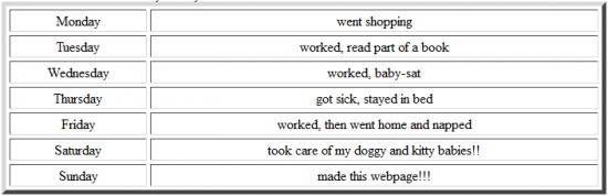
I used to love how thick-bordered tables looked on a page…but then again, that was back in 2001. 😛 The bordered table might be okay for true tabular data, but not for random information; it now just looks junky.

Animated GIFs (especially for an “Email Me” link)

Animated anything on a page these days tends to make your page look too young and kiddy. It can really de-professionalize a look. (If that ain’t a word yet, I’m making it one, because it works. 😛 )

No padding/margins in your divs

See how the table runs right up against the links? This is caused by no padding or margins used in the divs. Everything within the div expands out as far as it can go, and when there’s no padding there, it just makes your content look messy and harder to read.

Narrow left-aligned layout

Most users are used to seeing wide center-aligned layouts nowadays–itty-bitty left-aligned layouts are a visual shock, and may not display well on larger-resolution monitors (i.e., they will look too small).

Too much white used in the background

I’ve been guilty of this from time to time, but using white as a background color can look too “empty” if there’s not a lot of content on the page, like my sample page.

Using low-quality images (especially JPGs)

A JPG, or any image, that’s of this low quality looks unprofessional and makes it hard to tell what the picture’s subject even is. See other examples of low-quality JPGs on SixRevisions, Ransen.com, and PanoHelp.com.

Too-wordy link descriptions

Who wants to click on a link that takes several lines to describe? When you have a lot of words in your link text, it makes it look very messy and unkempt.

2-dimensional and square design

A website isn’t printed on paper, but this design looks like it could be printed out very easily. There’s very little visual interest at all, and no deviation from the invisible straight-sided square/rectangle box.

Next Week: Turning the Look from Newbie to Pro

Next week, we’ll be looking at 10 ways to make your page look professional. Never be tormented by centered Times New Roman text again! 😛

Road-Tested (and Robin-Tested) WordPress Plugins

As a blogger on dialup, I don’t have a lot of connection speed to test plugin after plugin. Instead, I spend a good bit of my time researching good plugins on WordPress help sites, and asking other WP bloggers what they personally use. Once I know the general community’s opinions and issues, as well as the opinions of closer blogging friends, I can then know whether the plugin is right for my own WP setup and needs.

In the process of all that research, vetting, and questioning, I have found 6 plugins that really help Crooked Glasses be all it can be, in the midst of all the other plugins available. I highly recommend each of these, as they have all made my blogging life much easier.

Akismet: Worth Its Weight in Data

Akismet, to be fair, came already installed when I loaded WP on my own server. But I have been so pleased with how it targets spam that I recommend everyone who hasn’t signed up for an Akismet API key to do so. (This is a completely unpaid statement on my part–I just really like the plugin because it works.)

Akismet plugin download page

Yet Another Related Posts Plugin (YARPP): Reaching Into My Archives For Me

Despite being named “Yet Another” related posts plugin, YARPP is the only one of the three “related posts” plugins I tested that worked for me. Not sure if it was operator error, faulty installation, or non-working programs on the other two, but YARPP came through with flying colors.

At the end of each single post, now, I have links displayed to other posts similar enough in content, without ever having to lift a finger. THAT is such a help, much more than I ever imagined. Now I don’t have to do huge, link-laden Glassics posts unless I just want to!

YARPP plugin download page

Wordbooker: A Way to Connect My Blog with Friends and Family

Thanks to Wordbooker, which automatically posts newest blogs to my Facebook, my close friends and family can now read my blogs with ease. This actually means a lot to me, to know that real-life people are reading my works and they can comment on Facebook about them.

(Wordbooker’s plugin updates do tend to unhook the link between my FB and Crooked Glasses, but all you have to do is go into the plugin’s settings and re-connect with Facebook, which takes about 5 minutes even over dialup.)

Wordbooker plugin download page

AddThis: Making Tweeting/Liking/Sharing SO Much Easier

AddThis, like many of the sharing plugins, has a tweet button and a like button–but it’s also infinitely customizable by adding other specific-site share buttons to your lineup as well (like Foursquare and Pinterest).

I also like that it tells you how “viral” your links have gone through being shared (via your Dashboard)–though Crooked Glasses hasn’t gone all that viral yet, I know that the potential is there and I’ll be able to track its progress.

AddThis plugin download page

Tweet Old Post: Tweeting from the Depths of My Archives

This wonderful little plugin digs back into my archives and auto-tweets older posts about every 3 or 4 hours, even when I can’t be online due to having to keep the phone line clear (or when I’m feeling sick/headachy, which is often these days). Thanks to this plugin, my older posts have a chance to get some Twitter love, and my blog’s Twitter presence stays fresh and updated.

This plugin and the aptly and funnily-named plugin below are likely the ones I have to thank for my Twitter following…just saying.

Tweet Old Post plugin download page

(Special Honors) Just Tweet That S**t: It Does What It Says!

Like Wordbooker does for Facebook, this plugin auto-tweets links to my newest blogs. It helps so much to have this automated, since I can’t always be online and logged into Twitter when my blogs go live.

The reason this plugin gets a special honor? Because I tried several auto-tweet plugins before this and none of them would authenticate correctly with Twitter. I was about to tear my hair out trying to find an auto-tweet plugin, and NONE of them would do it…but this one did!

Just Tweet That S**t plugin download page

Summary

If you run a WordPress blog and are looking for plugins to help your spam problem, link to older posts, auto-post to social media, or make sharing easier, I would highly encourage you to install these 6. I have found them to be reputable, without spam and without hassle. Amazing how a single plugin can change your blogging life!

Health Perils of Working on the Web

Web design and development can be fairly glamorous. You’re creating and maintaining tons of web pages and graphics that other users reference and link to, all with just a few key presses and clicks. (Or, if you’re a designer like me and have to use Backspace or Undo a lot, there’s quite a few more key presses and clicks involved. 😛 ). And it’s quite an ego boost to learn that your page is getting views from other people; suddenly, you feel like your 15 minutes of fame have started.

Most people who aren’t in the business think of it as an “easy” career or hobby. All you’re doing is sitting in front of the computer typing, right? Most of the work is in your mind–how hard can that be?

The Health Risks

But web designers and developers, along with all the other jobs that involve sitting for long periods of time working on a computer, are putting themselves at risk for several health problems, including the following:

  • Stiffness/muscle pain in the neck and back
  • Carpal tunnel syndrome
  • Arthritis in the hands and wrists
  • Eye strain
  • Sedentary lifestyle, leading to possible heart and joint problems, obesity, diabetes, etc.

Of these problems, carpal tunnel and eye strain are the most work-endangering; when you can no longer type or read your screen without pain or problems, you will not be able to work as a web designer or developer anymore. I remember my grandmother suffering arthritis and carpal tunnel when I was a child–her hands were literally gnarled up so badly she could barely hold anything, and to try to grip anything was agony. Typing was completely out of her range of motion. And eye strain is no better; it can lead to the need for new glasses much faster than normal, and it can also affect your long-distance sight whether you’re far-sighted, near-sighted, or blessedly 20/20.

I’ve suffered a number of these health problems ever since college, when my computer use went way up and my walking went way down because of injury. The amount of neck stiffness and eye strain I had, especially in college, led to bad headaches (and still does on occasion). Sitting for 10 straight hours coding a website–not the smartest thing I ever did, for several reasons. xD And these days, I find my wrists are more often achy than not. I worry I’ll end up just like my Nannie, unable to even uncurl my fingers or bend my wrists without wincing.

I’ve also seen how my imposed sedentary lifestyle (part choice, part necessity) actually contributed to loss of flexibility in my injured joints, especially my knees. Now that I’ve been doing weekly Zumba classes, doing physical activity, I notice that my knee joints are feeling just a bit easier to move. If I had not started doing more physical activity, who knows where my stiff and sore knees would have landed me?

Avoiding These Health Problems

Thankfully, there are ways we can avoid these types of problems without having to permanently stop doing the design and development we love. Just a few small changes to how we work, and where we work, can save us doctor visits and even later surgery!

Easing Tired Eyes

  • Set a timer for 20 minutes. For every 20 minutes of internet work, look away from your screen for 20 seconds at something 20 feet away (I usually try to look out a window if I can). This is the old “20-20-20” rule, taught for years in school.
  • Use a gel eye mask that can be chilled in cold water, especially after you’ve been staring at the screen for a while. I find that this helps the puffiness around my eyes as well as indirectly calming itching and irritation from long staring at screens. Plus, it forces you to shut your eyes and reduces the sense of ambient light, which might just make it easier to rest!
  • Turn down the brightness on your computer screen just a touch–I find that slightly dimmer computer screens are easier on my eyes than working with it on full brightness. Also work in a room that has an equal amount of light as your screen if you can. Working in complete darkness staring at a bright computer screen, for some reason, drives my eyes bonkers.

Helping Stiff Muscles

  • Add something to the 20-20-20 rule by standing up and stretching every 20 minutes, while you’re looking away from your computer screen. Be sure that when you stretch, you let your head go back so that you’re looking at the ceiling, and your arms are stretched up above your head and somewhat behind you. This gets some of that tension out of your neck, shoulders, and back (where most of mine ends up, at least).
  • If you can’t afford to stand up or don’t want to, at least let your head tilt back so that you’re looking at the ceiling for at least 20-30 seconds. Sometimes I even do this at stoplights. 🙂
  • Massage the sides of your neck and down into your shoulders, rubbing in circles, if those muscles are beginning to get sore. Anti-inflammatory medicines like Advil and Aleve are also good for helping soreness.

Avoiding Carpal Tunnel/Arthritis

  • Before starting work, and every 30 minutes during work, do the wrist and hand exercises which are so excellently detailed on eatonhand.com, a site for helping patients prepare for, recover from, and avoid surgery on the hands and wrists.
  • Design your office space, especially your keyboard and mouse setup, so that your wrists don’t have to be positioned at weird angles. And you might not need those ubiquitous wrist rests, either. Check this WebMD article on office ergonomics for more information.
  • Simply take breaks from typing. Visit a site that requires no typing and mostly browsing with the mouse (with one hand), and let the other hand rest. After about 10 minutes, let the mouse-using hand rest and switch the mouse control to the other hand. It might be a little awkward to use the mouse with your non-dominant hand, but your dominant hand will thank you.

Getting a Little Bit More Active

  • For every hour you work on the computer, try getting just 10 minutes of exercise. Walk around the office, do a bit of housekeeping (sweeping and picking up trash helps the most, with all the bending)–anything that gets you moving for 10 minutes. Your eyes and hands will also thank you for being away from the productivity machine for a little while.
  • If you’ve got the money and space, invest in a treadmill desk (a less costly DIY version plan can be found here). This ingenious invention combines a fairly sizable workspace with an actual treadmill underneath you, forcing you to walk to stay close enough to your desk. I don’t know if this would actually work for me, but at least I wouldn’t be walking for nothing!
  • Fidget while you sit. Even just wiggling your toes or trotting your leg can be good to just keep blood flowing around faster than glacier speed. Just make sure it doesn’t disturb anyone else working near you, of course

Summary

Working as a web designer/developer doesn’t mean you have to sacrifice your health. To be sure you can code happily ever after, you need to start now maintaining at least some healthy habits. After all, we webmasters don’t want to end up unable to type and unable to move from our chairs, right?

When and How to Use a Horizontal Drop-Down Menu

Before beginning this post, I thought I’d be all smart and helpful and write a tutorial on how to do a horizontal drop-down menu using CSS. That was before I Googled how to do it, and discovered that no less than five people had beaten me to the punch. 😀

I linked to those five tutorials (at the end of this article), and took a new tack: WHEN and HOW to use such a design. As with all styles of design, there are times where such a menu is appropriate and times where it completely breaks the look and functionality of your whole page.

Why Use a Horizontal Drop-Down Menu?

If you’re considering using a menu like this, you probably want to condense and simplify your navigation, or you want to use your sidebar space for something other than navigation (like ads, links, recent posts lists, etc.). Both are worthy goals–using as much screen space as you can closer to the top of your page ensures that more content can be displayed “above the fold,” so that the user does not have to scroll down.

Also, horizontal drop-down menus are great for decluttering a website’s look–somehow, it adds a sleekness that vertical navigation just never gives. If you’re looking for ways to neaten up the appearance of your site, such a menu design could be the very thing you need. And of course, if you already have a simple navigation (just a few pages in a couple of categories), then this look is perfect for your site.

When to Keep Away from This Menu Style

Just because you CAN do a horizontal menu with drop-down space doesn’t mean you SHOULD.

If you have just a few categories with lots of links in each one, you should not use this style–it will make your drop-down menu way too big and clunky on your page.

Also, if you have content high up on your page that you don’t want covered up at all (like sidebar widgets or important updates), I’d advise against this style, because your users will automatically be drawn to the menu and may never see your content.

How to Implement a Horizontal Menu Beautifully

  • Make your categories many and your links within each category few, so that your menu displays in a compact fashion.
  • Choose an easily-readable medium text size for your menu options (12-14 pixels for most fonts).
  • Make sure your link color and the menu’s background color are different enough from each other to be readable.
  • Don’t go crazy with link animations or graphics in your drop-down menu–just text links that match the colors of your site will be much more professional and usable.

Four Visual Degrees of Drop-Down Menus: From Worst to Best


#4. Not only is this menu HUGE, covering up much of the page underneath it, but its links are formatted in this weird, widely-spaced, almost tabular layout. It is visually confusing–everything looks the same, and it’s scattered all over the place.


#3. This menu is a little bit better–it’s big but doesn’t cover up the whole page underneath it. But its text formatting is strange; why all the space between each item, and why such huge font? Plus, the two top categories in bold are a bit vaguely worded, which means no one is going to click on them.


#2. This menu is more compact, with manageable font size and spacing, and a simple two-column link layout. But it still feels a bit “busy” with links.


#1. We have a winner! This menu is very compact, yet has big enough font size to read. Plus, it’s got high-contrast colors between the background and text colors, and its links are sorted alphabetically. Makes it very, very easy to find what you want, which is the point when designing a good navigation menu of any sort.

Learn How to Code and Design This Menu Type

AListApart (basics)
Onextrapixel (combines HTML, CSS, and JQuery)
CSSNewbie (VERY easy to understand–even I got it!)
Sperling.com (a little more jargon-heavy, but still a good reference)
MyCSSMenu (if you don’t want to fool with the code)

Font Series Wrapup: Fonts You Need for Your Toolbox

As an ending to this series of font-tastic posts, I am recapping some of the best fonts I discovered while doing font research. The five I have chosen for today’s post are, in my opinion, the most usable and easily-read of all the fonts in each category I wrote about (fancy fonts, sans-serif/serif body fonts, bitmap fonts, and symbol fonts). I hope you find them as useful and awesome as I have–I’ve already downloaded them all for use in my future designs!

(By the way, I provide links back to the articles I wrote for each category, so it’s easy to check through the articles and see if you agree with my picks. 😀 )

Best Fonts from This Article Series

Best Bitmap Font:

Ernest
Why? Because it provides the smallest and yet most readable text for itty-bitty graphics. I’ve long used it for link buttons, but it has a variety of uses around a website.
Best Symbol Font:

CD-Icons
Why? Because it has a ton of symbols–even symbols for special characters, like accented E’s, etc. It literally has a symbol for every character you can think of, and they are all useful in an icon-based design.
Best Fancy Font:

Dhe Mysterious
Why? Because it has a well-defined character set, and yet it has a beautiful wispy quality to it too…strong but soft. Great for titles and headings, but not too bold.
Best Sans-Serif Body Font:

Alido
Why? Because it’s not Arial, Verdana, or Helvetica, but it is still legible–it’s different without being tiring on the eyes after reading a page or two written in it.
Best Serif Body Font:

Timeless
Why? Graceful without being overpowering–and again, it looks different enough from Georgia, Garamond, and Times New Roman.

Summary

Fonts are, for me, one of the most important parts of web design, because a good font choice means that people can read your content (what they came for). Making a website beautiful AND easy to use/read is what webdesigners are all about, after all!

I hope that this font article series has helped you discover new fonts for your own site designs. It certainly has been fun for me to review all these different fonts (and find new favorites)!

Leaving Letter Forms Behind: Symbol Fonts

Sometimes it’s just not feasible to make icons for every single thing you want to link to on your page. Yet, you want something different than just a text link; you want something more creative than just “Click here for [this content]”.

And it’s not just links, either. Often, you end up with a need for a small graphic, but you either don’t want to draw it out or you can’t draw it on the computer (like me controlling a laptop mouse–fail). What does one do when you want a cute little graphic that doesn’t require Photoshop to create?

ANSWER: Use a symbol font!

What IS A Symbol Font, Anyway?

A symbol font is any font that does not display the typical alphabet letters when you use it. The most common (and oldest) of these symbol fonts are the Wingdings series and the Webdings font, often included with many systems’ default fonts.

Well, Why Bother with Fonts that Have No Recognizable Letters?

Precisely for the webdesign opportunities it offers. Not only do you have ready-made, professional-looking icon designs, but you can also include your symbol font as part of your webpage using the @font-face CSS declaration. It saves you from having to create icons; instead, you can just type a letter and stipulate that it has to display in the symbol font. Instant icon!

And, if you want to dress up your icons a little more, you can always use the symbol font in your preferred image-creation program, masking, sizing, turning, and otherwise decorating the font to look like a traditional icon. Either way you go about it, symbol fonts provide icons and small graphics with more professional “pop.”

How Can You Use Symbol Fonts?

I find that symbol fonts used as icons are best at slightly larger font sizes, so that they are more visible and easier to click on. Too-small symbols can be frustrating for users, because it’s hard to tell what the symbol even IS at small sizes.

Also, symbol fonts need to be used with as sharp a color contrast as possible (i.e., white symbol on black background) so that all the symbols are easily visible.

What Kinds of Symbol Fonts Exist?

Literally everything you can imagine…including fonts with symbols and pictures that baffle the mind. (“Why would anybody make a font out of THAT?!”) What follows below is a fairly broad listing of some of the better symbol fonts out there.

The images are merely samples of each font–in each case, I tried to capture much of the range each font covers. Also, some of the symbol fonts in my examples, below, are sized smaller or larger than I like, due to the previews. Clicking on their links, however, will take you to the pages where you can see them in better quality, and see the entire character set.

Useful Icons and Signs


Cursor

FFF Extras

IconBit1

IconBit2

PepGenious10

PixArrows

BTD Cart-O-Grapher

The B.O.M.B. (Best of Magurno Brushes)

Symbolix

DNR Recreation Symbols

Spaider Simbol

CD Icons
(not actually this huge normally)

WMSymbols

Little Faces and Emoticons


Skrewd Up Soulz

Spacy Stuff

SQCon

V5 Pixelpals

Decorative Designs


BitFuul

Rosette110621

Calligraphic Frames Soft Two
(screenshot does not do it justice)

Picture Squares
(screenshot does not do it justice)

Davy’s Dingbats 2

Gembats 2

Detailed Images


Suboel
(Christmas/holiday theme)

Craft
(Minecraft theme)

SL Mythological Silhouettes

Random Dingbats

(Fonts displayed in this section are from DaFont and Fontspace. Additional symbol fonts can be found at 1001Fonts.com.)

Summary

If you’re having trouble finding icons for what you want, try a symbol font–an easy and clean way to get icons without having to manage your own pixel-by-pixel design. For those of us who are not skilled in small designs (like me :P), symbol fonts can be a lovely way to dress up your page, whether used alone or within an image creation program.

Itty-Bitty Bitmappy Fonts

Big, beautiful, fancy fonts are awesome for making huge first impressions on a user. They’re like wearing a bold-patterned coat or a brightly-colored dress–they instantly grab attention. But the itty-bitty details on a website design help “finish” the site, just like jewelry or shined shoes give an outfit a more polished and put-together look.

Today, we’ll be looking at several itty-bitty fonts, called “bitmap fonts,” that can help do all sorts of small decorative tasks around your website. Labeling link buttons, crafting social media graphics, doing copyright text or watermarks, and even making up parts of hovered navigation can all be done using one or more of the fonts I’ll cover today.

Bitmap fonts are generally best used at smaller sizes, so today’s previews will have two sizes of each font. The larger font is more to show you what the font looks like. Also, bitmap fonts are usually best used without anti-aliasing–the harder edge gives the bitmap font its shape.

With the exception of Baby Blocks, all fonts were tested with the text “crooked glasses” in lowercase letters.

Squarish & Space-Agey


Aansa

Bit 1
no custom preview available

Ernest

Hilogin

Micro N56

Small and Graceful


BF Mnemonik

Chixat 8

Venice Classic

Outlined/Shadowed Letters


Bit Out
no custom preview available

Fipps

Half Life
(un-outlined also available)
no custom preview available

M04 Fatal Fury
(un-outlined also available)

Fun, Blocky Effects


Baby Blocks
(blocks appear for capital letters only)

V5 Bloques

Summary

I find that bitmap fonts are some of the best little tools in my font toolbox. Where other fonts are illegible at small sizes, bitmap fonts are perfectly legible; where other fonts would be too busy or too elaborate, bitmap fonts are just decorative enough without struggling to read them.

But what do you think? Might there be a place on your site for a few itty-bitty fonts?

Getting Your Body Font in Shape

Last week I covered fancy fonts, primarily used for headings, images, logos, and special text. But what about body fonts in web design, those used for all the rest of your text content?

With body fonts, I’ve always felt just a little stuck in a rut–a rut called “I can only use Arial, Verdana, Helvetica, Georgia,” etc. And I would be willing to say that many designers are wary of using specialized fonts in our body text. It’s one more thing for our users to download, and possibly one more thing that won’t display correctly.

But in fact, we now CAN use special fonts for our body text designs, using the @font-face declaration in our CSS. (More about how to use that here–this article from SixRevisions explains it so much better than I ever could.) Using @font-face is a way we can include slightly different body fonts that help brand our sites. Not only that, we can better match body fonts to our special fancy fonts–always a nice way to pull a site together!

As part of my own research for new fonts, I began hunting through DaFont again, looking for lovely sans-serif and serif fonts that were readable and basic enough for body text–i.e., nothing too hard on the eyes at small pixel sizes. I came up with the following list of body fonts that are just different enough. Check through this list of sans-serif and serif fonts, all chosen for legibility and coolness–download links are below each image.

Each font below is previewed with the text “crooked glasses” (all in lowercase), and the display size was set to “Tiny” on dafont.com.

12 “Just Different Enough” Sans-Serif Body Fonts


Ageone

Alido

Bird Cherry

Cuprum

Existence Light

Forgotten Futurist

Lintel

Myndraine

Passion Sans

Print Clearly

Susanna

Tin Birdhouse

12 “Just Different Enough” Serif Body Fonts


Angleterre Book

Berylium

Day Roman

Dualis Lite

Gentium

Happy Phantom

Just Old Fashion

Mary Jane

OldStyle

Sanford

Springsteel Serif

Timeless

Fancy Fonts Your Users Can Still Read

Designing a beautiful layout is not just about choosing the right color/style or picking the most fitting image format. It’s also about choosing fonts that work well for your website’s topic (and are readable to users’ eyes).

To elaborate more about the important role of fonts in web design, I’m beginning a series on fonts this week, tackling the chief issue I have with modern fancy fonts: legibility. What’s the use of using a pretty or nifty font if no one can read what it says, after all?

Why Focus on Legibility?

  1. A site’s logo should be easily read and understood
  2. Content and navigation should be easily distinguished
  3. Headings and subheadings should be emphasized, but not overdone

If we want users to stay on our sites and enjoy the text content we’ve written, we need to make it easy to read our sites. Thus, legible fancy fonts, fonts that are decorative and yet still readable, should be at the top of our design list.

Where ARE Some Fancy Legible Fonts?

After doing a thorough search on my favorite font resource, DaFont.com, I found five fonts each in several fancier categories that meet my criteria for legibility, which is the following:

  • Each letter is distinguishable from others
  • Not too thick
  • Not completely obscured by flourishes

Each font has been previewed using the text “crooked glasses” in lowercase letters, set to “medium” size. Some previews have had to be shrunk to fit in the content space.

Cartoony Fonts


Andrea Karime


Witches’ Magic


Jinx


Lounge Bait


Skinny Jeans

Groovy Fonts


Finesse (has been shrunk slightly to fit)


Delusion


Rollergirls


Keep On Truckin’


Neon 80s

Curly Fonts


One Starry Night


Seasons Spring


Boingo


Daisy Mae (has been shrunk slightly to fit)


Dirty Lady

Barely-There Fonts


Awakening


White Tie Affair (has been shrunk slightly to fit)


Seraphim (has been shrunk slightly to fit)


Dhe Mysterious


Fluid Light

Retro Fonts


Odalisque (has been shrunk slightly to fit)


Chocolate Box


Galeria Coruna 2008


Bellerose


Stripes Caps (has been shrunk to fit)

Odd Fonts


Ground Round (has been shrunk to fit)


Angelic War


Where Is The Rest?


Inflammable Age


Botanic

Wahhh, We Want Comments!

A blog is a difficult thing to write for every week, as many bloggers can tell you. Oh, sure, it’s much easier to write when you’re all het up about something and you know you’re going to get a lot of feedback. But sometimes, it feels like you’re writing on a wall that nobody even looks at.

Though I enjoy my own blogging experience here on Crooked Glasses, I have found myself feeling the same way about the blog as of late. Is my writing that uninteresting, that I get maybe a comment a week (if I’m lucky)? Am I not writing about things that others want to read about or know more about? When no readers give feedback on your blog, sometimes you begin to wonder if these proverbial “readers” are even out there, or whether you’re just the falling tree in the forest, with no one around to hear you.

I know that I’m not the only blogger to feel this way. I’ve spoken to several people in real life and online who have similar issues with their own blogs, never sure whether they’re really informing and entertaining, or whether they’re just wasting time, money, and megabytes of storage space. It’s not completely an egotistical need for attention, though I admit there is some truth to that. But for me, it’s more a need for validation: Am I doing something worthwhile, or should I be spending these 6 to 10 blogging hours a week doing something else?

This article, therefore, is written to help other bloggers like me figure out how to inspire reader feedback, as well as to push us all toward writing more for the readers rather than just ourselves.

How can bloggers inspire readers to give feedback?

So, with this concern of reader feedback high on many bloggers’ minds, we wonder how to help others respond to what we write. I began to brainstorm, and realized I needed to answer this question: “What makes ME want to post a comment about something someone’s blogged about?”

Ask thought-provoking questions

Insightful blog posts always get me, right in the cerebral cortex. (That’s one reason I strive to include both philosophy and commentary in my Tuesday on the Soapbox posts…I like being able to give insights if I come up with something that sounds halfway decent.) I like commenting on the insight and thoughts that the blogger has had, especially if it makes me see an issue in a new light–I like letting them know I was touched or moved by their writing.

State an opinion and ask for rebuttals/other perspectives

When someone asks directly for my opinion, I usually give it. (If you couldn’t tell already, I tend to have strong opinions. 😛 ) So, when I see a blog post that has a very strong or well-stated opinion (either aligned with what I believe or not), I tend to respond. There’s no need to be incendiary here; just writing your opinion with evidence to back up why you believe what you believe can be enough to start a (polite) debate or discussion.

Write something so personal/beautiful that others can’t help but reply

When a blogger writes openly and honestly about something in their real-life experience, especially a struggle with illness, family trouble, depression, regret, or anything else troubling, I want to give them words of courage. Also, if the blogger writes about getting better or taking it one day at a time, I want to leave words of encouragement. Either way, I’m clicking that comment button for all it’s worth.

What’s Your Opinion?

What makes you, as a reader, leave comments on a blogger’s writings? [/shameless appeal for comments] 🙂