Choosing which font to use for your website’s graphics seems like such a small concern, especially in the light of all the other parts of building a website. For business websites, the font concern can seem even less important–there are so many other choices to make, like hosting, bandwidth, site colors, etc., that seem much more pressing. But even if your content is wonderful, your images superb, and your networking beyond compare, your site will still suffer if its font choices look less than professional.
What do I mean by “less than professional” font choices? Anything that looks informal, more like printing or cursive handwriting than typed text–like the following:
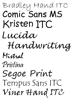
|
Comic Sans has gotten most of the bad press for being a rather overused and ill-advised font, but there are other fonts out there that are not good choices for business sites.
I’m not saying that these fonts are all-around bad–not at all! Tempus Sans ITC is one of my favorite fonts to use, for instance. But I use it for personal design and web projects only. It and other “handwriting” fonts give the right touch of personality and humanity to small personal sites; for a business website, however, it makes the business’ Web presence seem less polished and “finished”. It’s like getting dressed for a job interview. If I went to an interview wearing my best blouse, but paired it with torn jeans, I wouldn’t be likely to get the job–torn jeans are more appropriate for casual events. The same goes for fonts; handwriting fonts are more appropriate for casual or personal webpages. |
Look at the following example, using Kristen ITC for the top font and Palatino Linotype for the bottom font. With both fonts in similar sizes, styled with the same color and drop shadow, which font looks more professional and polished? Which site would you instinctively trust more to give you accurate information in a timely manner?

Fonts silently tell your visitors more about your content and your businesslike personality–for better or for worse. When you’re designing a page for a business, you want to make sure your website is putting its best foot forward, and fonts are a surprisingly important part of that. (This is one reason I’m looking at redesigning Crooked Glasses’ own look soon–I want to make sure I’m following my own advice!)